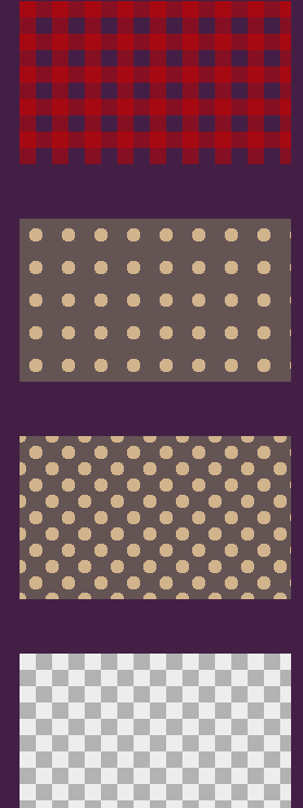
1.css网格背景
<!DOCTYPE html>
<html lang="en">
<head>
    <meta charset="UTF-8">
    <title>css网格背景</title>
    <style type="text/css">
    body{ background-color: #451F46}
        div{margin:20px;}
        .stripe1{
          width: 250px;
          height: 150px;
          margin: 50px;
          background: linear-gradient(90deg,rgba(200,0,0,.5) 50%,transparent 0),
                      linear-gradient(rgba(200,0,0,.5) 50%,transparent 0);
          background-size: 30px 30px;
        }
        .stripe2{
          width: 250px;
          height: 150px;
          margin: 50px;
          background-color: #655;
          background-image: radial-gradient(tan 30%,transparent 0);
          background-size: 30px 30px;
        }
        .stripe3{
          width: 250px;
          height: 150px;
          margin: 50px;
          background-color: #655;
          background-image: radial-gradient(tan 30%,transparent 0),
                            radial-gradient(tan 30%,transparent 0);
          background-size: 30px 30px;
          background-position: 0 0,15px 15px;
        }
        .stripe4{
          width: 250px;
          height: 150px;
          margin: 50px;
          background-image: linear-gradient(45deg,rgba(0,0,0,.25) 25%,transparent 0,transparent 75%,rgba(0,0,0,.25) 0),
                            linear-gradient(45deg,rgba(0,0,0,.25) 25%,transparent 0,transparent 75%,rgba(0,0,0,.25) 0);
          background-color: #eee;
          background-size: 30px 30px;
          background-position: 0 0,15px 15px;
        }
    </style>
</head>
<body>
    <div class="stripe1"></div>
    <div class="stripe2"></div>
    <div class="stripe3"></div>
    <div class="stripe4"></div>

</body>
</html>
效果图:
2.遮罩
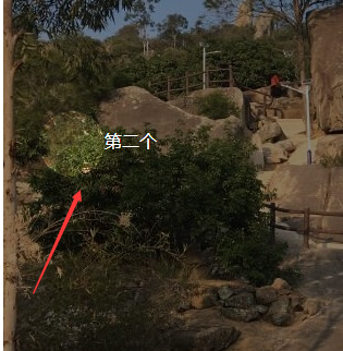
<!DOCTYPE html>
<html lang="en">

<head>
    <meta charset="UTF-8">
    <title>透明遮罩</title>
    <style type="text/css">


    .trans {
        /*transition*/
        -webkit-transition: 0.3s ease;
        -moz-transition: 0.3s ease;
        -ms-transition: 0.3s ease;
        -o-transition: 0.3s ease;
        transition: 0.3s ease;
    }

    .test_outer {
        width: 320px;
        height: 480px;
        margin: 1em auto;
        position: relative;
        overflow: hidden;
    }

    .test_cover {
        width: 60px;
        height: 60px;
        border: 480px solid rgba(0, 0, 0, .45);
        border-radius: 50%;
        position: absolute;
    }

    .test_cover_pos1 {
        left: -227px;
        top: -478px;
    }

    .test_cover_pos1:after {
        content: '第一个';
        margin: 16px 0 0 -140px;
    }

    .test_cover_pos2 {
        left: -447px;
        top: -378px;
    }

    .test_cover_pos2:after {
        width: 140px;
        content: '第二个';
        margin: 16px 0 0 60px;
    }

    .test_cover_pos3 {
        left: -337px;
        top: -48px;
    }

    .test_cover_pos3:after {
        content: '第三个';
        margin: -20px 0 0 -20px;
        white-space: nowrap;
    }

    .test_cover_pos1:after,
    .test_cover_pos2:after,
    .test_cover_pos3:after {
        color: #fff;
        font-family: '微软雅黑';
        text-shadow: 1px 1px rgba(0, 0, 0, .35);
        position: absolute;
    }
    </style>
</head>

<body>
    <div class="test_outer">
        <span id="testCover" class="test_cover test_cover_pos1 trans"></span>
        <img src="http://img.d1xz.net/d/2018/09/5b90cde1ceab0.jpg"  border="0" />
    </div>
    <script type="text/javascript">
    (function(stepIndex) {
        var objStep = document.getElementById("testCover");
        var funStep = function() {
            objStep.className = objStep.className.replace(/d/, (stepIndex + 1));
            stepIndex++;
            if (stepIndex > 2) {
                stepIndex = 0;
            }
            setTimeout(funStep, 3000);
        };
        setTimeout(funStep, 3000);
    })(1);
    </script>
</body>

</html>
效果图:
3.透明遮罩
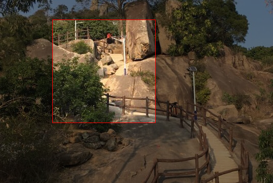
<!DOCTYPE html>
<html lang="en">

<head>
    <meta charset="UTF-8">
    <title>透明遮罩</title>
    <style type="text/css">

    body{background:url(images/img.jpg) top center no-repeat; }

    .editor-shell {
        width: 200px;
        height: 200px;
        border: 1px solid red;
        position: absolute;
        pointer-events: none;
        z-index: 1;
        box-shadow: 0 0 0 9999px rgba(0, 0, 0, .5);
    }
    </style>
</head>

<body>
    <div class="wrap">
        <div class="editor-shell" id="demo"></div>
    </div>
    <script src="http://apps.bdimg.com/libs/jquery/1.9.1/jquery.min.js" type="text/javascript"></script>
    <script>
    $(document).on("mousemove", function(event) {
        $("#demo").css({
            "top": event.pageY,
            "left": event.pageX
        });
    });
    </script>
</body>

</html>
效果图:
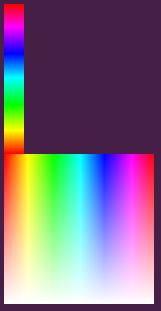
4.颜色拾取器
<!DOCTYPE html>
<html lang="en">

<head>
    <meta charset="UTF-8">
    <title>颜色拾取器</title>
    <style type="text/css">
    body {
        background-color: #451F46
    }

    .rainbow {
        width: 20px;
        height: 150px;
        background-image: linear-gradient( -180deg,
        #f00 0%,
        #f0f 15%,
        #00f 33%,
        #0ff 49%,
        #0f0 67%,
        #ff0 84%,
        #f00 100%)
    }

    .rainbow-block {
        width: 150px;
        height: 150px;
        background-image: linear-gradient(
        180deg,rgba(255,255,255,0) 0%,
        rgb(255,255,255) 100%),
        linear-gradient( -90deg,
        #f00 0%,
        #f0f 15%,
        #00f 33%,
        #0ff 49%,
        #0f0 67%,
        #ff0 84%,
        #f00 100%)
    }
    </style>
</head>

<body>
    <div class="rainbow"></div>
    <div class="rainbow-block"></div>
</body>

</html>
效果图:
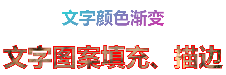
5.文字颜色渐变
<!DOCTYPE html>
<html lang="en">

<head>
    <meta charset="UTF-8">
    <title>背景网格</title>
    <style type="text/css">
    .demo {
        text-align: center;
        margin: 100px auto 0;
        background-clip: text;
        background-image: linear-gradient( 146.976deg,
        rgb(107, 25, 207) 0%,
        rgb(242, 255, 0) 21.1765%,
        rgb(31, 222, 216) 35.8824%,
        rgb(255, 0, 153) 71.4706%,
        rgb(0, 0, 0) 100%);
        font-size: 70px;
        font-weight: 700;
        /*文字填充渐变色*/
        -webkit-background-clip: text;
        color: transparent;
    }

    .words {
        margin: 50px auto;
        font-size: 100px;
        font-weight: bold;
        text-align: center;
        text-transform: uppercase;
        color: transparent;
        background: url(images/img.jpg) no-repeat;
        background-size: cover;
        background-position: center center;
        -webkit-background-clip: text;
        /*文字描边*/
        -webkit-text-fill-color:transparent;
        -webkit-text-stroke:3px red;
    }
    </style>
</head>

<body>
    <div class="demo">文字颜色渐变</div>
    <div class="words"> 文字图案填充、描边</div>
</body>

</html>
效果图:
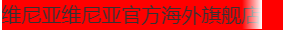
6.标题溢出渐变
<!DOCTYPE html>
<html lang="en">
<head>
    <meta charset="UTF-8">
    <title>Document</title>
    <style type="text/css">
        *{margin:0;padding:0;}
        a{ color: #333; text-decoration: none; }
        .demo{ width: 500px; height: 400px; margin:0 auto; background-color: red}
        .demo a{
            width: 260px;
            height: 30px;
            line-height: 30px;
            font-size: 20px;
            display: block;
            overflow:hidden;
            /*text-overflow: ellipsis;
            white-space: nowrap;*/
            position: relative;
        }
        .demo a:after{
            content: "";
            background: linear-gradient(to right,rgba(255, 255, 255, 0), #fff) no-repeat;
            position: absolute;
            right: 0;
            width: 20px;
            height: 30px;
        }

    </style>
</head>
<body>
    <div class="demo">
        <a href="波浪.html">维尼亚维尼亚官方海外旗舰店</a>
    </div>
</body>
</html>
效果图:
css3字渐变:
<!DOCTYPE html>
<html lang="en">

<head>
    <meta charset="UTF-8">
    <title>Document</title>
    <style type="text/css">
    * {
        margin: 0;
        padding: 0;
    }

    .text-gradient {
        display: inline-block;
        color: green;
        font-size: 10em;
        font-family: '微软雅黑';
        background-image: -webkit-gradient(linear, 0 0, 0 bottom, from(rgba(0, 128, 0, 1)), to(rgba(51, 51, 51, 1)));
        -webkit-background-clip: text;
        -webkit-text-fill-color: transparent;
    }

    ;
    </style>
</head>

<body>
    <h2 class="text-gradient">渐变色</h2>
</body>

</html>
效果图:

css3文字渐变色2:
<!DOCTYPE html>
<html>

<head>
    <meta charset="utf-8">
    <style>
    .gradient-text {
        background-image: -webkit-linear-gradient(bottom, red, #fd8403, yellow);
        -webkit-background-clip: text;
        -webkit-text-fill-color: transparent;
    }
    </style>
</head>
<body>
    <h3 class="gradient-text">文字渐变</h3>
</body>
</html>
效果图:

body{background: #880010}
.index_form_title{ font-weight: 700; font-size: 80px; text-align: center;
background-image: -webkit-linear-gradient(bottom, rgb(245, 189, 130), rgb(255, 255, 255));
-webkit-background-clip: text;
-webkit-text-fill-color: transparent;}

伪元素渐变:
<p class="index_form_title" data-text="渐变色"></p>
.index_form_wrap{ background: #880010 }
.index_form_title{ position: relative; font-weight: 700; font-size: 20px; height: 50px; }
 .index_form_title::after {
            content: attr(data-text);
            color: #fff;
            position: absolute;
            left: 0;
            z-index: 2;
            -webkit-mask-image: -webkit-gradient(linear, 0 0, 0 bottom, from(rgb(245, 189, 130)), to(rgba(255, 255, 255, 0)));
        }

css3径向渐变
.radial-gradient {
    width: 400px; height: 200px;
    background: radial-gradient(yellow, red);
}
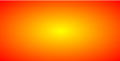
原链接:
https://www.zhangxinxu.com/wordpress/2017/11/css3-radial-gradient-syntax-example/