上午的时候我在jQuery论坛上看到网友分享的一款CSS3 3D图片侧翻倾斜特效,觉得效果非常棒,其实话说回来,这玩意儿的实现真的非常简单,主要是创意不错。先来看看效果图。
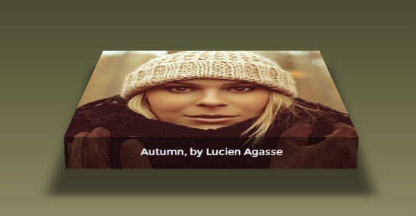
如何,看上去挺不错吧,倾斜、阴影,让一张很普通的图片变得如此霸气。
另外你也可以在这里查看DEMO演示,鼠标滑过图片时会出现这样的效果。
那么接下来我们分析一下源码吧,显示html代码,非常简单:
<div onclick="">
  <figure>
    <figcaption>Autumn, by Lucien Agasse</figcaption>
  </figure>
</div>
这里用了HTML5的 figure标签,表示插图,没什么特别。
然后是CSS代码:
figure {
  margin: 0;
  width: 100%;
  height: 29.5vw;
  background: url("winter-hat.jpg");
    background-size: 100%;
    transform-origin: center bottom;
    transform-style: preserve-3d;
    transition: 1s transform;
 }
figure figcaption {
  width: 100%;
  background: linear-gradient(rgba(0, 0, 0, 0.4), rgba(0, 0, 0, 0.4)),
        url("winter-hat.jpg");
    background-size: 100%; height: 50px;
    background-repeat: no-repeat;
  background-position: bottom;
  color: #fff;
    position: relative; top: 29.5vw;
    transform-origin: center top;
    transform: rotateX(-89.9deg);
    font-size: 1.2vw;
  font-family: Montserrat, Arial, sans-serif;
  text-align: center;
    line-height: 3;
}
figure:before {
  content: '';
  position: absolute; top: 0; left: 0;
  width: 100%; height: 100%;
    box-shadow: 0 0 100px 50px rgba(0, 0, 0, 0.1), inset 0 0 250px 250px rgba(0, 0, 0, 0.1);
    transition: 1s;
    transform: rotateX(95deg) translateZ(-80px) scale(0.75);
    transform-origin: inherit;
}
这里我们定义了figure的背景图片,也就是我们要实现3d效果的那张图片。同时还定义了图片的描述信息样式,这样在图片侧翻后更加凸显立体效果。
接下来就是鼠标滑过的动画效果了:
div:hover figure {
  transform: rotateX(75deg) translateZ(5vw);
}
div:hover figure:before {
    box-shadow: 0 0 25px 25px rgba(0, 0, 0, 0.5), inset 0 0 250px 250px rgba(0, 0, 0, 0.5);
    transform: rotateX(-5deg) translateZ(-80px) scale(1);
    }

@media screen and (max- 800px) {
  div { width: 50%; }
  figure { height: 45vw; }
  figure figcaption {
    top: 45vw;
    font-size: 2vw;
  }
}

@media screen and (max- 500px) {
  div {
    width: 80%;
    margin-top: 1rem;
  }
  figure {
    height: 70vw;
  }
  figure figcaption {
    top: 70vw;
    font-size: 3vw;
  }
}
很容易可以看出这里利用了css3的transform属性,其中rotateX来翻转,translateZ来实现Z轴的3D转换,思路都非常清晰。
最后,还是把源码分享一下,下载地址>>