WPF不仅支持传统的Windows Forms编程的用户界面和用户体验设计,更支持使用专门的Blend进行专业设计,同时还推出了以模板为核心的新一代设计理念。在WPF中,通过引入模板,将数据和算法的“内容”和“形式”进行解耦。模板主要分为两大类:数据模板【Data Template】和控件模板【Control Template】。本文主要以一些简单的小例子,简述控件模板【Control Template】的的相关内容,仅供学习分享使用,如有不足之处,还请指正。
编辑默认模板
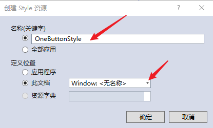
选中控件--右键--编辑模板--编辑副本,打开创建Style资源对话框,如下所示:

创建Style资源,输入资源名称,定义位置,默认为此文档【Window】,然后点击【确定】,创建资源。如下所示:
创建控件元素的默认资源,如下所示:
 1 <Window x:Class="WpfApp2.TwoWindow"
 2         xmlns="http://schemas.microsoft.com/winfx/2006/xaml/presentation"
 3         xmlns:x="http://schemas.microsoft.com/winfx/2006/xaml"
 4         xmlns:d="http://schemas.microsoft.com/expression/blend/2008"
 5         xmlns:mc="http://schemas.openxmlformats.org/markup-compatibility/2006"
 6         xmlns:local="clr-namespace:WpfApp2"
 7         mc:Ignorable="d"
 8         Title="TwoWindow" Height="350" Width="800">
 9     <Window.Resources>
10         <Style x:Key="FocusVisual">
11             <Setter Property="Control.Template">
12                 <Setter.Value>
13                     <ControlTemplate>
14                         <Rectangle Margin="2" SnapsToDevicePixels="true" Stroke="{DynamicResource {x:Static SystemColors.ControlTextBrushKey}}" StrokeThickness="1" StrokeDashArray="1 2"/>
15                     </ControlTemplate>
16                 </Setter.Value>
17             </Setter>
18         </Style>
19         <SolidColorBrush x:Key="Button.Static.Background" Color="#FFDDDDDD"/>
20         <SolidColorBrush x:Key="Button.Static.Border" Color="#FF707070"/>
21         <SolidColorBrush x:Key="Button.MouseOver.Background" Color="#FFBEE6FD"/>
22         <SolidColorBrush x:Key="Button.MouseOver.Border" Color="#FF3C7FB1"/>
23         <SolidColorBrush x:Key="Button.Pressed.Background" Color="#FFC4E5F6"/>
24         <SolidColorBrush x:Key="Button.Pressed.Border" Color="#FF2C628B"/>
25         <SolidColorBrush x:Key="Button.Disabled.Background" Color="#FFF4F4F4"/>
26         <SolidColorBrush x:Key="Button.Disabled.Border" Color="#FFADB2B5"/>
27         <SolidColorBrush x:Key="Button.Disabled.Foreground" Color="#FF838383"/>
28         <Style x:Key="OneButtonStyle" TargetType="{x:Type Button}">
29             <Setter Property="FocusVisualStyle" Value="{StaticResource FocusVisual}"/>
30             <Setter Property="Background" Value="{StaticResource Button.Static.Background}"/>
31             <Setter Property="BorderBrush" Value="{StaticResource Button.Static.Border}"/>
32             <Setter Property="Foreground" Value="{DynamicResource {x:Static SystemColors.ControlTextBrushKey}}"/>
33             <Setter Property="BorderThickness" Value="1"/>
34             <Setter Property="HorizontalContentAlignment" Value="Center"/>
35             <Setter Property="VerticalContentAlignment" Value="Center"/>
36             <Setter Property="Padding" Value="1"/>
37             <Setter Property="Template">
38                 <Setter.Value>
39                     <ControlTemplate TargetType="{x:Type Button}">
40                         <Border x:Name="border" BorderBrush="{TemplateBinding BorderBrush}" BorderThickness="{TemplateBinding BorderThickness}" Background="{TemplateBinding Background}" SnapsToDevicePixels="true">
41                             <ContentPresenter x:Name="contentPresenter" Focusable="False" HorizontalAlignment="{TemplateBinding HorizontalContentAlignment}" Margin="{TemplateBinding Padding}" RecognizesAccessKey="True" SnapsToDevicePixels="{TemplateBinding SnapsToDevicePixels}" VerticalAlignment="{TemplateBinding VerticalContentAlignment}"/>
42                         </Border>
43                         <ControlTemplate.Triggers>
44                             <Trigger Property="IsDefaulted" Value="true">
45                                 <Setter Property="BorderBrush" TargetName="border" Value="{DynamicResource {x:Static SystemColors.HighlightBrushKey}}"/>
46                             </Trigger>
47                             <Trigger Property="IsMouseOver" Value="true">
48                                 <Setter Property="Background" TargetName="border" Value="{StaticResource Button.MouseOver.Background}"/>
49                                 <Setter Property="BorderBrush" TargetName="border" Value="{StaticResource Button.MouseOver.Border}"/>
50                             </Trigger>
51                             <Trigger Property="IsPressed" Value="true">
52                                 <Setter Property="Background" TargetName="border" Value="{StaticResource Button.Pressed.Background}"/>
53                                 <Setter Property="BorderBrush" TargetName="border" Value="{StaticResource Button.Pressed.Border}"/>
54                             </Trigger>
55                             <Trigger Property="IsEnabled" Value="false">
56                                 <Setter Property="Background" TargetName="border" Value="{StaticResource Button.Disabled.Background}"/>
57                                 <Setter Property="BorderBrush" TargetName="border" Value="{StaticResource Button.Disabled.Border}"/>
58                                 <Setter Property="TextElement.Foreground" TargetName="contentPresenter" Value="{StaticResource Button.Disabled.Foreground}"/>
59                             </Trigger>
60                         </ControlTemplate.Triggers>
61                     </ControlTemplate>
62                 </Setter.Value>
63             </Setter>
64         </Style>
65     </Window.Resources>
66     <Grid>
67         <Button x:Name="one" Content="Hello wpf" Margin="5" Width="100" Height="30" Style="{DynamicResource OneButtonStyle}"></Button>
68     </Grid>
69 </Window>
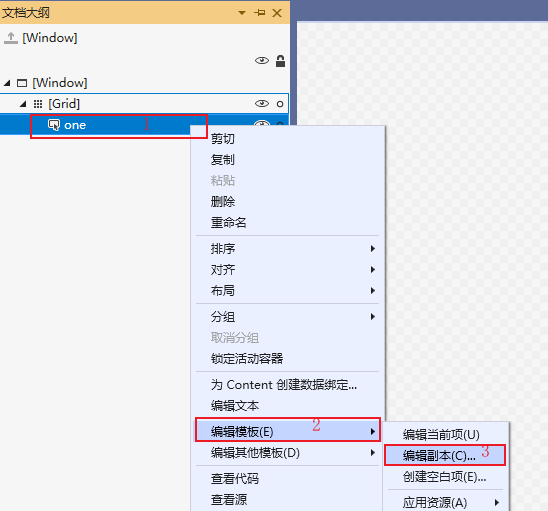
编辑默认模板,也可以通过【文档大纲】右键--编辑模板--编辑副本,然后打开创建资源对话框,进行操作,如下所示:
修改默认样式
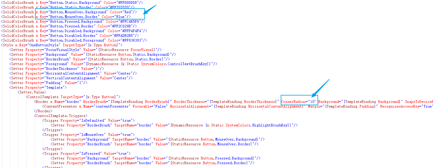
通过默认创建的控件模板Style,可以修改和重定义控件的显示内容,如:设置按钮显示圆角,和鼠标放上去为红色。
要实现以上功能,只需要修改两个地方即可,如下所示:
自定义控件模板
通过自定义模板,同样能达到修改控件样式的效果。
控件模板也是资源的一种,每一个控件模板都有一个唯一的key,在控件上通过Template进行绑定,如下所示:
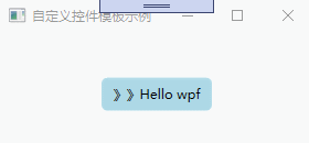
 1 <Window x:Class="WpfApp2.ThreeWindow"
 2         xmlns="http://schemas.microsoft.com/winfx/2006/xaml/presentation"
 3         xmlns:x="http://schemas.microsoft.com/winfx/2006/xaml"
 4         xmlns:d="http://schemas.microsoft.com/expression/blend/2008"
 5         xmlns:mc="http://schemas.openxmlformats.org/markup-compatibility/2006"
 6         xmlns:local="clr-namespace:WpfApp2"
 7         mc:Ignorable="d"
 8         Title="自定义控件模板示例" Height="150" Width="300">
 9     <Window.Resources>
10         <ControlTemplate x:Key="oneStyle" TargetType="Button">
11             <Border Background="LightBlue" CornerRadius="5" x:Name="border">
12                 <StackPanel Orientation="Horizontal" HorizontalAlignment="{TemplateBinding HorizontalAlignment}">
13                     <TextBlock VerticalAlignment="{TemplateBinding VerticalAlignment}">》》</TextBlock>
14                     <ContentPresenter HorizontalAlignment="{TemplateBinding HorizontalAlignment}" VerticalAlignment="{TemplateBinding VerticalAlignment}"></ContentPresenter>
15                 </StackPanel>
16             </Border>
17             <ControlTemplate.Triggers>
18                 <Trigger Property="IsMouseOver" Value="true">
19                     <Setter Property="Background" TargetName="border" Value="Red"/>
20                     <Setter Property="BorderBrush" TargetName="border" Value="Blue"/>
21                 </Trigger>
22             </ControlTemplate.Triggers>
23         </ControlTemplate>
24     </Window.Resources>
25     <Grid>
26         <Button x:Name="one" Content="Hello wpf" Margin="5" Width="100" Height="30" VerticalAlignment="Center"  HorizontalAlignment="Center" Template="{StaticResource oneStyle}"></Button>
27     </Grid>
28 </Window>
自定义控件模板,示例如下:
备注
控件模板决定了数据的展示形式和用户体检,在软件UI设计中非常重要,本文旨在抛砖引玉,共同学习,一起进步。
无题·昨夜星辰昨夜风
【作者】李商隐
昨夜星辰昨夜风,画楼西畔桂堂东。身无彩凤双飞翼,心有灵犀一点通。
隔座送钩春酒暖,分曹射覆蜡灯红。嗟余听鼓应官去,走马兰台类转蓬。