1、思路分析
第一步:首先需要一个大盒子,承载立方体的六个面;
第二步:立方体的六个面需要3D转化在特定的位置,拼接成一个立方体;
第三步:设置动画;
2、代码实现
第一步:创建div并且设置样式:
    <style>
      .box {
        width: 150px;
        height: 150px;
        background-color: pink;
        margin: 200px auto;
        position: relative;
      }
      .box > div {
        width: 100%;
        height: 100%;
        position: absolute;
        text-align: center;
        line-height: 150px;
        font-size: 20px;
      }
      </style>
    <div class="box">
        <div class="front">front</div>
        <div class="back">back</div>
        <div class="left">left</div>
        <div class="right">right</div>
        <div class="top">top</div>
        <div class="bottom">bottom</div>
    </div>
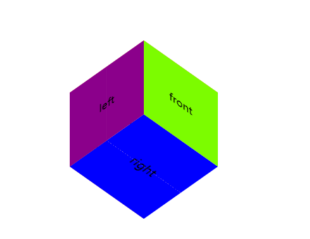
第二步:创建六个面,并且在父元素.box 设置立体效果
transform-style: preserve-3d;
transform: rotateX(45deg) rotateY(45deg);
      .box .front {
        background-color: lawngreen;
        transform: translateZ(75px);
      }
      .box .back {
        background-color: lightcoral;
        transform: translateZ(-75px);
      }
      .box .left {
        background-color: darkmagenta;
        transform: rotateY(-90deg) translateZ(75px);
      }
      .box .right {
        background-color: paleturquoise;
        transform: rotateY(90deg) translateZ(75px);
      }
      .box .top {
        background-color: salmon;
        transform: rotateX(90deg) translateZ(75px);
      }
      .box .bottom {
        background-color: blue;
        transform: rotateX(-90deg) translateZ(75px);
      }
显示效果:
第三步设置动画:
       在.box中设置:animate
      animation: move 5s ease infinite alternate;


      @keyframes move {
        from {
          transform: rotateX(45deg) rotateY(45deg);
        }
        to {
          transform: rotateX(270deg) rotateY(270deg);
        }
      }
3、完整代码
<!DOCTYPE html>
<html lang="en">
<head>
    <meta charset="UTF-8">
    <title>Title</title>
    <style>
      .box {
        width: 150px;
        height: 150px;
        background-color: pink;
        margin: 200px auto;
        position: relative;
        transform-style: preserve-3d;
        transform: rotateX(45deg) rotateY(45deg);
        animation: move 5s ease infinite alternate;
      }
      @keyframes move {
        from {
          transform: rotateX(45deg) rotateY(45deg);
        }
        to {
          transform: rotateX(270deg) rotateY(270deg);
        }
      }

      .box > div {
        width: 100%;
        height: 100%;
        position: absolute;
        text-align: center;
        line-height: 150px;
        font-size: 20px;
      }
      .box .front {
        background-color: lawngreen;
        transform: translateZ(75px);
      }
      .box .back {
        background-color: lightcoral;
        transform: translateZ(-75px);
      }
      .box .left {
        background-color: darkmagenta;
        transform: rotateY(-90deg) translateZ(75px);
      }
      .box .right {
        background-color: paleturquoise;
        transform: rotateY(90deg) translateZ(75px);
      }
      .box .top {
        background-color: salmon;
        transform: rotateX(90deg) translateZ(75px);
      }
      .box .bottom {
        background-color: blue;
        transform: rotateX(-90deg) translateZ(75px);
      }
    </style>
</head>
<body>
    <div class="box">
        <div class="front">front</div>
        <div class="back">back</div>
        <div class="left">left</div>
        <div class="right">right</div>
        <div class="top">top</div>
        <div class="bottom">bottom</div>
    </div>
</body>
</html>