一、VUE UI组件之 MUSE UI分析
首先我先从这一款组件源码进行剖析
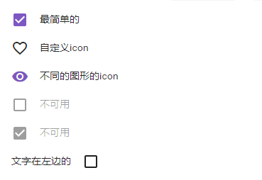
(1)checkbox 组件
如何实现呢:
checkbox.vue 源码如下
看过去代码好多行,由于checkbox要满足很多场景的实现,所以会臃肿,在下面我会讲下如何给他“减肥”,所以耐心的看完源码,或者直接略过这段源码,看下面
<template>
  <label @mousedown="handleMouseDown" @mouseup="handleMouseUp" @mouseleave="handleMouseLeave"
    @touchstart="handleTouchStart" @touchend="handleTouchEnd" @touchcancel="handleTouchEnd" @click.stop="handleClick"
    class="mu-checkbox" :class="{'label-left': labelLeft, 'disabled': disabled, 'no-label': !label}">
    <input type="checkbox" :disabled="disabled" :name="name" :value="nativeValue" @change="handleChange" v-model="inputValue">
    <touch-ripple v-if="!disabled" rippleWrapperClass="mu-checkbox-ripple-wrapper" class="mu-checkbox-wrapper">
      <div class="mu-checkbox-label" :class="labelClass" v-if="label && labelLeft">{{label}}</div>
      <div class="mu-checkbox-icon">
        <svg class="mu-checkbox-icon-uncheck mu-checkbox-svg-icon" :class="iconClass" v-if="!checkedIcon" viewBox="0 0 24 24">
          <path d="M19 5v14H5V5h14m0-2H5c-1.1 0-2 .9-2 2v14c0 1.1.9 2 2 2h14c1.1 0 2-.9 2-2V5c0-1.1-.9-2-2-2z"/>
        </svg>
        <svg class="mu-checkbox-icon-checked mu-checkbox-svg-icon" :class="iconClass" v-if="!uncheckIcon" viewBox="0 0 24 24">
          <path d="M19 3H5c-1.11 0-2 .9-2 2v14c0 1.1.89 2 2 2h14c1.11 0 2-.9 2-2V5c0-1.1-.89-2-2-2zm-9 14l-5-5 1.41-1.41L10 14.17l7.59-7.59L19 8l-9 9z"/>
        </svg>
        <icon :value="uncheckIcon" v-if="uncheckIcon" :class="iconClass" class="mu-checkbox-icon-uncheck"></icon>
        <icon :value="checkedIcon" v-if="checkedIcon" :class="iconClass" class="mu-checkbox-icon-checked"></icon>
      </div>
      <div class="mu-checkbox-label" :class="labelClass" v-if="label && !labelLeft">{{label}}</div>
    </touch-ripple>
    <div class="mu-checkbox-wrapper" v-if="disabled">
      <div class="mu-checkbox-label" :class="labelClass" v-if="label && labelLeft">{{label}}</div>
      <div class="mu-checkbox-icon">
        <svg class="mu-checkbox-icon-uncheck mu-checkbox-svg-icon" :class="iconClass" v-if="!checkedIcon" viewBox="0 0 24 24">
          <path d="M19 5v14H5V5h14m0-2H5c-1.1 0-2 .9-2 2v14c0 1.1.9 2 2 2h14c1.1 0 2-.9 2-2V5c0-1.1-.9-2-2-2z"/>
        </svg>
        <svg class="mu-checkbox-icon-checked mu-checkbox-svg-icon" :class="iconClass" v-if="!uncheckIcon" viewBox="0 0 24 24">
          <path d="M19 3H5c-1.11 0-2 .9-2 2v14c0 1.1.89 2 2 2h14c1.11 0 2-.9 2-2V5c0-1.1-.89-2-2-2zm-9 14l-5-5 1.41-1.41L10 14.17l7.59-7.59L19 8l-9 9z"/>
        </svg>
        <icon :value="uncheckIcon" v-if="uncheckIcon" :class="iconClass" class="mu-checkbox-icon-uncheck"></icon>
        <icon :value="checkedIcon" v-if="checkedIcon" :class="iconClass" class="mu-checkbox-icon-checked"></icon>
      </div>
      <div class="mu-checkbox-label" :class="labelClass" v-if="label && !labelLeft">{{label}}</div>
    </div>
  </label>
</template>

<script>
import icon from '../icon'
import touchRipple from '../internal/touchRipple'
export default {
  name: 'mu-checkbox',
  props: {
    name: {
      type: String
    },
    value: {},
    nativeValue: {
      type: String
    },
    label: {
      type: String,
      default: ''
    },
    labelLeft: {
      type: Boolean,
      default: false
    },
    labelClass: {
      type: [String, Object, Array]
    },
    disabled: {
      type: Boolean,
      default: false
    },
    uncheckIcon: {
      type: String,
      default: ''
    },
    checkedIcon: {
      type: String,
      default: ''
    },
    iconClass: {
      type: [String, Object, Array]
    }
  },
  data () {
    return {
      inputValue: this.value
    }
  },
  watch: {
    value (val) {
      this.inputValue = val
    },
    inputValue (val) {
      this.$emit('input', val)
    }
  },
  methods: {
    handleClick () {
      // 阻止事件冒泡,放置外部控制的时候触发两次 click
    },
    handleMouseDown (event) {
      if (this.disabled) return
      if (event.button === 0) {
        this.$children[0].start(event)
      }
    },
    handleMouseUp () {
      if (this.disabled) return
      this.$children[0].end()
    },
    handleMouseLeave () {
      if (this.disabled) return
      this.$children[0].end()
    },
    handleTouchStart (event) {
      if (this.disabled) return
      this.$children[0].start(event)
    },
    handleTouchEnd () {
      if (this.disabled) return
      this.$children[0].end()
    },
    handleChange () {
      this.$emit('change', this.inputValue)
    }
  },
  components: {
    icon,
    'touch-ripple': touchRipple
  }
}
</script>

<style lang="less">
@import "../styles/import.less";
.mu-checkbox {
  position: relative;
  display: inline-block;
  height: 24px;
  line-height: 24px;
  cursor: pointer;
  user-select: none;
  input[type="checkbox"] {
    display: none;
    &:checked {
      + .mu-checkbox-wrapper {
        .mu-checkbox-icon-uncheck{
          opacity: 0;
          transition: opacity 650ms @easeOutFunction 150ms;
          color: @primaryColor;
        }
        .mu-checkbox-icon-checked{
          opacity: 1;
          transform: scale(1);
          transition: opacity 0ms @easeOutFunction, transform 800ms @easeOutFunction;
        }
        .mu-checkbox-ripple-wrapper{
          color: @primaryColor;
        }
      }
    }
  }
  * {
    pointer-events: none;
  }
  &.disabled  {
    cursor: not-allowed;
  }
}
.mu-checkbox-wrapper{
  display: flex;
  width: 100%;
  height: 24px;
  align-items: center;
  justify-content: space-between;
}
.mu-checkbox-icon{
  width: 24px;
  height: 24px;
  vertical-align: middle;
  position: relative;
  margin-right: 16px;
  .mu-checkbox.label-left &{
    margin-right: 0;
    margin-left: 16px;
  }
  .mu-checkbox.no-label &{
    margin-left: 0;
    margin-right: 0;
  }
}
.mu-checkbox-label {
  color: @textColor;
  .mu-checkbox.disabled & {
    color: @disabledColor;
  }
}
.mu-checkbox-svg-icon{
  display: inline-block;
  fill: currentColor;
  height: 24px;
  width: 24px;
  user-select: none;
}
.mu-checkbox-icon-uncheck {
  position: absolute;
  left: 0;
  top: 0;
  opacity: 1;
  transition: opacity 1s @easeOutFunction .2s;
  color: @textColor;
  .mu-checkbox.disabled & {
    color: @disabledColor;
  }
}
.mu-checkbox-icon-checked {
  position: absolute;
  left: 0;
  top: 0;
  opacity: 0;
  color: @primaryColor;
  transform: scale(0);
  transition: opacity 450ms @easeOutFunction, transform 0ms @easeOutFunction 450ms;
  .mu-checkbox.disabled & {
    color: @disabledColor;
  }
}
.mu-checkbox-ripple-wrapper {
  width: 48px;
  height: 48px;
  top: -12px;
  left: -12px;
  .mu-checkbox.label-left & {
      right: -12px;
      left: auto;
  }
}
</style>
checkbox的实现的原理就是 写一个选择框来代替原生的选择款
首先的思路
<style>
    .app span{
        color:green;
        cursor: pointer;
    }
    .app input[type=checkbox]:checked+ span{
        color:red
    }
</style>

<div>
    <label  class="app"><input type="checkbox" style="display:none"><span>111111</span></label>
</div>

有没有灵感了呢
就是直接写个 span 定义有没有checked
<style>
    .app .icon{
        display: inline-block;
        width:20px;
        height:20px;
        border:2px solid #333
    }
    .app input[type=checkbox]:checked+ .icon{
        border:2px solid red;
        background-color:red;
    }
</style>

<div>
    <label  class="app"><input type="checkbox" style="display:none"><span class="icon"></span><span>11111</span></label>
</div>

是不是有点像了
然后我们把他们改成vue ui
组件check.vue
<template>
    <label class="app">
        <input type="checkbox"  style="display:none" :disabled="disabled"  :value="nativeValue" @change="handleChange" v-model="inputValue"/>
         <span class="icon"></span>
         <span>{{labelText}}</span>
    </label>
</template>
<script>
 export default{
     data(){
         return {
             inputValue:this.value
         }
     },
     props:{
         labelText:{
             type:String,
             required: true
         },
         value:{
             type:Boolean,
         },
         disabled:{
             type:Boolean,
         },
         nativeValue: {
             type: String
        },
     },
 watch: {
    value (val) {
      this.inputValue = val
    },
    inputValue (val) {
      this.$emit('input', val)
    }
  },
  methods: {
    handleClick () {
      // 阻止事件冒泡,放置外部控制的时候触发两次 click
    },
     handleChange () {
      this.$emit('elChangeInput',this.inputValue)
    }
  },
 }

</script>
<style>
    .app .icon{
        display: inline-block;
        20px;
        height:20px;
        border:2px solid #333;
        cursor: pointer;
    }
    .app input[type=checkbox]:checked+ .icon{
        border:2px solid red;
        background-color:red;
    }
</style>
引用方法:
<template>
<div>
  <el-input :value='value' labelText="222222" nativeValue="1" @elChangeInput='elChangeInput'></el-input>
</div>
</template>
<script>
    import elInput from './../components/checkbox'
  export default{
      data(){
          return {
             value:false
          }
      },
      components: {elInput},
      methods:{
          elChangeInput(val){
              this.value=val;
          }

      }

  }
</script>
这里我们就把这个组件写好了
这里要注意的点:
既然涉及input checkbox就要进行数据的存储 ;由于vue的props不是双向绑定的;我们可以使用eventbus进行数据传递;或者我们可以使用vuex来传递。
这里我是使用的eventbus ;当项目比较大时,传递的数据比较多可以使用vuex进行传递