我们在编写前端代码时,经常会遇到各种各样的形状图形(如:边框对话框,三角形,平行四边形、圆角边框、圆形、四叶草、花瓣等),除了用背景图片(css雪碧图或css精灵图+定位引用)和插入img图片的方法,我们还可以用css边框、圆角(border-radius)、渐变和定位的方法结合使用,绘制各种各样的形状图形。
实心圆
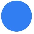
.circle {
     120px;
    height: 120px;
    background: #317ef3;
    border-radius: 100%;
}
圆环(空心圆)
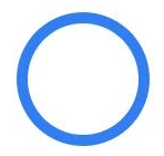
.ring {
     120px;
    height: 120px;
    border: 10px solid #317ef3;
    border-radius: 100%;
    box-sizing: border-box;
}
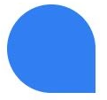
半圆
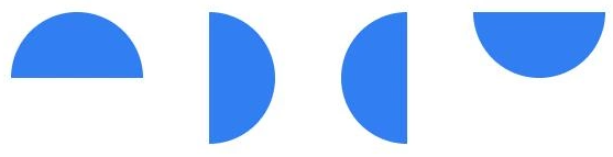
//上半圆
.top-semicircle {
     120px;
    height: 60px;
    background: #317ef3;
    border-radius: 60px 60px 0 0;
    /*顺时针方向,四个值依次分别表示左上、右上、右下、左下*/
}
//右半圆
.rt-semicircle {
     60px;
    height: 120px;
    background: #317ef3;
    border-radius: 0 60px 60px 0;
}

//左半圆
.lf-semicircle {
     60px;
    height: 120px;
    background: #317ef3;
    border-radius: 60px 0 0 60px;
}

//下半圆
.bot-semicircle {
     120px;
    height: 60px;
    background: #317ef3;
    border-radius: 0 0 60px 60px;
}
四分之一圆(扇形)

.toplf-sector,
.toprt-sector,
.botlf-sector,
.botrt-sector {
     60px;
    height: 60px;
    background: #317ef3;
}

.toprt-sector {
    border-radius: 60px 0 0 0;
}

.toplf-sector {
    border-radius: 0 60px 0 0;
}

.botlf-sector {
    border-radius: 0 0 60px 0;
}

.botrt-sector {
    border-radius: 0 0 0 60px;
}
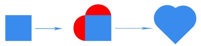
心形

.love {
     100px;
    height: 100px;
    background: #317ef3;
    position: relative;
    transform: rotate(45deg);
    -webkit-transform: rotate(45deg);
    -moz-transform: rotate(45deg);
    -o-transform: rotate(45deg);
}
.love::before,.love:after{
    content: "";
    background: #317ef3;
    position: absolute;
}
.love:after {
     50px;
    height: 100px;
    background: #317ef3;
    border-radius: 50px 0 0 50px;
    right: 99px;
    top: 0;
}

.love::before {
     100px;
    height: 50px;
    border-radius: 50px 50px 0 0;
    bottom: 99px;
    left: 0;
}
原理图,奉上
吃豆人

.eat {
     0;
    height: 0;
    border: 60px solid #317ef3;
    border-radius: 100%;
    border-right-color: transparent;
}
值得注意的是如果右边框的颜色设置为白色的话,右边会有一条蓝色线条

鸡蛋
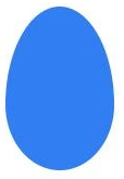
.egg {
     100px;
    height: 150px;
    background: #317ef3;
    border-radius: 50px 50px 50px 50px/90px 90px 60px 60px;
}
原理图奉上:

椭圆
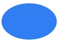
.ellipse1 {
     180px;
    height: 120px;
    background: #317ef3;
    border-radius: 100%;
    /* border-radius: 90px/60px; */
}
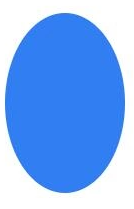
.ellipse2 {
     120px;
    height: 180px;
    background: #317ef3;
    border-radius: 100%;
    /* border-radius: 60px/90px; */
}
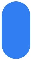
胶囊
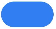
.capsule1 {
     200px;
    height: 100px;
    background: #317ef3;
    border-radius: 50px;
}
.capsule2 {
     100px;
    height: 200px;
    background: #317ef3;
    border-radius: 50px;
}
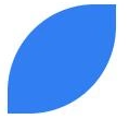
叶子(花瓣)
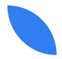
.leaf1 {
     100px;
    height: 100px;
    background: #317ef3;
    border-radius: 0 100px;
}
.leaf2 {
     100px;
    height: 100px;
    background: #317ef3;
    border-radius: 80px 0px;
}
.leaf3 {
     100px;
    height: 100px;
    background: #317ef3;
    border-radius: 50px 50px 0 50px;
}
五叶花瓣

<div class="five-petal mar30">
     <span class="petal1"></span>
     <span class="petal2"></span>
     <span class="petal3"></span>
     <span class="petal4"></span>
     <span class="petal5"></span>
</div>
.five-petal {
     160px;
    height: 160px;
}

.five-petal span {
    display: block;
     80px;
    height: 80px;
    background: #317ef3;
    border-radius: 0 100px;
    transform-origin: 100% 100%;
    position: absolute;
}

.five-petal .petal2 {
    transform: rotate(72deg);
}

.five-petal .petal3 {
    transform: rotate(144deg);
}

.five-petal .petal4 {
    transform: rotate(216deg);
}

.five-petal .petal5 {
    transform: rotate(288deg);
}
四叶草

     <!-- 四叶草 -->
        <div class="four-leaf mar30">
            <span class="leaf1"></span>
            <span class="leaf2"></span>
            <span class="leaf3"></span>
            <span class="leaf4"></span>
        </div>
.four-leaf {
     210px;
    height: 210px;
    position: relative;
}

.four-leaf span {
    display: block;
     100px;
    height: 100px;
    background: #317ef3;
    position: absolute;
}

.four-leaf span.leaf1 {
    left: 0;
    top: 0;
    border-radius: 50px 50px 0 50px;
}

.four-leaf span.leaf2 {
    right: 0;
    top: 0;
    border-radius: 50px 50px 50px 0;
}

.four-leaf span.leaf3 {
    left: 0;
    bottom: 0;
    border-radius: 50px 0 50px 50px;
}

.four-leaf span.leaf4 {
    right: 0;
    bottom: 0;
    border-radius: 0 50px 50px 50px;
}
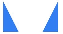
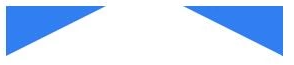
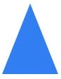
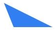
三角形
实现原理:
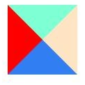
.triangle-shiyi {
     0;
    height: 0;
    border: 50px solid #317ef3;
    border-left-color: red;
    border-top-color: aquamarine;
    border-right-color: bisque;
}
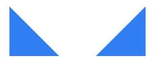
.dbzj-sanjiao1 {
     0;
    height: 0;
    border-bottom: 100px solid #317ef3;
    border-right: 100px solid transparent;
}

.dbzj-sanjiao2 {
     0;
    height: 0;
    border-bottom: 100px solid #317ef3;
    border-left: 100px solid transparent;
}
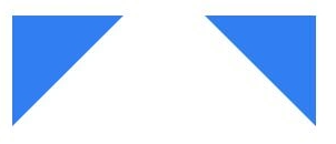
.dbzj-sanjiao3 {
     0;
    height: 0;
    border-top: 100px solid #317ef3;
    border-right: 100px solid transparent;
}

.dbzj-sanjiao4 {
     0;
    height: 0;
    border-top: 100px solid #317ef3;
    border-left: 100px solid transparent;
}
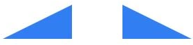
.dbzj-sanjiao5 {
     0;
    height: 0;
    border-bottom: 50px solid #317ef3;
    border-left: 100px solid transparent;
    /* border-left、border-right决定宽度 */
    /* border-top、border-bottom决定高度 */
}

.dbzj-sanjiao6 {
     0;
    height: 0;
    border-bottom: 50px solid #317ef3;
    border-right: 100px solid transparent;
}
.dbzj-sanjiao7 {
     0;
    height: 0;
    border-bottom: 100px solid #317ef3;
    border-right: 50px solid transparent;
}

.dbzj-sanjiao8 {
     0;
    height: 0;
    border-bottom: 100px solid #317ef3;
    border-left: 50px solid transparent;
}
.dbzj-sanjiao9 {
     0;
    height: 0;
    border-top: 50px solid #317ef3;
    border-right: 100px solid transparent;
}

.dbzj-sanjiao10 {
     0;
    height: 0;
    border-top: 50px solid #317ef3;
    border-left: 100px solid transparent;
}
.dbzj-sanjiao11 {
     0;
    height: 0;
    border-left: 40px solid transparent;
    border-right: 40px solid transparent;
    border-bottom: 100px solid #317ef3;
    /*三角形的宽度w=left+right,h=bottom*/
}
.dbzj-sanjiao12 {
     0;
    height: 0;
    border-bottom: 50px solid #317ef3;
    border-right: 100px solid transparent;
    position: relative;
}

.dbzj-sanjiao12::before {
    content: "";
    position: absolute;
    left: 0;
    top: 0;
    border-bottom: 50px solid #fff;
    border-right: 20px solid transparent;
}
平行四边形
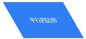
.pxsbx1 {
     200px;
    height: 120px;
    background: #317ef3;
    color: #fff;
    text-align: center;
    line-height: 120px;
    font-size: 18px;
    transform: skewX(30deg);
}
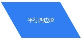
.pxsbx2 {
     200px;
    height: 120px;
    text-align: center;
    line-height: 120px;
    position: relative;
    font-size: 18px;
    color: #fff;
}

.pxsbx2::after {
    content: "";
    position: absolute;
    left: 0;
    top: 0;
    z-index: -1;
     200px;
    height: 120px;
    background: #317ef3;
    transform: skewX(30deg);
}
与上面的平行四边形相比,可以看到该图形中的文字不会发生倾斜,方法是在文字层后添加一个伪元素绘制平行四边。
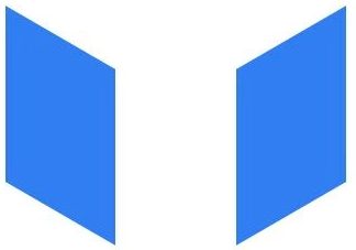
.pxsbx3 {
     100px;
    height: 160px;
    background: #317ef3;
    transform: skewY(30deg);
}

.pxsbx4 {
     100px;
    height: 160px;
    background: #317ef3;
    transform: skewY(-30deg);
}
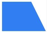
梯形
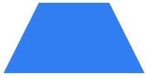
.tixing1 {
     100px;
    height: 0;
    border-bottom: 100px solid #317ef3;
    border-left: 50px solid transparent;
    border-right: 50px solid transparent;
}
.tixing2 {
     100px;
    height: 100px;
    background: #317ef3;
    position: relative;
}

.tixing2::before {
    content: "";
     0;
    height: 0;
    border-bottom: 100px solid #317ef3;
    border-right: 50px solid transparent;
    position: absolute;
    left: 100%;
    top: 0;
}
边框对话框
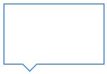
.duihuakuang1 {
     200px;
    height: 120px;
    border: 2px solid #317ef3;
    position: relative;
}

.duihuakuang1::before {
    content: "";
    position: absolute;
    left: 40px;
    top: 92%;
     20px;
    height: 20px;
    border-right: 2px solid #317ef3;
    border-bottom: 2px solid #317ef3;
    transform: rotate(45deg);
    background: #fff;
}
太极八卦阵图
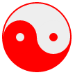
#yin-yang {
     96px;
    height: 48px;
    background: #eee;
    border-color: red;
    border-style: solid;
    border- 2px 2px 50px 2px;
    border-radius: 100%;
    position: relative;
}

#yin-yang:before {
    content: "";
    position: absolute;
    top: 50%;
    left: 0;
    background: #eee;
    border: 18px solid red;
    border-radius: 100%;
     12px;
    height: 12px;
}

#yin-yang:after {
    content: "";
    position: absolute;
    top: 50%;
    left: 50%;
    background: red;
    border: 18px solid #eee;
    border-radius:100%;
     12px;
    height: 12px;
}
月亮
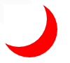
#moon {
   80px;
  height: 80px;
  border-radius: 50%;
  box-shadow: 15px 15px 0 0 red;
}
立体球形
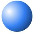
.litiqiuxing1 {
     100px;
    height: 100px;
    border-radius: 100%;
    background: #317ef3;
    background: radial-gradient(circle at 25% 35%, #fff, #317ef3, #071529);
}
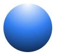
.litiqiuxing2 {
     100px;
    height: 100px;
    border-radius: 100%;
    background: #317ef3;
    background: radial-gradient(circle at top, #fff, #317ef3, #071529)
}
参考:
(用CSS绘制最常见的40种形状和图形)[https://www.cnblogs.com/zs-xanadu/p/9229242.html]