1. 实现div的水平居中和垂直居中
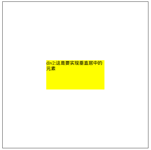
实现效果:
这大概是最经典的一个题目了,所以放在第一个. 方法有好多, 一一列来
主要思路其实就是
- 使用position,相对父元素做绝对定位(设置百分比[由父元素宽高调节子元素大小]/设置margin和相对位置(确定宽高))
- 使用flex属性
- 使用tranfrom做相对位移的调节
1) 只适用: 宽高已定
设置position: absolute(父元素记得设置: relative), 然后top和left设置50%, 50%, 再设置margin-left=宽/2, margin-top:宽/2
        .div1{
            width:500px;
            height:500px;
            border:1px solid black;
            position: relative;     /*很重要,不能忘*/
        }
        .div2{
            background: yellow;
            width:300px;
            height:200px;
            margin-left:-150px;
            margin-top:-100px;
            top:50%;
            left:50%;
            position: absolute;
2) 只适用: 固定宽高; 如果宽高随意,想靠内部撑开的话, 会占满整个父div
依然是利用position:子div的上下左右都设置成0,然后margin设置auto。关键是要设置position:子absolute,父relative。
        .div1{
            width:500px;
            height:500px;
            border:1px solid black;
            position: relative;     /*很重要,不能忘*/
        }
        .div2{
            background: yellow;
            width:300px;
            height:200px;
            margin:auto;
            bottom: 0;
            top:0;
            left:0;
            right:0;
            position: absolute;
3) 适用: 不论是否固定宽高都可用. 问题在于兼容性. ie9及以下不支持
设置父级flex属性: display:flex; justify-content:center; align-items: center;
这种方法在子级div有多个时也可以实现居中----具体看flex属性设置
        .div1{
            width:500px;
            height:500px;
            border:1px solid black;
            display: flex;
            justify-content: center;  /*使垂直居中*/
            align-items:center;    /*使水平居中*/

        }
        .div2{
            background: yellow;
            /*300px;
            height:200px;*/

        }
4) 适用: 要设宽度, 否则会使得宽度为父级div的宽度
父级元素设置display:table-cell ,然后vertical-align:middle。这种方法可以设置垂直居中. 这时候只要在子元素里设置margin:auto即可实现水平居中
但是这种方法好像会使父元素的居中无效。
        .div1{
            width:500px;
            height:500px;
            border:1px solid black;
            display:table-cell;
            vertical-align: middle;

        }
        .div2{
            background: yellow;
            width:300px;
            /*height:200px;*/
            margin:auto;

        }
5) 适用: 可不指定宽高
使用transform居中. 设置父级position:relative; 子级position:absolute. 然后top: 50%; left:50%; transform:translate(-50%,-50%)
        .div1{
            width:500px;
            height:500px;
            border:1px solid black;
            position: relative;
        }
        .div2{
            background: yellow;
            position: absolute;
            /*200px;*/
            top:50%;
            left:50%;
            transform:translate(-50%,-50%);
        }
6) 适用: 指定宽高百分比
保证left和right的百分数一样就可以实现水平居中,保证top和bottom的百分数一样就可以实现垂直居中。但是这种方法不能由内部元素自动调节div的宽高,而是通过父元素大小控制的
        .div1{
            width:500px;
            height:500px;
            border:1px solid black;
            position: relative;
        }
        .div2{
            background: yellow;
            position: absolute;
            left: 30%;
            right: 30%;
            top:40%;
            bottom: 40%;
        }
7) 使用display:inline-block加伪元素
        .div1{
            width:600px;
            height:200px;
            border:1px solid black;
            text-align: center;
        }
        .div1:after{
            content:"";
            display: inline-block;
            vertical-align: middle;
            height: 100%;
        }
        .div2{
            background: black;
            color:white;
            display: inline-block;
        }
box 容器通过 after或者before 生成一个高度 100% 的「备胎」,他的高度和容器的高度是一致的,相对于「备胎」垂直居中,在视觉上表现出来也就是相对于容器垂直居中了
2. 多元素水平居中
效果:

1) 把子级div设置成display:inline-block; 然后父级div设置text-align:center;
/**base style**/
div{
  background:#000;
  color:#fff;
  height:50px;
  width:50px;
  text-align:center;
  line-height:50px;
  margin-left:10px;
}

/**start here**/
main{
  text-align:center;
}
div{
  display:inline-block;
  *display:inline;/*hack IE*/
  *zoom:1;/*hack IE*/
}
2) 更方便灵活的做法还是使用flex-box, 设置水平居中 justify-content: center
main{
  display:flex;
  justify-content:center;
}
3. 实现栅格化布局

使用flex,
.parent{
  display: flex;
  flex-direction: column;  /*按列的顺序*/
  flex-wrap: wrap;  /*可换行*/
  height: 440px;
  width: 660px;
}
参考: CSS常见布局问题整理