关于display:flex布局,有人了解颇深,我也是看着别人的东西学习的。
display:flex的布局是什么、基本概念之类的我根本就不了解,只会用。每次看到概念之类的东西,我都是扫一眼就过去。
第一个属性和用法:flex-direction
我了解的方法有4个:row(水平排列)、row-revese(水平反向排列)、column(垂直排列)、column-reserve(垂直反向排列)
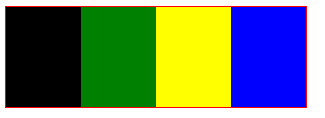
<!DOCTYPE html>
<html>
    <head>
        <meta charset="UTF-8">
        <title></title>
    </head>
    <body>
        <div style="300px;border:1px solid red;display: flex;flex-direction: row;">
            <div style=" 100px;height: 100px;background-color: black;"></div>
            <div style=" 100px;height: 100px;background-color: green;"></div>
            <div style=" 100px;height: 100px;background-color: yellow;"></div>
            <div style=" 100px;height: 100px;background-color: blue;"></div>
        </div>
    </body>
</html>
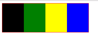
上面的代码和效果图是属性为row时的效果
注意:虽然是设置好的宽度,但是父容器只有300px,子div没法达到100px,而是适应父容器
只需要将 flex-direction: row代码替换成 flex-direction: row-revese 或者 flex-direction: column 或则 flex-direction: column-reserve,就可以得到不同的效果
下面是效果图:
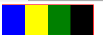
row-revese
-------
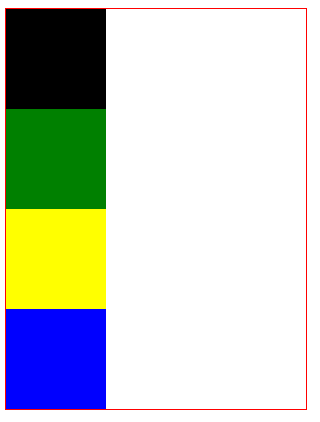
column
-------
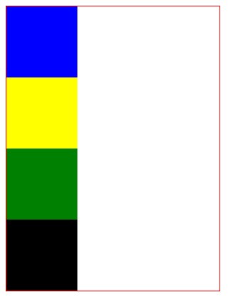
column-reverse
-------
第二个属性和用法:flex-wrap
这是换行属性:nowrap(不换行)、wrap(换行)、wrap-reverse(方向换行)
<!DOCTYPE html>
<html>
    <head>
        <meta charset="UTF-8">
        <title></title>
    </head>
    <body>
        <div style="300px;border:1px solid red;display: flex;flex-wrap: wrap;">
            <div style=" 100px;height: 100px;background-color: black;"></div>
            <div style=" 100px;height: 100px;background-color: green;"></div>
            <div style=" 100px;height: 100px;background-color: yellow;"></div>
            <div style=" 100px;height: 100px;background-color: blue;"></div>
        </div>
    </body>
</html>
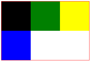
这是换行的代码和效果图
-------
将属性 flex-wrap: wrap 替换成 nowrap(不换行)、wrap-reverse(方向换行)得到的效果图如下:
nowrap
-----
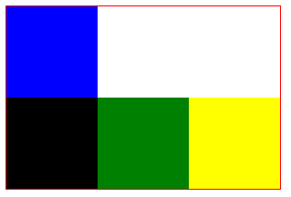
wrap-reverse
---------
第三个属性和用法:justify-content
包含的属性有: justify-content: start | end | flex-start | flex-end | center | left | right | space-between | space-around | space-evenly | stretch | safe | unsafe | baseline | first baseline | last baseline
(这些属性都是抄别人的)
-
flex-start(默认值):左对齐;
 左对齐
左对齐 -
flex-end:右对齐;
 右对齐
右对齐 -
center:居中;

- space-between:两端对齐,项目之间间隔相等;

- space-around:每个项目两侧的间隔相等,即项目之间的间隔比项目与边框的间隔大一倍。

其他属性:如align-item、align-content、justify-content 请查看原文:https://www.cnblogs.com/qingchunshiguang/p/8011103.html