
<!DOCTYPE html>
<html lang="en">
<head>
<meta charset="UTF-8">
<title>Document</title>
<style>
body{
margin:0;
}
.box{
display:flex;
flex-direction:row;
}
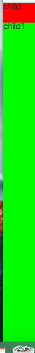
.box .child{
40px;
background:#f00;
}
.box .child1{
flex:1;
background:#0f0
}
</style>
</head>
<body>
<div class="box">
<div class="child">child</div>
<div class="child1">child1</div>
</div>
</body>
</html>
或者有两个div,一个高度为100px, 另外一个高度自动补全当前界面下剩余的高度:
<!DOCTYPE html>
<html lang="en">
<head>
    <meta charset="UTF-8">
    <title>Document</title>
    <style>
        html,body,.box{
            height:100%;
        }
        body{
            margin:0;

        }
        .box{
            display:flex;
            flex-direction:column;
        }
        .box .child{
            height:40px;
            background:#f00;
        }
        .box .child1{
            flex:1;
            background:#0f0
        }
    </style>
</head>
<body>
    <div class="box">
        <div class="child">child</div>
        <div class="child1">child1</div>
    </div>
</body>
</html>
所以说flex布局是很灵活, flex布局没出现之前,这种布局不好实现, 只能通过-webkit-calc的方式, 或者使用javascript的方式动态修改元素的样式,还有水平方向元素自动适应布局等, 用了flex,css的布局方式更加多样化了;
flex布局也可以实现未知宽高的元素自动居中, 以前用的比较多的居中布局方式主要为固定宽高的负margin居中:
运行下面代码
<!DOCTYPE html>
<html lang="en">
<head>
    <meta charset="UTF-8">
    <title>Document</title>
    <style>
        html,body,.parent{
            height:100%;
        }
        .parent{
            justify-content:center;/*水平居中*/
            align-items: center; /*垂直居中*/
            display:-webkit-flex;
/*
            flex-direction:排版方向
            flex-wrap:如果宽度超出父级宽度, 是否折行
            flex-flow:flex-direction和flex-wrap的缩写
*/        }
        .child{
        }
    </style>
</head>
<body>
    <div class="parent">
        <div class="child">
            hehe
        </div>
    </div>
</body>
</html>
子元素css的样式flex:auto或者flex:1的时候, 该子元素会自动适应当前宽高:
如果一个父元素为flex布局, 内部元素的宽度会根据各自的flex属性值进行等比切分:
运行下面代码
<!DOCTYPE html>
<html lang="en">
<head>
    <meta charset="UTF-8">
    <title>Document</title>
    <style>
        *{
            margin:0;
            padding:0;
        }
    </style>
</head>
<body>
    <style>
        .box{
            display:flex;
            flex-direction:row
        }
        .box .child{
            flex:1;
        }
        .box .chi{
            flex:3;
        }
    </style>
    <div class="box">
        <div class="child">
            child
        </div>
        <div class="chi">
            chi, child占用1/4的百分比, chi占用3/4的百分比
        </div>
    </div>
    <br>
    <br>
    <style>
        .box1{
            display:flex;
            flex-direction:row;
        }
        .box1 .child{
            40px;
        }
        .box1 .chi{
            flex:1;
        }
    </style>
    <div class="box1">
        <div class="child">
            child
        </div>
        <div class="chi">
            chi, child固定长度, chi自动适应
        </div>
    </div>
    <br>
    <br>
    <style>
        .box2 {
            display:flex;
            flex-direction:row;
        }
        .box2 .child1{
            40px;
        }
        .box2 .child2{
            flex:auto;
        }
        .box2 .child3{
            40px;
        }
    </style>
    <div class="box2">
        <div class="child1">child1</div>
        <div class="child2">child2, 两边固定宽度, 中间自动适应</div>
        <div class="child3">child3</div>
    </div>
</body>
</html>
高度自动适应的demo:
<!DOCTYPE html>
<html lang="en">
<head>
    <meta charset="UTF-8">
    <title>Document</title>
    <style>
        *{
            margin:0;
            padding:0;
        }
        html,body,.box{
            height:100%;
        }
        .box{
            display:flex;
            flex-direction:column;
        }
        .box .header{
            height:40px;
            background:#f00;
        }
        .box .bodyer{
            flex:1;
            background:#0f0;
        }
        .box .footer{
            height:40px;
            background:#00f;
        }
    </style>
</head>
<body>
    <div class="box">
        <div class="header">header</div>
        <div class="bodyer">bodyer</div>
        <div class="footer">footer</div>
    </div>
</body>
</html>
通过flex布局可以模拟一个微信的聊天窗口:

<!DOCTYPE html>
<html lang="en">
<head>
    <meta charset="UTF-8">
    <title>Document</title>
    <meta name="viewport" content="width=device-width, initial-scale=1, maximum-scale=1, user-scalable=no">
    <style>
        *{
            margin:0;
            padding:0;
        }
        html,body,.box{
            height:100%;
        }
        .box{
            display:-webkit-flex;
            display:flex;
            flex-direction:column;
            font-family:"microsoft yahei";
            font-size:18px;
        }
        .box .header{
            height:40px;
            line-height:40px;
            text-align:center;
            background:#3498DB;
            color:#fff;
        }
        .box .body{
            display: block;
            border-bottom:1px solid #eee;
            overflow:auto;
            flex:1;
        }
        .box .send-left {
            align-self:flex-end;
            margin-top:10px;
            position:relative;
            height:35px;
            background:#F8C301;
            border-radius:5px; /* 圆角 */
            line-height:35px;
            margin-left:10px;
            padding:0 10px;
            float:left;
        }
        .box .send-left .arrow {
            position:absolute;
            top:5px;
            left:-15px;
            0;
            height:0;
            font-size:0;
            border:solid 8px;
            border-color:#fff #F8C301 #fff #fff;
        }
        .box .send {
            align-self:flex-end;
            margin-top:10px;
            position:relative;
            height:35px;
            background:#2ECC71;
            border-radius:5px; /* 圆角 */
            line-height:35px;
            margin-right:10px;
            padding:0 10px;
            float:right;
        }
        .box .send .arrow {
            position:absolute;
            top:5px;
            right:-15px;
            0;
            height:0;
            font-size:0;
            border:solid 8px;
            border-color:#fff #fff #fff #2ECC71;
        }
        .box  .clear{
            clear:both;
        }
        .box .footer{
            height:40px;
            line-height:40px;
            display:-webkit-flex;
            display:flex;
        }
        .box .footer input{
            flex:auto;
            border:none;
            border-right:1px solid #eee;
            font-size:18px;
            padding-left:4px;
        }
        .box .footer button{
            50px;
            font-size:18px;
        }
    </style>
</head>
<body>
    <!--
    容器属性
        flex-direction
        flex-wrap
        flex-flow
        justify-content
        align-items
        align-content
    项目属性:
        order
        flex-grow
        flex-shrink
        flex-basis
        flex
        align-self
    -->
    <div class="box">
        <div class="header">
            消息
        </div>
        <div class="body">
            <div class="send-left">
                hehe我哟我去
                <div class="arrow"></div>
            </div>
            <div class="clear"></div>
            <div class="send">
                hehe
                <div class="arrow"></div>
            </div>
            <div class="clear"></div>
            <div class="send">
                hehe我哟我去
                <div class="arrow"></div>
            </div>
            <div class="clear"></div>
            <div class="send">
                来啊, 哈哈
                <div class="arrow"></div>
            </div>
            <div class="clear"></div>
            <div class="send">
                来啊, 哈哈
                <div class="arrow"></div>
            </div>
            <div class="clear"></div>
            <div class="send">
                来啊, 哈哈
                <div class="arrow"></div>
            </div>
            <div class="clear"></div>
            <div class="send">
                来啊, 哈哈
                <div class="arrow"></div>
            </div>
            <div class="clear"></div>
            <div class="send">
                来啊, 哈哈
                <div class="arrow"></div>
            </div>
            <div class="clear"></div>
            <div class="send">
                来啊, 哈哈
                <div class="arrow"></div>
            </div>
            <div class="clear"></div>
            <div class="send">
                来啊, 哈哈
                <div class="arrow"></div>
            </div>
            <div class="clear"></div>
            <div class="send">
                来啊, 哈哈
                <div class="arrow"></div>
            </div>
            <div class="clear"></div>
            <div class="send">
                来啊, 哈哈
                <div class="arrow"></div>
            </div>
            <div class="clear"></div>
            <div class="send">
                来啊, 哈哈
                <div class="arrow"></div>
            </div>
        </div>
        <div class="footer">
            <input type="text">
            <button>发送</button>
        </div>
    </div>
</body>
<script>

</script>
</html>
flex布局的其它css属性:
Flex 容器属性:
Flex 条目属性:
兼容:
android 4.4以上版本支持display:flex。低版本不支持。
安卓4.1,以及4.1以下不支持flex布局, 必须考虑别的方案;
android的低版本无法使用display:flex, 但是可以使用display:box替代;
要记得加浏览器前缀, 兼容写法如下:
运行下面代码
  display: -webkit-box;
  display: -moz-box;
  display: -webkit-flex;
  display: -ms-flexbox;
  display: flex;
参考:
caniuse:http://caniuse.com/#feat=flexbox
MDN:https://developer.mozilla.org/zh-CN/docs/Web/CSS/CSS_Flexible_Box_Layout/Using_CSS_flexible_boxes
ruanyifeng:http://www.ruanyifeng.com/blog/2015/07/flex-examples.html
flex布局笔记:
1.兼容到IE10及以上;2.弹性布局的项目(item)默认没有间隔
3.容器有用的属性:
1. justify-content:(默认flex-start)
flex-start | flex-end | center | space-between | space-around; 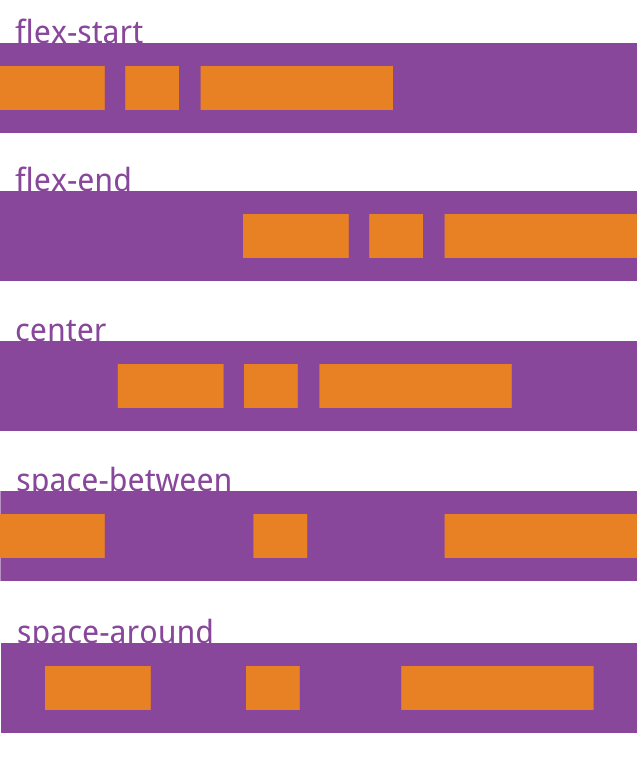
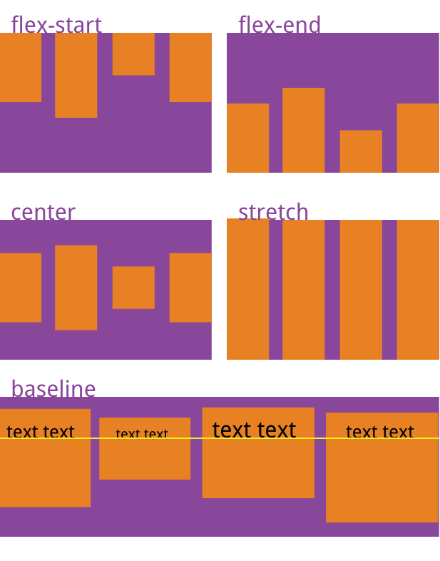
2.align-items:(默认值stretch,如果项目未设置高度或设为auto,将占满整个容器的高度)
3.项目有用的属性
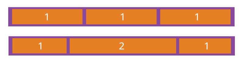
1)flex-grow (默认为0,不放大,弹性布局默认不改变项目的宽度,等于1时,就表示不改变项目的宽度,等于1时,就表示改项目宽度拉伸,占据当前行的所有剩余宽度)
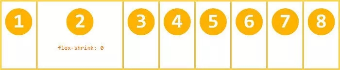
2)flex-shrink(定义了项目的缩小比例,默认为1,即如果控件不足,该项目将缩小)
3)flex-base(为项目设定固定宽高,默认是auto,即项目本来的大小)
4)align-self(给某个项目开小灶)
