<!DOCTYPE html>
<html>
    <head>
        <meta charset="utf-8"/>
        <script src="vue.js"></script>
    </head>
    <body>
        <div>
        <h1>--CSS过渡--</h1>
        <div id="example1">
            <button @click="show = !show">Toggle render</button>
            <transition name="slide-fade">
                <p v-if="show">hello</p>
            </transition>
        </div>
        <script>
        // Vue 根实例
        var example1 = new Vue({
            el: '#example1',
            data: {
                show: true
            }
        })
        </script>
        <style>
            .slide-fade-enter-active {
                transition: all .3s ease;
            }
            .slide-fade-leave-active {
                transition: all .8s cubic-bezier(1.0, 0.5, 0.8, 1.0);
            }
            .slide-fade-enter, .slide-fade-leave-to {
                transform: translateX(10px);
                opacity: 0;
            }
        </style>
        </div>
        <div>
        <h1>--CSS动画--</h1>
        <div id="example2">
            <button @click="show = !show">Toggle show</button>
            <transition name="bounce">
                <p v-if="show">Lorem ipsum dolor sit amet, consectetur adipiscing elit. Mauris facilisis enim libero, at lacinia diam fermentum id. Pellentesque habitant morbi tristique senectus et netus.</p>
            </transition>
        </div>
        <script>
        // Vue 根实例
        var example2 = new Vue({
            el: '#example2',
            data: {
                show: true
            }
        })
        </script>
        <style>
            .bounce-enter-active {
                animation: bounce-in .5s;
            }
            .bounce-leave-active {
                animation: bounce-in .5s reverse;
            }
            @keyframes bounce-in {
                0% {
                    transform: scale(0);
                }
                50% {
                    transform:scale(1.5);
                }
                100% {
                    transform:scale(1);
                }
            }
        </style>
        </div>
    </body>
</html>
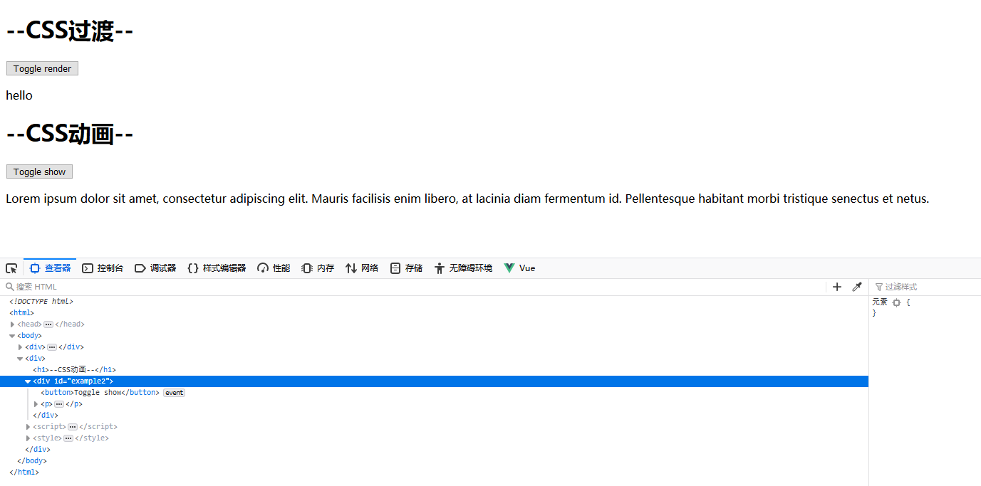
运行效果图: