IMOOC 数学在css中的应用
一、径向动画菜单
代码:
<!DOCTYPE html>
<html lang="en">
<head>
	<meta charset="UTF-8">
	<title>径向动画菜单</title>
	<style type="text/css">
		* {
			margin: 0;
			padding: 0;
		}
		body {
			background-color: #292a38;
			font-family: "Microsoft Yahei";
		}
		h1 {
			margin-top: 20px;
			text-align: center;
		  	color: #fff;
		}

		.nav-wrap {
		  	position: relative;
		  	 200px;
			height: 200px;
			margin: 50px auto;
			border: 2px dotted #4e5061;
			border-radius: 50%;
		}
		.nav-wrap .main-nav {
			position: absolute;
			left: 50%;
			top: 50%;
			transform: translate(-50%,-50%);
			 40px;
			height: 40px;
			line-height: 40px;
			font-size: 12px;
			text-align: center;
			text-decoration: none;
			color: #fff;
			border-radius: 3px;
			text-shadow: 1px 1px 0px #000;
			background: #15a5f3;
			cursor: pointer;
		}
		.nav-wrap nav {
			position: absolute;
			 100%;
			height: 100%;
			transform: scale(0) rotate(0);
			transition: all 0.5s ease-out;
			opacity: 0;
		}
		.nav-wrap.active nav {
			transform: scale(1) rotate(360deg);
			opacity: 1;
		}
		.nav-wrap nav > a{
			position: absolute;
			 30px;
			height: 30px;
			background: #f44283;
			text-align: center;
			line-height: 30px;
			text-decoration: none;
			color: #fff;
			border-radius: 3px;
			text-shadow: 1px 1px 0px #000;
			transform: translate(-50%,-50%) rotateY(0deg);/*rotateY不能省,省了就不行了*/
		}
		-webkit-@keyframes rotate{
			100% {transform:translate(-50%,-50%) rotateY(360deg);}
		}
		@keyframes rotate{
			100% {transform:translate(-50%,-50%) rotateY(360deg);}
		}
	</style>
</head>
<body>
	<h1>径向动画菜单效果分步演示</h1>
	<div class="nav-wrap">
		<nav>
			<a class="nav-item">1</a>
			<a class="nav-item">2</a>
			<a class="nav-item">3</a>
			<a class="nav-item">4</a>
			<a class="nav-item">5</a>
			<a class="nav-item">6</a>
			<a class="nav-item">7</a>
			<a class="nav-item">8</a>
		</nav>
		<a class="main-nav">点我</a>
	</div>

</body>
<script src="http://s0.qhimg.com/lib/jquery/183.js" ></script>
<script type="text/javascript">
	(function(){

		// 当菜单没被激活时
		var isLocated = false;

		$('.nav-wrap').on('click','.main-nav',function(e){
			e.preventDefault();

			var me = $(this),
				  navWrap = me.closest('.nav-wrap'), // 动画效果的父容器
				  navs = navWrap.find('nav a'); // 父容器中的所有子菜单

			if(!navWrap.hasClass('active') && !isLocated){

				// 圆的半径 raduis
				var width = navWrap.width(),
					  radius = width / 2;

				// 圆形菜单的起始、终止角度
				var startAngle = 0,
					  endAngle = 360;

				// 两个子菜单间的夹角 gap
				var total = navs.length,
					  gap = (endAngle - startAngle)/total;

				// 角度->弧度
				var radian = Math.PI / 180;


				/*
				 * 计算并确定各个子菜单的最终位置
				 */
				$.each(navs, function(index, item){

					// 当前子菜单与x轴正向的夹角 θ (角度->弧度)
					var myAngle = (startAngle + gap*index) * radian;  // θ

					// 计算当前子菜单相对于左上角(0,0)的坐标 (x,y)
					var myX = radius + radius * Math.cos( myAngle ), // x=r+rcos(θ)
						  myY = radius + radius * Math.sin( myAngle ); // y=r+rsin(θ)

					// 设置当前子菜单的位置 (left,top) = (x,y)
					$(this).css({
		                    left: myX + 'px',
		                    top:  myY + 'px',
							webkitAnimation: "rotate 10s linear 1s infinite",
							animation: "rotate 5s linear 1s infinite",
		           });

		    });

				isLocated = true;
			}

			navWrap.toggleClass('active');
		});

	})();
</script>
</html>
效果:
原理:
动画是卡片从圆心开始平均散开到圆的相应位置,如下图,假设卡片就是圆上某一点,其运动轨迹与x轴的夹角为θ,则该点的相对于容器的坐标为(r+rcosθ,r+rsinθ)。则其相对于容器的left和top分别为其x和y坐标的值这样,通过脚本设置卡片的left和top和容器position改为relative就可以实现平均分布了。然后通过给容器添加transition和transform:scale(0)给容器加上过渡动画和缩小到0在其父元素中心(即圆心),这样一开始就看不到卡片(不过已经在容器的边上了),点击按钮时容器加上scale(1),容器从圆心扩展到原来大小,由于卡片在容器边上,卡片随着容器的扩展,好像跟着慢慢运动到圆的边上。给容器加上rotate(0deg)到rotate(360deg)可以实现卡片边“运动”边“旋转”的效果。

在这里回顾一下涉及到的数学知识:
1.在直角三角形中,夹角θ所对的边,边长为斜边 * sinθ;相邻的边为斜边 * cosθ。上图θ是圆上某一点与圆心的连线(半径)与x轴的夹角。
2.弧度制与度数的换算: 1deg = π / 180弧度(randian)
3.将x个点平均放在一个长为y的线上,将线划分为x-1段,从端点(也算)开始每隔y / (x-1)长度放一个点,即可平均放置。
4.将x个点平均反正一个循环路线上(如圆),将线划分为x段,从端点(也算)开始每隔y / x长度放一个点,即可平均放置。
所以,如果只想实现半圆效果,就用到第三个数学知识,应该把度数划分为total-1份而不是现在的total份,即把(endAngle-startAngle)/total改为(endAngle-startAngle)/total-1
二、时钟
<!DOCTYPE html>
<html lang="en">
<head>
	<meta charset="utf-8">
	<title></title>
	<style type="text/css">
		body {
			/*background-color: #ccc;*/
		}
		ol,ul {
			margin: 0;
			padding: 0;
			list-style: none;
		}
		h1{
			text-align: center;
			color: #333;
			margin-top: 40px;
			font-family: 'Microsoft Yahei';
		}

		/*表盘*/
		.clock {
			position: relative;
			 200px;
			height: 200px;
			border-radius: 100%;
			background-color: #292a38;
			margin: 50px auto;
		}
		.pointer li.circle {
			position: absolute;
			top: 50%;
			left: 50%;
			transform-origin: left center;
			background: #fff;
			 10px;
			height: 10px;
			border-radius: 100%;
			margin-top: -5px;
			margin-left: -5px;
		}

		/*演示*/
		/*.line-demo {
			position: absolute;
			left: 50%;
			top: 50%;
			transform:rotate(-60deg) translate(75px, -50%);
			transform-origin: left center;
			 20px;
			height: 10px;
			background-color: red;
			z-index: 1;
		}*/

		/*刻度*/
		.line-hour li,
		.line-min li {
			position: absolute;
			left: 50%;
			top: 50%;
			transform-origin: left center;
			background-color: #fff;
		}
		.line-hour li {
			 10px;
			height: 2px;
		}
		.line-min li {
			 5px;
			height: 2px;
		}

		/*数字*/
		.number {
			position: absolute;
			height: 150px;
			 150px;
			left: 50%;
			top: 50%;
			transform: translate(-50%, -50%);
			font-family: 'Microsoft Yahei';
			font-size: 15px;
			color: #fff;
		}
		.number li {
			position: absolute;
			transform: translate(-50%, -50%);
		}

		/*指针*/
		.pointer li {
			position: absolute;
			top: 50%;
			left: 50%;
			transform-origin: left center;/*先确定origin即时钟中心,再translate*/
			background: #fff;
		}
		.pointer li.hour {
			 45px;
			height: 3px;
			margin-top: -1px;
		}
		.pointer li.min {
			 60px;
			height: 2px;
			margin-top: -1px;
		}
		.pointer li.sec {
			 80px;
			height: 1px;
			margin-top: -1px;
		}
	</style>
</head>
<body>

	<h1>CSS 时钟效果分步实现</h1>

	<div class="clock">
		<ul class="line-min"></ul>
		<ul class="line-hour">
			<!-- <li class="line-demo"></li> -->
		</ul>
		<ol class="number"></ol>
		<ul class="pointer">
			<li class="hour"></li>
			<li class="min"></li>
			<li class="sec"></li>
			<li class="circle"></li>
		</ul>
	</div>
</body>
<script type="text/javascript" src="jquery-3.2.1.min.js"></script>
<script>
	$(function(){

		function init(){
			drawLines($('.line-min'), 60, 85);
			drawLines($('.line-hour'), 12, 80);
			drawNumbers($('.number'));
			move();
		}
		init();


		/*
		 * 绘制钟表刻度线
		 * @param wrap 刻度线的父容器
		 * @param total 刻度线的总个数
		 * @param translateX 刻度线在x轴方向的偏移量
		 */
		function drawLines(wrap, total, translateX){
			var gap = 360/total;
			var strHtml = '';
			for(var i=0; i<total; i++){
				strHtml += '<li style="transform:rotate('+ (i*gap) + 'deg) translate(' + translateX + 'px,-50%)"></li>';
			}
			wrap.html(strHtml);
		}


		/*
		 * 绘制时钟数字
		 * @param wrap 数字的父容器
		 */
		function drawNumbers(wrap){
			var radius = wrap.width() / 2;

			var strHtml = '';
			for(var i=1; i<=12; i++){
				var myAngle = (i-3)/6 * Math.PI;

				var myX = radius + radius*Math.cos(myAngle), // x=r+rcos(θ)
					myY = radius + radius*Math.sin(myAngle); // y=r+rsin(θ)

				strHtml += '<li style="left:' + myX + 'px; top:'+ myY +'px">' + i + '</li>';
			}
			wrap.html(strHtml);
		}


		/*
		 * 钟表走动,转动秒针、分针、时针
		 */
		function move(){
			var domHour = $(".hour"),
			    domMin = $(".min"),
			    domSec = $(".sec");

			setInterval(function(){
				var now = new Date(),
					hour = now.getHours(),
				    min = now.getMinutes(),
				    sec = now.getSeconds();

				var secAngle = sec*6 - 90,  // s*6-90 //60个sec才使min移动1个单位6度,故1个sec移动0.1度
				    minAngle = min*6 + sec*0.1 - 90,  // m*6+s*0.1-90
				    hourAngle = hour*30 + min*0.5 - 90;  // h*30+m*0.5 - 90

				domSec.css('transform', 'rotate(' + secAngle + 'deg)');
				domMin.css('transform', 'rotate(' + minAngle + 'deg)');
				domHour.css('transform', 'rotate(' + hourAngle + 'deg)');

				document.title = hour + ':' + min + ':' + sec;
			},1000);
		}

	});
</script>
</html>
效果:
原理:
数字的摆放和径向菜单的原理一样,就是相对于容器改left和top的值。这里解释一下number容器为什么是height和width是150px。容器的右半边就是75px,而时针刻度线是向右translate(移动)80px,长10px又退回50%,就是它的左端离圆心为75px刚好和数字相切。 接着说一个较难懂的地方,想了很久。刻度的transform-orign都为left center,也就是刻度自己本身的左边的中点作为旋转点。这就容易产生疑惑,因为它移动了啊。其实它是先执行transform-origin和translate,执行完后,它相对于圆心是向右平移了,而且translateY -50%使其left center和圆心在一条线上,这是旋转,与对着圆心旋转的效果一样。如下图所示:绿色长方形为绕圆心的旋转效果,紫色长方形是移动后旋转的效果。
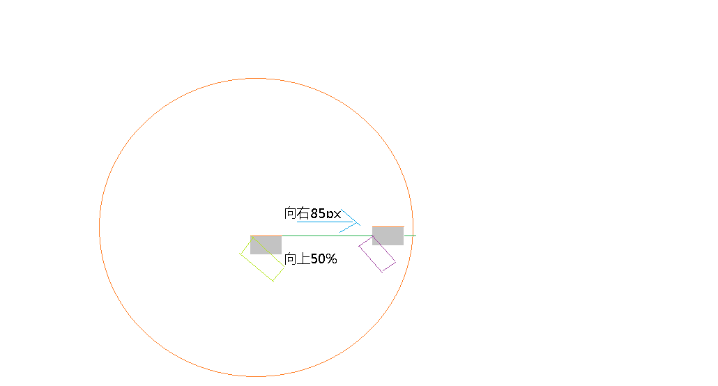
最后说一下代码的数学换算:
1. myAngle = (i-3)/6 * Math.PI; 这是数字与x轴的夹角。可知,数字总共有12个,分为12份,则每份为 360deg/12=30deg。而从12点刻度开始分配,其夹角为-90deg,所以第i个数字的夹角为-90+30*ideg,换算成弧度制 则乘π/180,化简即可得到该算式。
2. secAngle = sec*6 - 90;minAngle = min*6 + sec*0.1 - 90;hourAngle = hour*30 + min*0.5 - 90 秒针是“瞬间”旋转的,而秒针是指向分钟刻度,即每秒6deg,从12点钟方向开始,故-90。下面的-90一样,不再说。 分针是每60个秒增加1,而分针移动1次是6deg,则每一秒使分针移动0.1deg。而本身每分移动6deg。所以是该算式。时针是每60个分增加1,而时针移动1次是30deg,则每一分使时针移动0.5deg,对时针而言秒可以忽略不计。
三、图片的遮罩层按方向淡入淡出
<!doctype html>
<html>
 <head>
  <meta http-equiv="Content-Type" content="text/html; charset=utf-8">
  <meta name="viewport" content="width=device-width, initial-scale=1, user-scalable=no">
  <meta name="Generator" content="EditPlus®">
  <meta name="Author" content="">
  <meta name="Keywords" content="">
  <meta name="Description" content="">
  <title>Demo</title>
  <style>
	*{margin:0;padding:0;}
	ul,li{list-style:none;}
	div{font-family:"Microsoft YaHei";}
	html,body{100%; height:100%; background:#f2f2f2;}
	ul{margin-left:50px;}
	ul li{float:left;}
	ul li .outer{300px; height:250px; position: relative; overflow: hidden;}
	ul li .outer .inner{300px; height:250px; background:rgba(0, 0, 0, .3); position: absolute;}
  </style>
	<script id="jquery_183" type="text/javascript" class="library" src="/js/sandbox/jquery/jquery-1.8.3.min.js"></script>
 </head>
 <body>
	<ul>
		<li>
			<div class="outer">
				<img src="http://sandbox.runjs.cn/uploads/rs/253/e6wsbxul/09.jpg" width="300px" height="250px" />
				<div class="inner">
					这是描述。。。
				</div>
			</div>
		</li>
		<li>
			<div class="outer">
				<img src="http://sandbox.runjs.cn/uploads/rs/253/e6wsbxul/010.jpg" width="300px" height="250px" />
				<div class="inner">
					这是描述。。。
				</div>
			</div>
		</li>
		<li>
			<div class="outer">
				<img src="http://sandbox.runjs.cn/uploads/rs/253/e6wsbxul/011.jpg" width="300px" height="250px" />
				<div class="inner">
					这是描述。。。
				</div>
			</div>
		</li>
		<li>
			<div class="outer">
				<img src="http://sandbox.runjs.cn/uploads/rs/253/e6wsbxul/012.jpg" width="300px" height="250px" />
				<div class="inner">
					这是描述。。。
				</div>
			</div>
		</li>
		<li>
			<div class="outer">
				<img src="http://sandbox.runjs.cn/uploads/rs/253/e6wsbxul/013.jpg" width="300px" height="250px" />
				<div class="inner">
					这是描述。。。
				</div>
			</div>
		</li>
		<li>
			<div class="outer">
				<img src="http://sandbox.runjs.cn/uploads/rs/253/e6wsbxul/014.jpg" width="300px" height="250px" />
				<div class="inner">
					这是描述。。。
				</div>
			</div>
		</li>
		<li>
			<div class="outer">
				<img src="http://sandbox.runjs.cn/uploads/rs/253/e6wsbxul/015.jpg" width="300px" height="250px" />
				<div class="inner">
					这是描述。。。
				</div>
			</div>
		</li>
		<li>
			<div class="outer">
				<img src="http://sandbox.runjs.cn/uploads/rs/253/e6wsbxul/016.jpg" width="300px" height="250px" />
				<div class="inner">
					这是描述。。。
				</div>
			</div>
		</li>
	</ul>
	<script type="text/javascript" src="jquery.js"></script>
	<script>
		(function($){
			$.fn.extend({
				show : function(div){
					console.log(this); //[div.outer] : $(".outer") 会发现this并非指向dom,不过还是写$(this)不会被误解。
					var w = $(this).width(), //outer的宽
						h = $(this).height(), //outer的高
						xpos = w/2, //
						ypos = h/2,
						eventType = "",
						direct = "";
					//$(this).css({"overflow" : "hidden", "position" : "relative"});
					//div.css({"position" : "absolute", "top" : $(this).width()});
					this.on("mouseenter mouseleave", function(e){
						var oe = e || event;
						var x = oe.offsetX;
						var y = oe.offsetY;
						var angle = Math.atan((x - xpos)/(y - ypos)) * 180 / Math.PI;
						if(angle > -45 && angle < 45 && y > ypos){
							direct = "down";
						}
						if(angle > -45 && angle < 45 && y < ypos){
							direct = "up";
						}
						if(((angle > -90 && angle <-45) || (angle >45 && angle <90)) && x > xpos){
							direct = "right";
						}
						if(((angle > -90 && angle <-45) || (angle >45 && angle <90)) && x < xpos){
							direct = "left";
						}
						move(e.type, direct)
					});
					function move(eventType, direct){
						if(eventType == "mouseenter"){
							switch(direct){
								case "down":
									div.css({"left": "0px", "top": h}).stop(true,true).animate({"top": "0px"}, "fast");
									break;
								case "up":
									div.css({"left": "0px", "top": -h}).stop(true,true).animate({"top": "0px"}, "fast");
									break;
								case "right":
									div.css({"left": w, "top": "0px"}).stop(true,true).animate({"left": "0px"}, "fast");
									break;
								case "left":
									div.css({"left": -w, "top": "0px"}).stop(true,true).animate({"left": "0px"}, "fast");
									break;
							}
						}else{
							switch(direct){
								case "down":
									div.stop(true,true).animate({"top": h}, "fast");
									break;
								case "up":
									div.stop(true,true).animate({"top": -h}, "fast");
									break;
								case "right":
									div.stop(true,true).animate({"left": w}, "fast");
									break;
								case "left":
									div.stop(true,true).animate({"left": -w}, "fast");
									break;
							}
						}
					}
				}
			});
		})(jQuery)
/*
*使用说明:
*		$(".a").show($(".b"))
*		a是展示层,b是遮罩层
*		b在a的内部
*/


		$(".outer").each(function(i){
			console.log(this); //<div class = "outer"></div>
			$(this).show($(".inner").eq(i));
		});
	</script>
 </body>
</html>
效果:
原理:
展示层(outer)的两条对角线会把会把其划分为四个部分,通过判断属性是从哪个区域移入移除来判断鼠标移入的方向进而确定淡入淡出方向。
如何确定鼠标在哪个区域呢?看下图:
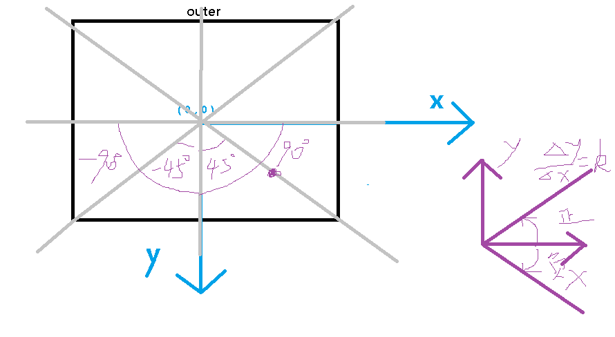
可以将outer的中心点作为原点建立坐标轴,那么区域就可以由斜率为45deg,-45deg的直线划分为四个部分。(将电脑的x轴看作y轴,y轴看作x轴)
down: -45deg ~ 45deg (y>原点) up: -45deg ~ 45deg(y<原点) left: 45deg ~ 90deg, -90deg ~-45deg(x<原点) right:45deg~90deg,-90deg~-45deg(x>原点)
如何用代码实现:
设置坐标原点:(outer的width / 2 , outer的height / 2) 即 (xpos,ypos)
x轴作为y轴,y轴作为x轴的直线的斜率:△x / △y => x - xpos / y - ypos
计算直线的夹角的弧度制:Math.atan((x-xpos / y-ypos)) * 180 / Math.PI