来自:https://www.jb51.net/article/139349.htm
3D图形在数据分析、数据建模、图形和图像处理等领域中都有着广泛的应用,下面将给大家介绍一下如何使用python进行3D图形的绘制,包括3D散点、3D表面、3D轮廓、3D直线(曲线)以及3D文字等的绘制。
准备工作:
python中绘制3D图形,依旧使用常用的绘图模块matplotlib,但需要安装mpl_toolkits工具包,安装方法如下:windows命令行进入到python安装目录下的Scripts文件夹下,执行: pip install --upgrade matplotlib即可;linux环境下直接执行该命令。
安装好这个模块后,即可调用mpl_tookits下的mplot3d类进行3D图形的绘制。
下面以实例进行说明。
1、3D表面形状的绘制
|
1
2
3
4
5
6
7
8
9
10
11
12
13
14
15
16
17
18
|
from mpl_toolkits.mplot3d import Axes3D import matplotlib.pyplot as plt import numpy as np fig = plt.figure() ax = fig.add_subplot(111, projection='3d') # Make data u = np.linspace(0, 2 * np.pi, 100) v = np.linspace(0, np.pi, 100) x = 10 * np.outer(np.cos(u), np.sin(v)) y = 10 * np.outer(np.sin(u), np.sin(v)) z = 10 * np.outer(np.ones(np.size(u)), np.cos(v)) # Plot the surface ax.plot_surface(x, y, z, color='b') plt.show() |
球表面,结果如下:

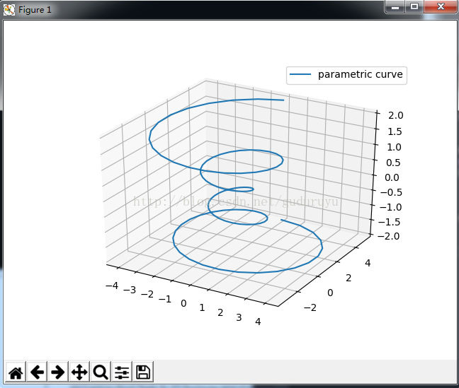
2、3D直线(曲线)的绘制
|
1
2
3
4
5
6
7
8
9
10
11
12
13
14
15
16
17
18
|
import matplotlib as mpl from mpl_toolkits.mplot3d import Axes3D import numpy as np import matplotlib.pyplot as plt mpl.rcParams['legend.fontsize'] = 10 fig = plt.figure() ax = fig.gca(projection='3d') theta = np.linspace(-4 * np.pi, 4 * np.pi, 100) z = np.linspace(-2, 2, 100) r = z**2 + 1x = r * np.sin(theta) y = r * np.cos(theta) ax.plot(x, y, z, label='parametric curve') ax.legend() plt.show() |
这段代码用于绘制一个螺旋状3D曲线,结果如下:
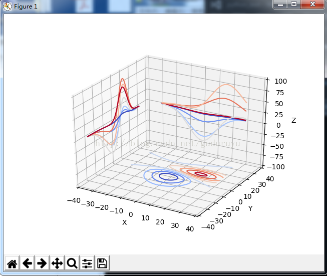
3、绘制3D轮廓
|
1
2
3
4
5
6
7
8
9
10
11
12
13
14
15
16
17
18
19
|
from mpl_toolkits.mplot3d import axes3d import matplotlib.pyplot as plt from matplotlib import cm fig = plt.figure() ax = fig.gca(projection='3d') X, Y, Z = axes3d.get_test_data(0.05) cset = ax.contour(X, Y, Z, zdir='z', offset=-100, cmap=cm.coolwarm) cset = ax.contour(X, Y, Z, zdir='x', offset=-40, cmap=cm.coolwarm) cset = ax.contour(X, Y, Z, zdir='y', offset=40, cmap=cm.coolwarm) ax.set_xlabel('X') ax.set_xlim(-40, 40) ax.set_ylabel('Y') ax.set_ylim(-40, 40) ax.set_zlabel('Z') ax.set_zlim(-100, 100) plt.show() |
绘制结果如下:
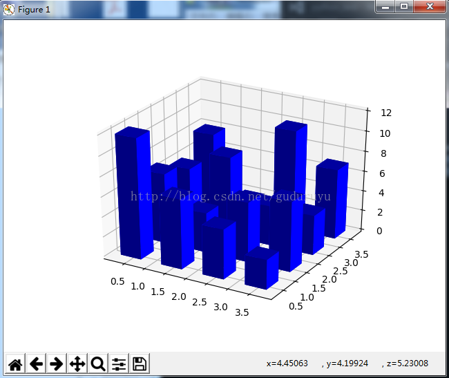
4、绘制3D直方图
|
1
2
3
4
5
6
7
8
9
10
11
12
13
14
15
16
17
18
19
20
21
22
23
24
25
26
|
from mpl_toolkits.mplot3d import Axes3D import matplotlib.pyplot as plt import numpy as np fig = plt.figure() ax = fig.add_subplot(111, projection='3d') x, y = np.random.rand(2, 100) * 4hist, xedges, yedges = np.histogram2d(x, y, bins=4, range=[[0, 4], [0, 4]]) # Construct arrays for the anchor positions of the 16 bars. # Note: np.meshgrid gives arrays in (ny, nx) so we use 'F' to flatten xpos, # ypos in column-major order. For numpy >= 1.7, we could instead call meshgrid # with indexing='ij'. xpos, ypos = np.meshgrid(xedges[:-1] + 0.25, yedges[:-1] + 0.25) xpos = xpos.flatten('F') ypos = ypos.flatten('F') zpos = np.zeros_like(xpos) # Construct arrays with the dimensions for the 16 bars. dx = 0.5 * np.ones_like(zpos) dy = dx.copy() dz = hist.flatten() ax.bar3d(xpos, ypos, zpos, dx, dy, dz, color='b', zsort='average') plt.show() |
绘制结果如下:
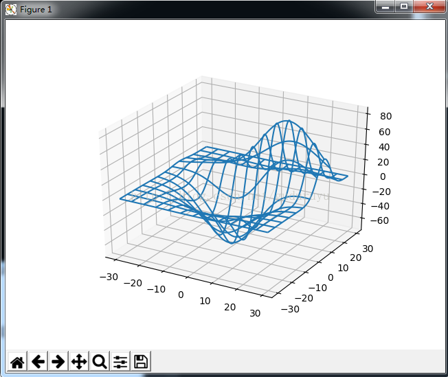
5、绘制3D网状线
|
1
2
3
4
5
6
7
8
9
10
11
12
13
14
|
from mpl_toolkits.mplot3d import axes3d import matplotlib.pyplot as plt fig = plt.figure() ax = fig.add_subplot(111, projection='3d') # Grab some test data. X, Y, Z = axes3d.get_test_data(0.05) # Plot a basic wireframe. ax.plot_wireframe(X, Y, Z, rstride=10, cstride=10) plt.show() |
绘制结果如下:
6、绘制3D三角面片图
|
1
2
3
4
5
6
7
8
9
10
11
12
13
14
15
16
17
18
19
20
21
22
23
24
25
26
27
28
29
30
|
from mpl_toolkits.mplot3d import Axes3D import matplotlib.pyplot as plt import numpy as np n_radii = 8n_angles = 36 # Make radii and angles spaces (radius r=0 omitted to eliminate duplication). radii = np.linspace(0.125, 1.0, n_radii) angles = np.linspace(0, 2*np.pi, n_angles, endpoint=False) # Repeat all angles for each radius. angles = np.repeat(angles[..., np.newaxis], n_radii, axis=1) # Convert polar (radii, angles) coords to cartesian (x, y) coords. # (0, 0) is manually added at this stage, so there will be no duplicate # points in the (x, y) plane. x = np.append(0, (radii*np.cos(angles)).flatten()) y = np.append(0, (radii*np.sin(angles)).flatten()) # Compute z to make the pringle surface. z = np.sin(-x*y) fig = plt.figure() ax = fig.gca(projection='3d') ax.plot_trisurf(x, y, z, linewidth=0.2, antialiased=True) plt.show( |
绘制结果如下:

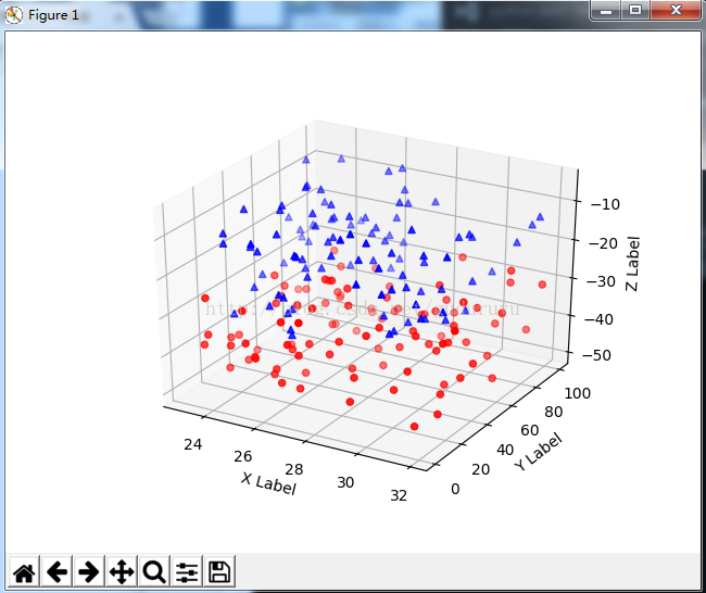
7、绘制3D散点图
|
1
2
3
4
5
6
7
8
9
10
11
12
13
14
15
16
17
18
19
20
21
22
23
24
25
26
27
28
29
30
|
from mpl_toolkits.mplot3d import Axes3D import matplotlib.pyplot as plt import numpy as np def randrange(n, vmin, vmax): ''''' Helper function to make an array of random numbers having shape (n, ) with each number distributed Uniform(vmin, vmax). ''' return (vmax - vmin)*np.random.rand(n) + vmin fig = plt.figure() ax = fig.add_subplot(111, projection='3d') n = 100 # For each set of style and range settings, plot n random points in the box # defined by x in [23, 32], y in [0, 100], z in [zlow, zhigh]. for c, m, zlow, zhigh in [('r', 'o', -50, -25), ('b', '^', -30, -5)]: xs = randrange(n, 23, 32) ys = randrange(n, 0, 100) zs = randrange(n, zlow, zhigh) ax.scatter(xs, ys, zs, c=c, marker=m) ax.set_xlabel('X Label') ax.set_ylabel('Y Label') ax.set_zlabel('Z Label') plt.show() |
绘制结果如下:
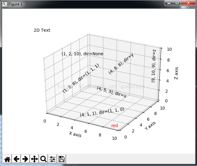
8、绘制3D文字
|
1
2
3
4
5
6
7
8
9
10
11
12
13
14
15
16
17
18
19
20
21
22
23
24
25
26
27
28
29
30
31
32
33
|
from mpl_toolkits.mplot3d import Axes3D import matplotlib.pyplot as plt fig = plt.figure() ax = fig.gca(projection='3d') # Demo 1: zdir zdirs = (None, 'x', 'y', 'z', (1, 1, 0), (1, 1, 1)) xs = (1, 4, 4, 9, 4, 1) ys = (2, 5, 8, 10, 1, 2) zs = (10, 3, 8, 9, 1, 8) for zdir, x, y, z in zip(zdirs, xs, ys, zs): label = '(%d, %d, %d), dir=%s' % (x, y, z, zdir) ax.text(x, y, z, label, zdir) # Demo 2: color ax.text(9, 0, 0, "red", color='red') # Demo 3: text2D # Placement 0, 0 would be the bottom left, 1, 1 would be the top right. ax.text2D(0.05, 0.95, "2D Text", transform=ax.transAxes) # Tweaking display region and labels ax.set_xlim(0, 10) ax.set_ylim(0, 10) ax.set_zlim(0, 10) ax.set_xlabel('X axis') ax.set_ylabel('Y axis') ax.set_zlabel('Z axis') plt.show( |
绘制结果如下:
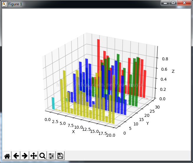
9、3D条状图
|
1
2
3
4
5
6
7
8
9
10
11
12
13
14
15
16
17
18
19
20
21
|
from mpl_toolkits.mplot3d import Axes3D import matplotlib.pyplot as plt import numpy as np fig = plt.figure() ax = fig.add_subplot(111, projection='3d') for c, z in zip(['r', 'g', 'b', 'y'], [30, 20, 10, 0]): xs = np.arange(20) ys = np.random.rand(20) # You can provide either a single color or an array. To demonstrate this, # the first bar of each set will be colored cyan. cs = [c] * len(xs) cs[0] = 'c' ax.bar(xs, ys, zs=z, zdir='y', color=cs, alpha=0.8) ax.set_xlabel('X') ax.set_ylabel('Y') ax.set_zlabel('Z') plt.show() |
绘制结果如下:
以上所述是小编给大家介绍的python绘制3D图形,希望对大家有所帮助,如果大家有任何疑问请给我留言,小编会及时回复大家的。在此也非常感谢大家对脚本之家网站的支持