一、 CSS介绍
1、 CSS概述:CSS(Cascading Style Sheets)指层叠样式表,极大提高了工作效率。
2、 基础语法:
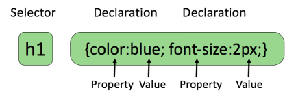
属性大于1个之后,属性之间用分号隔开
如果大于1个单词,则需要加上引号,如:p{font-family:”sans serif”;}
CSS注释:以“/*”开始,以“*/”结束。
3、 高级语法
① 选择器分组
h1,h2,h3,h4,h5,h6{color:red;}
② 继承:
body{
  color:green;
}
4、 CSS id 选择器
① id选择器:id选择器可以为标有id的HTML元素指定特定的样式,以“#”来定义。如:#id{}
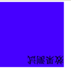
② id选择器和派生选择器:#id p{}
示例:
1 <!DOCTYPE html>
2 <html lang="en">
3 <head>
4 <meta charset="UTF-8">
5 <title>Title</title>
6 <link href="MyCss.css" type="text/css" rel="stylesheet">
7 </head>
8 <body>
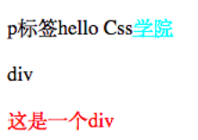
9 <p id="pid">p标签hello Css<a href="www.jikexueyuan.com">学院</a></p>
10 <div id="divid">
11 div<p>这是一个div</p>
12 </div>
13 </body>
14 </html>
1 #pid a{
2     color: aqua;
3 }
4 #divid p{
5     color: red;
6 }
显示效果:
5、 CSS类选择器
① 类选择器:类选择器以一个点显示, class 选择器用于描述一组元素的样式,class 选择器有别于id选择器,class可以在多个元素中使用。
② class也可以用作派生选择器
1 <body>
2     <p class="pclass">这是一个class效果<a href="http://www.jikexueyuan.com">学院</a></p>
3     <div class="divclass">
4         Hello Div<p>标签</p>
5     </div>
6 </body>
1 .pclass a{
2     color: red;
3 }
4 .divclass p{
5     color: blue;
6 }
效果:

6、 CSS属性选择器
① 属性选择器:对带有指定属性的HTML元素设置样式
② 属性和值选择器
 1 <!DOCTYPE html>
 2 <html lang="en">
 3 <head>
 4     <meta charset="UTF-8">
 5     <title>Title</title>
 6     <style type="text/css">
 7          [title]{
 8              color: blueviolet;
 9          }
10          [title=te]{
11              color: red;
12          }
13     </style>
14 </head>
15 <body>
16     <p title="t">属性选择器</p>
17     <p title="te">属性和值选择器</p>
18 </body>
19 </html>
二、 CSS样式
1、 背景:CSS允许应用纯色作为背景,也允许使用背景图像创建相当复杂的效果
|
Property |
描述 |
|
background |
简写属性,作用是将背景属性设置在一个声明中。 |
|
background-attachment |
背景图像是否固定或者随着页面的其余部分滚动。 |
|
background-color |
设置元素的背景颜色。 |
|
background-image |
把图像设置为背景。 |
|
background-position |
设置背景图像的起始位置。 |
|
background-repeat |
设置背景图像是否及如何重复。 |
|
background-size |
规定背景图片的尺寸 |
|
background-origin |
规定背景图片的定位区域 |
|
background-clip |
规定背景的绘制区域 |
示例:
 1 body{
 2     /*设置背景颜色*/
 3     /*background-color: darkgrey;*/
 4     /*设置背景图片*/
 5     background-image: url("bg.jpg");
 6     /*设置背景是否重复,默认重复*/
 7     background-repeat: no-repeat;
 8     /*设置背景图像的起始位置,可以采用方位参数,也可用坐标参数和百分比*/
 9     /*background-position: center center;*/
10     /*背景图像是否固定或者随着页面的其余部分滚动。默认不滚动*/
11     /*background-attachment:fixed;*/
12     /*设置背景图片大小*/
13     /*background-size: 100px 100px;*/
14 }
15 p{
16     /*设置背景宽度*/
17     width: 200px;
18     /*设置文字背景内边距*/
19     padding: 10px;
20     /*设置背景颜色*/
21     /*background-color: red;*/
22     /*设置背景图片*/
23     /*background-image: url("bg.jpg");*/
24 }
2、 CSS文本
CSS文本属性可定义文本外观,通过文本属性,可以改变文本的颜色、字符间距、对齐文本、装饰文本、对文本缩进。
|
属性 |
描述 |
|
color |
设置文本颜色 |
|
direction |
设置文本方向 |
|
letter-spacing |
设置字符间距 |
|
line-height |
设置行高 |
|
text-align |
对齐元素中的文本 |
|
text-decoration |
向文本添加修饰 |
|
text-indent |
缩进元素中文本的首行 |
|
text-shadow |
设置文本阴影 |
|
text-transform |
控制元素中的字母 |
|
unicode-bidi |
设置或返回文本是否被重写 |
|
vertical-align |
设置元素的垂直对齐 |
|
white-space |
设置元素中空白的处理方式 |
|
word-spacing |
设置字间距 |
|
Word-wrap |
规定文本的换行规则 |
3、 CSS字体
CSS字体属性定义文本的字体系列、大小、加粗、风格和变形
|
Property |
描述 |
|
font |
在一个声明中设置所有的字体属性 |
|
font-family |
指定文本的字体系列 |
|
font-size |
指定文本的字体大小 |
|
font-style |
指定文本的字体样式 |
|
font-variant |
以小型大写字体或者正常字体显示文本。 |
|
font-weight |
指定字体的粗细。 |
4、 链接
① CSS链接的样式,可以用任何CSS属性(如颜色,字体,背景等)。
特别的链接,可以有不同的样式,这取决于他们是什么状态。
这四个链接状态是:
-
- a:link - 正常,未访问过的链接
- a:visited - 用户已访问过的链接
- a:hover - 当用户鼠标放在链接上时
- a:active - 链接被点击的那一刻
示例:
a:link{color: red;}/* 未访问链接*/
a:visited{color: #00FF00;}/* 已访问链接 */
a:hover{color: blue;}/* 鼠标移动到链接上 */
a:active{color: blue;}/* 鼠标点击时 */
② 常见的链接样式:
-
- text-decoration属性大多用于去掉链接中的下划线
- background-color属性设置背景颜色
5、 CSS列表
CSS列表属性允许你放置、改变列表标志,或者将图像作为列表项标志
|
属性 |
描述 |
|
list-style |
简写属性。用于把所有用于列表的属性设置于一个声明中 |
|
list-style-image |
将图象设置为列表项标志。 |
|
list-style-position |
设置列表中列表项标志的位置。 |
|
list-style-type |
设置列表项标志的类型。 |
6、 CSS表格
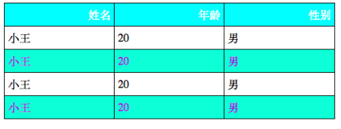
CSS表格属性可以帮助我们极大的改善表格的外观。表格边框(border)、折叠边框(border-collapse)、表格宽高(width、height)、表格文本对齐(text-align)、表格内边距(padding)、表格颜色(color)。
示例:
 1 <!DOCTYPE html>
 2 <html lang="en">
 3 <head>
 4     <meta charset="UTF-8">
 5     <title>Title</title>
 6     <link type="text/css" href="style.css" rel="stylesheet">
 7 </head>
 8 <body>
 9     <table id="tb">
10         <tr><th>姓名</th><th>年龄</th><th>性别</th></tr>
11         <tr><td>小王</td><td>20</td><td>男</td></tr>
12         <tr class="alt"><td>小王</td><td>20</td><td>男</td></tr>
13         <tr><td>小王</td><td>20</td><td>男</td></tr>
14         <tr class="alt"><td>小王</td><td>20</td><td>男</td></tr>
15     </table>
16 </body>
17 </html>
 1 /*style.css*/
 2
 3 /*设置表格外边框为可折叠(即单一边框)及宽度,默认背景颜色为灰色*/
 4 #tb{
 5     border-collapse: collapse;
 6     width: 500px;
 7 }
 8 /*设置表格的表头和单元格边框为黑色,边距为5px */
 9 #tb td,#tb th{
10     border: 1px solid black;
11     padding: 5px;
12 }
13 /*设置表头为右对齐,背景颜色aqua,字体颜色为white*/
14 #tb th{
15     text-align: right;
16
17     color: white;
18 }
19 /*设置指定行单元格背景颜色为aquamarine,字体颜色为blue violet,*/
20 #tb tr.alt td{
21     color: blueviolet;
22     background-color: aquamarine;
23 }
显示效果:
7、 CSS轮廓
|
属性 |
说明 |
值 |
|
outline |
在一个声明中设置所有的轮廓属性 |
outline-color |
|
outline-color |
设置轮廓的颜色 |
color-name |
|
outline-style |
设置轮廓的样式 |
none |
|
outline-width |
设置轮廓的宽度 |
thin |
三、 CSS盒子模式
1、 CSS盒子模式概述:盒子模式的内容范围包括:margin(外边距)、border(边框)、padding(内边距)、content(内容)部分组成。
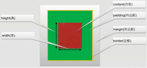
2、 CSS内边距(padding):在content外,边框内
内边距属性:
|
属性 |
描述 |
|
padding |
设置所有边距 |
|
padding-bottom |
设置底边距 |
|
padding-left |
设置左边距 |
|
padding-right |
设置右边距 |
|
padding-top |
设置上边距 |
3、 CSS边框
① 可以创建出效果出色的边框,并且可以应用于任何元素。
② 边框样式:border-style,定义了10个不同的非继承样式,包括none.
③ 边框的单边样式:
border-top-style
border-left-style
border-right-style
border-bottom-style
④ 边框的宽度:
border-width
⑤ 边框单边的宽度:
border-top-width
border-left-width
border-right-width
border-bottom-width
⑥ 边框的颜色:
border-color
⑦ 边框单边框的颜色
border-top-color
border-left- color
border-right- color
border-bottom- color
⑧ CSS3边框:
border-radius:圆角边框
box-shadow: 边框阴影
border-image:边框图片
4、 CSS外边距
① 外边距:围绕在内容边框的区域就是外边距,外边距默认为透明区域,接受任何长度单位、百分数值。
② 外边距常用属性:
|
属性 |
描述 |
|
margin |
简写属性。在一个声明中设置所有外边距属性。 |
|
margin-bottom |
设置元素的下外边距。 |
|
margin-left |
设置元素的左外边距。 |
|
margin-right |
设置元素的右外边距。 |
|
margin-top |
设置元素的上外边距。 |
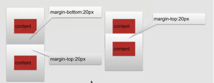
5、 CSS外边距合并:就是一个叠加的概念,遵循取大原则。
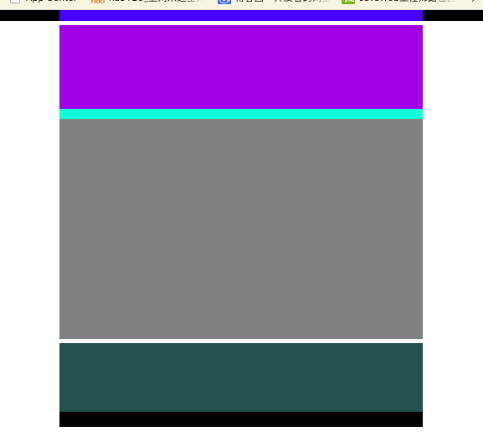
6、 盒子模型应用简单示例:
 1 <!DOCTYPE html>
 2 <html lang="en">
 3 <head>
 4     <meta charset="UTF-8">
 5     <title>盒子模型的应用</title>
 6     <link href="style.css" type="text/css" rel="stylesheet">
 7 </head>
 8 <body>
 9     <div class="top">
10         <div class="top_content"></div>
11     </div>
12     <div class="body">
13         <div class="body_img"></div>
14         <div class="body_content">
15             <div class="body_no"></div>
16         </div>
17     </div>
18     <div class="footing">
19         <div class="footing_content"></div>
20         <div class="footing_menu"></div>
21     </div>
22 </body>
23 </html>
 1 style.css
 2
 3 *{
 4     margin: 0px;
 5     padding: 0px;
 6 }
 7 .top{
 8     width: 100%;
 9     height: 50px;
10
11 }
12 .top_content{
13     width: 75%;
14     height: 50px;
15     margin: 0px auto;
16     background-color: blue;
17 }
18 .body{
19     margin: 20px auto;
20     width: 75%;
21     height: 1500px;
22     background-color: antiquewhite;
23 }
24 .body_img{
25     width: 100%;
26     height: 400px;
27     background-color: blueviolet;
28 }
29 .body_content{
30     width: 100%;
31     height: 1100px;
32     background-color:gray;
33 }
34 .body_no{
35     width: 100%;
36     height: 50px;
37     background-color: aquamarine;
38 }
39 .footing{
40     width: 75%;
41     height: 400px;
42     background-color: brown;
43     margin: 0px auto;
44 }
45 .footing_content{
46     width: 100%;
47     height: 330px;
48     background-color: darkslategrey;
49 }
50 .footing_menu{
51     width: 100%;
52     height: 70px;
53     background-color: black;
54 }
显示效果:
四、 CSS定位
1、 CSS定位:改变元素在页面上的位置
2、 CSS定位机制:
普通流:元素安装其在HTML中的位置顺序决定排布的过程
浮动
绝对布局
3、 CSS定位属性:
|
属性 |
描述 |
|
position |
把元素放在一个静态的、相对的、绝对的或固定的位置上 |
|
top |
元素向上的偏移量 |
|
left |
元素向左的偏移量 |
|
right |
元素向右的偏移量 |
|
bottom |
元素向下的偏移量 |
|
overflow |
设置元素溢出其区域发生的事情 |
|
clip |
设置元素显示的形状 |
|
vertical-align |
设置元素垂直对齐方式 |
|
z-index |
设置元素的堆叠顺序 |
①CSS position属性:
-
- static (HTML元素的默认值,即没有定位,元素出现在正常的流中。静态定位的元素不会受到 top, bottom, left, right影响。)
- relative(相对定位元素的定位是相对其正常位置,可以移动的相对定位元素的内容和相互重叠的元素,它原本所占的空间不会改变,相对定位元素经常被用来作为绝对定位元素的容器块。)
- fixed(元素的位置相对于浏览器窗口是固定位置,即使窗口是滚动的它也不会移动。)
- absolute(绝对定位的元素的位置相对于最近的已定位父元素,如果元素没有已定位的父元素,那么它的位置相对于<html>,absolute 定位使元素的位置与文档流无关,因此不占据空,absolute 定位的元素和其他元素重叠。)
②重叠的元素:元素的定位与文档流无关,所以它们可以覆盖页面上的其它元素。
z-index属性指定了一个元素的堆叠顺序(哪个元素应该放在前面,或后面)一个元素可以有正数或负数的堆叠顺序,具有更高堆叠顺序的元素总是在较低的堆叠顺序元素的前面。
4、 CSS浮动:
① 浮动:float属性可用的值:
-
- left:元素向左浮动
- right:元素向右浮动
- none:元素不浮动
- inherit:从父级继承浮动属性
② clear属性:去掉浮动属性(包括继承来的属性)
clear属性值:
-
- left、right:去掉元素向左、向右浮动
- both:左右两侧均去掉浮动
- inherit:从父级继承来clear的值
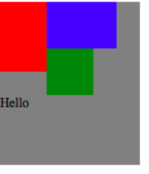
③ 示例:
 1 <!DOCTYPE html>
 2 <html lang="en">
 3 <head>
 4     <meta charset="UTF-8">
 5     <title>浮动</title>
 6     <link href="style.css" type="text/css" rel="stylesheet">
 7 </head>
 8 <body>
 9     <div id="contain">
10         <div id="fd"></div>
11         <div id="sd"></div>
12         <div id="td"></div>
13         <div id="text">Hello</div>
14     </div>
15 </body>
16 </html>
 1 /*style.css*/
 2 #fd{
 3      200px;
 4     height: 300px;
 5
 6     float: left;
 7 }
 8 #sd{
 9      300px;
10     height:200px;
11     background-color: blue;
12     float: left;
13 }
14 #td{
15      200px;
16     height:200px;
17     background-color: green;
18     float: left;
19 }
20 #contain{
21      600px;
22     height: 700px;
23     background-color: gray;
24 }
25 #text{
26     clear: both;
27 }
显示效果:
五、 CSS3选择器详解
1、 元素选择器:最常见的选择器,文档的元素就是最基本的选择器,例如:h1{},a{}
2、 选择器分组
例子:h1,h2{}
通配符*{},例如:*{margin: 0px; padding:0px;}
3、 类选择器
① 类选择器允许以一种独立与文档元素的方式来指定样式,例如:.class{}
② 结合元素选择器,例如:a.class{}
③ 多类选择器,例如:.class.class{}
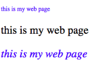
示例:
1 <body>
2     <p class="p1">this is my web page</p>
3     <p class="p2">this is my web page</p>
4     <p class="p1 p2">this is my web page</p>
5 </body>
1 .p1{
2     color: blue;
3 }
4 .p2{
5     font-size: 100px;
6 }
7 .p1.p2{
8     font-style: italic;
9 }
显示效果:
4、 id选择器:
① 类似于类选择,不过也有一些重要差别
例如:#id{}
② 类选择器和id选择器区别:
id只能在文档中使用一次,而类可以多次使用
<div id="myid">Hello World!</div>
<div id="myid">Hello World!</div>//报错
<div class="div1">Hello World!</div>
<div class="div1">Hello World!</div>
id选择器不能结合使用
当使用js时候,需要用到id 。
5、 属性选择器
① 简单属性选择,例如:[title]{}
② 根据具体属性值选择:
除了选择拥有某些的元素,还可以进一步缩小选择范围,只选择有特定属性值得元素,例如:a[href=”http://www.jikexueyuan.com”]{}
③ 属性和属性值必须完全匹配
④ 根据部分属性值选择
示例:
 1 <!DOCTYPE html>
 2 <html lang="en">
 3 <head>
 4     <meta charset="UTF-8">
 5     <title>浮动应用</title>
 6         <style>
 7         [title]{
 8             color: aqua;
 9         }
10         /*属性和属性值必须完全匹配,否则无法起作用*/
11         [href="http://jikexueyuan.com"]{
12             font-size: 100px;
13         }
14         /*根据部分属性值选择*/
15         [title~="title"]{
16             font-size: 100px;
17         }
18     </style>
19 </head>
20 <body>
21     <p title="tit">hello</p>
22     <p title="title">hello</p>
23     <p title="t">hello</p>
24     <p title="title hello">hello</p>
25     <a href="http://jikexueyuan.com">极客学院</a>
26 </body>
27 </html>
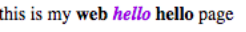
6、 CSS3 后代选择器
后代选择器:后代选择器可以选择作为某元素后代的元素
示例:
<p>this is my <strong>web <i>hello</i> hello</strong> page</p>

//css文件
p strong i{
    color: blueviolet;
}
显示效果:
7、 CSS3 子元素选择器
与后代选择器相比,子元素选择器作为某元素子元素的元素
例如:h1>strong{}
同6示例,如果要实现该效果,则需改为:p>strong>i{},子元素的子元素,p>i{}则无效。
8、 CSS3相邻兄弟选择器
可选择紧接在另一个元素后的元素,且二者有相同父元素。
例如:h1+p{}
六、 常见操作
1、 对齐操作
① 使用margin属性进行水平对齐
② 使用position属性进行左右对齐
③ 使用float属性进行左右对齐
2、 尺寸操作
|
属性 |
描述 |
|
height |
设置元素高度 |
|
line-height |
设置行号 |
|
max-height |
设置元素最大高度 |
|
max-width |
设置元素最大宽度 |
|
min-height |
设置元素最小高度 |
|
min-width |
设置元素最小宽度 |
|
width |
设置元素宽度 |
3、 分类操作
|
属性 |
描述 |
|
clear |
设置一个元素的侧面是否允许其他的浮动元素 |
|
cursor |
规定当指向某元素之上时显示的指针类型 |
|
display |
设置是否及如何显示元素 |
|
float |
定义元素在那个方向浮动 |
|
position |
把元素放置到一个静态的、相对的、绝对的、固定的位置 |
|
visibility |
设置元素是否可见或不可见 |
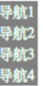
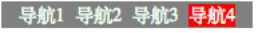
4、 导航栏
① 垂直导航栏
1 <body>
2     <ul>
3         <li><a href="#">导航1</a></li>
4         <li><a href="#">导航2</a></li>
5         <li><a href="#">导航3</a></li>
6         <li><a href="#">导航4</a></li>
7     </ul>
8 </body>
 1 /*css文件*/
 2 ul{
 3     list-style-type:none;
 4     margin: 0px;
 5     padding: 0px;
 6 }
 7 /*去除链接的下滑线*/
 8 a:link,a:visited{
 9     text-decoration: none;
10     display: block;
11     background-color: gray;
12     color: honeydew;
13     width: 150px;
14 }
15 a:active,a:hover{
16     background-color: red;
显示效果:
② 水平导航栏
 1 ul{
 2     list-style-type:none;
 3     margin: 0px;
 4     padding: 0px;
 5
 6     width: 750px;
 7     text-align: center;
 8 }
 9 /*去除链接的下滑线*/
10 a:link,a:visited{
11     text-decoration: none;
12     background-color: gray;
13     color: honeydew;
14     width: 150px;
15 }
16 a:active,a:hover{
17     background-color: red;
18 }
19 li{
20     display: inline;
21     padding: 5px ;
22     padding-right: 10px;
23     padding-left: 10px;
24 }
显示效果:
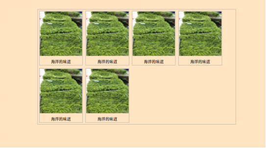
5、 图片操作
 1 <body>
 2     <div class="image">
 3         <div class="image">
 4             <a href="#" target="_self">
 5                 <img src="1.jpeg" alt="海葡萄"
 6                      width="600px" height="600px">
 7             </a>
 8             <div class="text">海洋的味道</div>
 9         </div>
10         <div class="image">
11             <a href="#" target="_self">
12                 <img src="1.jpeg" alt="海葡萄"
13                      width="600px" height="600px">
14             </a>
15             <div class="text">海洋的味道</div>
16         </div>
17         <div class="image">
18             <a href="#" target="_self">
19                 <img src="1.jpeg" alt="海葡萄"
20                      width="600px" height="600px">
21             </a>
22             <div class="text">海洋的味道</div>
23         </div>
24         <div class="image">
25             <a href="#" target="_self">
26                 <img src="1.jpeg" alt="海葡萄"
27                      width="600px" height="600px">
28             </a>
29             <div class="text">海洋的味道</div>
30         </div>
31         <div class="image">
32             <a href="#" target="_self">
33                 <img src="1.jpeg" alt="海葡萄"
34                      width="600px" height="600px">
35             </a>
36             <div class="text">海洋的味道</div>
37         </div>
38         <div class="image">
39             <a href="#" target="_self">
40                 <img src="1.jpeg" alt="海葡萄"
41                      width="600px" height="600px">
42             </a>
43             <div class="text">海洋的味道</div>
44         </div>
45     </div>
46 </body>
 1 /*style.css*/
 2 .image{
 3     border: 1px solid darkgrey;
 4     width: auto;
 5     height: auto;
 6     float: left;
 7     text-align: center;
 8     margin: 20px;
 9 }
10 img{
11     margin: 5px;
12     opacity: 1;
13 }
14 .text{
15     font-size: 12px;
16     margin: 10px;
17 }
18 a:hover{
19     background-color: darkgrey;
20 }
显示效果:
七、 CSS3动画
1、2D、3D转换
① 通过CSS3转换,我们能够对元素进行移动、缩放、转动、拉长或拉伸
转换是使元素改变形状、尺寸和位置的一种效果
可以使用2D、3D来转换元素
② 2D转换方法:
translate(x,y)根据左(X轴)和顶部(Y轴)位置给定的参数,从当前元素位置移动。
1 .div{
2     transform: translate(200px,100px);
3     -webkit-transform:translate(200px,100px);/*safari chrome*/
4     -ms-transform:translate(200px,100px); /*IE*/
5     -o-transform:translate(200px,100px);/*opera*/
6     -moz-transform: translate(200px,100px);/*Firefox*/
7 }
translate(x,y)显示效果: rotate(angle)显示效果:
rotate(angle)在一个给定度数顺时针旋转的元素。负值是允许的,这样是元素逆时针旋转。
1 .div2{
2     transform: rotate(200deg);
3     -webkit-transform:rotate(200deg);
4     -ms-transform:rotate(180deg);
5     -o-transform:rotate(180deg);
6     -moz-transform: rotate(180deg);
7 }
scale(x,y)该元素增加或减少的大小,取决于宽度(X轴)和高度(Y轴)的参数(可以是倍数)
1 .div2{
2     margin: 50px 0px;
3     transform: scale(1,2);
4 }
scale(x,y)显示效果: skew(x-angle,y-angle)显示效果:
skew(x-angle,y-angle)倾斜效果函数,包含两个参数值,分别表示X轴和Y轴倾斜的角度,如果第二个参数为空,则默认为0,参数为负表示向相反方向倾斜。
1 .div2{
2     transform: skew(50deg,50deg);
3 }
matrix(n,n,n,n,n)方法有六个参数,包含旋转,缩放,移动(平移)和倾斜功能。
③ 3D转换方法:
rotateX()围绕其在一个给定度数X轴旋转的元素
1 .div{ 2 transform: rotateX(120deg); 3 }
rotateX()显示效果: rotateY()显示效果:
rotateY()围绕其在一个给定度数Y轴旋转的元素。
1 .div2{ 2 transform: rotateY(120deg); 3 }
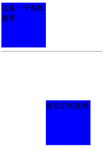
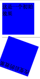
2、 CSS3动画过渡
①通过使用CSS3,可以给元素添加一些效果
②CSS3过渡是元素从一种样式转换成另一种样式
动画效果的CSS
动画执行的时间
④ 属性
|
属性 |
描述 |
|
transition |
简写属性,用于在一个属性中设置四个过渡属性。 |
|
transition-property |
规定应用过渡的 CSS 属性的名称。 |
|
transition-duration |
定义过渡效果花费的时间。默认是 0。 |
|
transition-timing-function |
规定过渡效果的时间曲线。默认是 "ease"。 |
|
transition-delay |
规定过渡效果何时开始。默认是 0。 |
 1 div{
 2     width: 100px;
 3     height: 100px;
 4
 5     -webkit-transition:width 2s,height 2s,-webkit-transform 2s;
 6     transition: width 2s,height 2s,transform 2s;
 7     transition-delay: 2s ;
 8 }
 9 div:hover{
10     width: 200px;
11     height: 200px;
12     transform: rotate(360deg);
13     -webkit-transform: rotate(360deg) ;
14 }
显示效果前: 显示效果后:

3、 CSS3动画
① 通过CSS3,可以进行创建动画
② CSS3的动画需要遵循@keyframes规则
- 规定动画的时长
- 规定动画的名称
 1 <!DOCTYPE html>
 2 <html lang="en">
 3 <head>
 4     <meta charset="UTF-8">
 5     <title>Title</title>
 6     <link href="style2.css" type="text/css" rel="stylesheet">
 7 </head>
 8 <body>
 9     <div>动画效果</div>
10 </body>
11 </html>
 1 /*style2.css*/
 2
 3 div{
 4     width: 200px;
 5     height: 200px;
 6
 7     position: relative;
 8     animation: anim 5s infinite alternate;
 9     -webkit-animation: anim 5s infinite alternate;
10 }
11 @keyframes anim{
12     0%{background-color: red;left: 0px;top: 0}
13     25%{background-color: blue;left: 400px;top: 0px}
14     50%{background-color: #ccffcc;left:400px;top: 400px}
15     75%{background-color: #00ffff;left: 0px;top: 400px}
16     100%{background-color: red;left: 0px;top: 0px}
17 }
18 @-webkit-keyframes anim {
19             0%{background-color: red;left: 0px;top: 0}
20             25%{background-color: blue;left: 400px;top: 0px}
21             50%{background-color: #ccffcc;left:400px;top: 400px}
22             75%{background-color: #00ffff;left: 0px;top: 400px}
23             100%{background-color: red;left: 0px;top: 0px}
24         }
4、 多列
在CSS3中,可以创建多列来对文本或者区域进行布局
属性:
- column-count
- column-gap
- column-rule
1 .div1{
2     column-count: 3;
3     -webkit-column-count:3;
4     column-gap: 30px;
5     -webkit-column-gap: 30px;
6     column-rule:10px outset #FF0000;
7     -webkit-column-rule: 10px outset #FF0000;
8 }
效果展示:
八、 面向对象的CSS
1、OO CSS将页面可重复元素抽象成一个类,用Class加以描述,而与其对应的HTML即可看成是此类的一个实例。
2、OO CSS的作用和注意事项
①作用:
-
- 加强代码复用以方便维护
- 减少CSS体积
- 提升渲染效率
- 组件库思想、栅格布局可共用、减少选择器、方便扩展
②注意事项
代码示例:
.mod .inner{………}   //.mod下面的inner
.inner{……….}          //不是很建议的声明
-
- 不要直接定义子节点,应把共性声明放到父类。
- 结构和皮肤相分离。
代码示例:
<div class=”container simpleExt”></div>   //html结构
.container{…………}    //控制结构的class
.simpleExt{…………}   //控制皮肤的class
-
- 容器和内容相分离。
代码示例:
<div class=”container”><ul><li>排列</li></ul></div>   //html结构
.container ul{…………}    //ul依赖了容器

<div class=”container”><ul class=“ranklist”><li>排列</li></ul></div>   //html结构
.ranklist ul{…………}    //解除与容器的依赖,可以从一个容器转移到其他容器
-
- 抽象出可重用的元素,建好组件库,在组件库内寻找可用的元素组装页面。
- 往你想要扩展的对象本身增加class而不是他的父节点。
- 对象应保持独立性。
<div class=”container”><div class=“mod”></div></div>   //html结构
.container{…..} .container.mod {………..}  //控制机构的class
<div class=”container mod”></div>
-
- 避免使用ID选择器,权重太高,无法重用。
- 避免位置相关的样式。
#header .container {……}, #footer .container{…….}
.container{}

#header h1{……}, #footer h1{…………}
h1,h2{}  h2,h2{}  <h1><class=”h6”><h/1>
-
- 保证选择器相同的权重。
- 类名 简短 清晰 语义化 OOSCSS 的名字并不影响HTML语义化
九、 Less(CSS预处理器)
1、安装less
$ brew update
$ brew install node
$ npm install –g less
2、编译less文件
$lessc index.less > index.css
十、 SASS(CSS预处理器)
安装: $gem install sass
编译: $sass index.scss > index.css
十一、双飞翼布局
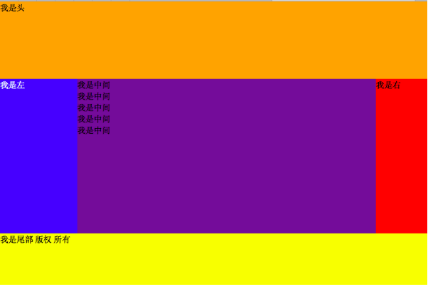
1、双飞翼布局
圣杯:指的是一种常用的网页布局,它可以由现有的技术(无一没有缺点)来实现。所以找到一种最优的实现方法就好像寻找难以捉摸的圣杯一样。
双飞翼布局:是一种灵活的布局,始于淘宝UED。如果把三栏布局比作一只鸟,可以吧main看作鸟的身体,sub和extra则是鸟的翅膀。这个布局的实现思路是,先把最重要的身体部分放好,然后再将翅膀移动到适当的地方。是对圣杯布局的一种改良。
2、代码示例:(理解代码背后布局思想)
 1 <!DOCTYPE html>
 2 <html lang="en">
 3 <head>
 4     <meta charset="UTF-8">
 5     <title>div+css布局</title>
 6     <style type="text/css">
 7         *{
 8             margin: 0;
 9             padding: 0;
10         }
11         div{
12
13         }
14         .header{
15             height: 150px;
16         }
17         .atricle{
18             background-color: green;
19             height: 300px;
20             /*padding-left: 150px;*/
21             /*padding-right: 100px;*/
22             overflow: hidden;
23         }
24         .footer{
25             background-color: yellow;
26             height:100px;
27         }
28         .atricle .left{
29             background-color: blue;
30             float: left;
31              150px;
32             height: 22px;
33             color: white;
34             margin-left: -100%;
35             margin-bottom: 999px;
36             padding-bottom: 999px;
37             /*position: relative;*/
38             /*left: -150px;*/
39         }
40         .atricle .right{
41             background-color: red;
42             float: left;
43              100px;
44             /*height: 22px;*/
45             margin-bottom: 999px;
46             padding-bottom: 999px;
47             margin-left: -100px;
48             /*position:relative;*/
49             /*right: -100px;*/
50         }
51         .atricle .middle{
52             background-color: rebeccapurple;
53             float: left;
54              100%;
55             margin-bottom: 999px;
56             padding-bottom: 999px;
57         }
58         .inner{
59             margin-left:150px ;
60             margin-right: 100px;
61         }
62     </style>
63 </head>
64 <body>
65     <div class="header">
66         我是头
67     </div>
68     <div class="atricle">
69         <div class="middle">
70             <div class="inner">
71                 我是中间
72                 <p>我是中间</p><p>我是中间</p><p>我是中间</p><p>我是中间</p>
73             </div>
74         </div>
75         <div class="left">
76             我是左
77         </div>
78         <div class="right">
79             我是右
80         </div>
81     </div>
82     <div class="footer">
83         我是尾部 版权 所有
84     </div>
85 </body>
86 </html>
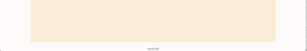
显示效果:
 十二、HTML与CSS简单页面效果实例
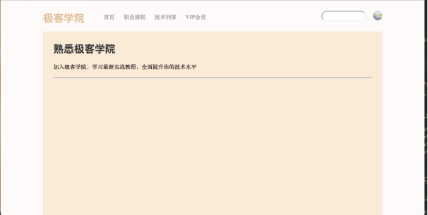
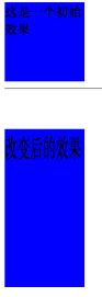
 1 <!DOCTYPE html>
 2 <html lang="en">
 3 <head>
 4     <meta charset="UTF-8">
 5     <title>极客学院</title>
 6     <link href="style.css" type="text/css" rel="stylesheet">
 7 </head>
 8 <body>
 9     <div class="container">
10         <div class="wrapper">
11             <div class="heading">
12                 <div class="heading_nav">
13                     <div class="heading_title">
14                         极客学院
15                     </div>
16                     <div class="heading_navbar">
17                         <ul>
18                             <li><a href="#">首页</a></li>
19                             <li><a href="#">职业课程</a></li>
20                             <li><a href="#">技术问答</a></li>
21                             <li><a href="#">VIP会员</a></li>
22                         </ul>
23                     </div>
24                     <div class="heading_img">
25                         <img src="1.jpg">
26                     </div>
27                     <div class="heading_soptlight">
28                         <form>
29                             <input type="text">
30                         </form>
31                     </div>
32                 </div>
33             </div>
34             <div class="body">
35                 <div class="body_title">
36                     <h3>熟悉极客学院</h3>
37                     <p>加入极客学院,学习最新实战教程,全面提升你的技术水平</p>
38                 </div>
39                 <hr/>
40                 <hr/>
41             </div>
42         </div>
43         <div class="footing">
44             @极客学院
45         </div>
46     </div>
47 </body>
48 </html>
 1 /*style.css*/
 2 *{
 3     margin: 0px;
 4     padding: 0px;
 5 }
 6 body{
 7
 8 }
 9 .wrapper{
10     width: 80%;
11     height: 1000px;
12     background-color: antiquewhite;
13     margin: 0px auto;
14 }
15 .heading{
16     width: 100%;
17     height: 90px;
18     background-color: snow;
19     margin: 0px auto ;
20 }
21 .heading_nav{
22     padding-bottom: 30px;
23     padding-top: 30px;
24     width: 100%;
25     height: 30px;
26     position: relative;
27 }
28 .heading_title{
29     float: left;
30     font-family: Arial,Helvetica,sans-serif ;
31     font-size: 30px;
32     color:burlywood;
33 }
34 ul{
35     margin-left:40px ;
36     float: left;
37     list-style-type: none ;
38     padding-top: 6px ;
39     padding-bottom: 6px;
40 }
41 li{
42     padding-left: 10px;
43     display: inline;
44 }
45 a:link,a:visited{
46     font-weight: bold;
47     color: darkgrey;
48     text-align: center;
49     padding: 6px;
50     text-decoration: none;
51 }
52 a:hover,a:active{
53     color: dimgray;
54 }
55 .heading_img img{
56     border-radius: 30px;
57     display: inline;
58     width: 26px;
59     height: 26px;
60     box-shadow: 0 1px 1px rgba(0,0,0,2);
61     float: right;
62 }
63 .heading_soptlight form{
64     float: right;
65     width: 100px;
66     height: 26px;
67     position: relative;
68     margin-right: 50px;
69 }
70 form input{
71     height: 26px;
72     border-radius: 30px;
73 }
74 .body{
75     padding: 30px;
76     height: auto;
77     width: auto;
78 }
79 .body_title h3{
80     font-size: 30px;
81     font-family: Arial,Helvetica,sans-serif;
82     color: #333333;
83 }
84 .body_title p{
85     margin-top: 20px;
86     margin-bottom: 20px;
87 }
88 .footing{
89     padding-top: 20px;
90     text-align: center;
91     font-size: 10px;
92     color: darkgrey;
93 }
显示效果: