毫无疑问,解决一个问题最重要的是恰当选取特征、甚至创造特征的能力,这叫做特征选取和特征工程。对于特征选取工作,我个人认为分为两个方面:
1)利用python中已有的算法进行特征选取。
2)人为分析各个变量特征与目标值之间的关系,包括利用图表等比较直观的手段方法,剔除无意义或者说不重要的特征变量,使得模型更加精炼高效。
一、scikit-learn中树算法
from sklearn import metrics
from sklearn.ensemble import ExtraTreesClassifier
model = ExtraTreesClassifier()
model.fit(X, y)
# display the relative importance of each attribute
print(model.feature_importances_)
二、RFE搜索算法
另一种算法是基于对特征子集的高效搜索,从而找到最好的子集,意味着演化了的模型在这个子集上有最好的质量。递归特征消除算法(RFE)是这些搜索算法的其中之一,Scikit-Learn库同样也有提供。
from sklearn.feature_selection import RFE
from sklearn.linear_model import LogisticRegression
model = LogisticRegression()
# create the RFE model and select 3 attributes
rfe = RFE(model, 3)
rfe = rfe.fit(X, y)
# summarize the selection of the attributes
print(rfe.support_)
print(rfe.ranking_)
三、利用LassoCV进行特征选择
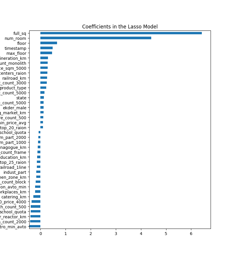
#!/usr/bin/python

import pandas as pd
import numpy as np
import csv as csv
import matplotlib
import matplotlib.pyplot as plt
from sklearn.linear_model import Ridge, RidgeCV, ElasticNet, LassoCV, LassoLarsCV
from sklearn.model_selection import cross_val_score


train = pd.read_csv('train.csv', header=0)        # Load the train file into a dataframe
df = pd.get_dummies(train.iloc[:,1:-1])
df = df.fillna(df.mean())

X_train = df
y = train.price


def rmse_cv(model):
    rmse= np.sqrt(-cross_val_score(model, X_train, y, scoring="neg_mean_squared_error", cv = 3))
    return(rmse)

#调用LassoCV函数,并进行交叉验证,默认cv=3
model_lasso = LassoCV(alphas = [0.1,1,0.001, 0.0005]).fit(X_train, y)

#模型所选择的最优正则化参数alpha
print(model_lasso.alpha_)

#各特征列的参数值或者说权重参数,为0代表该特征被模型剔除了
print(model_lasso.coef_)

#输出看模型最终选择了几个特征向量,剔除了几个特征向量
coef = pd.Series(model_lasso.coef_, index = X_train.columns)
print("Lasso picked " + str(sum(coef != 0)) + " variables and eliminated the other " +  str(sum(coef == 0)) + " variables")

#输出所选择的最优正则化参数情况下的残差平均值,因为是3折,所以看平均值
print(rmse_cv(model_lasso).mean())


#画出特征变量的重要程度,这里面选出前3个重要,后3个不重要的举例
imp_coef = pd.concat([coef.sort_values().head(3),
                     coef.sort_values().tail(3)])

matplotlib.rcParams['figure.figsize'] = (8.0, 10.0)
imp_coef.plot(kind = "barh")
plt.title("Coefficients in the Lasso Model")
plt.show()
从上述代码中可以看出,权重为0的特征就是被剔除的特征,从而进行了特征选择。还可以从图上直观看出哪些特征最重要。至于权重为负数的特征,还需要进一步分析研究。
四、利用图表分析特征以及特征间的关系
1)分析特征值的分布情况,如果有异常最大、最小值,可以进行极值的截断
plt.figure(figsize=(8,6))
plt.scatter(range(train.shape[0]), np.sort(train.price_doc.values))
plt.xlabel('index', fontsize=12)
plt.ylabel('price', fontsize=12)
plt.show()
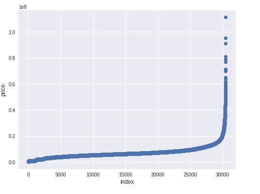
从图中可以看出,目标值price_doc有一些异常极大值散列出来,个别异常极值会干扰模型的拟合。所以,可以截断极值。其它各特征列也可以采取该方式进行极值截断。
#截断极值,因为极值有时候可以认为是异常数值,会干扰模型的参数
ulimit = np.percentile(train.price_doc.values, 99)
llimit = np.percentile(train.price_doc.values, 1)

train['price_doc'].ix[train['price_doc']>ulimit] = ulimit
train['price_doc'].ix[train['price_doc']<llimit] = llimit
2)分组进行分析
grouped_df = df.groupby('LotFrontage')['MSSubClass'].aggregate(np.mean).reset_index() #根据LotFrontage进行分组聚合,并求出分组聚合后MSSubClass的平均值,reset_index()将分组后的结果转换成DataFrame形式

plt.figure(figsize=(12,8))
sns.barplot(grouped_df.LotFrontage.values, grouped_df.MSSubClass.values, alpha=0.9, color='red')
plt.ylabel('MSSubClass', fontsize=12)
plt.xlabel('LotFrontage', fontsize=12)
plt.xticks(rotation='vertical')
plt.show()
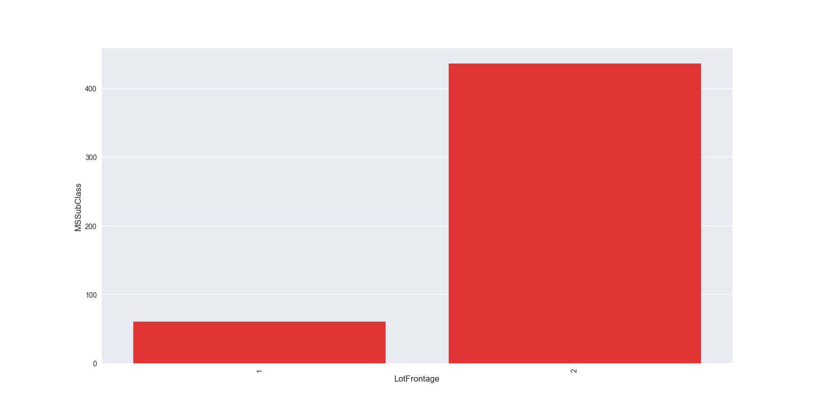
这种可以分析出目标值的一个变化情况,比如房屋价格的话,可以根据年进行分组聚合,展示出每年房屋价格均值的一个变化情况,从而能够看出时间对房屋价格的一个大致影响。比如,北京房屋价格随着时间的推进,每年都在上涨,这说明时间是一个很重要的特征变量。
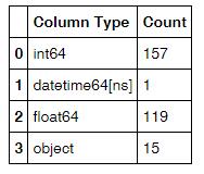
3)统计数据集中各种数据类型出现的次数
#打出df各列数据类型,并利用rest_index()转成DataFrame形式。一共两列,1-列名,2-类型
df_type = df.dtypes.reset_index()

#将两列更改列名
df_type.columns = ["Count", "Column Type"]

#分组统计各个类型列出现的次数
df_type=df_type.groupby("Column Type").aggregate('count').reset_index()
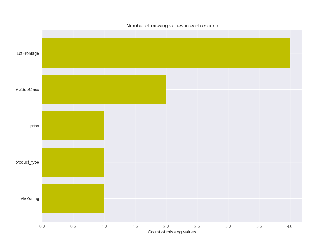
4)图的形式展示缺失值情况
#将各列的缺失值情况统计出来,一共2列,1-列名,2-缺失值数量
missing_df = df.isnull().sum(axis=0).reset_index()
#赋予新列名
missing_df.columns = ['column_name', 'missing_count']
#将缺失值数量>0的列筛选出来
missing_df = missing_df.ix[missing_df['missing_count']>0]
#排序
missing_df = missing_df.sort_values(by='missing_count', ascending=True)
#将缺失值以图形形式展示出来
ind = np.arange(missing_df.shape[0])
width = 0.9
fig, ax = plt.subplots(figsize=(12,18))
rects = ax.barh(ind, missing_df.missing_count.values, color='y')
ax.set_yticks(ind)
ax.set_yticklabels(missing_df.column_name.values, rotation='horizontal')
ax.set_xlabel("Count of missing values")
ax.set_title("Number of missing values in each column")
plt.show()
5)利用联合分布图分析各重要特征变量与目标值的影响关系
#先对该特征进行极值截断
col = "full_sq"
ulimit = np.percentile(train_df[col].values, 99.5)
llimit = np.percentile(train_df[col].values, 0.5)
train_df[col].ix[train_df[col]>ulimit] = ulimit
train_df[col].ix[train_df[col]<llimit] = llimit
#画出联合分布图
plt.figure(figsize=(12,12))
sns.jointplot(x=np.log1p(train_df.full_sq.values), y=np.log1p(train_df.price_doc.values), size=10)
plt.ylabel('Log of Price', fontsize=12)
plt.xlabel('Log of Total area in square metre', fontsize=12)
plt.show()
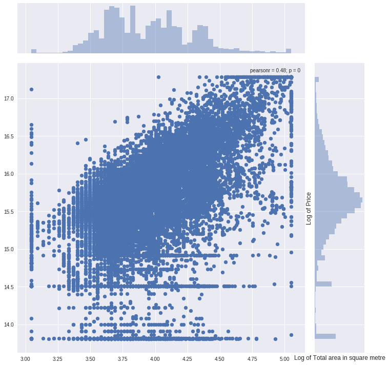
pearsonr表示两个变量的相关性系数。
6)pointplot画出变量间的关系
grouped_df = train_df.groupby('floor')['price_doc'].aggregate(np.median).reset_index()
plt.figure(figsize=(12,8))
sns.pointplot(grouped_df.floor.values, grouped_df.price_doc.values, alpha=0.8, color=color[2])
plt.ylabel('Median Price', fontsize=12)
plt.xlabel('Floor number', fontsize=12)
plt.xticks(rotation='vertical')
plt.show()
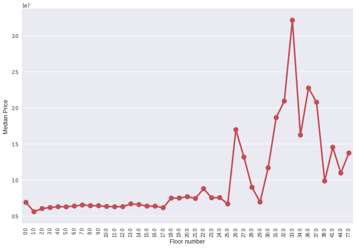
从中看出楼层数对价格的一个整体影响。
7)countplot展示出该特征值的数量分布情况
plt.figure(figsize=(12,8))
sns.countplot(x="price", data=df)
plt.ylabel('Count', fontsize=12)
plt.xlabel('Max floor number', fontsize=12)
plt.xticks(rotation='vertical')
plt.show()
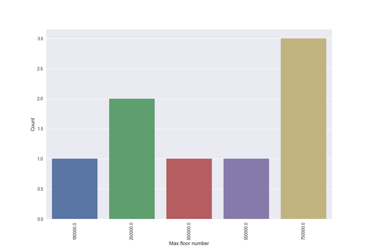
展示出了每个价格的出现次数。
8)boxplot分析最高楼层对房屋价格的一个影响,尤其看中位价格的走势,是一个大致的判断。
plt.figure(figsize=(12,8))
sns.boxplot(x="max_floor", y="price_doc", data=train_df)
plt.ylabel('Median Price', fontsize=12)
plt.xlabel('Max Floor number', fontsize=12)
plt.xticks(rotation='vertical')
plt.show()
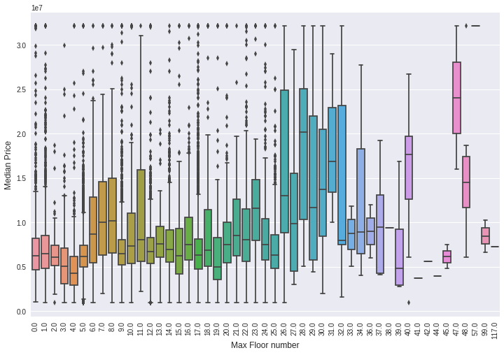
最高楼层下可以有很多房屋的价格数据,这样每一个最高楼层数正好对应一组价格数据,可以画出一个箱式图来观察。