- 布局出该效果
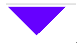
提示:使用DIV的border样式,调整边框粗细出现该效果,保留上边框,其它三个方向的边框需设置:border-left:100px solid transparent;来透明掉。
做法: <style type="text/css">
#ww{0px; height:0px; border-top:100px solid #006; border-right:100px solid transparent; border-bottom:100px solid transparent; border-left:100px solid transparent;}
</style>
</head>
<body>
<div id="ww"></div>
</body>
2.布局出该效果
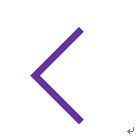
提示:DIV旋转使用的样式:transform:rotate(45deg);旋转45度
做法:<style type="text/css">
#aa{ 200px; height:200px; border:5px solid #009;transform:rotate(45deg); border-top:0px; border-right:0px}
</style>
</head>
<body>
<div id="aa"></div>
</body>
3.
<style type="text/css">
*{ margin:0px auto; padding:0px; font-family:微软雅黑; font-size:14px;}
#content{margin:20px 0px 0px 300px;350px; height:100px; border:2px solid #60F; overflow:hidden; padding:10px 10px 10px 10px}
#waiceng{100px; height:50px;margin-left:320px; overflow:hidden; margin-top:-2px}
#sanjiao{50px; height:50px; border:2px solid #60F;transform:rotate(45deg); position:relative;top:-27px; border-left:0px; border-top:0px; background-color:white;}
</style>
<div id="content">
CSS3中添加的transform是对元素进行变化操作的,包括位移,旋转,放大,变形等操作。这里我的代码均是采用标准的css3规范书写,大家使用的时候为了兼容可加上-webkit-、-o-、-ms-、-moz-、-khtml-等前缀以适应不同的浏览器。
</div>
<div id="waiceng">
<div id="sanjiao"></div>
</div>
效果图: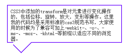
4.
- 布局出该效果

鼠标放上:
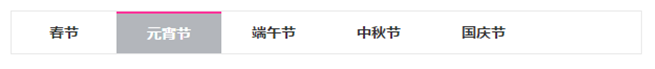
要求:鼠标放上的过程中文字位置不移动。
提示:字体微软雅黑,文字颜色#333,外边框颜色#e9e9e9,鼠标放上背景色#b3b6bb,鼠标放上边框颜色#F39
做法:<style type="text/css">
*{ font-family:微软雅黑; color:#333; font-weight:bold}
#aa{750px; height:50px; border:1px solid #CCC }
.qq{ 150px; height:50px; float:left; text-align:center; vertical-align:middle; line-height:50px }
.qq:hover{ background-color:#b3b6bb; cursor: pointer; color: #FFF; border-top:2px solid #FF0000; height:48px; line-height:48px }
</style>
</head>
<body>
<div id="aa">
<div class="qq">春节</div>
<div class="qq">元宵节</div>
<div class="qq">端午节</div>
<div class="qq">中秋节</div>
<div class="qq">国庆节</div>
</div>
</body>
5.括号内可以写加或减,要使等式成立,括号里面应该填什么值。
123()45()56()78 ()90 = 100
提示:使用for循环嵌套,+1可代表加号(正1乘以一个数是整数),-1可代表减号(负1乘以一个数是负数,负数在加法运算中相当于减)
做法:
<script type="text/javascript">
var s="";
for(var i=-1;i<2;i=i+2)
{
for(var a=-1;a<2;a=a+2)
{
for(var b=-1;b<2;b=b+2)
{
for(var c=-1;c<2;c=c+2)
{
var leftzhi=123+i*45+a*56+b*78+c*90;
if(leftzhi==100)
{
s="("+i+")("+a+")("+b+")("+c+")";
}
}
}
}
} alert(s);
</script>