本文转自:https://confluence.atlassian.com/doc/jira-chart-macro-427623467.html
Add the Jira Charts macro to a page to build visual graphs and charts from information in Jira.
This is great for:
- team meetings and retrospectives
- project status updates
- sharing updates with people in your organization who don't use Jira regularly.
The macro can display issues from any connected Jira Server, Data Center, or Cloud application, including Jira Software and Jira Service Management.
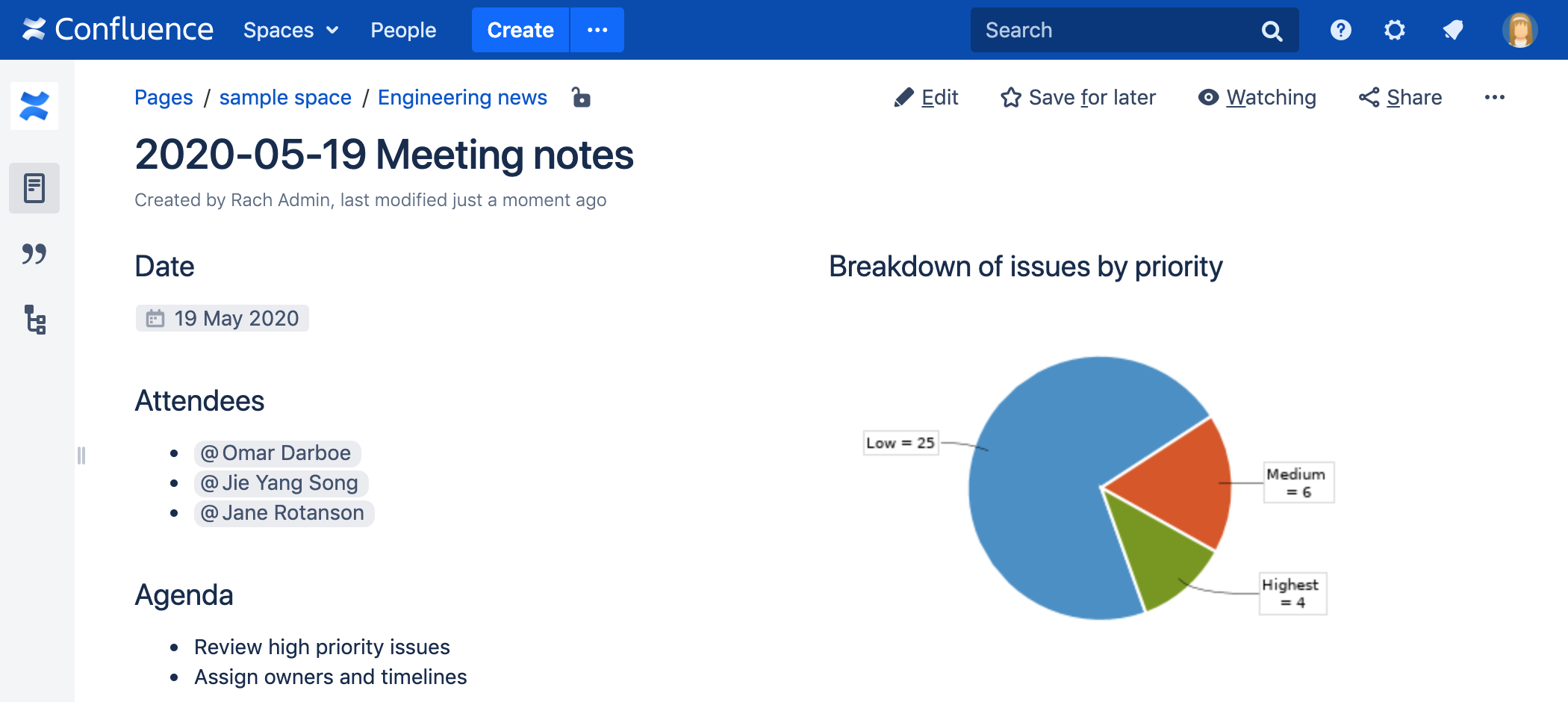
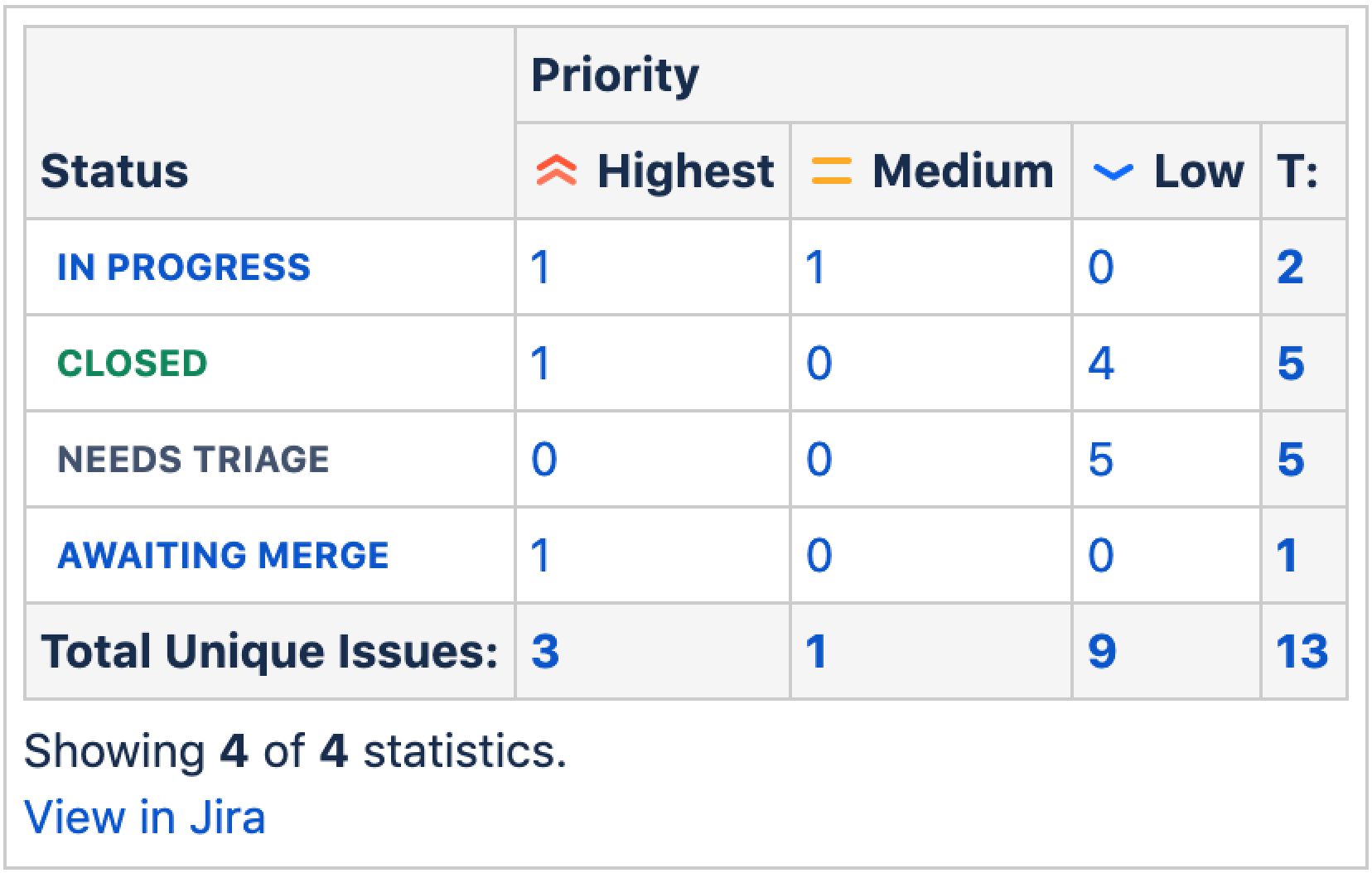
Screenshot: Meeting notes page with a Jira Chart macro showing a breakdown of all issues for a software version, by priority.
Connect Confluence and Jira
Before you can use this macro, your Confluence and Jira applications must be connected via Application Links. People viewing the page will see charts for publicly accessible issues. If your Jira application has restricted viewing (that is, people need permission to view issues) then they'll need to authenticate before seeing the charts. This macro is compatible with Jira 5.x and later.
See Use Jira applications and Confluence together for more information.
Add this macro to your page
To add the Jira Chart macro to a page:
-
From the editor toolbar, choose Insert
 > Other Macros.
 - Choose Jira Chart from the Development category.
- Choose the type of report you want to create (for example Pie, Created vs Resolved)
-
Select your Jira server.
If you have multiple Jira servers linked to Confluence the drop down will default to the primary application link. - Search for issues - you can enter the query in JQL or paste a Jira URL directly into the search field.
- Choose Preview to generate the chart.
- Choose Display Options to further control how your chart appears.
- Choose Insert.
You can then publish your page to see the macro in action.
To find out more about searching for issues see Displaying issues using JIRA Query Language (JQL).
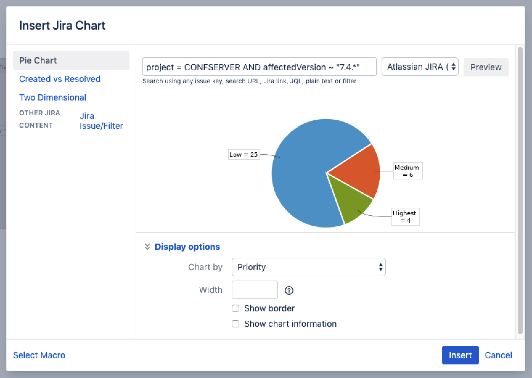
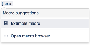
Screenshot: Configuring the Jira Chart Macro in the macro browser.
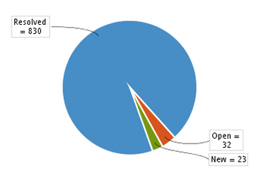
Pie chart
Pie charts can be used to report on issue status, priority, assignee and more.
To further control how this chart appears on your page. Choose Display options:
- Chart by - select the field you want to segment the pie chart by such as:
- Status
- Fix version
- Assignee name
- Priority
- Component
- Issue type
- Width - define the total width of the chart area. You can enter values in pixels, percent or leave blank to auto fit.
- Show border - add a border around the chart area.
- Show chart information - include a text summary under the chart with the total issues count and chart by value.
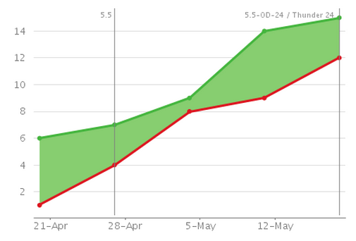
Created vs Resolved chart
Created vs Resolved charts can be used to show the difference between the number of issues created versus the number of issues resolved over time.
To further control how this chart appears on your page choose Display options:
- Period - choose a time frame to report by (week, month, quarter etc).
- Days previously - the total number of days to report on (counting back from today).
- Cumulative totals - choose to progressively add totals or report individual values for each period.
- Show unresolved trend - add a subplot showing unresolved issues over time.
- Show versions - indicate version release dates as a vertical line on the chart.
- Width - define the total width of the chart area. Enter values in pixels, percent or leave blank to auto fit.
- Show border - add a border around the chart area
- Show chart information - include a text summary under the chart with the total issues count and chart by value.
Two Dimensional Chart
Two Dimensional Charts can be used to show issue statistics in a matrix. You can configure the X and Y axes to display these issue fields:
- Status
- Priority
- Assignee
- Fix version
- Component
- Issue type.
For example you could use the chart to show issue types by status (as shown above).
To configure the chart axes choose Display options:
- X Axis - the issue field to display on the X axis (columns).
- Y Axis - the issue field to display on the Y axis (rows).
- Rows to display - the maximum number to display in the chart.
Disable the Jira Chart macro
The functionality is provided by a system app (plugin) called 'Jira Macros'. This is also used for the Jira Issues macro. To make the macro unavailable on your site, you can disable the app. See Disabling and enabling apps.
Notes
HTTPS: The Jira Chart macro can access a Jira site running under SSL provided the Confluence server is configured to accept the Jira SSL certificate. See Connecting to LDAP or Jira applications or Other Services via SSL.
Authentication: If the query includes issues that require authentication (issues that are not visible to anonymous users in Jira), users will be prompted to authenticate to view charts on the Confluence page.
In order to search for issues in the macro browser you will need to authenticate.
Other ways to add this macro
Add this macro as you type
Add this macro using wiki markup
You can't use wiki markup to add this macro.