虽然项目赶工还是挺忙的,但闲了总要找点乐子嘛,毕竟秃顶和猝死两座大山夹逼着编程员们。
好吧,其实是无聊起来我自己都怕,于是就做了点小玩意。
.heart {
	position: relative;
	transform: rotate(45deg);
	 3em;
	height: 3em;
	background: red;
	margin: 50px auto;
}
.heart:before, .heart:after {
	content: "";
	position: absolute;
	top: 0;
	left: 0;
	right: 0;
	bottom: 0;
	background: red;
      border-radius: 100%;
}
.heart:before {transform: translate(-50%,0);}
.heart:after {transform: translate(0,-50%);}
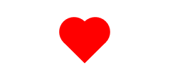
画个桃心送给女朋友(没错,我没法让她变成空心的,要空心的话那就去玩玩 Font Awesome 什么的吧)
.warning {
    position: relative;
     0;
    height: 0;
    font-size: 2rem;
    border-left: 1em solid transparent;
    border-right: 1em solid transparent;
    border-bottom: 2em solid #e67e22;
    text-align: center;
    line-height: 2em;
}
.warning:after {
    content: "!";
    font-size: 2em;
    color: #fff;
    position: absolute;
    transform: translate(-50%,0);
}
警告,你的污力已超标(改掉 .warning 的 font-size 就能改整体大小咯)

.chooseButton {
	position: relative;
	font-size: 1rem;
	 4em;
	height: 2em;
	display: inline-block;
	background: lightblue;
	border: 1px solid #ccc;
	border-radius: 1000px;
	transition: .3s;
}
.chooseButton:after {
	content: "";
	position: absolute;
	top: 0;
	left: 0;
	 50%;
	height: 100%;
	border-radius: 100%;
	background: #fff;
	transition: .3s;
}
.chooseButton:focus {
	background: pink;
}
.chooseButton:focus:after {
	left: 50%;
}
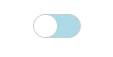
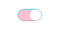
这个倒是挺简单的,到时候把 :focus 换成类然后与事件绑定,是个不错的表单
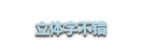
.word {
	color: lightblue;
	text-shadow: 0 1px 0 #999, 0 2px 0 #888, 0 3px 0 #777, 0 4px 0 #666, 0 5px 0 #555, 0 4px 8px #000;
}
好吧好吧,先放这些吧,以后再来一波...