一、ColorUI
解压
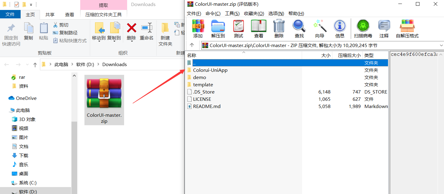
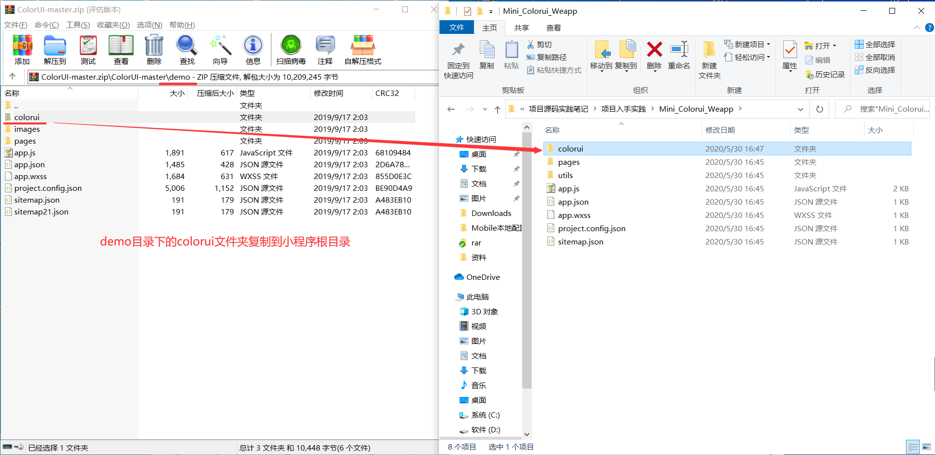
1、使用方式 新建小程序,并将demo目录的colorui文件夹复制到小程序根目录
具体
使用,在index.wxml中直接使用。(没有官方文档,你只能边对照colorui案例,边做。)
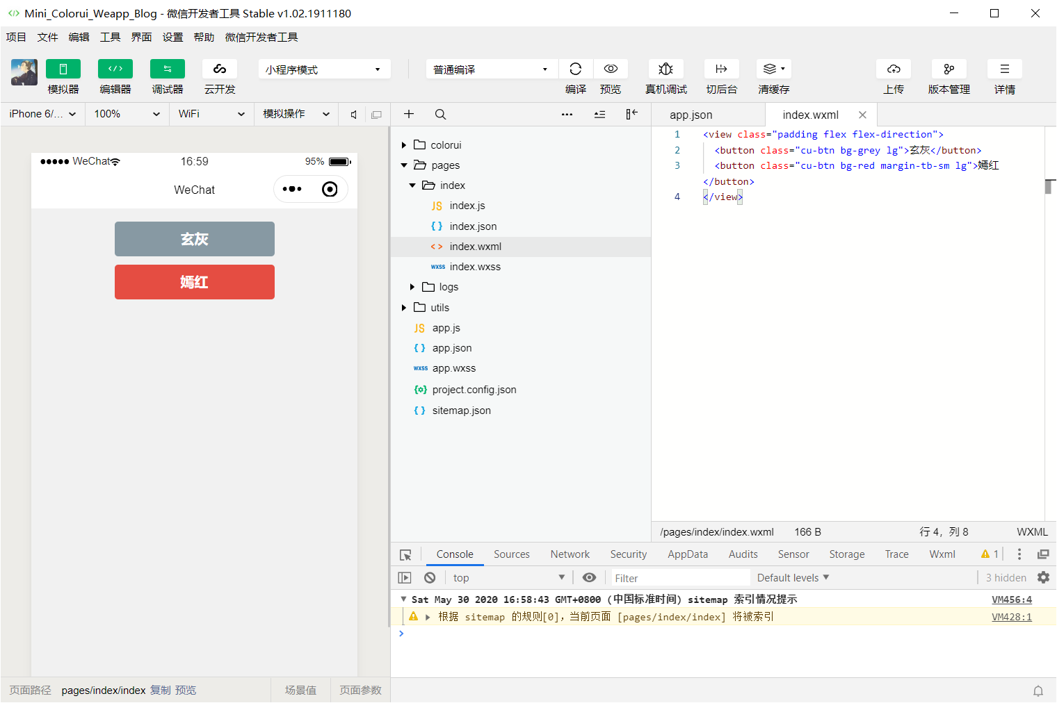
index.wxml
<view class="padding flex flex-direction">
  <button class="cu-btn bg-grey lg">玄灰</button>
  <button class="cu-btn bg-red margin-tb-sm lg">嫣红</button>
</view>
效果如下
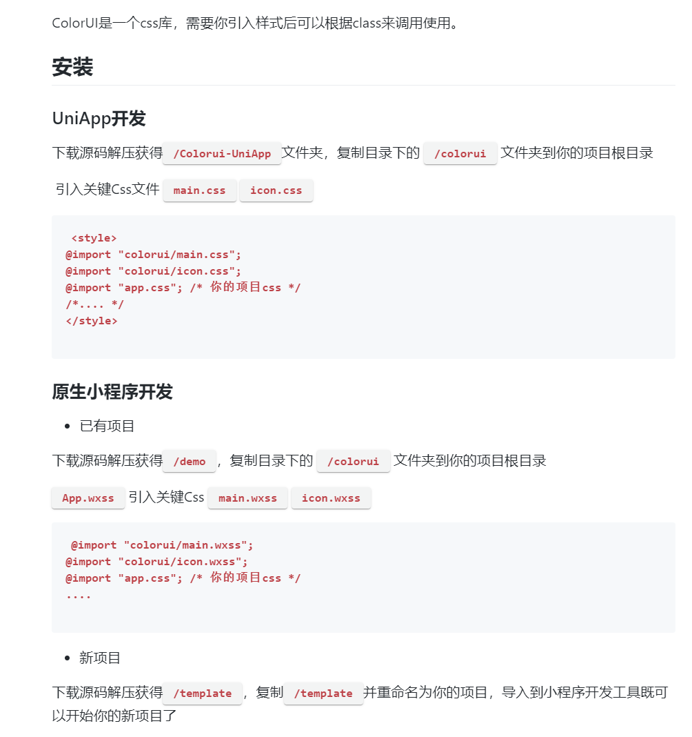
2、使用方式 (ColorUI是一个Css类的UI组件库!不是一个Js框架。相比于同类小程序组件库,ColorUI更注重于视觉交互!)
将里面的两个文件icon.wxss和main.wxss复制到你的项目下
之后再在app.wxss里面写入:
@import "icon.wxss";
@import "main.wxss";
二、使用样例
代码
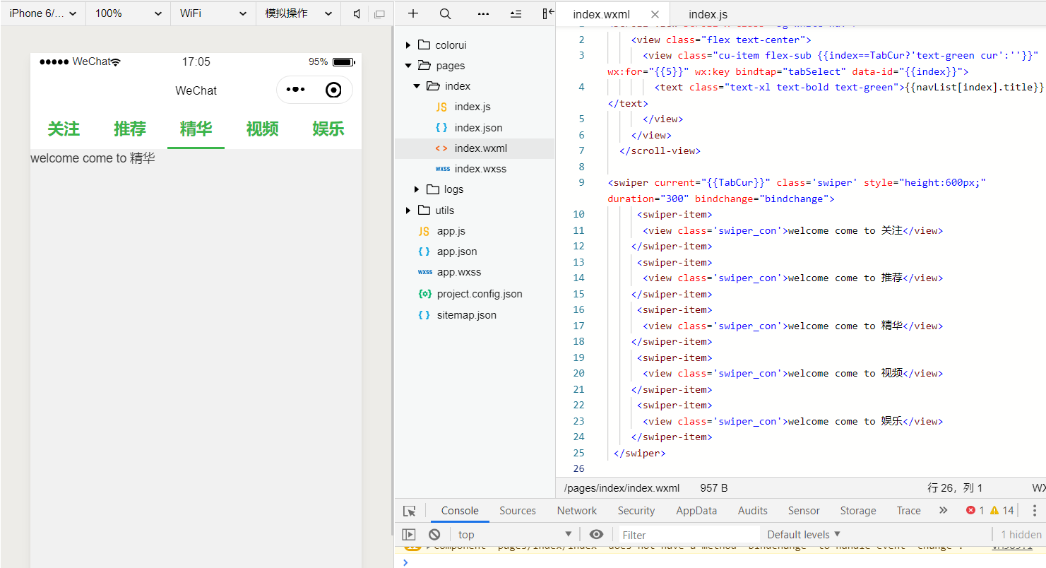
<scroll-view scroll-x class="bg-white nav">
    <view class="flex text-center">
      <view class="cu-item flex-sub {{index==TabCur?'text-green cur':''}}" wx:for="{{5}}" wx:key bindtap="tabSelect" data-id="{{index}}">
        <text class="text-xl text-bold text-green">{{navList[index].title}}</text>
      </view>
    </view>
  </scroll-view>

<swiper current="{{TabCur}}" class='swiper' style="height:600px;" duration="300" bindchange="bindchange">
     <swiper-item>
      <view class='swiper_con'>welcome come to 关注</view>
    </swiper-item>
     <swiper-item>
      <view class='swiper_con'>welcome come to 推荐</view>
    </swiper-item>
     <swiper-item>
      <view class='swiper_con'>welcome come to 精华</view>
    </swiper-item>
     <swiper-item>
      <view class='swiper_con'>welcome come to 视频</view>
    </swiper-item>
     <swiper-item>
      <view class='swiper_con'>welcome come to 娱乐</view>
    </swiper-item>
 </swiper>
如下js
Page({
  data: {
    TabCur: 0,
    scrollLeft: 0,
    navList: [{
      index: 0,
      title: "关注"
    }, {
      index: 1,
      title: "推荐"
    }, {
      index: 2,
      title: "精华"
    }, {
      index: 3,
      title: "视频"
    }, {
      index: 4,
      title: "娱乐"
    }]
  },
  tabSelect(e) {
    this.setData({
      TabCur: e.currentTarget.dataset.id,
      scrollLeft: (e.currentTarget.dataset.id - 1) * 60
    })
  }
})
三、使用正确的姿势
demo 文件 直接导入运行即可

预览效果
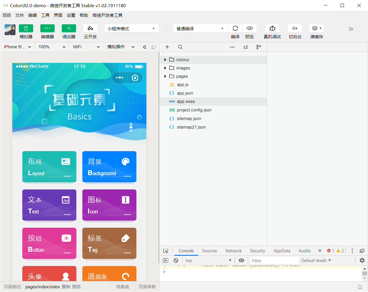
需要用的时候,直接复制即可。