在10/22之前补充的很多细微的知识点,导致文章过长,所以准备把第一节分成上下两节
fill 填色
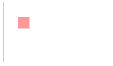
<rect x="290" y="50" width="100" height="100" stroke="#000" stroke-width="10" fill="#09f"></rect>
渐变
属性
- offset 颜色位置
- stop-color 颜色
- stop-opacity 颜色透明度
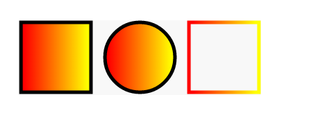
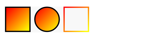
左到右
<defs>
   <linearGradient id="a1">
     <stop offset="5%" stop-color="#F00" />
     <stop offset="95%" stop-color="#ff0" />
   </linearGradient>
</defs>
<rect x="50" y="250" width="100" height="100" stroke="#000" stroke-width="5" fill="url(#a1)"></rect>
<circle cx="220" cy="300" r="50" stroke="#000" stroke-width="5" fill="url(#a1)"></circle>
<rect x="290" y="250" width="100" height="100" stroke="url(#a1)" stroke-width="5" fill="none"></rect>
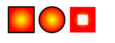
放射状
<defs>
   <radialGradient id="a1">
     <stop offset="5%" stop-color="#ff0" />
     <stop offset="95%" stop-color="#f00" />
   </radialGradient>
</defs>
线性渐变
使用linearGradient 标签
梯度矢量有属性来定义x1,y1 ,x2,y2
(x1,y1) 设置起点的坐标
(x2,y2) 设置 终点的坐标
如果不指定就是从左到右
写了一个简易版工具
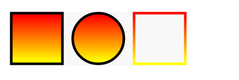
垂直渐变
<defs>
   <linearGradient id="a1" x1="0%" y1="0%" x2="0%" y2="100%">
     <stop offset="5%" stop-color="#F00" />
     <stop offset="95%" stop-color="#ff0" />
   </linearGradient>
</defs>
倾斜渐变
<defs>
   <linearGradient id="a1" x1="0%" y1="0%" x2="100%" y2="100%">
     <stop offset="5%" stop-color="#F00" />
     <stop offset="95%" stop-color="#ff0" />
   </linearGradient>
</defs>
修改中心点的渐变
<defs>
   <radialGradient id="a1" cx="20%" cy="40%">
     <stop offset="5%" stop-color="#ff0" />
     <stop offset="95%" stop-color="#f00" />
   </radialGradient>
</defs>

径向渐变
有点类似于圆的属性设置渐变参数:
cx,cy 设置中心,半径由属性设置
fx,fy 移动渐变的中心啦
gradientUnits
objectBoundingBox 应用渐变的对象计算坐标默认值
userSpaceOnuse 相对于整个SVG元素的坐标系计算坐标(径向渐变更明显)
gradientTransform 移动位置(可以设置 rotate,scale,)
- objectBoundingBox 用百分比
rotate(112,.4,.4) - gradientTransform 用实际数值
rotate(112,112,13)
渐变动画
  <style>
    stop {
      animation: colors 12s infinite;
    }
    .stop-2{
      animation-delay: 3s;
    }
    .stop-3{
      animation-delay: 6s;
    }
    @keyframes colors {
      15% {
        stop-color: crimson;
      }
      30% {
        stop-color: gold;
      }
      45% {
        stop-color: teal;
      }
      60% {
        stop-color: yellowgreen;
      }
      75% {
        stop-color: orangered;
      }
      90% {
        stop-color: purple;
      }
    }
  </style>
<svg viewBox="0 0 600 200">
  <linearGradient id="grad--linear-1">
    <stop offset="0%" stop-color="crimson"
          class="stop-1"/>
    <stop  offset="50%" stop-color="gold"
          class="stop-2"/>
    <stop offset="100%" stop-color="teal"
          class="stop-3"/>
  </linearGradient>

  <rect fill="url(#grad--linear-1)"
        width="100%" height="100%"/>
</svg>
pattern
用于fill
通过x轴或y轴方向以固定间隔平铺,然后通过id引用
属性
- patternUnits = "userSpaceOnUse | objectBoundingBox"
- patternContentUnits = "userSpaceOnUse | objectBoundingBox"
- patternTransform
- x
- y
- width
- height
- xlink:href
- preserveAspectRatio = "[defer] []"
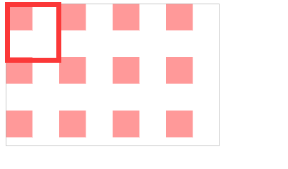
patternUnits=userSpaceOnUse
表示以使用者的坐标为主
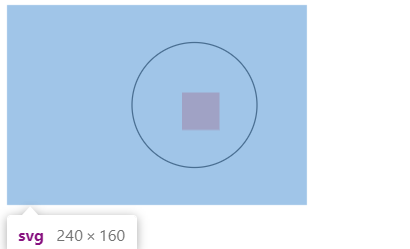
<svg width="240" height="160" >
  <defs>
    <pattern id="p" patternUnits="userSpaceOnUse" width="60" height="60">
      <rect width="30" height="30" fill="#f99" x="0" y="0"/>
    </pattern>
  </defs>
  <rect width="240" height="160" fill="url(#p)" stroke="#aaa" />
</svg>
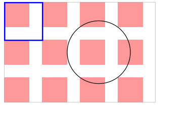
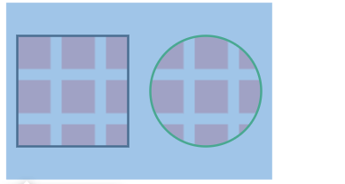
完整版,你可以把每一个注释下,方便自己理解
<svg width="240" height="160" >
  <defs>
    <pattern id="p" patternUnits="userSpaceOnUse" width="60" height="60">
      <rect width="40" height="40" fill="#f99" x="0" y="0"/>
    </pattern>
  </defs>
  <rect width="240" height="160" fill="url(#p)" stroke="#aaa" />
  <circle cx="150" cy="80" r="50" stroke="#000" fill="url(#p)" />
  <rect width="60" height="60" x="1" y="1" stroke="#00f" stroke-width="2" fill="url(#p)" />
</svg>
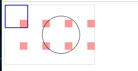
优先级从上到下一次递增的
<defs>
  <pattern id="p" patternUnits="userSpaceOnUse" width="40" height="40">
    <rect width="30" height="30" fill="#f99" x="30" y="0"></rect>
  </pattern>
</defs>
我们会发现当我们把pattern里的rect,位置超过了pattern 的范围,就会发现rect会被裁剪
patternUnits=userSpaceOnUse
设置是以我们画出来的形状为基准, 设置pattern长宽,就变成了比例而不是数值
如果宽高为1,1 那么画出来的就是等于图形长宽
<svg width="240" height="160" >
  <defs>
    <pattern id="p" patternUnits="objectBoundingBox" width="1" height="1">
      <rect width="30" height="30" fill="#f99" x="40" y="40"/>
    </pattern>
  </defs>
  <!-- 长宽比 1:1-->
  <rect width="240" height="160" fill="url(#p)" stroke="#aaa" />
   <!--x=40,y=40,w30h30 fill #f99 填充一个小矩形-->
</svg>
<svg width="240" height="160" >
  <defs>
    <pattern id="p" patternUnits="objectBoundingBox" width="1" height="1">
      <rect width="30" height="30" fill="#f99" x="40" y="40"/>
    </pattern>
  </defs>
  <!-- 长宽比 1:1-->
  <circle cx="150" cy="80" r="50" stroke="#000" fill="url(#p)" />
    <!--
           那么这个元素的起步位置原点应该是 100,30
           由于x=40,y=40
           所以 填充的矩形的其实位置是140,70
    -->
</svg>
<svg width="240" height="160">
  <defs>
    <pattern id="p" patternUnits="objectBoundingBox" width="1" height="1">
      <rect width="30" height="30" fill="#f99" x="0" y="0"/>
    </pattern>
  </defs>
  <!-- 长宽比 1:1-->
  <rect width="100" height="100" stroke-width="2" stroke="red"  fill="url(#p)" x="20" y="20"/>
   <circle r="30" cx="200" cy="80" fill="url(#p)" stroke-width="2" stroke="red"/>
</svg>
如果把width设为.4, height设置为0.4,那么在100*100的图形中,则是40 * 40 的pattern,
如果rect 为 width 30 height 30 则背景图案是带有10的宽度间距的重复图案
<svg width="240" height="160">
  <defs>
    <pattern id="p" patternUnits="objectBoundingBox" width=".4" height=".4">
      <rect width="30" height="30" fill="#f99" x="0" y="0"></rect>
    </pattern>
  </defs>
  <circle cx="180" cy="80" r="50" stroke="#0a0" stroke-width="2" fill="url(#p)" />
  <rect width="100" height="100" x="10" y="30" stroke="#000" stroke-width="2" fill="url(#p)" />
</svg>
不同的矩形的套用,出来的结果不同
<svg width="240" height="160">
  <defs>
    <pattern id="p" patternUnits="objectBoundingBox" width=".4" height=".4">
      <rect width="30" height="30" fill="#f99" x="0" y="0"></rect>
    </pattern>
  </defs>
  <rect width="80" height="80" x="120" y="30" stroke="#000"  stroke-width="2" fill="url(#p)" />
  <rect width="100" height="100" x="10" y="30" stroke="#000" stroke-width="2" fill="url(#p)" />
</svg>
设定为userSpaceOnUse实际的宽度的高度: 比例乘上实际套用的图像的长/宽
当为width/height 80px 80*0.4=32 由于他们每一个宽度是30那么空隙就是2
patternTransform
让我们直接对pattern 下大 transform
倾斜45度
<svg width="240" height="160">
  <defs>
    <pattern id="p1" patternUnits="objectBoundingBox" width=".2" height=".4" patternTransform="rotate(45)">
      <rect width="10" height="50" fill="#000" x="0" y="0"></rect>
      <rect width="10" height="50" fill="#fa0" x="10" y="0"></rect>
    </pattern>
  </defs>

  <rect width="100" height="100" x="10" y="30" stroke="#000" stroke-width="2" fill="url(#p1)" />
</svg>
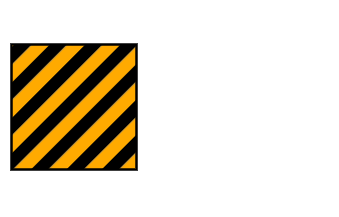
要记得的点在于userSpaceOnUse 就是标准的长度数值,objectBoundingBox 就是比例
xlink:href
二次引入
<defs>
  <pattern id="r1">
    <rect width="20" height="20" fill="#0c0" x="0" y="0"></rect>
  </pattern>
  <pattern id="p1" patternUnits="objectBoundingBox" width=".4" height=".4" xlink:href="#r1" />
  <pattern id="p2" patternUnits="objectBoundingBox" width=".25" height=".25" xlink:href="#r1" />
</defs>

<rect width="100" height="100" x="10" y="30" stroke="#000" stroke-width="2" fill="url(#p1)" />
<rect width="100" height="100" x="120" y="30" stroke="#000" stroke-width="2" fill="url(#p2)" />
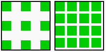
如果是描边的话就是用stroke="url(#pattern)"
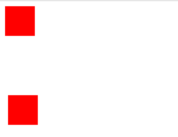
defs
把一些重复利用的物体放在defs元素内
再use 把元素呈现出来
use 的属性有 x,y 的坐标
<svg width="500px" height="500px" >
<defs>
  <rect id="ccc" width="100" height="100" x="10" y="10" fill="red"/>
</defs>
<use xlink:href="#ccc"/>
<use xlink:href="#ccc" x="10" y="300"/>
</svg>