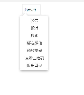
• 50.给前面的一个hover菜单加了一个小动画


    HTML

    <div class="pop-con">
        hover
        <ul class="pop">
            <li><a href="#">公告</a></li>
            <li><a href="#">投诉</a></li>
            <li><a href="#">搜索</a></li>
            <li><a href="#">绑定微信</a></li>
            <li><a href="#">修改密码</a></li>
            <li><a href="#">查看二维码</a></li>
            <li><a href="#">退出登录</a></li>
           </ul>
    </div>

    css

    <style type="text/css">
                a{
                    text-decoration: none;
                }
                li{
                    list-style: none;
                }
                .pop-con{
                    position: relative;
                    width: 50px;
                    height: 20px;
                    margin: 0 auto;
                    border: 1px solid #eee;
                    padding: 10px;
                }
                @keyframes elastic-grow{
                    from{transform: scale(0);}
                    70% {
                         transform: scale(1.05);
                         animation-timing-function:
                         cubic-bezier(.1,.25,1,.25); /* 反向的ease */
                     }
                     100% {
                         transform: scale(1);
                         animation-timing-function:
                         cubic-bezier(.1,.25,1,.25); /* 反向的ease */
                     }
                }
                .pop-con:not(:hover)>.pop{
                    transform: scale(0);
                    transition: .25s;
                    transition: .2s;
                    transition: .5s cubic-bezier(.25,.1,.3,1.5)
                    animation-fill-mode: forwards;
                }
                .pop-con:hover>.pop{
                    /*visibility: visible;*/
                    animation: elastic-grow .5s;
                    animation-fill-mode: forwards;
                }
                .pop{
                    /*visibility: hidden;*/
                    position: absolute;
                    padding-left: 0;
                    background: white;
                    width: 110px;
                    top: 0;
                    left: -10px;
                    margin-top: 44px;
                    filter: drop-shadow(0px 3px 5px rgba(0,0,0,.32));
                    border-radius: 4px;
                    padding-top: 0.25rem;
                    padding-bottom: 0.25rem;
                    transform: scale(0);
                    transform-origin: 1.4em -.4em;
                    animation-fill-mode: forwards;
                    /*transition: .2s;
                    transition: .5s cubic-bezier(.25,.1,.3,1.5);
                    */
                }
                .pop::before{
                    content: '';
                    height: 0;
                    width: 0;
                    border: 10px solid transparent;
                    border-color: transparent transparent white transparent;/*这是个三角形*/
                    position: absolute;
                    top: -20px;
                    left: 10px;
                    
                }
                .pop li{
                    color: #333;
                    text-align: center;
                    padding-left: 0.25rem;
                    height: 30px;
                    line-height: 30px;
                    
                }
                .pop li>a{
                    display: inline-block;
                    height: 32px;
                    line-height: 30px;
                    font-size: 15px;
                    width: 100%;
                    color: #333;            
                }
                
            </style>
  • 相关阅读:
    angularjs+webapi2 跨域Basic 认证授权(二)
    angularjs+webapi2 跨域Basic 认证授权(一)
    记录一些日常windows命令或操作技巧
    unable to locate nuget.exe
    Adobe Acrobat XI Pro闪退原因及解决办法
    货物移动BAPI:BAPI_GOODSMVT_CREATE报错提示“不能执行功能模块 MB_CREATE_GOODS_MOVEMENT”的原因
    ABAP中将Unicode字符串转换成中文的方法
    ABAP中时间戳的处理
    科学吵架修炼指南(摘自凤凰网)
    SAP Web Service简介与配置方法
  • 原文地址:https://www.cnblogs.com/famLiu/p/7509043.html
Copyright © 2020-2023  润新知