简介
近日业务需要,特来钻研一阵,最后选型svg技术实现,因为方便。
实现步骤
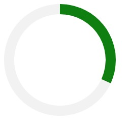
一、先画一圆环
<svg xmlns="http://www.w3.org/2000/svg" height="110" width="110" viewBox="0 0 110 110">
    <circle cx="50%" cy="50%" r="50" stroke-width="10" stroke="#F2F2F2" fill="none"></circle>
</svg>
定义让外层容器为宽高110px的正方形,并且定义在容器的中心处(cx="50%"" cy="50%")画半径为50px的圆(r="50"),圆的内容不着色(fill="none")。描边为10px,着描边色为灰色(stroke-width="10" stroke="#F2F2F2")

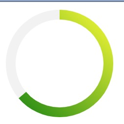
二、再来一层绿色圆环叠加
<svg xmlns="http://www.w3.org/2000/svg" height="110" width="110" viewBox="0 0 110 110">
    <circle cx="50%" cy="50%" r="50" stroke-width="10" stroke="#F2F2F2" fill="none"></circle>
    <circle id="ring" cx="50%" cy="50%" r="50" stroke-width="10" stroke="green" fill="none"
    transform="rotate(-90 55 55)"
    stroke-dasharray="100, 314"></circle>
</svg>
下面的 circle 着描边为绿,并且写上了 stroke-dasharray ,此属性参数第一个数值表示dash,这里代表覆盖范围,后一个数字表示gap长度默认为circle的周长314。此外tranform属性的作用是将圆环从0点位置开始覆盖,不写此属性则从3点位置开始覆盖(rotate第一个参数为角度,第二个和第三个参数为旋转中心,这里为容器的中心)。
三、给圆环加入渐变色
<svg xmlns="http://www.w3.org/2000/svg" height="110" width="110" viewBox="0 0 110 110">
    <linearGradient id="svg-gradient" gradientUnits="userSpaceOnUse" x1="100%" y1="100%" x2="0%" y2="0%">
        <stop offset="0%" style="stop-color:yellow"/>
        <stop offset="100%" style="stop-color:green"/>
    </linearGradient>
    <circle cx="50%" cy="50%" r="50" stroke-width="10" stroke="#F2F2F2" fill="none"></circle>
    <circle id="ring" cx="50%" cy="50%" r="50" stroke-width="10" fill="none"
    stroke="url(#svg-gradient)"
    transform="rotate(-90 55 55)"
    stroke-dasharray="200, 314"></circle>
</svg>
id为ring的 circle 改变了stroke属性为 url(#svg-gradient) ,意为以上面的 linearGradient 背景,以起点黄到终点绿渐变。
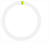
四、加入动画
<style>
circle {
    -webkit-transition: stroke-dasharray 2s;
    transition: stroke-dasharray 2s;
}
</style>
设置css动画持续2s
<svg xmlns="http://www.w3.org/2000/svg" height="110" width="110" viewBox="0 0 110 110">
    <linearGradient id="svg-gradient" gradientUnits="userSpaceOnUse" x1="100%" y1="100%" x2="0" y2="0">
        <stop offset="0%" style="stop-color:yellow"/>
        <stop offset="100%" style="stop-color:green"/>
    </linearGradient>
    <circle cx="50%" cy="50%" r="50" stroke-width="10" stroke="#F2F2F2" fill="none"></circle>
    <circle id="ring" cx="50%" cy="50%" r="50" stroke-width="10" fill="none"
    stroke="url(#svg-gradient)"
    transform="rotate(-90 55 55)"
    stroke-dasharray="0, 314"></circle>
</svg>
id为ring的 circle 改变了 stroke-dasharray 使其 dash 参数初始化为0。
var targetRing = document.getElementById('ring');
var totalLength = targetRing.getTotalLength();

targetRing.style.strokeDasharray = totalLength + ', ' + totalLength;
设置改变 circle 的 stroke-dasharray,0为初始,而周长314为一整个圆(直径为100可算得)。
注意
如果改变了圆环尺寸,以下需要更改
svg容器的width和height,还有viewBox- 两个
circle的r值 还有stroke-width值 #ring的transform=rotate()里的后两个参数为容器的中心坐标#ring的stroke-dasharray里的最后一个参数当为圆的周长