参考:https://blog.csdn.net/ScarlettYellow/article/details/80458797
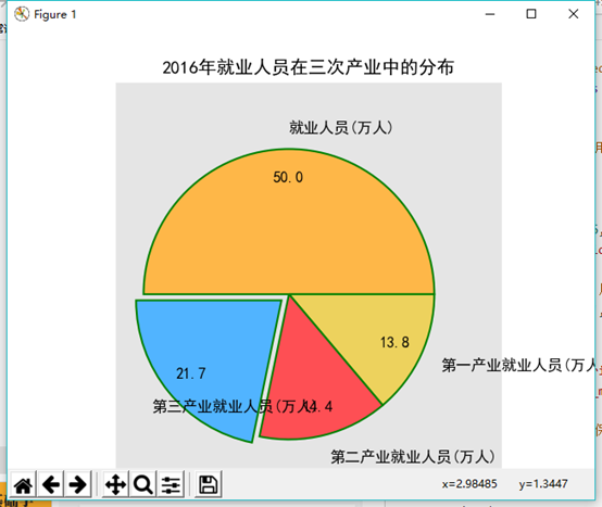
(2)2016年就业人员在三次产业中分布的饼状图。
def swap(list):
    date = []
    name = []
    for i in range(0,len(list)):
        date.append(list[i][1])
        name.append(list[i][0])
    return date, name
def fun2():
    # 构造数据
    industry3 = read_excel(r'sancichanye.xlsx')
    print(industry3)
    name = swap(industry3)[1]
    date = swap(industry3)[0]
    print(name)
    print(date)
    # 设置绘图主题风格
    plt.style.use('ggplot')

    colors = ['#FEB748', '#EDD25D', '#FE4F54', '#51B4FF']  # 自定义颜色

    # 中文乱码问题及坐标轴符号问题
    plt.rcParams['font.sans-serif'] = ['SimHei']
    plt.rcParams['axes.unicode_minus'] = False

    explode = [0, 0, 0, 0.1]  # 用于突出显示大专学历人群

    # 将横、纵坐标轴标准化处理,保证饼图是一个正圆,否则为椭圆
    plt.axes(aspect='equal')

    # 控制x轴和y轴的范围
    plt.xlim(0, 4)
    plt.ylim(0, 4)

    plt.pie(
        x=date,
        explode=explode,     # 突出显示的信息
        labels=name,    # 名称
        colors=colors,      # 颜色
        autopct='%.1f',     # 小数显示格式
        pctdistance=0.8,  # 设置百分比标签与圆心的距离
        labeldistance=1.15,     # 设置名称标签与圆心的距离
        startangle=180,     # 设置饼图的初始角度
        radius=1.5,     # 涉资饼图的半径
        counterclock=False, # 是否逆时针
        wedgeprops= {'linewidth':1.5, "edgecolor":"green"},     # 设置饼图内外边界的属性
        textprops={'fontsize':12, "color":'k'},    # 设置文本标签的属性值
        center=(1.8, 1.8),     # 设置饼图的原点
        frame=1     # 是否显示饼图的图框,这里设置显示
    )
    plt.xticks(())
    plt.yticks(())

    plt.title("2016年就业人员在三次产业中的分布")
    plt.show()
效果如下: