在python中实现数据的可视化,也即作图,一般是依赖matplotlib宏包实现的。但常见的代码中都是加载pylab,是不是这里写错了呀?其实pylib只是matplotlib的一个模块,只是被做成了可以直接调用的形式,所以调用pylab实际上还是调用了matplotlib。pylab的绘图函数和参数名和matlab是非常类似的。鉴于输入法切换的麻烦,在例子源代码中的注释都使用了英文,这并不是从英文网站上拷贝过来的。
import pylab
基本设定
虽说pylab绘图和matlab很类似,但是也有不少的区别之处。
close all;clc;
在matlab作图中,开头最常见的一段就是这行命令,要在python中实现它,可以用下面的命令:
import os

# clc the terminal in ipython script, cls for windows, clear for linux/unix/mac
os.system('cls' if os.name == 'nt' else 'clear')

# close all existing figure windows
pylab.close('all')
如果要进一步实现类似matlab的与图的动态交互,可以添加如下的命令:
# display figures interectively, which will not have to close figures to let the code run. Just like the way matlab plot works!
pylab.ion()
linestyles parameters
pylab.figure(1)
pylab.plot(x, y, linestyle='', linewidth=1, color='red', marker='*')
pylab.show()
['', ' ', 'None', '--', '-.', '-', ':']
小例子:控制字体和坐标点尺寸
# set the fontsize and ticklabel size
import pylab
import numpy

pi=numpy.pi
x=numpy.linspace(0,1,100)
y=numpy.sin(2*pi*10*x)

ax0=pylab.figure()
ax1=pylab.subplot(111)
pylab.plot(x,y,'-*',linewidth=2)
pylab.xlabel('x axis',fontsize=10,color='blue')
pylab.ylabel('y axis',fontsize=20)
pylab.grid('on')
pylab.title('test',fontsize=30)
# set parameters of tick markers
pylab.tick_params(which='major',labelsize=15,width=2,length=10,color='red')
pylab.tick_params(axis='x',colors='red')
pylab.tick_params(which='minor',width=1,length=5)
# control to show the minor tick
pylab.minorticks_on()
# control the color of axis line
ax1.spines['bottom'].set_color('green')
# control the color of ticklabel
pylab.tick_params(axis='x',color='green')
pylab.show()
设定图的尺寸大小[1]
pylab.figure(figsize=(20,10))
#pylab.figure(num=None, figsize=(8, 6), dpi=80, facecolor='w', edgecolor='k')
plot(x,y)
pylab.show()
# use tight layout if the text or edges of the figure are covered
fig.tight_layout()
在图中添加文字标记[2]
import numpy as np
import matplotlib.pyplot as plt

fig = plt.figure()
ax = fig.add_subplot(111)

t = np.arange(0.0, 5.0, 0.01)
s = np.cos(2*np.pi*t)
line, = ax.plot(t, s, lw=2)

ax.annotate('local max', xy=(2, 1), xytext=(3, 1.5),arrowprops=dict(facecolor='black', shrink=0.05))

ax.set_ylim(-2,2)
plt.show()
隐藏legend的窗体[3]
#How to remove the box of the legend?
plt.legend(frameon=False)
#How to change the color of the border of the legend box?
leg = plt.legend()
leg.get_frame().set_edgecolor('b')
#How to remove only the border of the box of the legend?
leg = plt.legend()
leg.get_frame().set_linewidth(0.0)
控制legend位置[5]
legend( ('label1', 'label2', 'label3'), loc='upper left')
add xlim, ylim
pylab.xlim([x1,x2])
pylab.ylim([y1,y2])
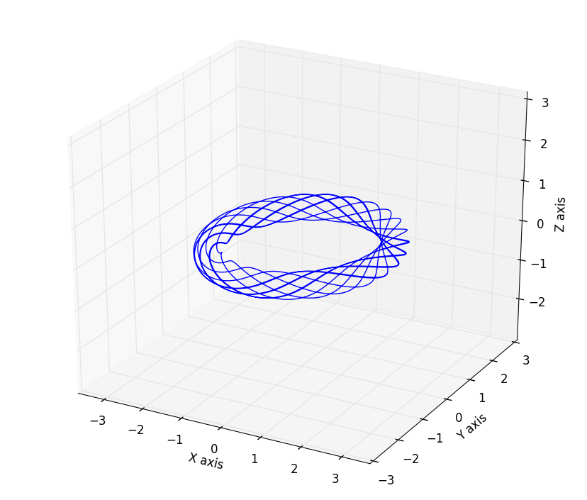
3D绘图并设置坐标轴等距
这里展示一个绘制三维空间曲线的例子,模型是托卡马克中的磁力线分布,其中matlabplotlib的equal axes设置在3D绘图中有缺陷,x,y轴等距离,但是z轴不会等距离,要实现相同的设置需要用到一些人为的设置,下面的代码中用的到设置函数set_axes_equal() 是在StackOverflow中的大神提供的[4]:
# this script will plot the magnetic field line with different q with circular cross section
import numpy
import pylab
from mpl_toolkits.mplot3d import Axes3D

def set_axes_equal(ax):
    '''Make axes of 3D plot have equal scale so that spheres appear as spheres,
    cubes as cubes, etc..  This is one possible solution to Matplotlib's
    ax.set_aspect('equal') and ax.axis('equal') not working for 3D.

    Input
      ax: a matplotlib axis, e.g., as output from plt.gca().
    '''
    x_limits = ax.get_xlim3d()
    y_limits = ax.get_ylim3d()
    z_limits = ax.get_zlim3d()
    x_range = abs(x_limits[1] - x_limits[0])
    x_middle = numpy.mean(x_limits)
    y_range = abs(y_limits[1] - y_limits[0])
    y_middle = numpy.mean(y_limits)
    z_range = abs(z_limits[1] - z_limits[0])
    z_middle = numpy.mean(z_limits)

    # The plot bounding box is a sphere in the sense of the infinity
    # norm, hence I call half the max range the plot radius.
    plot_radius = 0.5*max([x_range, y_range, z_range])
    ax.set_xlim3d([x_middle - plot_radius, x_middle + plot_radius])
    ax.set_ylim3d([y_middle - plot_radius, y_middle + plot_radius])
    ax.set_zlim3d([z_middle - plot_radius, z_middle + plot_radius])

pylab.close()
pylab.ion()
pi=numpy.pi
q=2
R0=2 # big radius unit=m
a=0.3  # small radius unit=m
q=pi    # safety factor

# the parameter function of helix field structure in big cylinder coordinates is:
psi=numpy.linspace(0,10*2*pi,2000)
x=(R0+a*numpy.sin(q*psi))*numpy.cos(psi)
y=(R0+a*numpy.sin(q*psi))*numpy.sin(psi)
z=a*numpy.cos(q*psi)

fig1=pylab.figure()
ax=Axes3D(fig1)
ax.plot3D(x,y,z)
ax.set_xlabel('X axis')
ax.set_ylabel('Y axis')
ax.set_zlabel('Z axis')
# set equal axes length unit
ax.axis('equal')
# apply the function to set equal axis on x,y,z axis
set_axes_equal(ax)
pylab.show()
模拟的结果:
- 变换坐标轴数字为科学计数显示
fig=pylab.figure()
ax1=fig.add_subplot(111)
ax1.plot(R_half,B_half)
pylab.legend(['possitive B(R) distribution'])
pylab.xlim([0,2.3])
pylab.minorticks_on()
pylab.xlabel('R')
pylab.ylabel('B(T)')
ax1.yaxis.set_major_formatter(mtick.FormatStrFormatter('%.1e'))
# 1e means how many rank is kept after decimal point.
注意,需要单独再定义一个subplot是因为ax=pylab.plot(x,y)得到的ax不是图形对象,而只是一个list,所以无法更改axis显示模式。因此需要再使用subplot获得一个对象。
- 对所有图的对象进行统一的字体设定
import matplotlib
import pylab
fig=pylab.figure()
ax1=fig.add_subplot(111)
ax1.plot(x,y)
pylab.legend(['test',])
pylab.title('test')
pylab.xlabel('X label')
pylab.ylabel('Y label')
matplotlib.rcParms.update({'font.size':15})
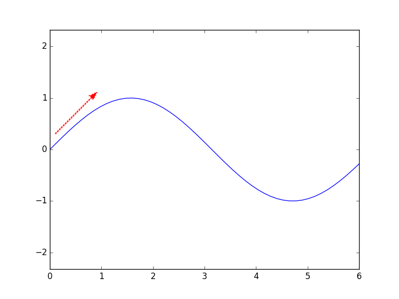
- 绘制箭头
# draw an arrow in the figure
import pylab
import numpy
pi=numpy.pi
x=numpy.linspace(0,6,50)
y=numpy.sin(x)
x0=0.1
y0=0.3
angle=45.0/180.0*pi
r0=1
pylab.figure()
pylab.plot(x,y)
pylab.hold('on')
pylab.arrow(x0,y0,r0*numpy.cos(angle),r0*numpy.sin(angle),r0,linewidth=2,width=0.005,color='red',linestyle=':')
pylab.axis('equal')
pylab.show()
其中width单独控制了箭头的大小
参考:
[1]: Stackoverflow: https://stackoverflow.com/questions/332289/how-do-you-change-the-size-of-figures-drawn-with-matplotlib
[2]: https://matplotlib.org/users/annotations_intro.html
[3]: Stackoverflow: https://stackoverflow.com/questions/25540259/remove-or-adapt-border-of-frame-of-legend-using-matplotlib
[4]: https://stackoverflow.com/questions/13685386/matplotlib-equal-unit-length-with-equal-aspect-ratio-z-axis-is-not-equal-to
[5]: https://stackoverflow.com/questions/10824156/matplotlib-legend-location-numbers