一、ECharts
1、简介
ECharts是百度的一个项目,后来百度把Echart捐给apache,用于图表展示,提供了常规的折线图、柱状图、散点图、饼图、K线图,用于统计的盒形图,用于地理数据可视化的地图、热力图、线图,用于关系数据可视化的关系图、treemap、旭日图,多维数据可视化的平行坐标,还有用于 BI 的漏斗图,仪表盘,并且支持图与图之间的混搭。
2、基本使用
入门参考:官网->文档->教程->5分钟上手ECharts
(1)创建html页面:柱图.html
(2)引入ECharts
1
<!-- 引入 ECharts 文件 -->
2
<script src="echarts.min.js"></script>
(3)定义图表区域
1
<!-- 为ECharts准备一个具备大小(宽高)的Dom -->
2
<div id="main" style=" 600px;height:400px;"></div>
(4)渲染图表
1
<script type="text/javascript">
2
// 基于准备好的dom,初始化echarts实例
3
var myChart = echarts.init(document.getElementById('main'));
4
5
// 指定图表的配置项和数据
6
var option = {
7
title: {
8
text: 'ECharts 入门示例'
9
},
10
tooltip: {},
11
legend: {
12
data:['销量']
13
},
14
xAxis: {
15
data: ["衬衫","羊毛衫","雪纺衫","裤子","高跟鞋","袜子"]
16
},
17
yAxis: {},
18
series: [{
19
name: '销量',
20
type: 'bar',
21
data: [5, 20, 36, 10, 10, 20]
22
}]
23
};
24
25
// 使用刚指定的配置项和数据显示图表。
26
myChart.setOption(option);
27
</script>
3、折线图
实例参考:官网->实例->官方实例 https://echarts.baidu.com/examples/
折线图.html
1
<script>
2
var myChart = echarts.init(document.getElementById('main'));
3
var option = {
4
//x轴是类目轴(离散数据),必须通过data设置类目数据
5
xAxis: {
6
type: 'category',
7
data: ['Mon', 'Tue', 'Wed', 'Thu', 'Fri', 'Sat', 'Sun']
8
},
9
//y轴是数据轴(连续数据)
10
yAxis: {
11
type: 'value'
12
},
13
//系列列表。每个系列通过 type 决定自己的图表类型
14
series: [{
15
//系列中的数据内容数组
16
data: [820, 932, 901, 934, 1290, 1330, 1320],
17
//折线图
18
type: 'line'
19
}]
20
};
21
myChart.setOption(option);
22
23
</script>
二、项目中集成ECharts
1、安装ECharts
1
npm install --save echarts@4.1.0
2、增加路由
src/router/index.js
在统计分析路由中增加子路由
1
{
2
path: 'chart',
3
name: 'StatisticsDayChart',
4
component: () => import('@/views/statistics/daily/chart'),
5
meta: { title: '统计图表' }
6
}
3、创建组件
src/views/sta/create.vue
模板
1
<template>
2
<div class="app-container">
3
<!--表单-->
4
<el-form :inline="true" class="demo-form-inline">
5
6
<el-form-item>
7
<el-select v-model="searchObj.type" clearable placeholder="请选择">
8
<el-option label="学员登录数统计" value="login_num"/>
9
<el-option label="学员注册数统计" value="register_num"/>
10
<el-option label="课程播放数统计" value="video_view_num"/>
11
<el-option label="每日课程数统计" value="course_num"/>
12
</el-select>
13
</el-form-item>
14
15
<el-form-item>
16
<el-date-picker
17
v-model="searchObj.begin"
18
type="date"
19
placeholder="选择开始日期"
20
value-format="yyyy-MM-dd" />
21
</el-form-item>
22
<el-form-item>
23
<el-date-picker
24
v-model="searchObj.end"
25
type="date"
26
placeholder="选择截止日期"
27
value-format="yyyy-MM-dd" />
28
</el-form-item>
29
<el-button
30
:disabled="btnDisabled"
31
type="primary"
32
icon="el-icon-search"
33
@click="showChart()">查询</el-button>
34
</el-form>
35
36
<div class="chart-container">
37
<div id="chart" class="chart" style="height:500px;100%" />
38
</div>
39
</div>
40
</template>
js:暂时显示临时数据
1
<script>
2
import echarts from 'echarts'
3
4
export default {
5
data() {
6
return {
7
searchObj: {
8
type: '',
9
begin: '',
10
end: ''
11
},
12
btnDisabled: false,
13
chart: null,
14
title: '',
15
xData: [],
16
yData: []
17
}
18
},
19
methods: {
20
showChart() {
21
this.initChartData()
22
23
this.setChart()
24
},
25
26
// 准备图表数据
27
initChartData() {
28
29
},
30
31
// 设置图标参数
32
setChart() {
33
// 基于准备好的dom,初始化echarts实例
34
this.chart = echarts.init(document.getElementById('chart'))
35
// console.log(this.chart)
36
37
// 指定图表的配置项和数据
38
var option = {
39
// x轴是类目轴(离散数据),必须通过data设置类目数据
40
xAxis: {
41
type: 'category',
42
data: ['Mon', 'Tue', 'Wed', 'Thu', 'Fri', 'Sat', 'Sun']
43
},
44
// y轴是数据轴(连续数据)
45
yAxis: {
46
type: 'value'
47
},
48
// 系列列表。每个系列通过 type 决定自己的图表类型
49
series: [{
50
// 系列中的数据内容数组
51
data: [820, 932, 901, 934, 1290, 1330, 1320],
52
// 折线图
53
type: 'line'
54
}]
55
}
56
57
this.chart.setOption(option)
58
}
59
}
60
}
61
</script>
三、完成后端业务
1、controller
1
("show-chart/{begin}/{end}/{type}")
2
public R showChart( String begin, String end, String type){
3
Map<String, Object> map = dailyService.getChartData(begin, end, type);
4
return R.ok().data(map);
5
}
2、service
接口
1
Map<String, Object> getChartData(String begin, String end, String type);
实现
1
2
public Map<String, Object> getChartData(String begin, String end, String type) {
3
4
QueryWrapper<Daily> dayQueryWrapper = new QueryWrapper<>();
5
dayQueryWrapper.select(type, "date_calculated");
6
dayQueryWrapper.between("date_calculated", begin, end);
7
8
List<Daily> dayList = baseMapper.selectList(dayQueryWrapper);
9
10
Map<String, Object> map = new HashMap<>();
11
List<Integer> dataList = new ArrayList<Integer>();
12
List<String> dateList = new ArrayList<String>();
13
map.put("dataList", dataList);
14
map.put("dateList", dateList);
15
16
17
for (int i = 0; i < dayList.size(); i++) {
18
Daily daily = dayList.get(i);
19
dateList.add(daily.getDateCalculated());
20
switch (type) {
21
case "register_num":
22
dataList.add(daily.getRegisterNum());
23
break;
24
case "login_num":
25
dataList.add(daily.getLoginNum());
26
break;
27
case "video_view_num":
28
dataList.add(daily.getVideoViewNum());
29
break;
30
case "course_num":
31
dataList.add(daily.getCourseNum());
32
break;
33
default:
34
break;
35
}
36
}
37
38
return map;
39
}
四、前后端整合
1、创建api
src/api/sta/sta.js中添加方法
1
showChart(searchObj) {
2
return request({
3
url: `${api_name}/show-chart/${searchObj.begin}/${searchObj.end}/${searchObj.type}`,
4
method: 'get'
5
})
6
}
2、chart.vue中引入api模块
1
import daily from '@/api/sta/sta'
2
3
3、修改initChartData方法
1
showChart() {
2
this.initChartData()
3
// this.setChart()//放在initChartData回调中执行
4
},
5
6
// 准备图表数据
7
initChartData() {
8
daily.showChart(this.searchObj).then(response => {
9
// 数据
10
this.yData = response.data.dataList
11
12
// 横轴时间
13
this.xData = response.data.dateList
14
15
// 当前统计类别
16
switch (this.searchObj.type) {
17
case 'register_num':
18
this.title = '学员注册数统计'
19
break
20
case 'login_num':
21
this.title = '学员登录数统计'
22
break
23
case 'video_view_num':
24
this.title = '课程播放数统计'
25
break
26
case 'course_num':
27
this.title = '每日课程数统计'
28
break
29
}
30
31
this.setChart()
32
})
33
},
4、修改options中的数据
1
xAxis: {
2
type: 'category',
3
data: this.xData//-------绑定数据
4
},
5
// y轴是数据轴(连续数据)
6
yAxis: {
7
type: 'value'
8
},
9
// 系列列表。每个系列通过 type 决定自己的图表类型
10
series: [{
11
// 系列中的数据内容数组
12
data: this.yData,//-------绑定数据
13
// 折线图
14
type: 'line'
15
}],
五、样式调整
1、显示标题
1
title: {
2
text: this.title
3
},
2、x坐标轴触发提示
1
tooltip: {
2
trigger: 'axis'
3
},
3、区域缩放
1
dataZoom: [{
2
show: true,
3
height: 30,
4
xAxisIndex: [
5
0
6
],
7
bottom: 30,
8
start: 10,
9
end: 80,
10
handleIcon: 'path://M306.1,413c0,2.2-1.8,4-4,4h-59.8c-2.2,0-4-1.8-4-4V200.8c0-2.2,1.8-4,4-4h59.8c2.2,0,4,1.8,4,4V413z',
11
handleSize: '110%',
12
handleStyle: {
13
color: '#d3dee5'
14
15
},
16
textStyle: {
17
color: '#fff'
18
},
19
borderColor: '#90979c'
20
},
21
{
22
type: 'inside',
23
show: true,
24
height: 15,
25
start: 1,
26
end: 35
27
}]
最终效果
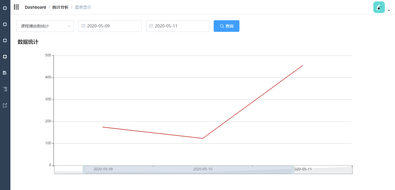
2
