一、Selector——图形、颜色选择器
语法
<selector>
<item android:drawable=“drawableResA” android:state_xxxxx=“true”/>
<item android:drawable=“drawableResB” android:state_xxxxx=“false”/>
<selector>
<selector>
<item android:color=“drawableResA” android:state_xxxxx=“true”/>
<item android:color=“drawableResB” android:state_xxxxx=“false”/>
<selector>
例:
<selector xmlns:android="http://schemas.android.com/apk/res/android">

<!-- android:state_pressed=""按下-->
<item android:drawable="@mipmap/bar_1_select" android:state_checked="true"/>
<item android:drawable="@mipmap/bar_1_unselect" android:state_checked="false"/>

</selector效果图:
二、常用的styles.xml修改和设置
<resources>

    <style name="sss" parent="@android:style/Theme.Holo.Light.Dialog"></style>
    <!-- Base application theme. -->
    <style name="AppTheme" parent="Theme.AppCompat.Light.DarkActionBar">
        <!-- Customize your theme here. -->
        <!--标题栏-->
        <item name="colorPrimary">@color/colorPrimary</item>
        <!--状态栏-->
        <item name="colorPrimaryDark">@color/colorPrimaryDark</item>
        <!--系统中,子空间,复选框,单选按钮,选中时的颜色-->
        <item name="colorAccent">@color/colorAccent</item>


        <!--窗体的背景色-->
        <item name="android:windowBackground">@android:color/white</item>

        <!--窗体无标题栏-->
        <item name="windowNoTitle">true</item>
        <!--无actionbar-->
        <item name="windowActionBar">false</item>
        <!--取消状态栏,也就是全屏显示-->
        <item name="android:windowFullscreen">true</item>
    </style>


    <!--需要注意的是,不能有空格,值不用引号-->
    <style name="bottom_bar_rb">
        <item name="android:layout_width">0dp</item>
        <item name="android:layout_height">match_parent</item>
        <item name="android:layout_marginTop">5dp</item>
        <item name="android:layout_marginBottom">5dp</item>
        <item name="android:gravity">center</item>
        <item name="android:layout_weight">1</item>
        <item name="android:button">@null</item>
        <item name="android:background">@android:color/transparent</item>
        <item name="android:textSize">14sp</item>
        <item name="android:textColor">@color/selector_bar_font_1</item>
    </style>
</resources>
二、常用的styles.xml修改和设置
Style——样式
样式就是各种属性的集合。当控件需要使用这些属性时,就可以直接使用这个集合来获得这些属性的
样式分为对控件的样式和对整个应用或Activity的样式,对整个应用或Activity的样式我们有称其为主题(Theme)
语法:
声明:
在values文件夹中
<style name=“styleName” parent=“extends”>
<item name=“paramsName”>value</item>
</style>
使用:
控件的style属性引用 style=“styleName”(布局页面)
三、Attribute
Attribute是位于values文件夹下的一种android资源,通常使用名称为attrs的xml资源文件来声明。可以作为自定义控件的自定义属性,也可以作为根据主题自动选择值的一种资源值。
用法:
作为可变资源
声明
<resource>
<attr name=“attr-name” format=“format-type”/>
</resource>
赋值
<style name=“xx”>
<item name=“attr-name”>value</item>
</style>
例:values文件夹下的,attrs.xml文件
<?xml version="1.0" encoding="utf-8"?>
<resources>
<!--注意不能和已有的重名,不会会有异常-->
<attr name="bg" format="color"/>
<!--格式为引用-->
<attr name="radioButtonStyle" format="reference"/>
</resources>
引用的时候:
android:background="?attr/bg">
具体代码,Layoutwork
四、Shape——图形
用来实现一些简单的图片,可控制图片的图形、颜色、边框圆角等。占用空间小,还可以适应不同大小的尺寸,不发生形变。
用法:
声明在drawable文件夹下
<shape xmlns:android="http://schemas.android.com/apk/res/android"
android:shape=["rectangle" | "oval" | "line" | "ring"]>
</shape>
shape 图形 rectangle 矩形 line 线 oval 椭圆 ring 环 
具体的案例:
一、矩形代码:
<?xml version="1.0" encoding="utf-8"?>
<!--默认矩形-->
<shape xmlns:android="http://schemas.android.com/apk/res/android"
 android:shape="rectangle">

 <!--纯色-->
 <solid android:color="@color/colorAccent"/>

 <!--圆角-->
 <!-- android:radius="100dp"四个角都是圆角-->
 <corners
 android:bottomLeftRadius="100dp"
 android:topRightRadius="100dp"/>

 <!--边框-->
 <!--android:dashWidth="50dp线段长-->
 <!--android:dashGap="20dp"线段之间的间隔-->
 <stroke
 android:width="10dp"
 android:color="@color/colorPrimary"
 android:dashWidth="50dp"
 android:dashGap="20dp"/>
 <!--大小-->
 <size
 android:width="200dp"
 android:height="200dp"/>

 <padding
 android:left="20dp"
 android:top="20dp"
 android:bottom="20dp"
 android:right="20dp"/>
 <!--渐变-->
 <!--默认左右渐变-->
 <!--android:centerColor="@color/colorPrimary" 三色渐变-->
 <!--渐变类型,默认为linear android:type="linear"-->
 <!--注意,这个属性的值只能是45的倍数,并且只能在linear中使用-->
 <!--<gradient-->
 <!--android:centerColor="@color/colorPrimary"-->
 <!--android:startColor="#fff"-->
 <!--android:endColor="@color/colorAccent"-->
 <!--android:type="linear"-->
 <!--android:angle="-90"/>-->


 <!--android:type="radial" 径向渐变-->
 <!--注意必须设置径向渐变半径-->
 <!--<gradient-->
 <!--android:centerColor="@color/colorPrimary"-->
 <!--android:startColor="#fff"-->
 <!--android:endColor="@color/colorAccent"-->
 <!--android:type="radial"-->
 <!--android:gradientRadius="200"-->
 <!--android:centerX="0.5"-->
 <!--android:centerY="0.3"/>-->

 <!--扫描线-->
 <!--也可以设置中心点,默认是0.5XY-->
 <gradient
 android:centerColor="@color/colorPrimary"
 android:startColor="#fff"
 android:endColor="@color/colorerAccent"
 android:type="sweep"
 android:centerX="0.5"
 android:centerY="0.5"/>

</shape>
二、线代码
<shape xmlns:android="http://schemas.android.com/apk/res/android"
 android:shape="line">
 <stroke
 android:width="3dp"
 android:color="@color/colorPrimary"
 android:dashGap="20dp"
 android:dashWidth="50dp"/>
</shape>
三、椭圆代码 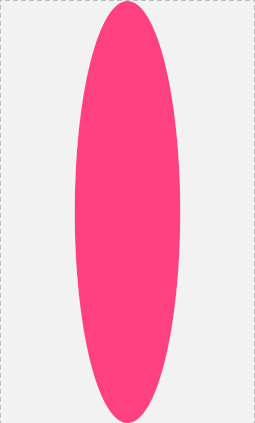
<shape xmlns:android="http://schemas.android.com/apk/res/android"

 android:shape="oval">
 <!--这里边的属性都可以使用-->
 <solid android:color="@color/colorAccent" />
 <!--宽高相等,会变成圆形-->
 <size
 android:width="50dp"
 android:height="200dp" />
</shape>
四、圆环代码 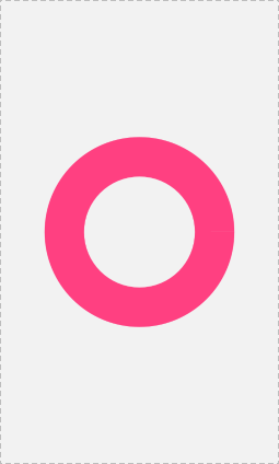
<!--环形-->
 <!--固定值,好处,固定大小不变,但是不能根据控件大小变化-->
<!--android:innerRadius="" 内环半径

 android:thickness="" 环厚度-->
<!--**** android:useLevel="false"必须为false,
默认为true,为false时显示*****-->
<!--比例
 android:innerRadiusRatio=""
 android:thicknessRatio=""-->
<!--控件的宽度/5,内环的半径 控件的宽度/7,环厚度-->
<shape xmlns:android="http://schemas.android.com/apk/res/android"
 android:shape="ring"
 android:innerRadiusRatio="5"
 android:thicknessRatio="7"
 android:useLevel="false">
 <solid
 android:color="@color/colorAccent"/>
</shape>