seaborn官方文档:http://seaborn.pydata.org/api.html
绘制多变量的分布图
先绘制两个变量的分布图,其中X变量为分类变量,Y为数值变量。
1 import pandas as pd
2 import numpy as np
3 import seaborn as sns
4 import matplotlib.pyplot as plt
5 import matplotlib as mpl
6 tips = sns.load_dataset("tips")
7 sns.set(style="whitegrid", color_codes=True)
8 sns.stripplot(x="day", y="total_bill", data=tips)
9 plt.show()
运行结果:
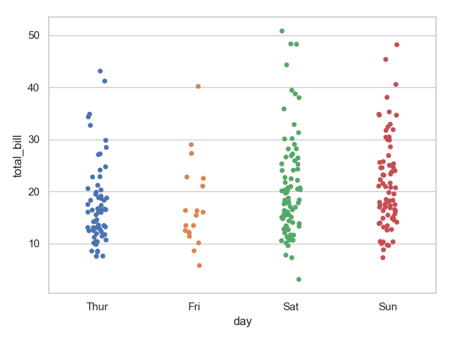
注意:观察上图不难发现,带图默认是有抖动的,即 jitter=True 。下面用 swarmplot 绘制带分布的散点图。并且将展示在图中分割多个分类变量,以不同的颜色展示。
1 plt.subplot(121)
2 sns.swarmplot(x="day", y="total_bill", data=tips)
3 plt.subplot(122)
4 sns.swarmplot(x="day", y="total_bill", hue="sex", data=tips)
5 plt.show()
6 sns.swarmplot(x="total_bill", y="day", hue="time", data=tips)
7 plt.show()
运行结果:
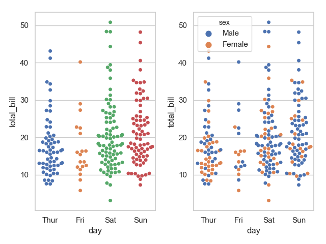
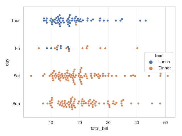
通过上面的图像我们很容易观察到 day 与 time 、sex 之间的一些关系。
箱线图与小提琴图
下面我们将绘制箱线图以及小提琴图展示 变量间的关系
盒图
IQR即统计学概念四分位距,第一/四分位 与 第三/四分位之间的距离
N = 1.5IQR 如果一个值>Q3+N或 < Q1-N,则为离群点
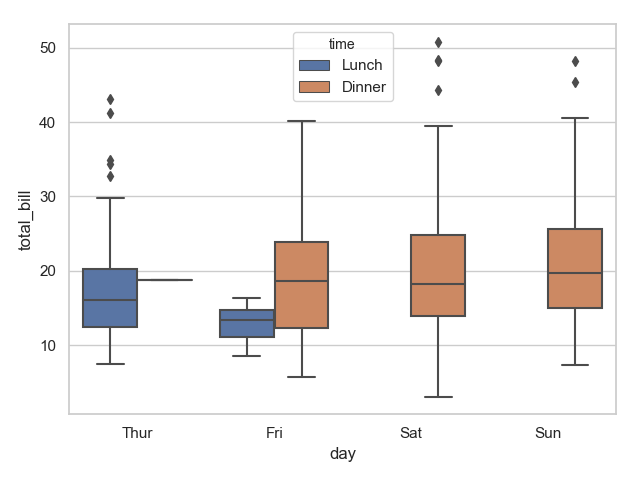
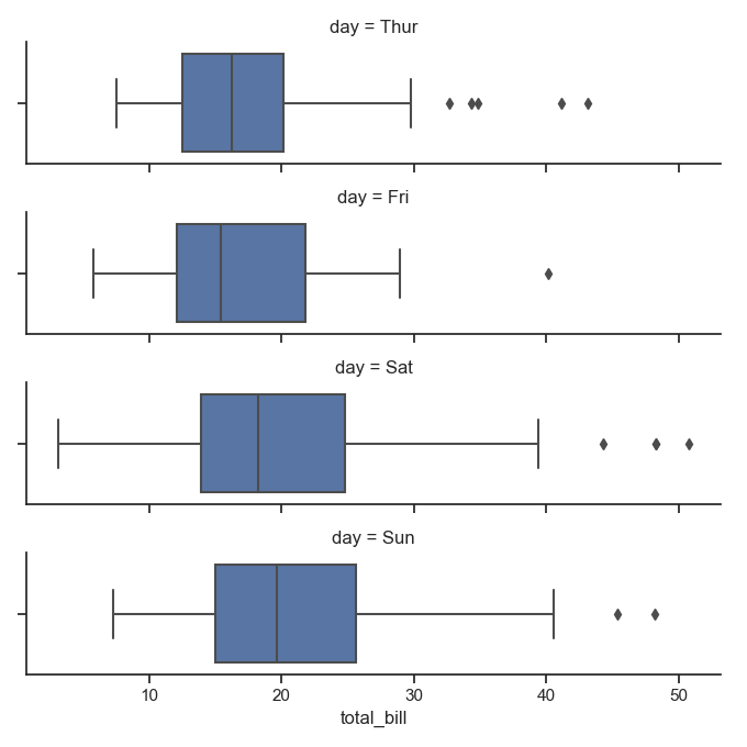
1 sns.boxplot(x="day", y="total_bill", hue="time", data=tips)
2 plt.show()
运行结果:
小提琴图可以做类似的效果,且能够展示其分布
1 sns.violinplot(x="total_bill", y="day", hue="time", data=tips)
2 plt.show()
运行结果:
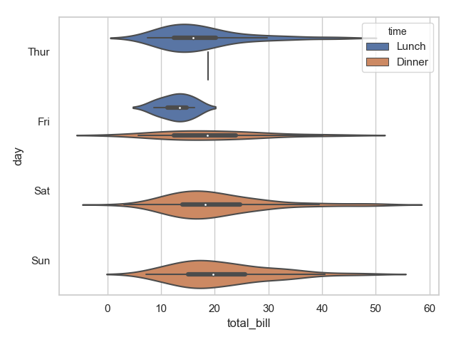
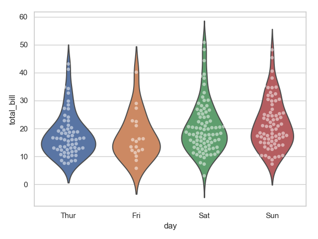
中间的黑色粗线为4分位距,细线为 95% 置信区间。我们也可以将小提琴图设置为一边显示一个类别,这样对比性就更加明确。
1 sns.violinplot(x="day", y="total_bill", hue="sex", data=tips)
2 plt.show()
3 sns.violinplot(x="day", y="total_bill", hue="sex", data=tips, split=True)
4 plt.show()
运行结果:
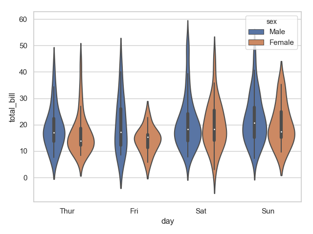
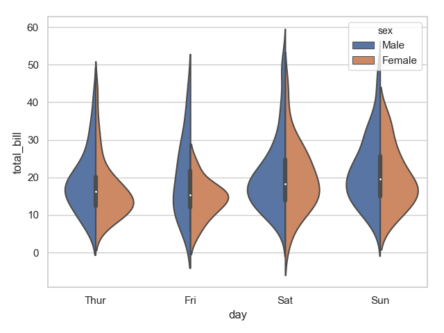
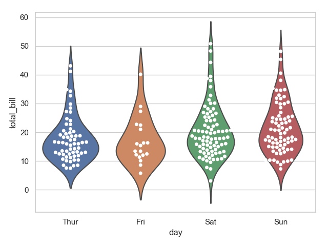
明显可以发现上面第二张图区分更明显。两种函数结合可以生成更加炫酷的图:
1 sns.violinplot(x="day", y="total_bill", data=tips, inner=None)  # inner 小提琴内部图形
2 sns.swarmplot(x="day", y="total_bill", data=tips, color="w", alpha=.5)  # alpha 透明度
3 plt.show()
4 sns.violinplot(x="day", y="total_bill", data=tips, inner=None)
5 sns.swarmplot(x="day", y="total_bill", data=tips, color="w",)
6 plt.show()
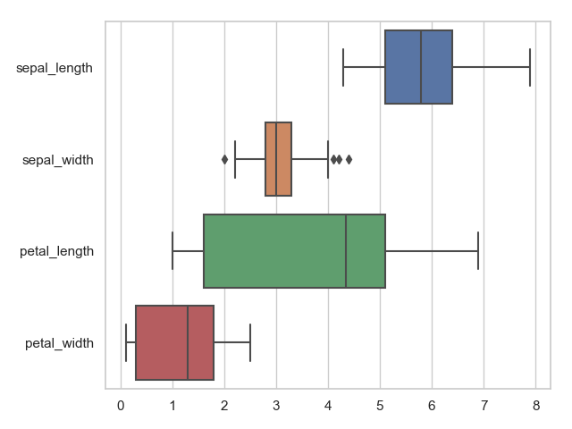
当然我们也可以横着展示箱线图:
1 sns.boxplot(data=iris, orient="h")  # orient  垂直和水平
2 plt.show()
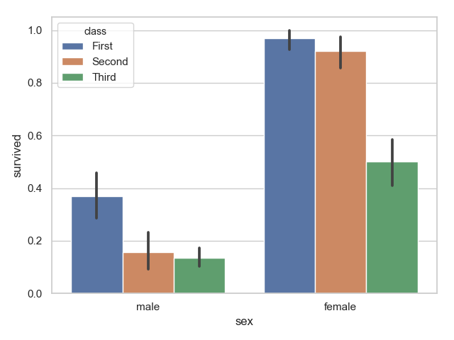
条形图
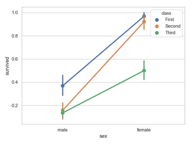
显示图的集中趋势
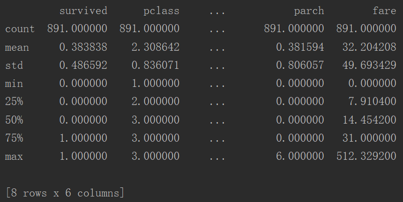
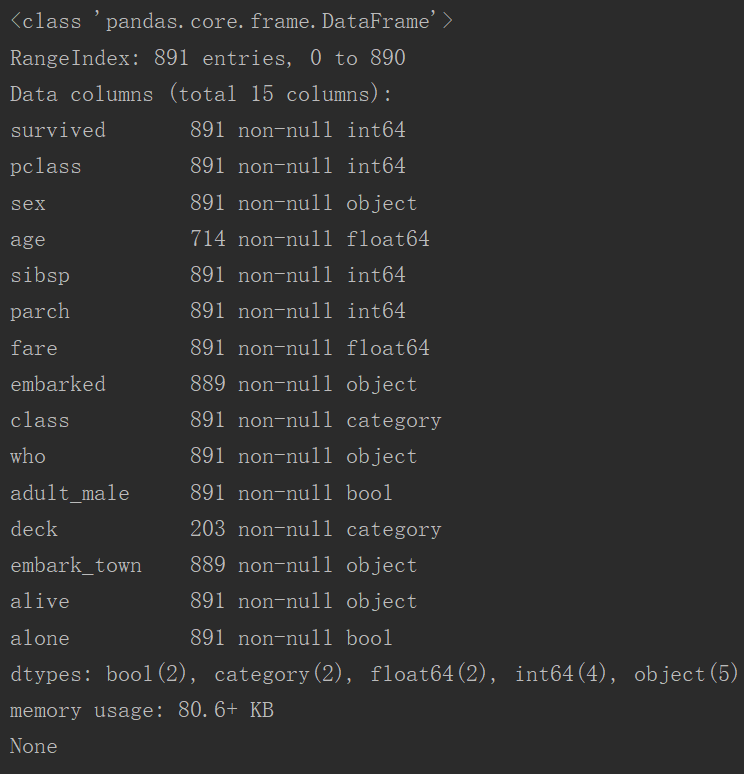
1 titanic = sns.load_dataset("titanic")
2 print(titanic.describe())
3 print(titanic.info())
4 sns.barplot(x="sex", y="survived", hue="class", data=titanic)
5 plt.show()
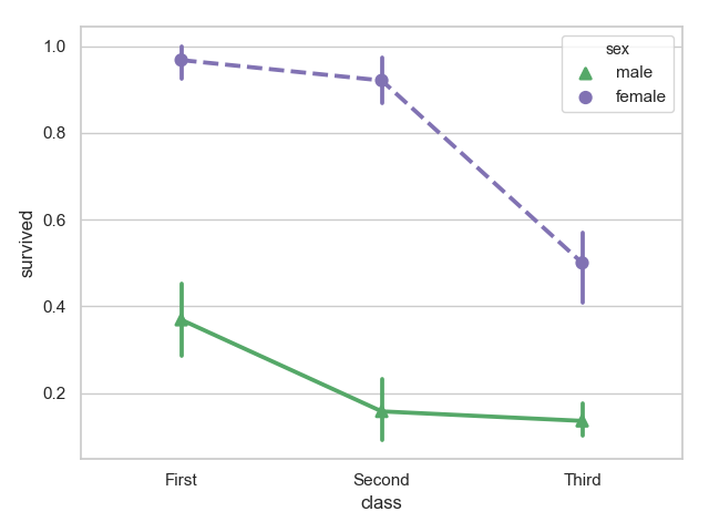
点图可以更好的描述变化差异
对class属性分类绘制:
1 sns.pointplot(x="sex", y="survived", hue="class", data=titanic)
2 plt.show()
改变线形和点的形状
1 sns.pointplot(x="class", y="survived", hue="sex", data=titanic,
2               palette={"male": "g", "female": "m"},
3               markers=["^", "o"], linestyles=["-", "--"])
4 plt.show()
多层面板分类图
下面展示的是 catplot 函数,及其参数说明:
# catplot(x=None, y=None, hue=None, data=None, row=None, col=None,
#             col_wrap=None, estimator=np.mean, ci=95, n_boot=1000,
#             units=None, order=None, hue_order=None, row_order=None,
#             col_order=None, kind="strip", height=5, aspect=1,
#             orient=None, color=None, palette=None,
#             legend=True, legend_out=True, sharex=True, sharey=True,
#             margin_titles=False, facet_kws=None, **kwargs)
|
Parameters:
x,y,hue 数据集变量 变量名
date 数据集 数据集名
row,col 更多分类变量进行平铺显示 变量名
col_wrap 每行的最高平铺数 整数
estimator 在每个分类中进行矢量到标量的映射 矢量
ci 置信区间 浮点数或None
n_boot 计算置信区间时使用的引导迭代次数 整数
units 采样单元的标识符,用于执行多级引导和重复测量设计 数据变量或向量数据
order, hue_order 对应排序列表 字符串列表
row_order, col_order 对应排序列表 字符串列表
kind : 可选:point 默认, bar 柱形图, count 频次, box 箱体, violin 提琴, strip 散点,swarm 分散点
size 每个面的高度(英寸) 标量 已经不用了,现在使用height
aspect 纵横比 标量
orient 方向 "v"/"h"
color 颜色 matplotlib颜色
palette 调色板名称 seaborn颜色色板
legend_hue 布尔值:如果是真的,图形大小将被扩展,并且图画将绘制在中心右侧的图外。
share{x,y} 共享轴线 True/False:如果为真,则刻面将通过列和/或X轴在行之间共享Y轴。
下面将是常用图像的展示:
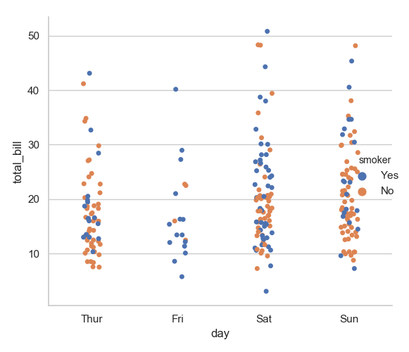
1 sns.catplot(x="day", y="total_bill", hue="smoker", data=tips)
2 plt.show()
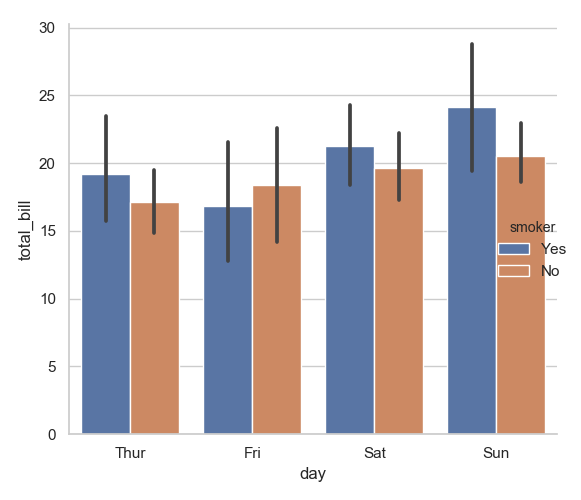
1 sns.catplot(x="day", y="total_bill", hue="smoker", data=tips, kind="bar")
2 plt.show()
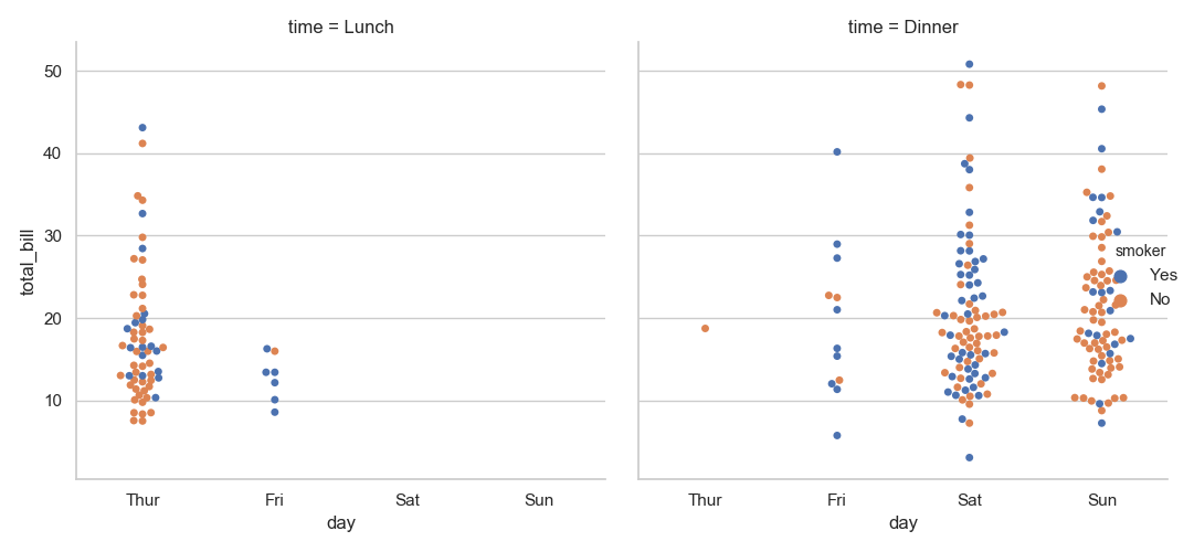
1 sns.catplot(x="day", y="total_bill", hue="smoker",
2             col="time", data=tips, kind="swarm")
3 plt.show()
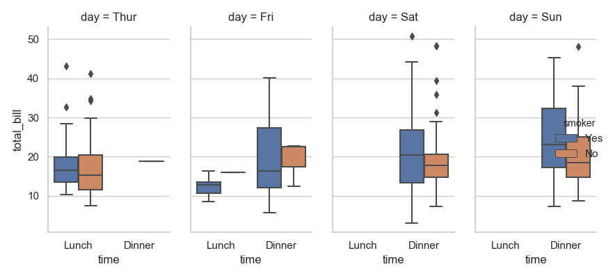
1 sns.catplot(x="time", y="total_bill", hue="smoker",
2             col="day", data=tips, kind="box", height=4, aspect=.5)
3 plt.show()
用 FacetGrid 这个类来展示数据
更多内容请点击上面的链接,下面将简单展示
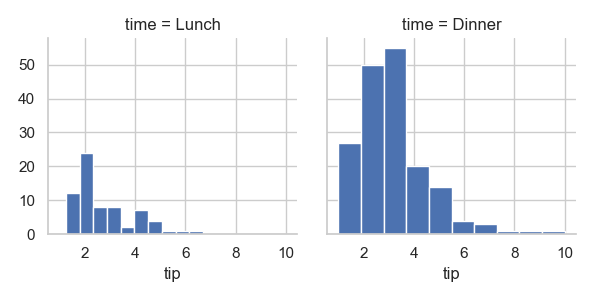
1 g = sns.FacetGrid(tips, col="time")                    # 占位
2 g.map(plt.hist, "tip")                                 # 画图;第一个参数是func
3 plt.show()
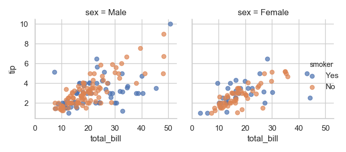
1 g = sns.FacetGrid(tips, col="sex", hue="smoker")
2 g.map(plt.scatter, "total_bill", "tip", alpha=.7)
3 g.add_legend()
4 plt.show()
1 sns.set_style("ticks")
2 g = sns.FacetGrid(tips, row="smoker", col="time", margin_titles=True)  # 变量标题右侧,实验性并不总是有效
3 g.map(sns.regplot, "size", "total_bill", color=".1", fit_reg=False, x_jitter=.1)  # color 颜色深浅  fit_reg  回归的线  x_jitter 浮动
4 plt.show()
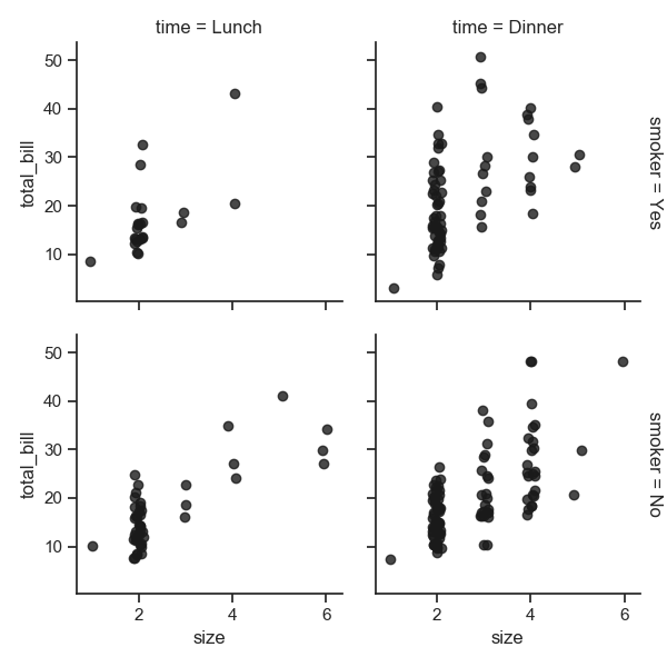
1 g = sns.FacetGrid(tips, col="day", height=4, aspect=.5)
2 g.map(sns.barplot, "sex", "total_bill", order=["Male", "Female"])
3 plt.show()
1 from pandas import Categorical
2 ordered_days = tips.day.value_counts().index
3 print(ordered_days)
4 ordered_days = Categorical(['Thur', 'Fri', 'Sat', 'Sun'])
5 g = sns.FacetGrid(tips, row="day", row_order=ordered_days,
6                   height=1.7, aspect=4)
7 g.map(sns.boxplot, "total_bill", order=["Male","Female"])
8 plt.show()
![]()
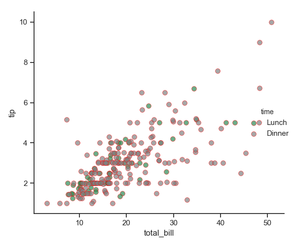
1 pal = dict(Lunch="seagreen", Dinner="gray")
2 g = sns.FacetGrid(tips, hue="time", palette=pal, height=5)
3 g.map(plt.scatter, "total_bill", "tip", s=50, alpha=.7, linewidth=.5, edgecolors="red") # edgecolors 元素边界颜色
4 g.add_legend()
5 plt.show()
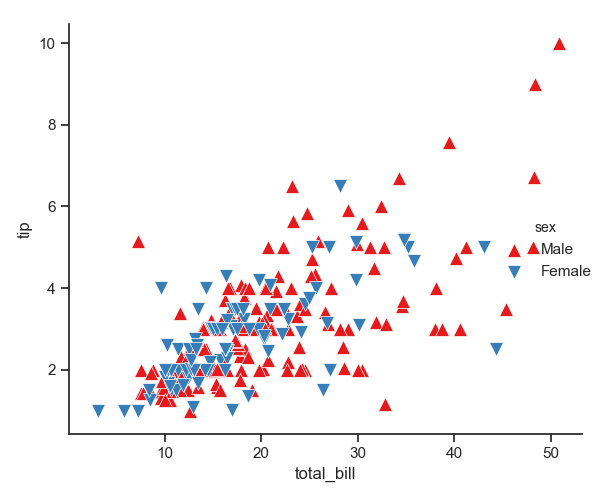
1 g = sns.FacetGrid(tips, hue="sex", palette="Set1", height=5, hue_kws={"marker": ["^", "v"]})
2 g.map(plt.scatter, "total_bill", "tip", s=100, linewidth=.5, edgecolor="white")
3 g.add_legend()
4 plt.show()
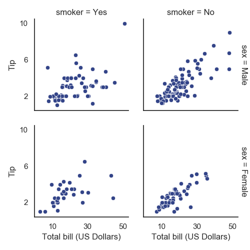
1 with sns.axes_style("white"):
2     g = sns.FacetGrid(tips, row="sex", col="smoker", margin_titles=True, height=2.5)
3 g.map(plt.scatter, "total_bill", "tip", color="#334488", edgecolor="white", lw=.5)
4 g.set_axis_labels("Total bill (US Dollars)", "Tip")
5 g.set(xticks=[10, 30, 50], yticks=[2, 6, 10])
6 g.fig.subplots_adjust(wspace=.02, hspace=.02)  # 子图与子图
7 # g.fig.subplots_adjust(left  = 0.125,right = 0.5,bottom = 0.1,top = 0.9, wspace=.02, hspace=.02)
8 plt.show()
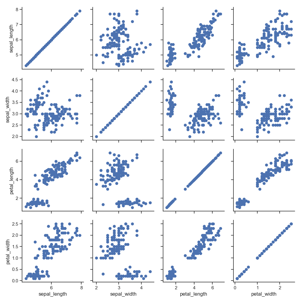
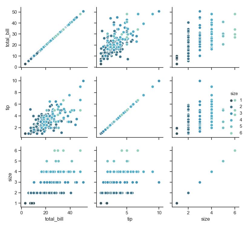
PairGrid 的简单展示
1 iris = sns.load_dataset("iris")
2 g = sns.PairGrid(iris)
3 g.map(plt.scatter)
4 plt.show()
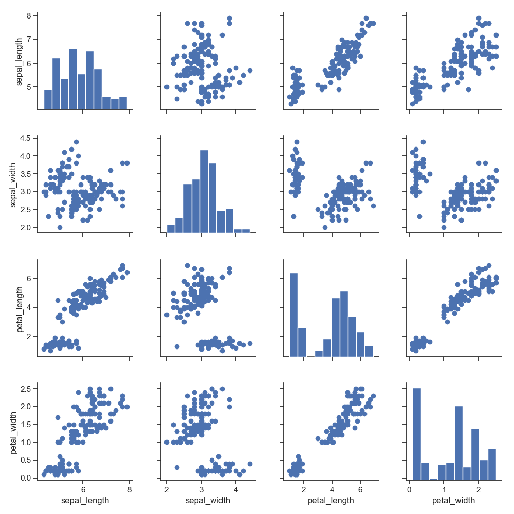
1 g = sns.PairGrid(iris)
2 g.map_diag(plt.hist)        # 对角线
3 g.map_offdiag(plt.scatter)  # 非对角线
4 plt.show()
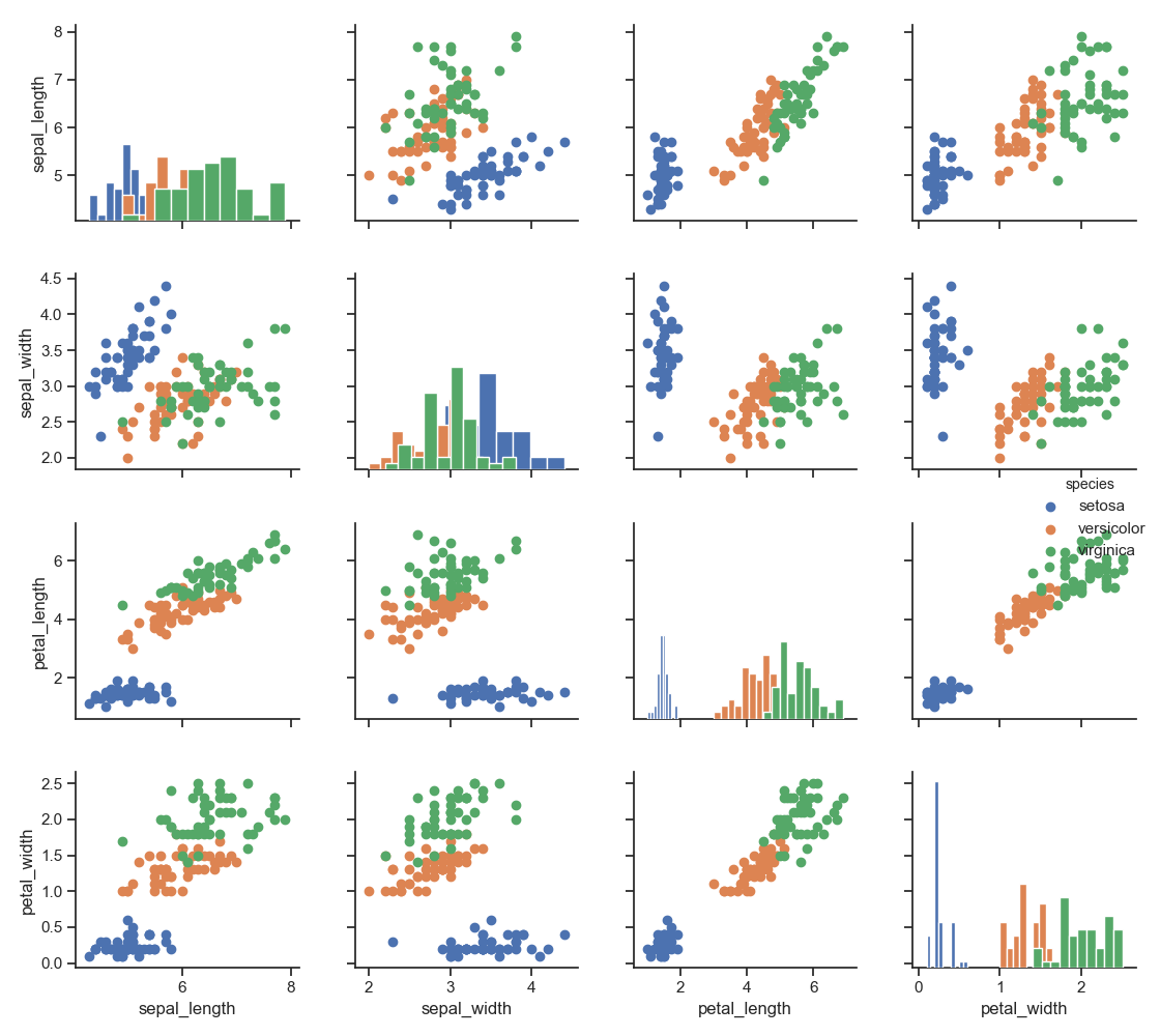
1 g = sns.PairGrid(iris, hue="species")
2 g.map_diag(plt.hist)
3 g.map_offdiag(plt.scatter)
4 g.add_legend()
5 plt.show()
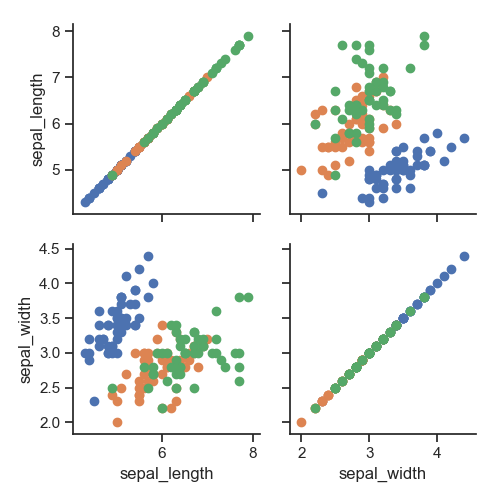
1 g = sns.PairGrid(iris, vars=["sepal_length", "sepal_width"], hue="species")  # vars 取一部分
2 g.map(plt.scatter)
3 plt.show()
1 g = sns.PairGrid(tips, hue="size", palette="GnBu_d")
2 g.map(plt.scatter, s=50, edgecolor="white")
3 g.add_legend()
4 plt.show()
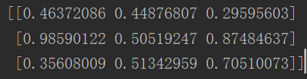
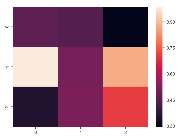
热力图
用颜色的深浅、亮度等来显示数据的分布
1 uniform_data = np.random.rand(3, 3)
2 print(uniform_data)
3 heatmap = sns.heatmap(uniform_data)
4 plt.show()
1 ax = sns.heatmap(uniform_data, vmin=0.2, vmax=0.5)  # 最大最小取值
2 plt.show()
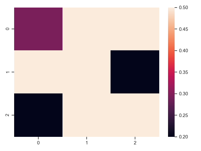
注意上图的随机数发生了变化。
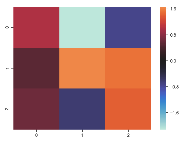
1 normal_data = np.random.randn(3, 3)
2 print(normal_data)
3 ax = sns.heatmap(normal_data, center=0)      # 中心值
4 plt.show()

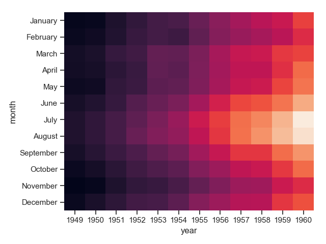
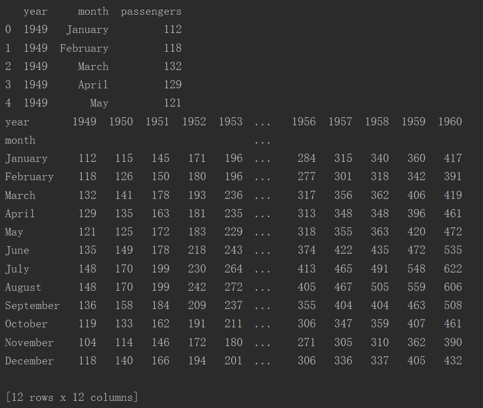
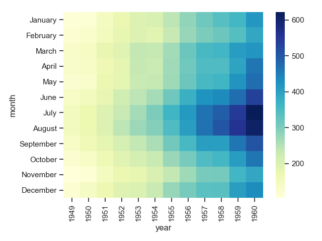
1 flights = sns.load_dataset("flights")
2 print(flights.head())
3 flights = flights.pivot("month", "year", "passengers") # 根据列值重塑数据
4 print(flights)
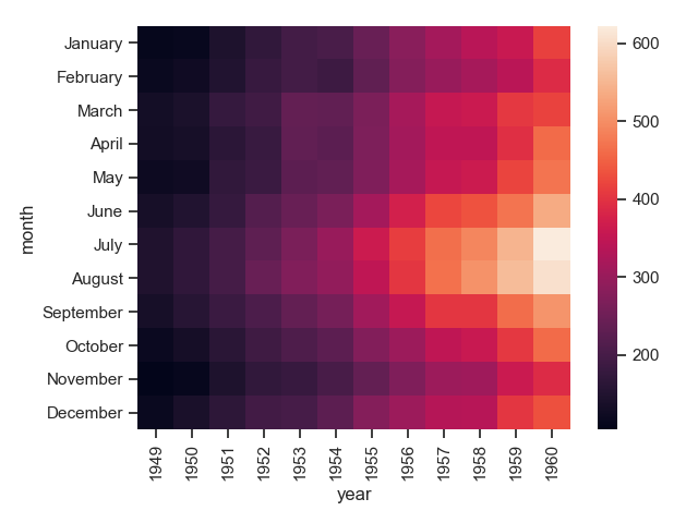
5 sns.heatmap(flights)
6 plt.show()
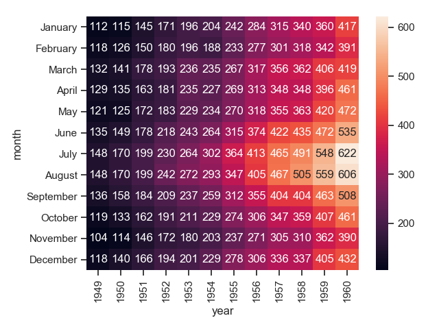
1 # fmt参数在这里是必须的,不然会乱码
2 sns.heatmap(flights, annot=True, fmt="d")
3 plt.show()
1 sns.heatmap(flights, linewidths=.4)
2 plt.show()

1 sns.heatmap(flights, cmap="YlGnBu")  # 指定数据值到颜色空间的映射;如果不提供,默认将取决于是否设置了中心
2 plt.show()
1 sns.heatmap(flights, cbar=False)  # 隐藏bar
2 plt.show()