基础按钮用法
<!--            <a-button type="primary" style="margin: 0 8px"  @click="insertEvent">新增</a-button>-->
            <vxe-button status="primary"  @click="insertEvent" content="新增"></vxe-button>
<!--            <a-button type="success" style="margin: 0 8px"  @click="handleSave">保存</a-button>-->
            <vxe-button status="success"  @click="handleSave" content="保存"></vxe-button>
<!--            <a-button type="primary" style="margin: 0 8px" @click="handleSave">编辑</a-button>-->
            <vxe-button status="danger"  @click="handleDelete" content="删除"></vxe-button>
<!--            <a-button type="danger" style="margin: 0 8px" @click="handleDelete">删除</a-button>-->

              <vxe-button content="默认颜色"></vxe-button>
              <vxe-button status="primary" content="主要颜色"></vxe-button>
              <vxe-button status="success" content="成功颜色"></vxe-button>
              <vxe-button status="info" content="信息颜色"></vxe-button>
              <vxe-button status="warning" content="警告颜色"></vxe-button>
              <vxe-button status="danger" content="危险颜色"></vxe-button>
              <vxe-button content="默认禁用颜色" disabled></vxe-button>
              <vxe-button status="primary" content="主要禁用颜色" disabled></vxe-button>
              <vxe-button status="success" content="成功禁用颜色" disabled></vxe-button>
              <vxe-button status="info" content="信息禁用颜色" disabled></vxe-button>
              <vxe-button status="warning" content="警告禁用颜色" disabled></vxe-button>
              <vxe-button status="danger" content="危险禁用颜色" disabled></vxe-button>
              <vxe-button content="默认颜色" loading></vxe-button>
              <vxe-button status="primary" content="主要颜色" loading></vxe-button>
              <vxe-button status="success" content="成功颜色" loading></vxe-button>
              <vxe-button status="info" content="信息颜色" loading></vxe-button>
              <vxe-button status="warning" content="警告颜色" loading></vxe-button>
              <vxe-button status="danger" content="危险颜色" loading></vxe-button>
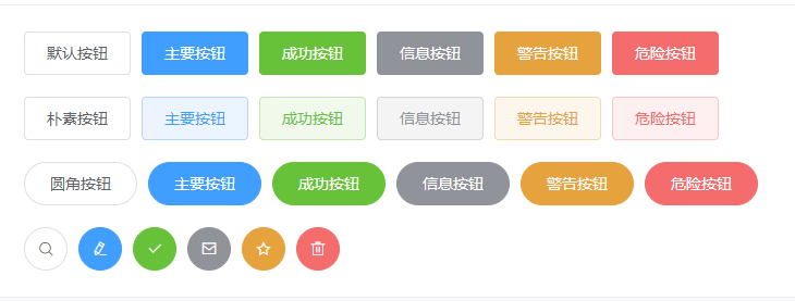
按钮分为:默认按钮、朴素按钮(plain)、圆角按钮(round)、圆形按钮(circle)。eg:
<el-button plain>朴素按钮</el-button>通过 type 属性指定 primary、success、info、warning、danger、text 其中的值设置按钮样式,其中若设置值为 text ,则为文字按钮,没有边框和背景颜色


 1 <el-row>
 2   <el-button>默认按钮</el-button>
 3   <el-button type="primary">主要按钮</el-button>
 4   <el-button type="success">成功按钮</el-button>
 5   <el-button type="info">信息按钮</el-button>
 6   <el-button type="warning">警告按钮</el-button>
 7   <el-button type="danger">危险按钮</el-button>
 8 </el-row>
 9
10 <el-row>
11   <el-button plain>朴素按钮</el-button>
12   <el-button type="primary" plain>主要按钮</el-button>
13   <el-button type="success" plain>成功按钮</el-button>
14   <el-button type="info" plain>信息按钮</el-button>
15   <el-button type="warning" plain>警告按钮</el-button>
16   <el-button type="danger" plain>危险按钮</el-button>
17 </el-row>
18
19 <el-row>
20   <el-button round>圆角按钮</el-button>
21   <el-button type="primary" round>主要按钮</el-button>
22   <el-button type="success" round>成功按钮</el-button>
23   <el-button type="info" round>信息按钮</el-button>
24   <el-button type="warning" round>警告按钮</el-button>
25   <el-button type="danger" round>危险按钮</el-button>
26 </el-row>
27
28 <el-row>
29   <el-button icon="el-icon-search" circle></el-button>
30   <el-button type="primary" icon="el-icon-edit" circle></el-button>
31   <el-button type="success" icon="el-icon-check" circle></el-button>
32   <el-button type="info" icon="el-icon-message" circle></el-button>
33   <el-button type="warning" icon="el-icon-star-off" circle></el-button>
34   <el-button type="danger" icon="el-icon-delete" circle></el-button>
35 </el-row>
按钮样式
添加 disabled 属性设置按钮禁用;设置 loading 属性值为 true ,在按钮上显示加载状态
图标按钮
设置 icon 属性值即可。eg:
<el-button type="primary" icon="el-icon-search">搜索</el-button>按钮组
使用 <el-button-group> 标签嵌套标签组。eg:
1 <el-button-group>
2   <el-button type="primary" icon="el-icon-arrow-left">上一页</el-button>
3   <el-button type="primary">下一页<i class="el-icon-arrow-right el-icon--right"></i></el-button>
4 </el-button-group>
5 <el-button-group>
6   <el-button type="primary" icon="el-icon-edit"></el-button>
7   <el-button type="primary" icon="el-icon-share"></el-button>
8   <el-button type="primary" icon="el-icon-delete"></el-button>
9 </el-button-group>
标签组

Button 组件提供了除默认按钮大小以外的 medium、small、mini 三种大小,通过设置 size 属性来配置