三角形代码
效果如右图所示 → 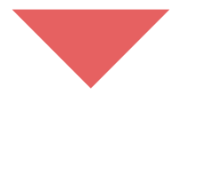
.triangle{width: 0;height: 0;border: 20px solid #e66161;border-color: #e66161 transparent transparent transparent;}
<div class="triangle"></div>
border-style
设置为none和hidden都不显示border。但是在运用表格时,hidden可以解决边框冲突的问题。
英文间隔、空白属性
word-spacing:英文单词之间的间距(例如 hello word)。
p{word-spacing: 30px;}
效果如右图所示 → 
letter-spacing:字符之间的间距(单个字符[字母、汉字、符号]之间的距离,例如 h e l l o)
h4 {letter-spacing: 20px}
效果如右图所示 → 
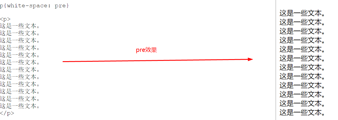
white-space:用来控制空白(空白包含:空格 Tab 回车)
| pre | 保留所有空白(完全按输入的格式显示) |
| nowrap | 强制不换行(除非使用 <br>强制换行) |
p{white-space: nowrap}
<p>
这是一些文本。
这是一些文本。
这是一些文本。
这是一些文本。
这是一些文本。
这是一些文本。
这是一些文本。
这是一些文本。
这是一些文本。
这是一些文本。
这是一些文本。
这是一些文本。
</p>
nowrap效果如右图所示 →
文字大小写
h1 {text-transform:uppercase} /* 全部大写 */
h2 {text-transform:capitalize}  /* 单词首字大写 */
p {text-transform:lowercase}   /* 全部小写 */
文字装饰
p.one {text-decoration:overline}  /*上划线*/
p.two {text-decoration:line-through} /*删除线*/
p.three {text-decoration:underline}  /*下划线*/
 /*如果想同时拥有三种效果,则将值同时赋给text-decoration,并用空格分开*/
p{text-decoration:overline line-through underline;}
效果: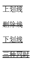
文字水平对齐方式
text-align: justify 设置两端对齐。 常用的 left / center / right
首字母缩进:text-indent:2em.
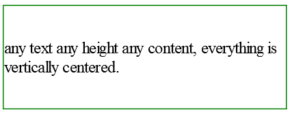
文字垂直居中
第一种方法:
vertical-align:middle 用于垂直方向对齐的属性。但只能使表格单元格中的对象垂直对齐。对于块元素,例如 div 则不起作用。
第二种方法:
line-height 只适用于单行垂直,如果是多行就不太好使。
第三种方法:
使用定位,代码如下
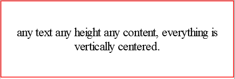
#outer {height: 100px; overflow: hidden; position: relative;}
#outer[id] {display: table; position: static;}

#middle {position: absolute; top: 50%;} /* for explorer only*/
#middle[id] {display: table-cell; vertical-align: middle; position: static;}

#inner {position: relative; top: -50%} /* for explorer only */
/* optional: #inner[id] {position: static;} */

.withBorder{
    border:1px green solid;
}
<div id="outer" class="withBorder">
  <div id="middle">
    <div id="inner">
      any text any height any content,
      everything is vertically centered.
    </div>
  </div>
</div>
效果如下:
第四种:(就是第三种的简单写法)
.middle-box{display:table;height:100px;border:1px solid #f00;width:400px;margin:0 auto;position:relative} /*固定宽度文字不能折行,去掉宽度即可折行*/
.middle-inner{display:table-cell;vertical-align:middle;*position:absolute;*top:50%;*left:50%;width:100%;text-align:center}
.middle-inner p{position:relative;*top:-50%;*left:-50%}
<div class="middle-box">
    <div class="middle-inner">
        <p> any text any height any content,
            everything is vertically centered.</p>
    </div>
</div>
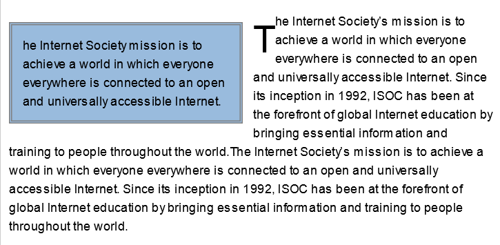
首字母大写效果
 p {font-family: Arial;font-size: 12px;line-height: 1.5;}
 .firstLetter {font-size: 3em;float: left;}/*首字母大写*/
 .p1 {width: 200px;float: left;margin: 10px;margin-left: 0;padding: 10px;border: 3px gray double;background: #9BD;}
<p class="p1">he Internet Society mission is to achieve a world in which
    everyone everywhere is connected to an open and universally accessible Internet. </p>
<p class="p2"><span class="firstLetter">T</Span>he Internet Society’s mission is to achieve a world in which everyone
    everywhere is connected to an open and universally accessible Internet. Since its inception in 1992, ISOC has been
    at the forefront of global Internet education by bringing essential information and training to people throughout
    the world.The Internet Society’s mission is to achieve a world in which everyone everywhere is connected to an open
    and universally accessible Internet. Since its inception in 1992, ISOC has been at the forefront of global Internet
    education by bringing essential information and training to people throughout the world.</p>
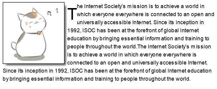
阴影效果
p {font-family: Arial;font-size: 12px;line-height: 1.5;}
.firstLetter {font-size: 3em;float: left;}
.shadow {float: left;background: url(images/bottom-right.gif) no-repeat bottom right;}
.shadow div {background: url(images/top-left.png) no-repeat left top !important;background: url(images/top-left.gif) no-repeat left top;padding: 0 6px 6px 0;}
.shadow img {border: 1px solid #000;padding: 4px;}
<div class="shadow">
    <div><img src="cat.jpg"/></div>
</div>
<p class="p2"><span class="firstLetter">T</Span>he Internet Society’s mission is to achieve a world in which everyone
    everywhere is connected to an open and universally accessible Internet. Since its inception in 1992, ISOC has been
    at the forefront of global Internet education by bringing essential information and training to people throughout
    the world.The Internet Society’s mission is to achieve a world in which everyone everywhere is connected to an open
    and universally accessible Internet. Since its inception in 1992, ISOC has been at the forefront of global Internet
    education by bringing essential information and training to people throughout the world.</p>
注意:1)fiewworks导出png格式时,除了要选择png格式外,还要选择透明模式为“Alpha透明度”。不要选择“索引色透明”,那个是GIF的透明方式。
2)png格式有8、24、32这3种,通常为减少文件体积,使用8位PNG,而IE6必须使用32位才能实现透明。24位不支持透明。
3)如果放置半透明png格式图片的div没有给出明确的高度或者宽度中的一个,有可能不现实该图像。解决方法:在代码中加入1px即可正确显示。
背景图像不移动效果background-attachment
有一种多见于博客的效果,当页面内容滚动时,背景始终不会移动。所有浏览器都支持 background-attachment 属性。
| 值 | 描述 |
|---|---|
| scroll | 默认值。背景图像会随着页面其余部分的滚动而移动。 |
| fixed | 当页面的其余部分滚动时,背景图像不会移动。 |
| inherit | 规定应该从父元素继承 background-attachment 属性的设置。任何IE版本 (包括 IE8)都不支持属性值 "inherit" |
body
  {
  background-image: url(bgimage.gif);
  background-attachment: fixed;
  }