element-ui的table组件有筛选功能,可以通过关键词筛选指定条件的当前页的数据:
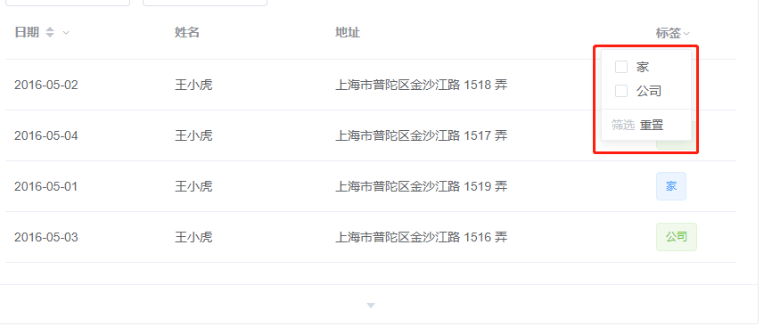
先放代码及效果图:
组件源码:
<template>
  <div class="filter-tool-tip">
    <el-popover width="110">
      <span slot="reference">
        <span :style="{ color: checkedList.length > 0 ? '#1890ff' : '' }">{{
          title
        }}</span>
        <i class="el-icon-arrow-down"></i>
      </span>
      <ul class="f-chb">
        <el-checkbox-group :max="1" v-model="checkedList">
          <li v-for="item in option" :key="item.value">
            <el-checkbox :label="item.value">{{ item.label }}</el-checkbox>
          </li>
        </el-checkbox-group>
      </ul>
      <div class="b-line"></div>
      <div class="s-and-re">
        <el-button
          :disabled="checkedList.length <= 0"
          type="text"
          @click="filter"
          >筛选</el-button
        >
        <el-button @click="reset" type="text">重置</el-button>
      </div>
    </el-popover>
  </div>
</template>

<script>
/* 用于表格的表头筛选功能 */
export default {
  props: {
    option: {
      // 多选的遍历值
      default: [],
      required: true,
    },
    // 是否可以多选,如果全选?
    multiSelect: {
      default: false,
    },
    // 标题
    title: {
      required: true,
      default: "--",
    },
    // 当前列的prop
    keyword: {
      type: String,
    },
  },
  data() {
    return {
      checkedList: [],
    };
  },
  methods: {
    filter() {
      this.$emit("change", this.checkedList, this.keyword);
    },
    reset() {
      this.checkedList = [];
      this.$emit("reset", this.keyword);
    },
  },
};
</script>

<style scoped>
.f-chb {
  list-style: none;
  padding-left: 6px;
}
.b-line {
  border-top: 1px solid #eee;
  margin: 0 -12px;
}
</style>
效果图:
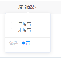
多选的数组:里面对象有两个属性:
- value:绑定的值
- label:展示的文本
注意:需要在父组件的<el-table-column></el-table-column>标签内加一个header的插槽,再把组件放进去:
        <el-table-column width="150" prop="status">
          <template slot="header" slot-scope="scope">
            <FilterTooltip
              title="填写情况"
              :option="filterListFilled"
              @change="filterChange"
              @reset="filterReset"
              keyword="status"
            />
          </template>
        </el-table-column>