引自 http://www.cnblogs.com/shimily/articles/7943370.html
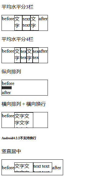
<!DOCTYPE html>
<html lang="en">
<head>
    <meta charset="UTF-8">
    <title>flexbox布局</title>
    <style>
    div {
        border: 1px solid #000;
        overflow: hidden;
    }
    div.flex-h:before, div.flex-v:before {
        content: "before";
    }
    div.flex-h:after, div.flex-v:after {
        content: "after";
    }
    .w60 {
        width: 60px;
    }
    .w150 {
        width: 150px;
    }
    .w200 {
        width: 200px;
    }
    .h30 {
        height: 30px;
    }
    .h50 {
        height: 50px;
    }
    /* 父元素-flex容器 */
    .flex {
        display: box;              /* OLD - Android 4.4- */

        display: -webkit-box;      /* OLD - iOS 6-, Safari 3.1-6 */
        display: -moz-box;         /* OLD - Firefox 19- (buggy but mostly works) */
        display: -ms-flexbox;      /* TWEENER - IE 10 */
        display: -webkit-flex;     /* NEW - Chrome */
        display: flex;             /* NEW, Spec - Opera 12.1, Firefox 20+ */
    }
    /* 子元素-平均分栏 */
    .flex1 {
        -webkit-box-flex: 1;      /* OLD - iOS 6-, Safari 3.1-6 */
        -moz-box-flex: 1;         /* OLD - Firefox 19- */
        width: 20%;               /* For old syntax, otherwise collapses. */
        -webkit-flex: 1;          /* Chrome */
        -ms-flex: 1;              /* IE 10 */
        flex: 1;                  /* NEW, Spec - Opera 12.1, Firefox 20+ */
    }
    /* 父元素-横向排列(主轴) */
    .flex-h {
        display: box;              /* OLD - Android 4.4- */

        display: -webkit-box;      /* OLD - iOS 6-, Safari 3.1-6 */
        display: -moz-box;         /* OLD - Firefox 19- (buggy but mostly works) */
        display: -ms-flexbox;      /* TWEENER - IE 10 */
        display: -webkit-flex;     /* NEW - Chrome */
        display: flex;             /* NEW, Spec - Opera 12.1, Firefox 20+ */


        /* 09版 */
        -webkit-box-orient: horizontal;
        /* 12版 */
        -webkit-flex-direction: row;
        -moz-flex-direction: row;
        -ms-flex-direction: row;
        -o-flex-direction: row;
        flex-direction: row;
    }
    /* 父元素-横向换行 */
    .flex-hw {
        /* 09版 */
        -webkit-box-lines: multiple;
        /* 12版 */
        -webkit-flex-wrap: wrap;
        -moz-flex-wrap: wrap;
        -ms-flex-wrap: wrap;
        -o-flex-wrap: wrap;
        flex-wrap: wrap;
    }
    /* 父元素-水平居中(主轴是横向才生效) */
    .flex-hc {
        /* 09版 */
        -webkit-box-pack: center;
        /* 12版 */
        -webkit-justify-content: center;
        -moz-justify-content: center;
        -ms-justify-content: center;
        -o-justify-content: center;
        justify-content: center;
        /* 其它取值如下:
            align-items     主轴原点方向对齐
            flex-end        主轴延伸方向对齐
            space-between   等间距排列,首尾不留白
            space-around    等间距排列,首尾留白
         */
    }
    /* 父元素-纵向排列(主轴) */
    .flex-v {
        display: box;              /* OLD - Android 4.4- */

        display: -webkit-box;      /* OLD - iOS 6-, Safari 3.1-6 */
        display: -moz-box;         /* OLD - Firefox 19- (buggy but mostly works) */
        display: -ms-flexbox;      /* TWEENER - IE 10 */
        display: -webkit-flex;     /* NEW - Chrome */
        display: flex;             /* NEW, Spec - Opera 12.1, Firefox 20+ */


        /* 09版 */
        -webkit-box-orient: vertical;
        /* 12版 */
        -webkit-flex-direction: column;
        -moz-flex-direction: column;
        -ms-flex-direction: column;
        -o-flex-direction: column;
        flex-direction: column;
    }
    /* 父元素-纵向换行 */
    .flex-vw {
        /* 09版 */
        -webkit-box-lines: multiple;
        /* 12版 */
        -webkit-flex-wrap: wrap;
        -moz-flex-wrap: wrap;
        -ms-flex-wrap: wrap;
        -o-flex-wrap: wrap;
        flex-wrap: wrap;
    }
    /* 父元素-竖直居中(主轴是横向才生效) */
    .flex-vc {
        /* 09版 */
        -webkit-box-align: center;
        /* 12版 */
        -webkit-align-items: center;
        -moz-align-items: center;
        -ms-align-items: center;
        -o-align-items: center;
        align-items: center;
    }

    .flex-1 {
        -webkit-box-ordinal-group: 1;   /* OLD - iOS 6-, Safari 3.1-6 */
        -moz-box-ordinal-group: 1;      /* OLD - Firefox 19- */
        -ms-flex-order: 1;              /* TWEENER - IE 10 */
        -webkit-order: 1;               /* NEW - Chrome */
        order: 1;                       /* NEW, Spec - Opera 12.1, Firefox 20+ */
    }
    .flex-2 {
        -webkit-box-ordinal-group: 2;   /* OLD - iOS 6-, Safari 3.1-6 */
        -moz-box-ordinal-group: 2;      /* OLD - Firefox 19- */
        -ms-flex-order: 2;              /* TWEENER - IE 10 */
        -webkit-order: 2;               /* NEW - Chrome */
        order: 2;                       /* NEW, Spec - Opera 12.1, Firefox 20+ */
    }
    </style>
</head>
<body>
    <p>平均水平分3栏</p>
    <div class="flex-h w150 h50">
        <div class="flex1">文字文字文字文字文字文字文字</div>
        <div class="flex1">text text text text text text text text</div>
        <div class="flex1">文字文字文字文字文字文字文字</div>
    </div>
    <p>平均水平分4栏</p>
    <div class="flex-h w150 h50">
        <div class="flex1">文字文字文字文字文字文字文字</div>
        <div class="flex1">text text text text text text text text</div>
        <div class="flex1">文字文字文字文字文字文字文字</div>
        <div class="flex1">text text text text text text text text</div>
    </div>
    <p>纵向排列</p>
    <div class="flex-v w150 h50">
        <div class="flex1 w60 h50">文字文字文字文字文字文字文字</div>
        <div class="flex1 w60 h50">text text text text text text text text</div>
        <div class="flex1 w60 h50">文字文字文字文字文字文字文字</div>
        <div class="flex1 w60 h50">text text text text text text text text</div>
    </div>
    <p>横向排列 + 横向换行</p>
    <div class="flex-h w150 h50 flex-hw">
        <div class="w60 h50">文字文字文字文字文字文字文字</div>
        <div class="w60 h50">text text text text text text text text</div>
        <div class="w60 h50">文字文字文字文字文字文字文字</div>
        <div class="w60 h50">text text text text text text text text</div>
    </div>
    <h6>Android4.2.2不支持换行</h6>
    <p>竖直居中</p>
    <div class="flex-h flex-vc w200 h50">
        <div class="w60 h30">文字文字文字文字文字文字文字</div>
        <div class="w60 h30">text text text text text text text text</div>
    </div>
    <p>水平居中</p>
    <div class="flex-h flex-hc w200 h50">
        <div class="w60 h30">文字文字文字文字文字文字文字</div>
        <div class="w60 h30">text text text text text text text text</div>
    </div>
    <p>居中</p>
    <div class="flex-h flex-hc flex-vc w200 h50">
        <div class="w60 h30">文字文字文字文字文字文字文字</div>
        <div class="w60 h30">text text text text text text text text</div>
    </div>
    <p>改变顺序(栅格布局,最终效果英文应该在左边)</p>
    <div class="flex-h w200 h50">
        <div class="flex1 flex-2">文字文字文字文字文字文字文字</div>
        <div class="flex1 flex-1">text text text text text text text text</div>
    </div>
    <h6>Android4.2.2下伪元素位置表现不一致</h6>
</body>
</html>