一直以来,使用纯 CSS 实现波浪效果都是十分困难的。
因为实现波浪的曲线需要借助贝塞尔曲线。

而使用纯 CSS 的方式,实现贝塞尔曲线,额,暂时是没有很好的方法。

当然,借助其他力量(SVG、CANVAS),是可以很轻松的完成所谓的波浪效果的,先看看,非 CSS 方式实现的波浪效果。
使用 SVG 实现波浪效果
借助 SVG ,是很容易画出三次贝塞尔曲线的。
看看效果:
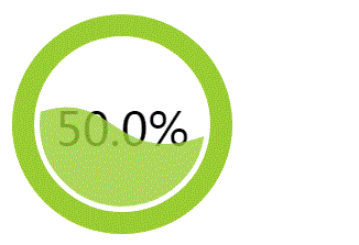
代码如下:
<svg width="200px" height="200px" version="1.1" xmlns="http://www.w3.org/2000/svg">
    <text class="liquidFillGaugeText" text-anchor="middle" font-size="42px" transform="translate(100,120)" style="fill: #000">50.0%</text>
    <!-- Wave -->
    <g id="wave">
        <path id="wave-2" fill="rgba(154, 205, 50, .8)" d="M 0 100 C 133.633 85.12 51.54 116.327 200 100 A 95 95 0 0 1 0 100 Z">
        <animate dur="5s" repeatCount="indefinite" attributeName="d" attributeType="XML" values="M0 100 C90 28, 92 179, 200 100 A95 95 0 0 1 0 100 Z;
                                    M0 100 C145 100, 41 100, 200 100 A95 95 0 0 1 0 100 Z;
                                    M0 100 C90 28, 92 179, 200 100 A95 95 0 0 1 0 100 Z"></animate>
        </path>
    </g>
    <circle cx="100" cy="100" r="80" stroke-width="10" stroke="white" fill="transparent"></circle>
    <circle cx="100" cy="100" r="90" stroke-width="20" stroke="yellowgreen" fill="none" class="percentage-pie-svg"></circle>
</svg>
画出三次贝塞尔曲线的核心在于 <path id="wave-2" fill="rgba(154, 205, 50, .8)" d="M 0 100 C 133.633 85.12 51.54 116.327 200 100 A 95 95 0 0 1 0 100 Z"> 这一段。感兴趣的可以自行去研究研究。
使用 canvas 实现波浪效果
使用 canvas 实现波浪效果的原理与 SVG 一样,都是利用路径绘制出三次贝塞尔曲线并赋予动画效果。

使用 canvas 的话,代码如下:
$(function() {
    let canvas = $("canvas");
    let ctx = canvas[0].getContext('2d');
    let radians = (Math.PI / 180) * 180;
    let startTime = Date.now();
    let time = 2000;
    let clockwise = 1;
    let cp1x, cp1y, cp2x, cp2y;

    // 初始状态
    // ctx.bezierCurveTo(90, 28, 92, 179, 200, 100);
    // 末尾状态
    // ctx.bezierCurveTo(145, 100, 41, 100, 200, 100);

    requestAnimationFrame(function waveDraw() {
        let t = Math.min(1.0, (Date.now() - startTime) / time);

        if(clockwise) {
            cp1x = 90 + (55 * t);
            cp1y = 28 + (72 * t);
            cp2x = 92 - (51 * t);
            cp2y = 179 - (79 * t);
        } else {
            cp1x = 145 - (55 * t);
            cp1y = 100 - (72 * t);
            cp2x = 41 + (51 * t);
            cp2y = 100 + (79 * t);
        }

        ctx.clearRect(0, 0, 200, 200);
        ctx.beginPath();
        ctx.moveTo(0, 100);
        // 绘制三次贝塞尔曲线
        ctx.bezierCurveTo(cp1x, cp1y, cp2x, cp2y, 200, 100);
        // 绘制圆弧
        ctx.arc(100, 100, 100, 0, radians, 0);
        ctx.fillStyle = "rgba(154, 205, 50, .8)";
        ctx.fill();
        ctx.save();

        if( t == 1 ) {
            startTime = Date.now();
            clockwise = !clockwise;
        }

        requestAnimationFrame(waveDraw);
    });
})
主要是利用了动态绘制 ctx.bezierCurveTo() 三次贝塞尔曲线实现波浪的运动效果,感兴趣的可以自行研究。
纯 CSS 实现波浪效果
好,接下来才是本文的重点!使用纯 CSS 的方式,实现波浪的效果。
你 TM 在逗我?刚刚不是还说使用 CSS 无能为力吗?
是,我们没有办法直接绘制出三次贝塞尔曲线,但是我们可以利用一些讨巧的方法,模拟达到波浪运动时的效果,姑且把下面这种方法看作一种奇技淫巧。
原理
原理十分简单,我们都知道,一个正方形,给它添加 border-radius: 50%,将会得到一个圆形。

border-radius:用来设置边框圆角,当使用一个半径时确定一个圆形。
好的,如果 border-radius 没到 50%,但是接近 50% ,我们会得到一个这样的图形:

注意边角,整个图形给人的感觉是有点圆,却不是很圆。额,这不是废话吗 
好的,那整这么个图形又有什么用?还能变出波浪来不成?
没错!就是这么神奇。:) 我们让上面这个图形滚动起来(rotate) ,看看效果:

可能很多人看到这里还没懂旋转起来的意图,仔细盯着一边看,是会有类似波浪的起伏效果的。
而我们的目的,就是要借助这个动态变换的起伏动画,模拟制造出类似波浪的效果。
实现
当然,这里看到是全景实现图,所以感觉并不明显,OK,让我们用一个个例子看看具体实现起来能达到什么样的效果。
我们利用上面原理可以做到的一种波浪运动背景效果图:

后面漂浮的波浪效果,其实就是利用了上面的 border-radius: 45% 的椭圆形,只是放大了很多倍,视野之外的图形都 overflow: hidden ,只留下了一条边的视野,并且增加了一些相应的 transform 变换。
注意,这里背景是蓝色静止的,运动是白色的椭圆形。
代码也很简单,SCSS 代码如下:
body {
    position: relative;
    align-items: center;
    min-height: 100vh;
    background-color: rgb(118, 218, 255);
    overflow: hidden;

    &:before, &:after {
        content: "";
        position: absolute;
        left: 50%;
        min- 300vw;
        min-height: 300vw;
        background-color: #fff;
        animation-name: rotate;
        animation-iteration-count: infinite;
        animation-timing-function: linear;
    }

    &:before {
        bottom: 15vh;
        border-radius: 45%;
        animation-duration: 10s;
    }

    &:after {
        bottom: 12vh;
        opacity: .5;
        border-radius: 47%;
        animation-duration: 10s;
    }
}

@keyframes rotate {
    0% {
        transform: translate(-50%, 0) rotateZ(0deg);
    }
    50% {
        transform: translate(-50%, -2%) rotateZ(180deg);
    }
    100% {
        transform: translate(-50%, 0%) rotateZ(360deg);
    }
}
为了方便写 DEMO,用到的长度单位是 VW 与 VH,不太了解这两个单位的可以戳这里:vh、vw、vmin、vmax 知多少
可能有部分同学,还存在疑问,OK,那我们把上面的效果缩小 10 倍,将视野之外的动画也补齐,那么其实生成波浪的原理是这样的:

图中的虚线框就是我们实际的视野范围。

值得探讨的点
值得注意的是,要看到,这里我们生成波浪,并不是利用旋转的椭圆本身,而是利用它去切割背景,产生波浪的效果。那为什么不直接使用旋转的椭圆本身模拟波浪效果呢?因为
- 中间高,两边低的效果不符合物理学原理,看上去十分别扭;
可以点进去看看下面这个例子:
使用纯 CSS 实现波浪进度图
好,既然掌握了这种方法,下面我们就使用纯 CSS 实现上面最开始使用 SVG 或者 CANVAS 才能实现的波浪进度图。
HTML 结构如下:
<div class="container">
    <div class="wave"></div>
</div>
CSS 代码如下:
.wave {
    position: relative;
     200px;
    height: 200px;
    background-color: rgb(118, 218, 255);
    border-radius: 50%;

    &::before,
    &::after{
        content: "";
        position: absolute;
         400px;
        height: 400px;
        top: 0;
        left: 50%;
        background-color: rgba(255, 255, 255, .4);
        border-radius: 45%;
        transform: translate(-50%, -70%) rotate(0);
        animation: rotate 6s linear infinite;
        z-index: 10;
    }

    &::after {
        border-radius: 47%;
        background-color: rgba(255, 255, 255, .9);
        transform: translate(-50%, -70%) rotate(0);
        animation: rotate 10s linear -5s infinite;
        z-index: 20;
    }
}

@keyframes rotate {
    50% {
        transform: translate(-50%, -73%) rotate(180deg);
    } 100% {
        transform: translate(-50%, -70%) rotate(360deg);
    }
}
效果图:
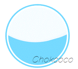
CodePen Demo -- Pure Css Wave Loading
虽然效果差了一点点,但是相较于要使用学习成本更高的 SVG 或者 CANVAS,这种纯 CSS 方法无疑可使用的场景更多,学习成本更低!
一些小技巧
单纯的让一个 border-radius 接近 50 的椭圆形旋转,动画效果可能不是那么好,我们可以适当的添加一些其他变换因素,让动画效果看上去更真实:
- 在动画过程中,动态的改变
border-radius的值; - 在动画过程中,利用 transform 对旋转椭圆进行轻微的位移、变形;
- 上面也演示到了,多个椭圆同时转动,赋予不同时长的动画,并且添加轻微的透明度,让整个效果更佳逼真。
最后
系列 CSS 文章汇总在我的 Github ,持续更新,欢迎点个 star 订阅收藏。
好了,本文到此结束,希望对你有帮助 :)
如果还有什么疑问或者建议,可以多多交流,原创文章,文笔有限,才疏学浅,文中若有不正之处,万望告知。