针对抓取到的南京市链家网的房源数据进行一次简单的数据可视化
首先导入必要的库。
import pandas as pd
import numpy as np
import matplotlib.pyplot as plt
import seaborn as sns
%matplotlib inline

plt.rcParams['font.sans-serif'] = ['SimHei']
plt.rcParams['axes.unicode_minus'] = False
读取链家网房源数据的csv文件。
df = pd.read_csv('lianjia.csv', encoding='utf-8')
del df['href']
df.head()

原文件中有每一个房源的链接信息,在这里我们不需要,所以就可以直接删除。
上面表格中的列分别是南京市的行政区划,房源名称,房屋设置,面积,朝向,装修情况的描述,电梯与否,楼层高度,建造时间,在网站上眠的注册时间,总价(万),单价(元),地铁情况。
首先来看一下基本我们获得的信息的基本情况。
df.info()
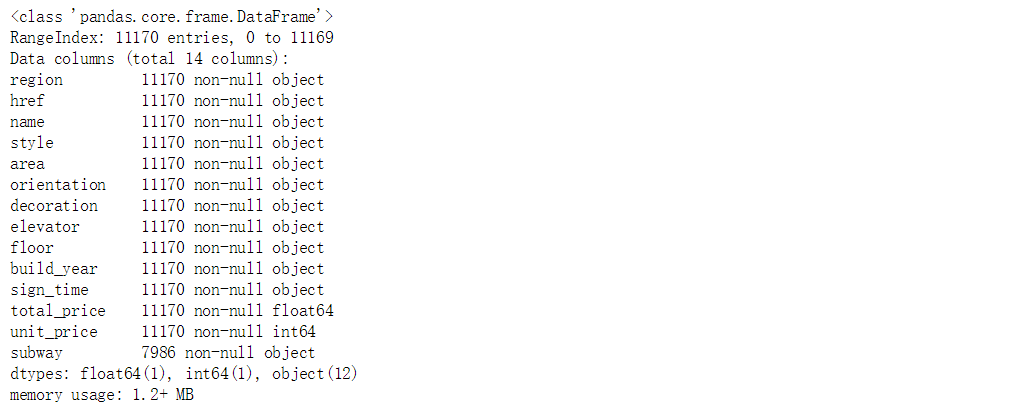
可以看到,数据一共是11170条,包括了每个字段的数据类型。
针对以上的数据,我们首先来看一下每个区划房源的平均价格,需要按照行政区划进行分组,在对单价单价进行平均。
mean_price_per_region = df.groupby(df.region)

fig = plt.figure(figsize=(12,7))
ax = fig.add_subplot(111)

ax.set_title('南京各区域二手房平均价格')
mean_price_per_region.unit_price.mean().plot.bar()
plt.savefig('mean_price.jpg')
plt.show()

鼓楼区作为南京市的核心地带,拥有众多的购物广场,其均价相对较高。
在来看一下南京市个行政区划房源的平均面积,首选需要将area字段的格式进行一下简单的转换。
df.area = df.area.apply(lambda x: x.replace('平米', ''))
df.area = df.area.astype(np.float)

fig = plt.figure(figsize=(12,7))
ax = fig.add_subplot(111)
df.groupby('region').area.mean().plot.bar()
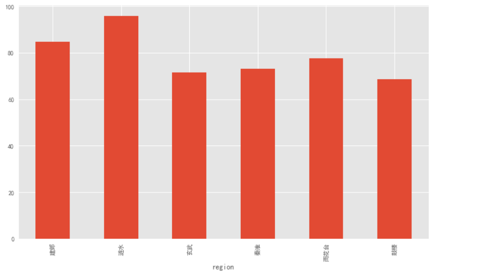
同样的,鼓楼区的平均面积也是最小的。
下面,我们看一下房屋的建造时间,同样的,先要对数据进行格式转换,将对象格式转换成数值类型,我们使用正则表达式,将房屋价格中的数字保留下来,将其余的汉字删除掉。
下面的代码中,我们使用了pandas库里面非常好用并且常用的一个方法apply()来对某一列进行全部应用,并且将将其图形化,由于建造时间五花八门,因此我们只是去其中出现次数最多的前20个进行画图。
import re
def number(x):
    a = re.findall('d+', x)
    if len(a) == 0:
        return None
    else:
        return a[0]
df['year'] = df.build_year.apply(number)

fig = plt.figure(figsize=(8,8))
ax = fig.add_subplot(111)
ax.set_title('南京地区二手房建造时间分布情况')
df.year.value_counts()[:20].plot.pie(cmap=plt.cm.rainbow)
plt.savefig('建造时间分布饼图.jpg')
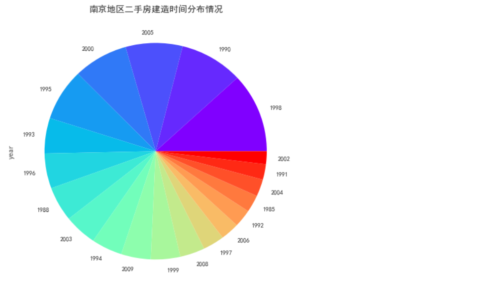
从以上的结果可以看出,占据绝对数量的建造时间依然是上个世纪九十年代,新建房屋相对偏少。
下面是以上数据直方图的分布情况。
df.year.fillna(df.year.median(), inplace=True)
df.year = df.year.astype(np.int)

fig = plt.figure(figsize=(12,7))
ax = fig.add_subplot(111)
ax.set_title('南京地区二手房建造时间分布直方图')
df.year.plot.hist(bins=8)
plt.xlim((1950,2020))
plt.savefig('建造时间直方图.jpg')
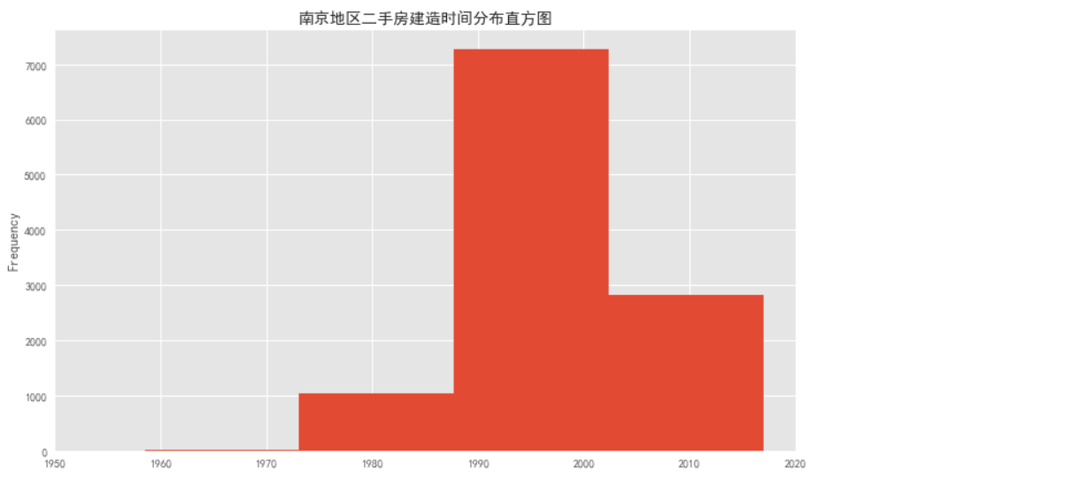
下面是建造时间的一个分布情况。
df.year.fillna(df.year.median(), inplace=True)
df.year = df.year.astype(np.int)

fig = plt.figure(figsize=(12,7))
ax = fig.add_subplot(111)
ax.set_title('南京地区二手房建造时间分布直方图')
df.year.plot.hist(bins=8)
plt.xlim((1950,2020))
plt.savefig('建造时间直方图.jpg')
下面是对房屋建造类型的一个描述,我们首先使用正则表达式将数字等信息删除,目的是保留房屋的结构类型,比如是楼板房还是平房这样的信息。
def clean_build(x):
    x = re.sub('d+', '', x)
    a = x.replace('年', '').replace('建', '')
    return a

df['build_type'] = df.build_year.apply(clean_build)
build_type = df.build_type.value_counts()
del build_type['无']

fig = plt.figure(figsize=(6,6))
ax = fig.add_subplot(111)
build_type.plot.pie()
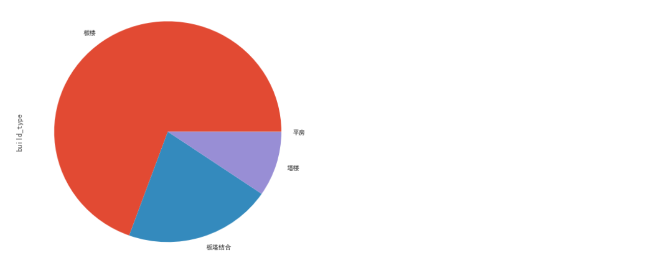
板楼类型的房屋是最多的,这也和建造时间有关,毕竟建造时间整体偏向于上个世纪。
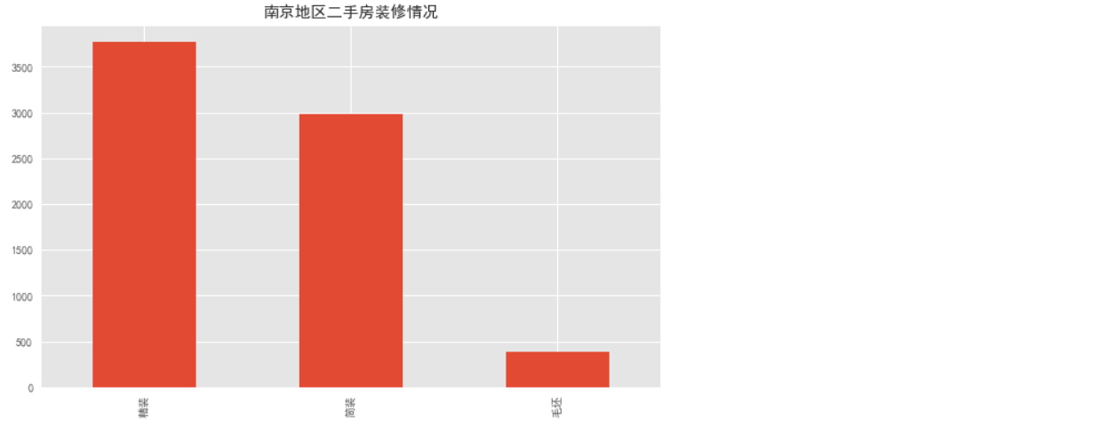
下面看一下装修情况。
def strip(x):
    return x.strip()
df.decoration = df.decoration.apply(strip)
df.decoration.unique()

decoration = df.decoration.value_counts()
del decoration['其他']

plt.figure(figsize=(10,6))
decoration.plot.bar()
plt.title('南京地区二手房装修情况')
plt.savefig('装修.jpg')
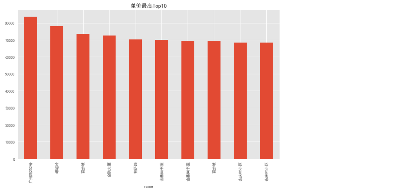
下面看一下哪几个街区的均价是最高的,先对数据做一些预处理。
df.unit_price = df.unit_price.astype(np.int)

unit_price = df.sort_values(by='unit_price', ascending=False)[:10]
unit_price.set_index(unit_price.name, inplace=True)

def clean__(x):
    return x.replace('平米', '')

unit_price.area = unit_price.area.apply(clean__)
unit_price.area = unit_price.area.astype(np.float)

area_price = unit_price['unit_price']
area_price

plt.figure(figsize=(12,7))
area_price.plot.bar()
plt.title('单价最高Top10')
plt.savefig('单价最高前十.jpg')
plt.show()
接下来在看一下,房屋整体结构的占比情况。
fig = plt.figure(figsize=(8,8))
ax = fig.add_subplot(111)

df['style'].value_counts()[:6].plot.pie(cmap=plt.cm.rainbow)
plt.title('房屋整体结构占比情况')

两室一厅作为标准配置,占比接近一半。
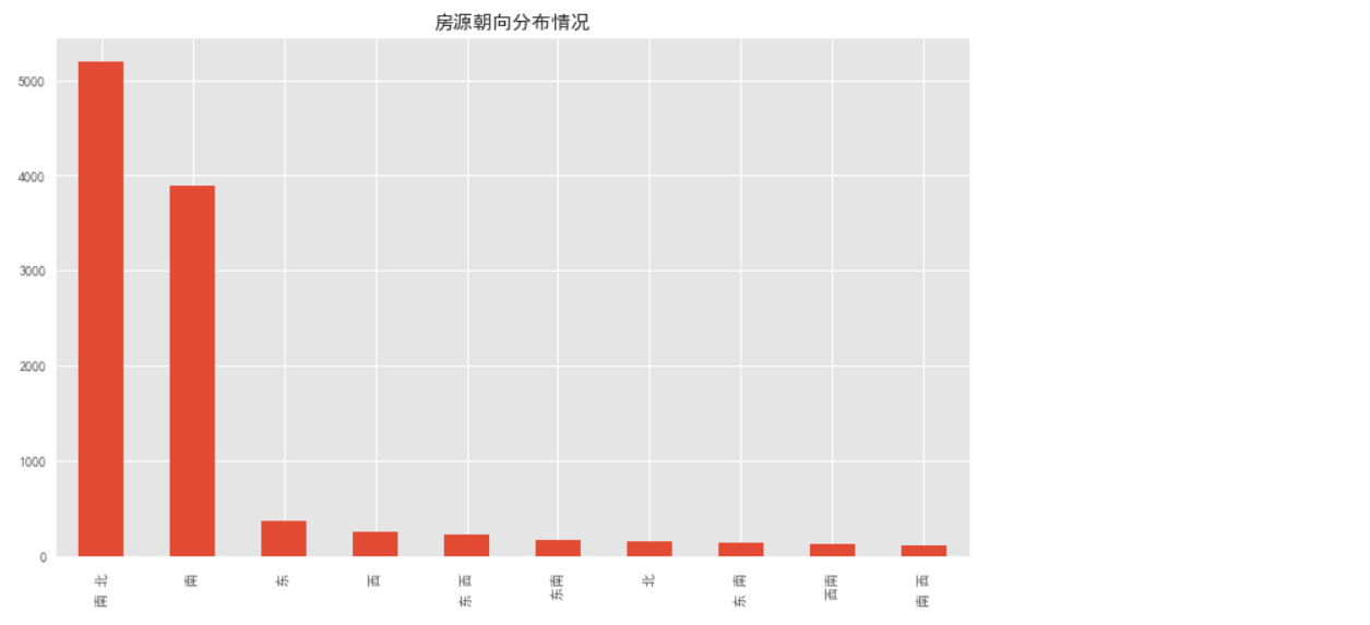
最后再来看一下房源朝向分布情况。
fig = plt.figure(figsize=(12,7))
ax = fig.add_subplot(111)
df.orientation.value_counts()[:10].plot.bar()
plt.title('房源朝向分布情况')