CSS3的强大毋庸置疑,下面就介绍一个用CSS3中 transition 属性实现的飘带样式菜单。
简要说明:就是实现鼠标移动到每一栏时,当前栏凸起、变色,鼠标移开后恢复原状。
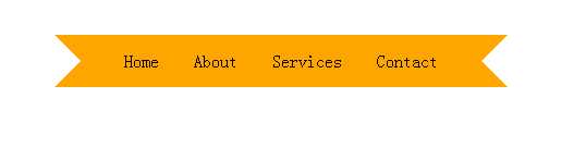
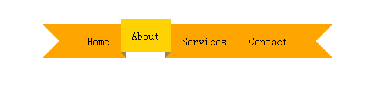
一、效果图
hover之前
hover 时
二、简要布局
这部分很简洁,废话不多说,直接上代码,如果代码看不懂,那说了也是白搭;
<div class='ribbon'>    //外部容器
        <a href='#'><span>Home</span></a>   //容器内部元素
        <a href='#'><span>About</span></a>
        <a href='#'><span>Services</span></a>
        <a href='#'><span>Contact</span></a>
    </div>
三、设计样式
规划整体(这个不是重点)
* {
            /* Basic CSS reset */
            margin:0;
            padding:0;
        }
        body {
            /* These styles have nothing to do with the ribbon */
            padding:35px 0 0;
            margin:auto;          //居中处理
            text-align:center;    //文本居中处理
}
设置外部容器(你看看就懂)
.ribbon {
            display:inline-block;
        }
        .ribbon:after, .ribbon:before {
            margin-top:0.5em;
            content: "";
            float:left;
            border:1.5em solid orange;
        }
        .ribbon:after {
            border-right-color:transparent;
        }
        .ribbon:before {
            border-left-color:transparent;
        }
设置容器内部细节(这是重点)
.ribbon a:link, .ribbon a:visited {
            color:#000;
            text-decoration:none;
            float:left;
            height:3.5em;
            overflow:hidden;
        }
        .ribbon span {
            background:orange;
            display:inline-block;
            line-height:3em;
            padding:0 1em;
            margin-top:0.5em;
            position:relative;
        //处理CSS3 浏览器兼容问题
            -webkit-transition: background-color 0.2s, margin-top 0.2s;  /* Saf3.2+, Chrome */
            -moz-transition: background-color 0.2s, margin-top 0.2s;  /* FF4+ */
            -ms-transition: background-color 0.2s, margin-top 0.2s;  /* IE10 */
            -o-transition: background-color 0.2s, margin-top 0.2s;  /* Opera 10.5+ */
            transition: background-color 0.2s, margin-top 0.2s;
        }
        .ribbon a:hover span {
            background:#FFD204;
            margin-top:0;
        }
        .ribbon span:before {
            content: "";
            position:absolute;
            top:3em;
            left:0;
            border-right:0.5em solid #9B8651;
            border-bottom:0.5em solid orange;
        }
        .ribbon span:after {
            content: "";
            position:absolute;
            top:3em;
            right:0;
            border-left:0.5em solid #9B8651;
            border-bottom:0.5em solid orange;
        }
:link 选择器用于选取未被访问的链接
:visited 选择器用于选取已被访问的链接
content 属性与 :before 及 :after 伪元素配合使用,来插入生成内容
上面这段代码是关键,如有不懂部分,可以在编辑器上调试,注释有疑问的语句,保存,再刷新页面看效果,这样影响深刻。