css3背景图像相关
兼容性:IE9+
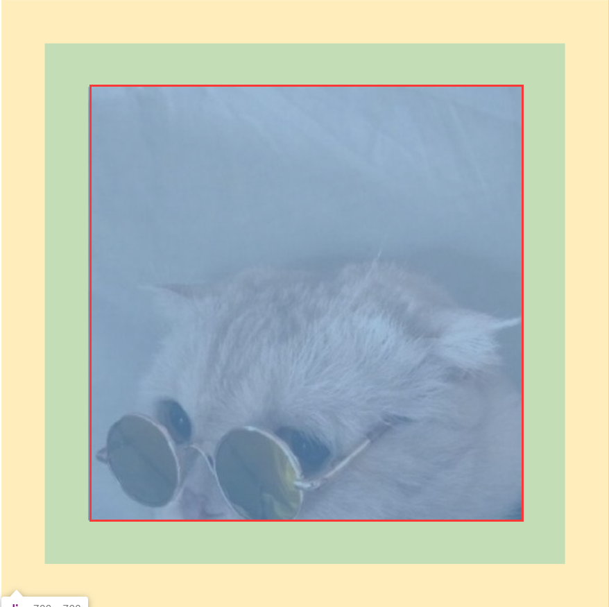
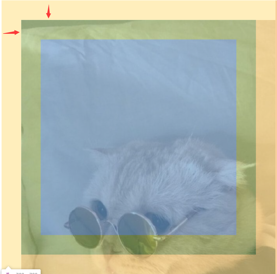
background-clip 背景图片绘制区域
background-clip:border-box; 内容区
<!DOCTYPE html>
<html lang="en" manifest="index.manifest">
<head>
<meta charset="UTF-8">
<title>Document</title>
<style>
    div{
        width: 500px;
        height: 500px;
        background:url(source/p3.jpg) center;
        padding:50px;
        border:50px solid transparent;
        background-clip:content-box;
        /*background-clip:padding-box;*/
        /*background-clip:border-box;*/
    }
</style>
</head>
<body>
    <div></div>
</body>
</html>
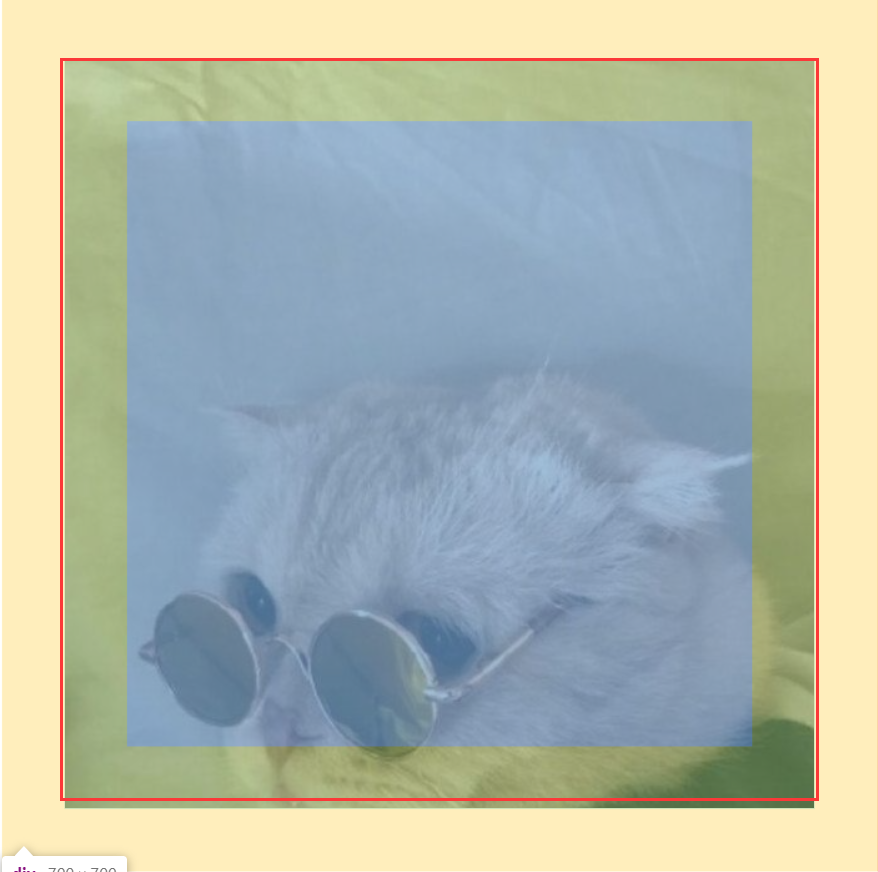
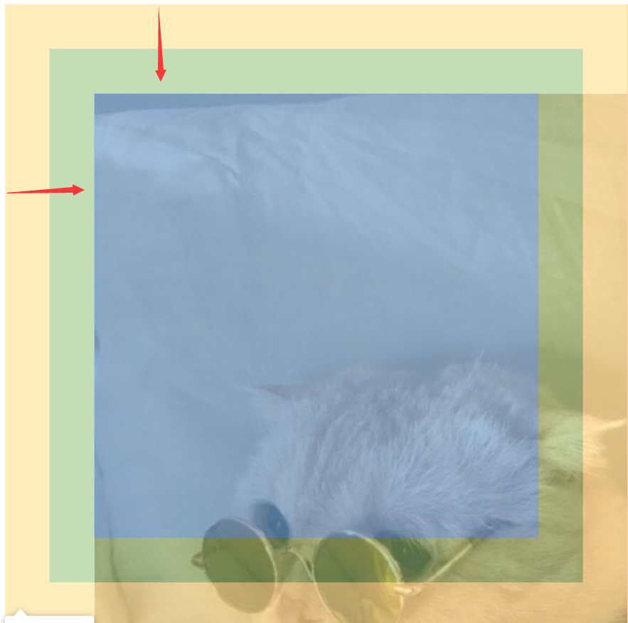
background-clip:padding-box; padding区域
<!DOCTYPE html>
<html lang="en" manifest="index.manifest">
<head>
<meta charset="UTF-8">
<title>Document</title>
<style>
    div{
        width: 500px;
        height: 500px;
        background:url(source/p3.jpg) center;
        padding:50px;
        border:50px solid transparent;
        background-clip:padding-box;
        /*background-clip:border-box;*/
    }
</style>
</head>
<body>
    <div></div>
</body>
</html>
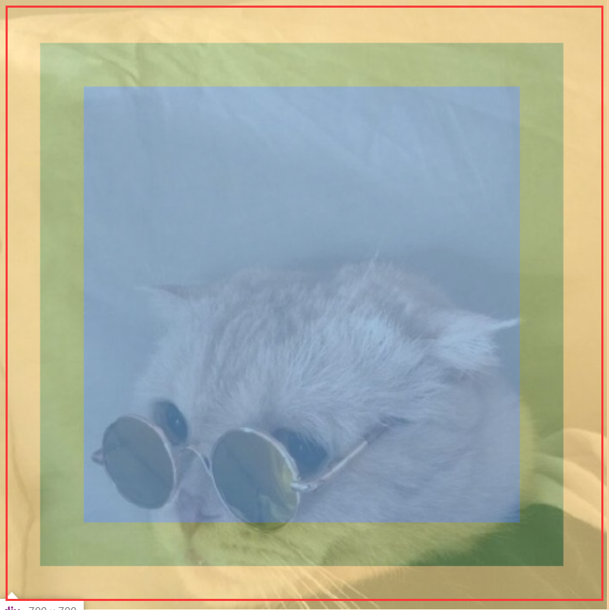
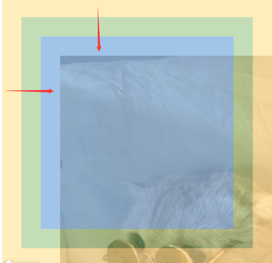
background-clip:border-box; border区域
<!DOCTYPE html>
<html lang="en" manifest="index.manifest">
<head>
<meta charset="UTF-8">
<title>Document</title>
<style>
    div{
        width: 500px;
        height: 500px;
        background:url(source/p3.jpg) center;
        padding:50px;
        border:50px solid transparent;
        background-clip:border-box;
    }
</style>
</head>
<body>
    <div></div>
</body>
</html>
background-origin: content-box | padding-box | border-box; 背景图片起始位置
背景图片从border-box开始水平垂直向下偏移50px
<!DOCTYPE html>
<html lang="en" manifest="index.manifest">
<head>
<meta charset="UTF-8">
<title>Document</title>
<style>
    div{
        width: 500px;
        height: 500px;
        background:url(source/p3.jpg) 50px 50px no-repeat;
        padding:50px;
        border:50px solid transparent;
        background-origin:border-box;
    }
</style>
</head>
<body>
    <div></div>
</body>
</html>
背景图片从padding-box开始水平垂直向下偏移50px
<!DOCTYPE html>
<html lang="en" manifest="index.manifest">
<head>
<meta charset="UTF-8">
<title>Document</title>
<style>
    div{
        width: 500px;
        height: 500px;
        background:url(source/p3.jpg) 50px 50px no-repeat;
        padding:50px;
        border:50px solid transparent;
        background-origin:padding-box;
    }
</style>
</head>
<body>
    <div></div>
</body>
</html>
背景图片从content-box开始水平垂直向下偏移50px
<!DOCTYPE html>
<html lang="en" manifest="index.manifest">
<head>
<meta charset="UTF-8">
<title>Document</title>
<style>
    div{
        width: 500px;
        height: 500px;
        background:url(source/p3.jpg) 50px 50px no-repeat;
        padding:50px;
        border:50px solid transparent;
        background-origin:content-box;
    }
</style>
</head>
<body>
    <div></div>
</body>
</html>
background-size: 填写数值或者百分比时,如果只填写一个值,另一个值默认为auto
cover 等比缩放填满容器
contain 等比缩放至一边碰到容器边
<!DOCTYPE html>
<html lang="en" manifest="index.manifest">
<head>
<meta charset="UTF-8">
<title>Document</title>
<style>
    div{
        width: 500px;
        height: 500px;
        background:url(source/p2.jpg) 50px 50px no-repeat;
        background-size:100%;/*宽度为容器宽度的100%,高度按图片比例来*/
        background-size:100% 100%;/*宽度为容器宽度的100%,高度为容器高度的100%*/
        background-size:cover;
        background-size:contain;
    }
</style>
</head>
<body>
    <div></div>
</body>
</html>
多重背景图片
background-image:url(),url();
前面的图片会覆盖后面的图片
<!DOCTYPE html>
<html lang="en" manifest="index.manifest">
<head>
<meta charset="UTF-8">
<title>Document</title>
<style>
    div{
        width: 500px;
        height: 500px;
        background-image:url(source/shuiyin.png), url(source/cat.jpg);

    }
</style>
</head>
<body>
    <div></div>
</body>
</html>
颜色设置为透明:transparent
css3渐变
兼容性:IE10
<!DOCTYPE html>
<html lang="en" manifest="index.manifest">
<head>
<meta charset="UTF-8">
<title>Document</title>
<style>
    div{
        width: 500px;
        height: 500px;
        background:-webkit-linear-gradient(pink, orange, #abcdef);/*默认是垂直方向*/
        background:   -moz-linear-gradient(pink, orange, #abcdef);/*默认是垂直方向*/
        background:     -o-linear-gradient(pink, orange, #abcdef);/*默认是垂直方向*/
        background:        linear-gradient(pink, orange, #abcdef);/*默认是垂直方向*/

        background:-webkit-linear-gradient(left, pink, orange, #abcdef);/*从左到右*/
        background:   -moz-linear-gradient(right, pink, orange, #abcdef);
        background:     -o-linear-gradient(right, pink, orange, #abcdef);
        background:        linear-gradient(to right, pink, orange, #abcdef);

        background:-webkit-linear-gradient(left top, pink, orange, #abcdef);/*从左上到右下*/
        background:   -moz-linear-gradient(right bottom, pink, orange, #abcdef);
        background:     -o-linear-gradient(right bottom, pink, orange, #abcdef);
        background:        linear-gradient(to right bottom, pink, orange, #abcdef);
    }
</style>
</head>
<body>
    <div></div>
</body>
</html>
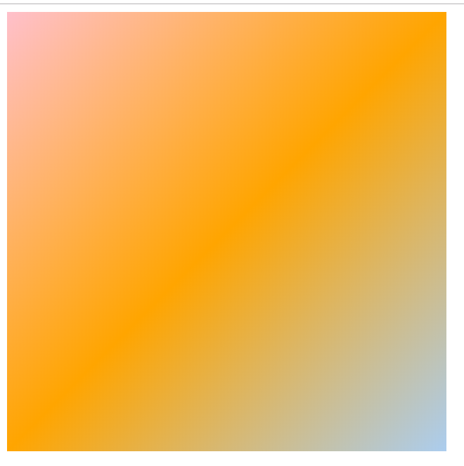
正常情况下线性渐变的角度
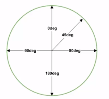
webkit内核下线性渐变的角度
解决方法:兼容浏览器的前缀按顺序书写,正常情况下无前缀的放在最后
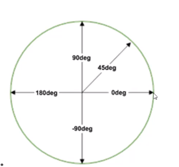
颜色可以具体分配位置
第一个颜色不写默认是0%的位置;最后一个颜色默认是100%的位置
<!DOCTYPE html>
<html lang="en" manifest="index.manifest">
<head>
<meta charset="UTF-8">
<title>Document</title>
<style>
    div{
        width: 500px;
        height: 500px;
        background:-webkit-linear-gradient(45deg, pink, orange, #abcdef);/*具体角度表示*/
        background:   -moz-linear-gradient(45deg, pink, orange, #abcdef);
        background:     -o-linear-gradient(45deg, pink, orange, #abcdef);
        background:        linear-gradient(45deg, pink, orange, #abcdef);

        background:-webkit-linear-gradient(90deg, orange, pink 30%, purple 70%, #abcdef);
        background:   -moz-linear-gradient(90deg, orange, pink 30%, purple 70%, #abcdef);
        background:     -o-linear-gradient(90deg, orange, pink 30%, purple 70%, #abcdef);
        background:        linear-gradient(90deg, orange, pink 30%, purple 70%, #abcdef);
    }
</style>
</head>
<body>
    <div></div>
</body>
</html>
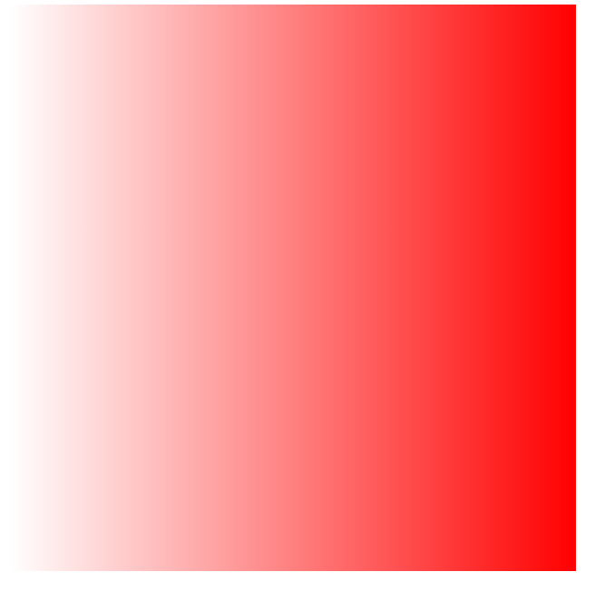
rgba() 可以设置带透明色的渐变
<!DOCTYPE html>
<html lang="en" manifest="index.manifest">
<head>
<meta charset="UTF-8">
<title>Document</title>
<style>
    div{
        width: 500px;
        height: 500px;
        background:-webkit-linear-gradient(90deg, rgba(255,0,0,0), rgba(255,0,0,1));/*具体角度表示*/
        background:   -moz-linear-gradient(90deg, rgba(255,0,0,0), rgba(255,0,0,1));
        background:     -o-linear-gradient(90deg, rgba(255,0,0,0), rgba(255,0,0,1));
        background:        linear-gradient(90deg, rgba(255,0,0,0), rgba(255,0,0,1));

    }
</style>
</head>
<body>
    <div></div>
</body>
</html>
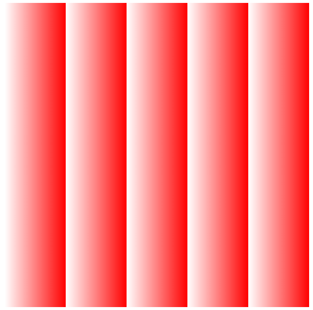
重复渐变
repeating-linear-gradient
<!DOCTYPE html>
<html lang="en" manifest="index.manifest">
<head>
<meta charset="UTF-8">
<title>Document</title>
<style>
    div{
        width: 500px;
        height: 500px;
        background:-webkit-repeating-linear-gradient(90deg, rgba(255,0,0,0), rgba(255,0,0,1) 20%);
        background:   -moz-repeating-linear-gradient(90deg, rgba(255,0,0,0), rgba(255,0,0,1) 20%);
        background:     -o-repeating-linear-gradient(90deg, rgba(255,0,0,0), rgba(255,0,0,1) 20%);
        background:        repeating-linear-gradient(90deg, rgba(255,0,0,0), rgba(255,0,0,1) 20%);

    }
</style>
</head>
<body>
    <div></div>
</body>
</html>
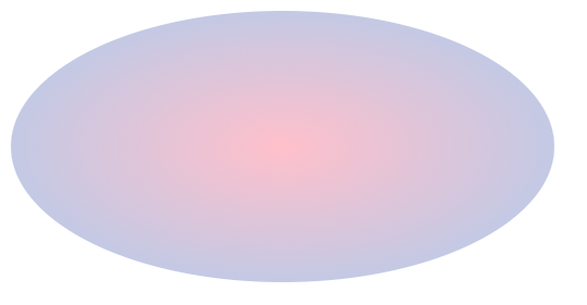
径向渐变 radial-gradient
<!DOCTYPE html>
<html lang="en" manifest="index.manifest">
<head>
<meta charset="UTF-8">
<title>Document</title>
<style>
    div{
        width: 400px;
        height: 200px;
        border-radius:50%;
        background:-webkit-radial-gradient(pink, #abcdef);
        background:   -moz-radial-gradient(pink, #abcdef);
        background:     -o-radial-gradient(pink, #abcdef);
        background:        radial-gradient(pink, #abcdef);
    }
</style>
</head>
<body>
    <div></div>
</body>
</html>
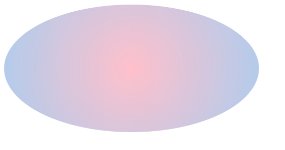
保持圆形渐变
<!DOCTYPE html>
<html lang="en" manifest="index.manifest">
<head>
<meta charset="UTF-8">
<title>Document</title>
<style>
    div{
        width: 400px;
        height: 200px;
        border-radius:50%;
        background:-webkit-radial-gradient(circle, pink, #abcdef);
        background:   -moz-radial-gradient(circle, pink, #abcdef);
        background:     -o-radial-gradient(circle, pink, #abcdef);
        background:        radial-gradient(circle, pink, #abcdef);
    }
</style>
</head>
<body>
    <div></div>
</body>
</html>
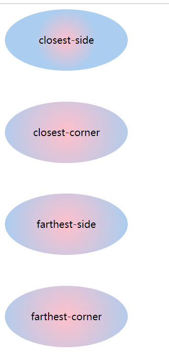
尺寸大小 closest-side closest-corner farthest-side farthest-corner
<!DOCTYPE html>
<html lang="en" manifest="index.manifest">
<head>
<meta charset="UTF-8">
<title>Document</title>
<style>
    div{
        width: 200px;
        height: 100px;
        border-radius:50%;
        margin-bottom:50px;
        line-height: 100px;
        text-align: center;
/*        background:-webkit-radial-gradient(circle, pink, #abcdef);
        background:   -moz-radial-gradient(circle, pink, #abcdef);
        background:     -o-radial-gradient(circle, pink, #abcdef);
        background:        radial-gradient(circle, pink, #abcdef);*/
    }
    div:nth-child(1){
        background:-webkit-radial-gradient(closest-side circle, pink, #abcdef);
        background:   -moz-radial-gradient(closest-side circle, pink, #abcdef);
        background:     -o-radial-gradient(closest-side circle, pink, #abcdef);
        background:        radial-gradient(closest-side circle, pink, #abcdef);
    }
    div:nth-child(2){
        background:-webkit-radial-gradient(closest-corner circle, pink, #abcdef);
        background:   -moz-radial-gradient(closest-corner circle, pink, #abcdef);
        background:     -o-radial-gradient(closest-corner circle, pink, #abcdef);
        background:        radial-gradient(closest-corner circle, pink, #abcdef);
    }
    div:nth-child(3){
        background:-webkit-radial-gradient(farthest-side circle, pink, #abcdef);
        background:   -moz-radial-gradient(farthest-side circle, pink, #abcdef);
        background:     -o-radial-gradient(farthest-side circle, pink, #abcdef);
        background:        radial-gradient(farthest-side circle, pink, #abcdef);
    }
    div:nth-child(4){
        background:-webkit-radial-gradient(farthest-corner circle, pink, #abcdef);
        background:   -moz-radial-gradient(farthest-corner circle, pink, #abcdef);
        background:     -o-radial-gradient(farthest-corner circle, pink, #abcdef);
        background:        radial-gradient(farthest-corner circle, pink, #abcdef);
    }
</style>
</head>
<body>
    <div>closest-side</div>
    <div>closest-corner</div>
    <div>farthest-side</div>
    <div>farthest-corner</div>
</body>
</html>
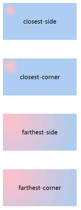
设置渐变的圆心位置
水平方向为宽度的10%,垂直方向为高度的20%
<!DOCTYPE html>
<html lang="en" manifest="index.manifest">
<head>
<meta charset="UTF-8">
<title>Document</title>
<style>
    div{
        width: 200px;
        height: 100px;
        margin-bottom:50px;
        line-height: 100px;
        text-align: center;
/*        background:-webkit-radial-gradient(circle, pink, #abcdef);
        background:   -moz-radial-gradient(circle, pink, #abcdef);
        background:     -o-radial-gradient(circle, pink, #abcdef);
        background:        radial-gradient(circle, pink, #abcdef);*/
    }
    div:nth-child(1){
        background:-webkit-radial-gradient(10% 20%, closest-side circle, pink, #abcdef);
        background:   -moz-radial-gradient(10% 20%, closest-side circle, pink, #abcdef);
        background:     -o-radial-gradient(10% 20%, closest-side circle, pink, #abcdef);
        background:        radial-gradient(10% 20%, closest-side circle, pink, #abcdef);
    }
    div:nth-child(2){
        background:-webkit-radial-gradient(10% 20%, closest-corner circle, pink, #abcdef);
        background:   -moz-radial-gradient(10% 20%, closest-corner circle, pink, #abcdef);
        background:     -o-radial-gradient(10% 20%, closest-corner circle, pink, #abcdef);
        background:        radial-gradient(10% 20%, closest-corner circle, pink, #abcdef);
    }
    div:nth-child(3){
        background:-webkit-radial-gradient(10% 20%, farthest-side circle, pink, #abcdef);
        background:   -moz-radial-gradient(10% 20%, farthest-side circle, pink, #abcdef);
        background:     -o-radial-gradient(10% 20%, farthest-side circle, pink, #abcdef);
        background:        radial-gradient(10% 20%, farthest-side circle, pink, #abcdef);
    }
    div:nth-child(4){
        background:-webkit-radial-gradient(10% 20%, farthest-corner circle, pink, #abcdef);
        background:   -moz-radial-gradient(10% 20%, farthest-corner circle, pink, #abcdef);
        background:     -o-radial-gradient(10% 20%, farthest-corner circle, pink, #abcdef);
        background:        radial-gradient(10% 20%, farthest-corner circle, pink, #abcdef);
    }
</style>
</head>
<body>
    <div>closest-side</div>
    <div>closest-corner</div>
    <div>farthest-side</div>
    <div>farthest-corner</div>
</body>
</html>
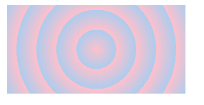
repeating-radial-gradient 重复径向渐变
<!DOCTYPE html>
<html lang="en" manifest="index.manifest">
<head>
<meta charset="UTF-8">
<title>Document</title>
<style>
    div{
        width: 200px;
        height: 100px;
        margin-bottom:50px;
        line-height: 100px;
        text-align: center;
        background:-webkit-repeating-radial-gradient(circle, pink, #abcdef 20%);
        background:   -moz-repeating-radial-gradient(circle, pink, #abcdef 20%);
        background:     -o-repeating-radial-gradient(circle, pink, #abcdef 20%);
        background:        repeating-radial-gradient(circle, pink, #abcdef 20%);
    }

</style>
</head>
<body>
    <div></div>
</body>
</html>
IE浏览器渐变
IE10+ 支持gradient 渐变
IE6-8 使用filter
<!DOCTYPE html>
<html lang="en" manifest="index.manifest">
<head>
<meta charset="UTF-8">
<title>Document</title>
<style>
    div{
        width: 200px;
        height: 100px;
        margin-bottom:50px;
        line-height: 100px;
        text-align: center;
        background:-webkit-repeating-radial-gradient(circle, pink, #abcdef 20%);
        background:   -moz-repeating-radial-gradient(circle, pink, #abcdef 20%);
        background:     -o-repeating-radial-gradient(circle, pink, #abcdef 20%);
        background:        repeating-radial-gradient(circle, pink, #abcdef 20%);
        filter: progid:DXImageTransform.Microsoft.gradient(startcolorstr=pink,endcolorstr=#abcdef,gradientType=1);
    }

</style>
</head>
<body>
    <div></div>
</body>
</html>
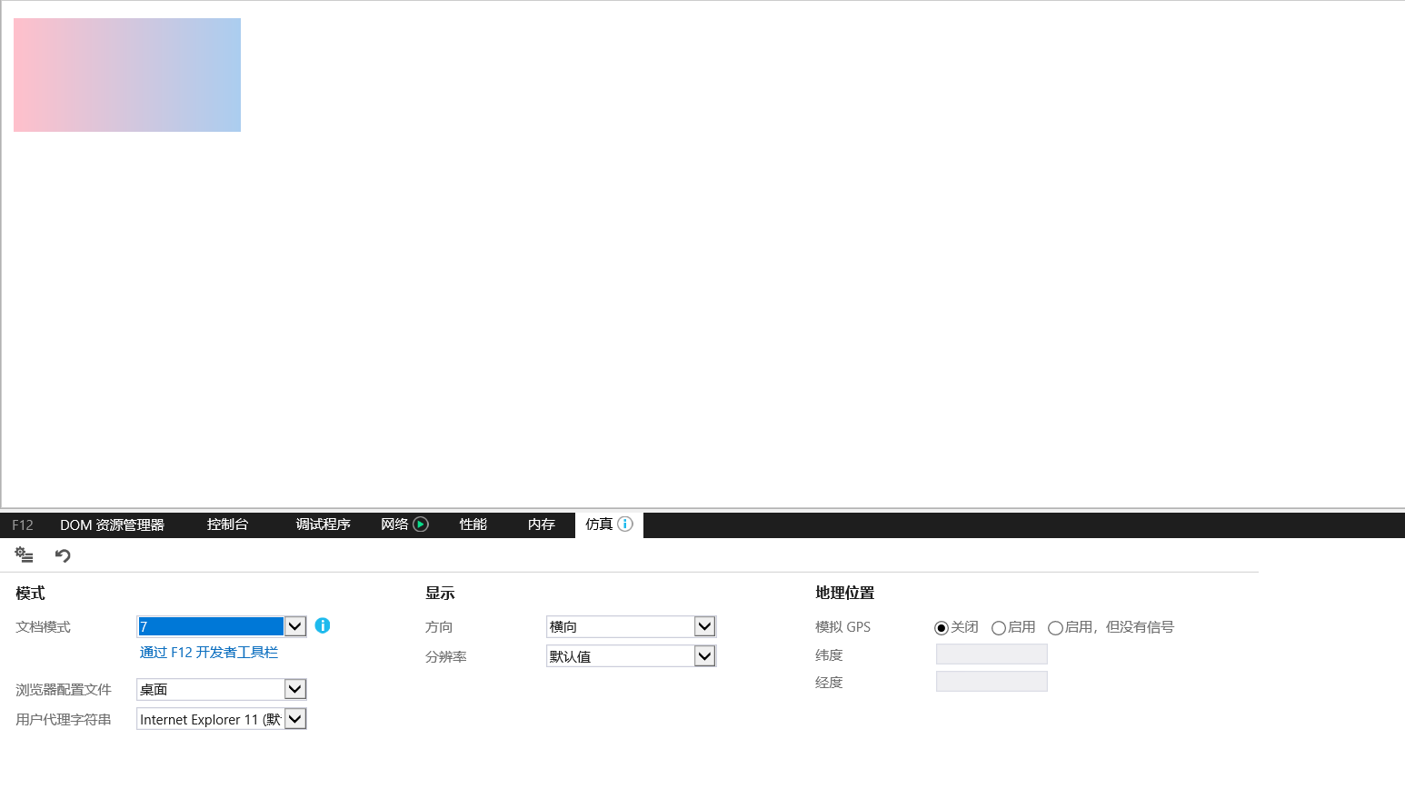
使用IE控制台可切换IE浏览器版本
IE filter
0 从左到右线性渐变
1 从上到下线性渐变
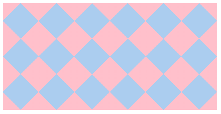
实际案例:
<!DOCTYPE html>
<html lang="en" manifest="index.manifest">
<head>
<meta charset="UTF-8">
<title>Document</title>
<style>
    div{
        width: 600px;
        height: 300px;
        background-color:#abcdef;
        background-size:100px 100px;
        background-image:-webkit-linear-gradient(45deg, pink 25%, transparent 25%),
                         -webkit-linear-gradient(-45deg, pink 25%, transparent 25%),
                         -webkit-linear-gradient(45deg, transparent 75%, pink 75%),
                         -webkit-linear-gradient(-45deg, transparent 75%, pink 75%);
        background-image:-moz-linear-gradient(45deg, pink 25%, transparent 25%),
                         -moz-linear-gradient(-45deg, pink 25%, transparent 25%),
                         -moz-linear-gradient(45deg, transparent 75%, pink 75%),
                         -moz-linear-gradient(-45deg, transparent 75%, pink 75%);
        background-image:-o-linear-gradient(45deg, pink 25%, transparent 25%),
                         -o-linear-gradient(-45deg, pink 25%, transparent 25%),
                         -o-linear-gradient(45deg, transparent 75%, pink 75%),
                         -o-linear-gradient(-45deg, transparent 75%, pink 75%);
        background-image:linear-gradient(45deg, pink 25%, transparent 25%),
                         linear-gradient(-45deg, pink 25%, transparent 25%),
                         linear-gradient(45deg, transparent 75%, pink 75%),
                         linear-gradient(-45deg, transparent 75%, pink 75%);
    }

</style>
</head>
<body>
    <div></div>
</body>
</html>