@羯瑞
三角形
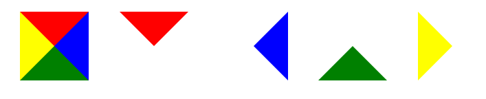
.triangle{0;height:0;border-50px;border-style:solid;border-color:red blue green yellow;}
.triangle_top{0;height: 0;border-50px;border-style:solid;border-color:red transparent transparent transparent;}
.triangle_right{0;height: 0;border-50px;border-style:solid;border-color:transparent blue transparent transparent;}
.triangle_bottom{0;height: 0;border-50px;border-style:solid;border-color:transparent transparent green transparent;}
.triangle_left{0;height: 0;border-50px;border-style:solid;border-color:transparent transparent transparent yellow;}
要点
- 注意各个方向边框值的边框,可以写出不同的等边三角形,等腰三角形,任意三角形...
transparent透明色,这个得必须,也可以设置成跟底色一样的颜色就可以。- 把四个边设置不同数值,你会发现CSS三角形的规律的
拓展扇形
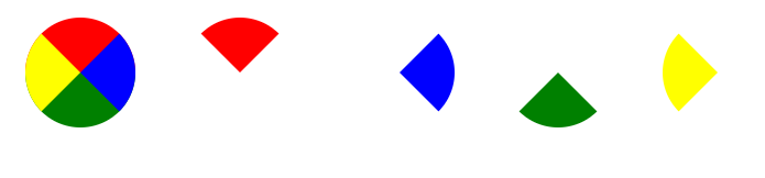
border-radius: 50px
饼图
思路
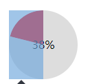
- 先建一个圆,然后分左右两块。
- 左右两块里面在包含一个半圆,然后对其做旋转处理,来匹配对应的百分比,溢出隐藏处理
注意
- 因为是左右两块,所以要注意溢出隐藏,以达到最终效果
- 注意旋转的中心点
- 如果中心区域掏空的话,注意层级问题
- 如果百分比<=50%,可以不要右边那块
- 百分比跟旋转角度的对应换算(百分比/100*360)
例子
<style>
.pie38{ 100px;height: 100px;border-radius: 50px;margin:20px;background-color: #ddd;position: relative;display: inline-block;overflow: hidden}
.pie38 .pie_content{line-height: 100px;text-align: center;position: absolute; 100px;height: 100px;z-index: 8}
.pie38 .pie_left{position: absolute;top:0;left:0; 50px;height: 100px;overflow: hidden;}
.pie38 .pie_left:after{content: '';height: 100px;50px;border-right:50px solid red;position:absolute;top:0;left:0;transform: rotate(-137deg);}
</style>

<div class="pie38">
	<div class="pie_content">38%</div>
	<div class="pie_left"></div>
</div>
<style>
.pie88{ 100px;height: 100px;border-radius: 50px;margin:20px;background-color: #ddd;position: relative;display: inline-block;overflow: hidden;}
.pie88 .pie_content{line-height: 100px;text-align: center;position: absolute; 100px;height: 100px;z-index: 8}
.pie88 .pie_left{position: absolute;top:0;left:0; 50px;height: 100px;overflow: hidden;background-color: red}
.pie88 .pie_right{position: absolute;top:0;right:0; 50px;height: 100px;overflow: hidden;}
.pie88 .pie_right:after{content: '';height: 100px;50px;border-left:50px solid red;position:absolute;right:0;top:0;border-radius: 50px;transform: rotate(-137deg);}
</style>

<div class="pie88">
	<div class="pie_content">88%</div>
	<div class="pie_left"></div>
	<div class="pie_right"></div>
</div>
总结
饼图的例子,在测算结果页还是经常会用到的,可以扩展为加载框等其他形式,代码比较简单易懂,相信类似的效果,还有很多方案的,欢迎留言...