本文是学习中传思客在慕课网开的课程《前端跳槽面试必备技巧》的学习笔记。课程地址:https://coding.imooc.com/class/evaluation/129.html#Anchor。
假设高度已知,请写出三栏布局,左栏、右栏宽度300px,中间宽度自适应。
这道题本身的难度并不大,我们在布局页面的时候,写个三栏布局还是挺简单的。但是如果在面试的时候遇到这道题,就没有那么简单了。看似简单的一道题,想把它答好是不简单的。往往越简单的题越不好答。如果看到这题只想到了浮动和绝对定位,那这题你连及格都及格不了。
下面是5种三栏布局的方法。
在写布局代码之前,先写两段公共的样式,此段写在头部。
样式
<style media="screen">
      html *{
        padding: 0;
        margin: 0;
      }
      .layout article div{
        min-height: 100px;
      }
</style>
1. 浮动布局
<!--浮动布局  -->
    <section class="layout float">
      <style media="screen">
      .layout.float .left{
        float:left;
        width:300px;
        background: red;
      }
      .layout.float .center{
        background: yellow;
      }
      .layout.float .right{
        float:right;
        width:300px;
        background: blue;
      }
      </style>
      <h1>三栏布局</h1>
      <article class="left-right-center">
        <div class="left"></div>
        <div class="right"></div>
        <div class="center">
          <h2>浮动解决方案</h2>
          1.这是三栏布局的浮动解决方案;
          2.这是三栏布局的浮动解决方案;
        </div>
      </article>
    </section>
浮动布局是有局限性的,浮动元素是脱离文档流,要做清除浮动,这个处理不好的话,会带来很多问题,比如高度塌陷等。
浮动布局的优点就是比较简单,兼容性也比较好。只要清除浮动做的好,是没有什么问题的。
延伸:你知道哪些清除浮动的方案?每种方案的有什么优缺点?
2.绝对定位布局
<!-- 绝对布局 -->
    <section class="layout absolute">
      <style>
        .layout.absolute .left-center-right>div{
          position: absolute;
        }
        .layout.absolute .left{
          left:0;
          width: 300px;
          background: red;
        }
        .layout.absolute .center{
          left: 300px;
          right: 300px;
          background: yellow;
        }
        .layout.absolute .right{
          right:0;
          width: 300px;
          background: blue;
        }
      </style>
      <h1>三栏布局</h1>
      <article class="left-center-right">
        <div class="left"></div>
        <div class="center">
          <h2>绝对定位解决方案</h2>
          1.这是三栏布局的绝对定位解决方案;
          2.这是三栏布局的绝对定位解决方案;
        </div>
        <div class="right"></div>
      </article>
    </section>
绝对定位布局优点,很快捷,设置很方便,而且也不容易出问题,你可以很快的就能想出这种布局方式。
缺点就是,绝对定位是脱离文档流的,意味着下面的所有子元素也会脱离文档流,这就导致了这种方法的有效性和可使用性是比较差的。
3.flex布局
<!-- flexbox布局 -->
    <section class="layout flexbox">
      <style>
        .layout.flexbox{
          margin-top: 110px;
        }
        .layout.flexbox .left-center-right{
          display: flex;
        }
        .layout.flexbox .left{
          width: 300px;
          background: red;
        }
        .layout.flexbox .center{
          flex:1;
          background: yellow;
        }
        .layout.flexbox .right{
          width: 300px;
          background: blue;
        }
      </style>
      <h1>三栏布局</h1>
      <article class="left-center-right">
        <div class="left"></div>
        <div class="center">
          <h2>flexbox解决方案</h2>
          1.这是三栏布局的felx解决方案;
          2.这是三栏布局的flex解决方案;
        </div>
        <div class="right"></div>
      </article>
    </section>
felxbox布局是css3里新出的一个,它就是为了解决上述两种方式的不足出现的,是比较完美的一个。目前移动端的布局也都是用flexbox。
felxbox的缺点就是不能兼容IE8及以下浏览器。
4.表格布局
<!-- 表格布局 -->
    <section class="layout table">
      <style>
        .layout.table .left-center-right{
          width:100%;
          height: 100px;
          display: table;
        }
        .layout.table .left-center-right>div{
          display: table-cell;
        }
        .layout.table .left{
          width: 300px;
          background: red;
        }
        .layout.table .center{
          background: yellow;
        }
        .layout.table .right{
          width: 300px;
          background: blue;
        }
      </style>
      <h1>三栏布局</h1>
      <article class="left-center-right">
        <div class="left"></div>
        <div class="center">
          <h2>表格布局解决方案</h2>
          1.这是三栏布局的表格解决方案;
          2.这是三栏布局的表格解决方案;
        </div>
        <div class="right"></div>
      </article>
    </section>
表格布局在历史上遭到很多人的摒弃,说表格布局麻烦,操作比较繁琐,其实这是一种误解,在很多场景中,表格布局还是很适用的,比如这个三栏布局,用表格布局就轻易写出来了。还有表格布局的兼容性很好,在flex布局不兼容的时候,可以尝试表格布局。
表格布局也是有缺陷的,当其中一个单元格高度超出的时候,两侧的单元格也是会跟着一起变高的,而有时候这种效果不是我们想要的。
5.网格布局
<!-- 网格布局 -->
    <section class="layout grid">
      <style>
        .layout.grid .left-center-right{
          width:100%;
          display: grid;
          grid-template-rows: 100px;
          grid-template-columns: 300px auto 300px;
        }
        .layout.grid .left-center-right>div{

        }
        .layout.grid .left{
          width: 300px;
          background: red;
        }
        .layout.grid .center{
          background: yellow;
        }
        .layout.grid .right{

          background: blue;
        }
      </style>
      <h1>三栏布局</h1>
      <article class="left-center-right">
        <div class="left"></div>
        <div class="center">
          <h2>网格布局解决方案</h2>
          1.这是三栏布局的网格布局解决方案;
          2.这是三栏布局的网格布局解决方案;
        </div>
        <div class="right"></div>
      </article>
    </section>
网格布局也是新出的一种布局方式,如果你答出这种方式,也就证明了你的实力,证明你对技术热点是有追求的,也说明你有很强的学习能力。
效果图
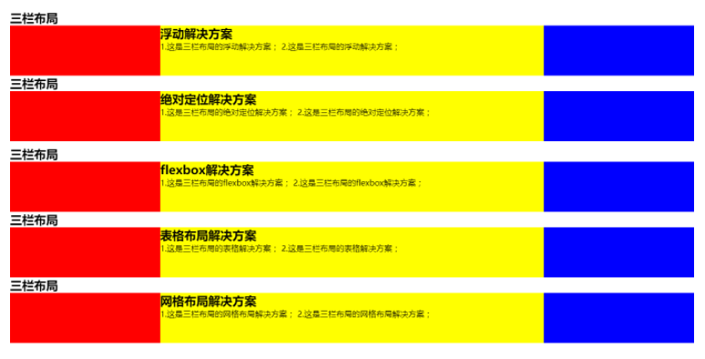
这五种解决方案应该是最常见的三栏布局,如果你还有其他的方案,欢迎补充!
最后这个问题还有很多延伸问题的,比如,
- 高度已知换为高度未知呢?
- 块内内容超出会是怎样的效果?
- 如果是上下高度已知,中间自适应呢?
- 如果是两栏布局呢?
- 如果是上下左右混合布局呢?
以上几个延伸你能否轻松应对,如果绝对还有欠缺,尽早查缺补漏吧!
欢迎补充!