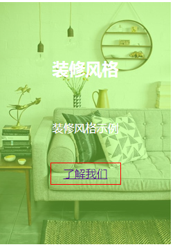
demo1先上图:

代码:
 1 <!DOCTYPE html>
 2 <html lang="en">
 3 <head>
 4     <meta charset="UTF-8">
 5     <title>Title</title>
 6     <style>
 7         * {
 8             font-family: "微软雅黑", "黑体", "宋体"
 9                }
10         .box {
11             height: 350px;
12              247px;
13             position: relative;
14             overflow: hidden;
15             float: left;
16             margin-left: 20px;
17         }
18
19         .ceng {
20             height: 350px;
21              247px;
22             background: rgba(156, 255, 77, 0.49);
23             position: absolute;
24             left: 0;
25             top: 350px;
26             text-align: center;
27             transition: 0.2s;
28         }
29
30         .box:hover .ceng {
31             top: 0;
32         }
33
34         .ceng h2 {
35             padding: 60px 0 40px;
36             color: white;
37         }
38
39         .ceng p {
40             color: white;
41             margin-bottom: 40px;
42         }
43
44         .ceng a {
45             display: block;
46              100px;
47             height: 30px;
48             border: solid 1px red;
49             margin: 0 auto;
50             line-height: 30px;
51         }
52
53     </style>
54 </head>
55 <body>
56 <div class="box">
57     <img src="IMG/z_shafa1.jpg" height="350" width="247"/>
58     <div class="ceng">
59         <h2>产品名称</h2>
60         <p>图片对应产品的介绍</p>
61         <a href="">了解我们</a>
62     </div>
63 </div>
64 </body>
65 </html>
该段demo是表现的是定位(position)在交互中的应用。显示效果为当鼠标经过图片时带有文字的一个半透明的颜色层向上滑动遮罩住图片。
其中的关键代码:
装图片的盒子(父):.box{position:relative;overflow:hidden;}
向上滑动的颜色层(子):.ceng{position:absolute;top:350px;}//图片高度350px。
鼠标滑过:.box:hover .ceng{top:0;}
渐变:.ceng{transition:0.2s;}
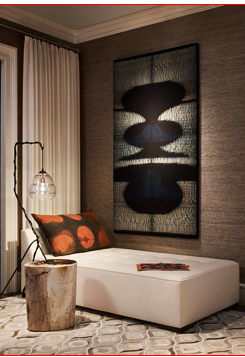
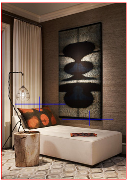
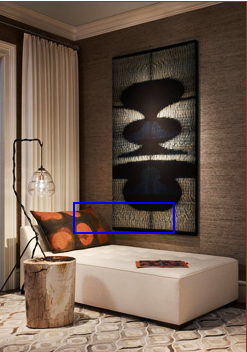
demo2先上图:
代码:
 1 <!DOCTYPE html>
 2 <html lang="en">
 3 <head>
 4     <meta charset="UTF-8">
 5     <title>Title</title>
 6     <style>
 7         .box{247px;height:350px;border:solid 1px red;background: url(IMG/z_shafa1.jpg)}
 8         .box1{100px;height:30px;margin:200px auto 300px;position:relative;}
 9         .box span{display:block;position:absolute;opacity:0;transition:0.5s;}
10         .box .l{100px;height:2px;background:blue;left:-100px;}
11         .box .t{2px;height:30px;background:blue;top:-30px;}
12         .box .r{2px;height:30px;background:blue;left:100px;top:30px;}
13         .box .b{102px;height:2px;background:blue;left:100px;top:30px;}
14         .box:hover span{opacity:1}
15         .box:hover .l{left:0}
16         .box:hover .t{top:0}
17         .box:hover .r{top:0}
18         .box:hover .b{left:0}
19 </style>
20 </head>
21 <body>
22 <div class="box">
23     <div class="box1">
24     <span class="l"></span>
25     <span class="t"></span>
26     <span class="r"></span>
27     <span class="b"></span>
28     </div>
29 </div>
30 </body>
31 </html>
demo2主要实现的是demo1中的了解我们的边框。这里是一个开始不可见,鼠标移入后才运动渐显的边框。
demo2实现与demo1类似,通过创建4个组成边框的盒子,分别对其定位,再opacity:0使其隐藏,再利用父级盒子的鼠标hover改变边框盒子定位,同时opacity:1使其显示,
渐变则是通过设置transition:0.5s实现。