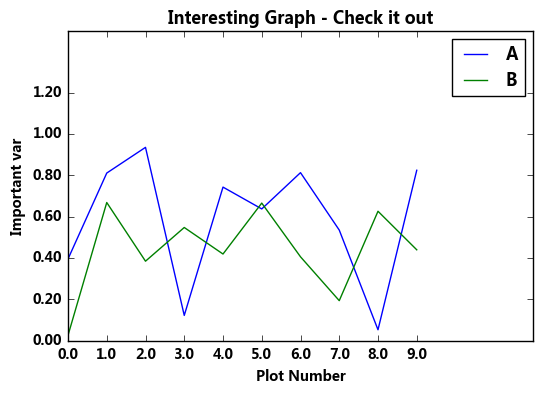
1.图名,图例,轴标签,轴边界,轴刻度,轴刻度标签
# 图名,图例,轴标签,轴边界,轴刻度,轴刻度标签等

df = pd.DataFrame(np.random.rand(10,2),columns=['A','B'])
fig = df.plot(figsize=(6,4))
# figsize:创建图表窗口,设置窗口大小
# 创建图表对象,并赋值与fig

plt.title('Interesting Graph - Check it out')  # 图名
plt.xlabel('Plot Number')  # x轴标签
plt.ylabel('Important var') # y轴标签

plt.legend(loc = 'upper right')
# 显示图例,loc表示位置
# 'best'         : 0, (only implemented for axes legends)(自适应方式)
# 'upper right'  : 1,
# 'upper left'   : 2,
# 'lower left'   : 3,
# 'lower right'  : 4,
# 'right'        : 5,
# 'center left'  : 6,
# 'center right' : 7,
# 'lower center' : 8,
# 'upper center' : 9,
# 'center'       : 10,

plt.xlim([0,12])  # x轴边界
plt.ylim([0,1.5])  # y轴边界
plt.xticks(range(10))  # 设置x刻度
plt.yticks([0,0.2,0.4,0.6,0.8,1.0,1.2])  # 设置y刻度
fig.set_xticklabels("%.1f" %i for i in range(10))  # x轴刻度标签 保留小数点后一位小数
fig.set_yticklabels("%.2f" %i for i in [0,0.2,0.4,0.6,0.8,1.0,1.2])  # y轴刻度标签 #保留小数点后2位小数
# 范围只限定图表的长度,刻度则是决定显示的标尺 → 这里x轴范围是0-12,但刻度只是0-9,刻度标签使得其显示1位小数 # 轴标签则是显示刻度的标签 print(fig,type(fig)) # 查看表格本身的显示方式,以及类别
输出结果:
Axes(0.125,0.125;0.775x0.775) <class 'matplotlib.axes._subplots.AxesSubplot'>
2.
# 其他元素可视性

x = np.linspace(-np.pi,np.pi,256,endpoint = True)  #linspace()通过指定开始值、终值和元素个数创建表示等差数列的一维数组,可以通过endpoint参数指定是否包含终值,默认值为True,即包含终值。
c, s = np.cos(x), np.sin(x)
plt.plot(x, c)
plt.plot(x, s)
# 通过ndarry创建图表
plt.grid(True, linestyle = "--",color = "gray", linewidth = "0.5",axis = 'both')
# 显示网格
# linestyle:线型
# color:颜色
# linewidth:宽度
# axis:x,y,both,显示x/y/两者的格网

plt.tick_params(bottom='on',top='off',left='on',right='off')
# 显示刻度的那根轴线,凸出来的地方。设置为off时都不显示。默认为全显示

import matplotlib
matplotlib.rcParams['xtick.direction'] = 'out'
matplotlib.rcParams['ytick.direction'] = 'inout'
# 设置刻度的方向,in,out,inout   设置为in,刻度突出的部分在里面显示,out在外面显示,inout在中间显示
# 这里需要导入matploltib,而不仅仅导入matplotlib.pyplot


frame = plt.gca()
#plt.axis('off')
# 关闭坐标轴
#frame.axes.get_xaxis().set_visible(False)
#frame.axes.get_yaxis().set_visible(False)
# x/y 轴不可见
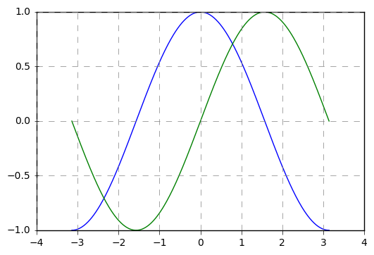
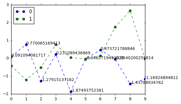
3.
# 注解

df = pd.DataFrame(np.random.randn(10,2))
print(df)
df.plot(style = '--o')
# plt.text(5,0.5,'hahaha',fontsize=10)
# 注解 → 横坐标,纵坐标,注解字符串
for i in range(10):
    plt.text(i,df[0].iloc[i],df[0].iloc[i],fontsize=10)   #对0列的元素来说,标注y点的坐标。
输出:
         0         1
0  0.091094 -0.417407
1  0.770065 -1.215896
2 -1.279151 -0.512889
3  0.231089  0.768293
4 -1.874938  0.051870
5 -0.046272 -0.041660
6  0.473722  0.144373
7 -0.054020  1.756313
8 -1.437889  2.679062
9 -1.169249 -0.029428
4. 图片保存
# 图表输出

df = pd.DataFrame(np.random.randn(1000, 4), columns=list('ABCD'))
df = df.cumsum()
df.plot(style = '--.',alpha = 0.5)
plt.legend(loc = 'upper left')
plt.savefig('C:/Users/Desktop/pdd.png',
            dpi=400,
            bbox_inches = 'tight',
            facecolor = 'g',
            edgecolor = 'b')
# 可支持png,pdf,svg,ps,eps…等,以后缀名来指定
# dpi是分辨率
# bbox_inches:图表需要保存的部分。如果设置为‘tight’,则尝试剪除图表周围的空白部分。
# facecolor,edgecolor: 图像的背景色,默认为‘w’(白色)
