最近从新巩固了一遍前端的HTML+CSS学习,发现好多知识点记忆是没有问题的,但是在页面布局的时候,还是有瑕疵,所以在这里总结一下前端常用的布局思路,我本人基础最早的是圣杯布局,所以先在这里介绍一下:
结构
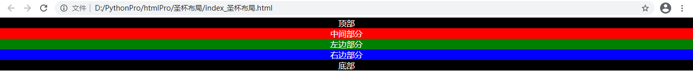
圣杯布局是我接触到网站布局之后的第一个完整页面布局的思路,大概如图:

这种布局主要显示内容的部分在顶部和中间部分,强调的点是中间部分优先加载,左右后加载的问题,并且从结构上要求:左右部分固定宽度,中间部分100%。
所以分为下面的三个步骤进行思考:
基础结构
写出结构,并且,给他们分别加上颜色和文字:
<!DOCTYPE html>
<html>
<head>
	<title></title>
	<style type="text/css">
		*{
			padding: 0;
			margin: 0
		}
		a{
			text-decoration: none;
		}
		li{
			list-style: none;
		}
		.top{
			color:white;
			background-color: black;
			text-align: center;
		}
		.bottom {
			color:white;
			background-color: black;
			text-align: center;
		}
		.center{
			color:white;
			background-color: red;
			text-align: center;
		}
		.left{
			color: white;
			background-color: green;
			text-align: center;
		}
		.right{
			color: white;
			background-color: blue;
			text-align: center;
		}

	</style>
</head>
<body>
	<div class="top">
		顶部
	</div>
	<div class="center">中间部分</div>  <!-- 注意,要先加载中间部分,所以需要先把中间部分的div放到这里-->
	<div class="left">左边部分</div>
	<div class="right">右边部分</div>
	<div class="bottom">
		底部
	</div>
</body>
</html>
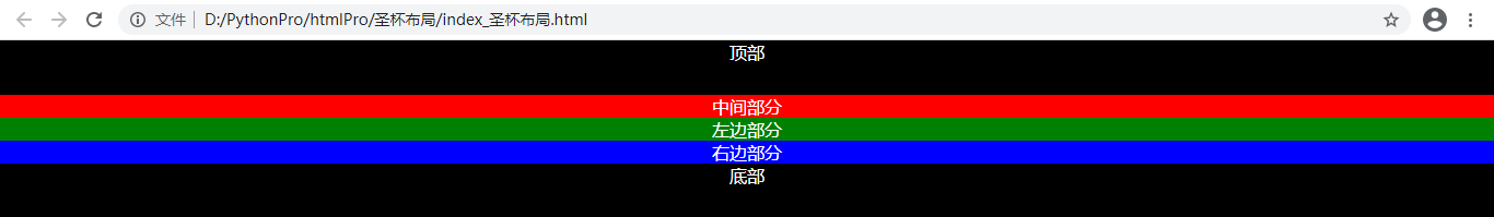
注意,这里为了优先加载,中间三联部分,第一个是center部分,效果如下:
初次布局
现在已经把需要的结构块儿搭建了上来,下面开始编写基本的布局
1、顶部和底部宽度100%,高度50px固定
		.top{
			color:white;
			background-color: black;
			text-align: center;
			 100%;
			height: 50px;
		}
		.bottom {
			color:white;
			background-color: black;
			text-align: center;
			 100%;
			height: 50px;
		}
2、中间的三个都浮动起来,高度设置一个值580px;左边宽度200px,右边宽度150px,中间自适应100%
<!DOCTYPE html>
<html>
<head>
	<title></title>
	<style type="text/css">
		*{
			padding: 0;
			margin: 0
		}
		a{
			text-decoration: none;
		}
		li{
			list-style: none;
		}
		.top{
			color:white;
			background-color: black;
			text-align: center;
			 100%;
			height: 50px;
		}
		.bottom {
			color:white;
			background-color: black;
			text-align: center;
			 100%;
			height: 50px;
		}
		.m-item{
			height: 580px;
			float: left;
		}

		.center{
			color:white;
			background-color: red;
			text-align: center;

			 100%;
		}
		.left{
			color: white;
			background-color: green;
			text-align: center;

			 200px;
		}
		.right{
			color: white;
			background-color: blue;
			text-align: center;

			 150px;
		}

	</style>
</head>
<body>
	<div class="top">
		顶部
	</div>
	<div class="center m-item">中间部分</div>  <!-- 注意,要先加载中间部分,所以需要先把中间部分的div放到这里-->
	<div class="left m-item">左边部分</div>
	<div class="right m-item">右边部分</div>
	<div class="bottom">
		底部
	</div>
</body>
</html>

3、不要让底部和中间部分粘到一起
		.bottom {
			color:white;
			background-color: black;
			text-align: center;
			 100%;
			height: 50px;

			clear: both;
		}
布局调整
现在乱的够呛,我们来调整一下结构吧。
1、设定一个外边框,占满中间,然后设置内边距,这个边距的目的是将中间部分挤到中间
<!DOCTYPE html>
<html>
<head>
	<title></title>
	<style type="text/css">
		....
		.m-item{
			height: 580px;
			float: left;
		}
		.content{
			padding-left: 200px;
			padding-right: 150px;
		}
		......
	</style>
</head>
<body>
	<div class="top">
		顶部
	</div>
	<div class="content">  <!-- 这里的div是为了约束中间部分使用的-->
			<div class="center m-item">中间部分</div>  <!-- 注意,要先加载中间部分,所以需要先把中间部分的div放到这里-->
			<div class="left m-item">左边部分</div>
			<div class="right m-item">右边部分</div>
	</div>

	<div class="bottom">
		底部
	</div>
</body>
</html>

2、安顿左边的div
两边的div布局需要用到一个知识点,负数外边距。我们用一下:
		.left{
			color: white;
			background-color: green;
			text-align: center;

			 200px;
			margin-left: -100%;
		}

这里浮动上去了,但是覆盖了中间部分的200px,不合适,我们采用相对定位方式:
		.left{
			color: white;
			background-color: green;
			text-align: center;

			 200px;
			margin-left: -100%;

			position: relative;
			left: -200px;
		}

3、 然后安顿(嘿嘿嘿)右边的div
		.right{
			color: white;
			background-color: blue;
			text-align: center;

			 150px;
			margin-right: -150px;
		}

提供一下完整的代码。
<!DOCTYPE html>
<html>
<head>
	<title></title>
	<style type="text/css">
		*{
			padding: 0;
			margin: 0
		}
		a{
			text-decoration: none;
		}
		li{
			list-style: none;
		}
		.top{
			color:white;
			background-color: black;
			text-align: center;
			 100%;
			height: 50px;
		}
		.bottom {
			color:white;
			background-color: black;
			text-align: center;
			 100%;
			height: 50px;

			clear: both;
		}
		.m-item{
			height: 580px;
			float: left;
		}
		.content{
			padding-left: 200px;
			padding-right: 150px;
		}
		.center{
			color:white;
			background-color: red;
			text-align: center;

			 100%;
		}
		.left{
			color: white;
			background-color: green;
			text-align: center;

			 200px;
			margin-left: -100%;

			position: relative;
			left: -200px;
		}
		.right{
			color: white;
			background-color: blue;
			text-align: center;

			 150px;
			margin-right: -150px;
		}

	</style>
</head>
<body>
	<div class="top">
		顶部
	</div>
	<div class="content">  <!-- 这里的div是为了约束中间部分使用的-->
			<div class="center m-item">中间部分</div>  <!-- 注意,要先加载中间部分,所以需要先把中间部分的div放到这里-->
			<div class="left m-item">左边部分</div>
			<div class="right m-item">右边部分</div>
	</div>

	<div class="bottom">
		底部
	</div>
</body>
</html>
到此完成了基本的圣杯样式,匆忙写的,有漏洞希望大家多多帮忙提点啊。