1.盒子边框的线条动画:
.gif)
<div class="cont">
    <div class="bb"></div>
</div>
.bb{
            position: relative;
            width: 200px;
            height: 200px;
            background: #666666;
            border: 1px solid #5EF75E;
        }
        .bb:before,.bb:after{
            content: " ";
            display: block;
            position: absolute;
            width:220px;
            height:220px;
            top: -10px;
            left: -10px;
            border:2px solid #00FF00;
            z-index:10;
            box-sizing: border-box;
            -webkit-animation: clipAni 4s infinite linear;
        }
        .bb:before{
            -webkit-animation-delay: 2s;
        }
        @keyframes  clipAni{
            0%,100%{
                clip:rect(0px,220px,220px,217px);
            }
            25%{
                clip:rect(0px,220px,3px,0px);
            }
            50%{
                clip:rect(0px,3px,220px,0px);
            }
            75%{
                clip:rect(217px,220px,220px,0px);
            }
        }
用到的知识点:
clip 属性用来设置元素的形状。用来剪裁绝对定位元素。
当一幅图像的尺寸大于包含它的元素时,"clip" 属性允许规定一个元素的可见尺寸,这样此元素就会被修剪并显示在这个元素中。
用这个属性需要注意以下三点:
1.clip属性只能用于绝对定位元素,position:absolute或fixed。
2.clip属性有三种取值:auto 默认的
inherit继承父级的
一个定义好的形状,但现在只能是方形的 rect()
clip: { shape | auto | inherit } ;
3.shape rect(<top>, <right>, <bottom>, <left>)中的四个元素不可省略。
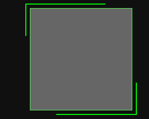
下面看下clip属性的rect()函数
clip: rect(<top>, <right>, <bottom>, <left>);
具体四个数值表示什么呢?看下张图即可理解。
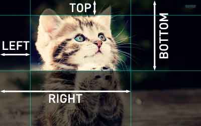

简单的理解就是:图片飞高就是bottom-top,宽就是right-left.当然图片不会是负数。
clip属性对于多数浏览器都可以用,写法会有点不同
.my-element {
    position: absolute;
    clip: rect(10px  350px  170px  0); /* IE4 to IE7 */
    clip: rect(10px, 350px, 170px, 0); /* IE8+ & other browsers */
}
2

用到的知识点::focus-within
:focus-within 是一个CSS 伪类 ,表示一个元素获得焦点,或,该元素的后代元素获得焦点。换句话说,元素自身或者它的某个后代匹配:focus伪类。
元素的子元素或者自身元素的文本框获取焦点后执行的样式
.gif)
源码:
<div class="g-container">
    <div class="g-section">
        <input type="button">
        <p>
            :focus-within 是一个CSS 伪类 ,表示一个元素获得焦点,或,该元素的后代元素获得焦点。换句话说,元素自身或者它的某个后代匹配:focus伪类。
        </p>
    </div>
    <div class="g-section">
        <input type="button">
        <p>
            :focus-within 是一个CSS 伪类 ,表示一个元素获得焦点,或,该元素的后代元素获得焦点。换句话说,元素自身或者它的某个后代匹配:focus伪类。
        </p>
    </div>
    <div class="g-section">
        <input type="button">
        <p>
            :focus-within 是一个CSS 伪类 ,表示一个元素获得焦点,或,该元素的后代元素获得焦点。换句话说,元素自身或者它的某个后代匹配:focus伪类。
        </p>
    </div>
</div>
.g-container {
    width: 300px;
    margin: 50px auto;
}
.g-container p {
    line-height: 1.4;
    padding-left: 40px;
}
.g-container input {
    position: absolute;
    border: none;
    outline: none;
    background: none;
    width: 20px;
    height: 20px;
    border-radius: 50%;
    border: 1px solid #aaa;
    box-sizing: border-box;
    top: 50%;
    left: 10px;
    -webkit-transform: translate(0, -50%);
    transform: translate(0, -50%);
    cursor: pointer;
}
.g-container .g-section {
    position: relative;
    padding: 10px;
    box-sizing: border-box;
    border: 1px solid transparent;
}
.g-container .g-section:focus-within {
    background: linear-gradient(90deg, #03a9f4 50%, transparent 0) repeat-x, linear-gradient(90deg, #03a9f4 50%, transparent 0) repeat-x, linear-gradient(0deg, #03a9f4 50%, transparent 0)         repeat-y, linear-gradient(0deg, #03a9f4 50%, transparent 0) repeat-y;
    background-size: 8px 1px, 8px 1px, 1px 8px, 1px 8px;
    background-position: 0 0, 0 100%, 0 0, 100% 0;
    -webkit-animation: linearGradientMove .5s infinite linear;
    animation: linearGradientMove .5s infinite linear;
}
    .g-container .g-section:focus-within input {
    background: #03a9f4;
}

@-webkit-keyframes linearGradientMove {
    100% {
        background-position: 6% 0, -6% 100%, 0 -6%, 100% 6%;
    }
}

@keyframes linearGradientMove {
    100% {
        background-position: 6% 0, -6% 100%, 0 -6%, 100% 6%;
    }
}
仅支持在pc端运行在移动端是不支持的
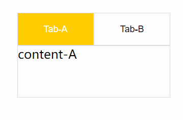
3:focus-within
.gif)
源码:
<!DOCTYPE html>
<html lang="en">
<head>
<meta charset="UTF-8">
<title>Title</title>
<style>
* {
margin: 0 ;
padding: 0;
}
.container {
width: 300px;
margin: 50px auto;
padding: 10px;
boder: 1px solid #ddd;
}

.nav-box {
font-size: 0;
}

button {
width: 150px;
height: 64px;
box-sizing: border-box;
outline: none;
background: #fff;
border: 1px solid #ddd;
font-size: 18px;
cursor: pointer;
}

button:focus-within {
color: #fff;
background: #ffcc00;
}

.content-box {
font-size: 24px;
border: 1px solid #ddd;
height: 100px;
}
.content-box div {
display: none;
}

.nav-box:not(:focus-within) .nav-A {
color: #fff;
background: #ffcc00;
}
.nav-box:not(:focus-within) .content-A {
display: block;
}

.nav-A:focus-within ~ .content-box .content-A {
display: block;
}

.nav-B:focus-within ~ .content-box .content-B {
display: block;
}
</style>
</head>
<body>
<div class="container">
<div class="nav-box">
<button class="nav-A">Tab-A</button>
<button class="nav-B">Tab-B</button>
<div class="content-box">
<div class="content-A">
content-A
</div>
<div class="content-B">
content-B
</div>
</div>
</div>
</div>
</body>
</html>
4.
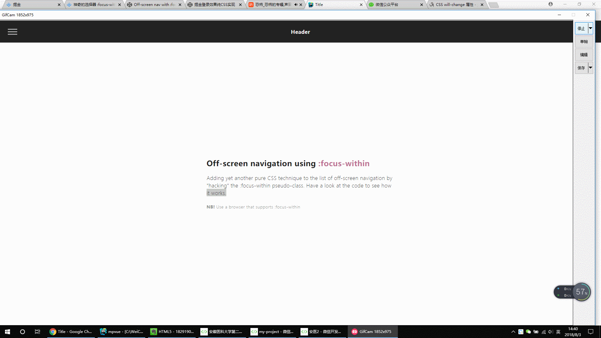
.gif)
<!DOCTYPE html>
<html lang="en">
<head>
<meta charset="UTF-8">
<title>Title</title>
<style>
* {
outline: none;
}
strong {
font-weight: 600;
}
.page {
width: 100%;
height: 100vh;
background: #fdfdfd;
font-family: 'Encode Sans Condensed', sans-serif;
font-weight: 600;
letter-spacing: .03em;
color: #212121;
}
header {
display: flex;
position: fixed;
width: 100%;
height: 70px;
background: #212121;
color: #fff;
justify-content: center;
align-items: center;
-webkit-tap-highlight-color: rgba(0,0,0,0);
}
main {
padding: 70px 20px 0;
display: flex;
flex-direction: column;
height: 100%;
}
main > div {
margin: auto;
max-width: 600px;
}
main h2 span {
color: #BF7497;
}
main p {
line-height: 1.5;
font-weight: 200;
margin: 20px 0;
}
main small {
font-weight: 300;
color: #888;
}
#nav-container {
position: fixed;
height: 100vh;
width: 100%;
pointer-events: none;
}
#nav-container .bg {
position: absolute;
top: 70px;
left: 0;
width: 100%;
height: calc(100% - 70px);
visibility: hidden;
opacity: 0;
transition: .3s;
background: #000;
}
#nav-container:focus-within .bg {
visibility: visible;
opacity: .6;
}
#nav-container * {
visibility: visible;
}
.button {
position: relative;
display: flex;
flex-direction: column;
justify-content: center;
z-index: 1;
-webkit-appearance: none;
border: 0;
background: transparent;
border-radius: 0;
height: 70px;
width: 30px;
cursor: pointer;
pointer-events: auto;
margin-left: 25px;
touch-action: manipulation;
-webkit-tap-highlight-color: rgba(0,0,0,0);
}
.icon-bar {
display: block;
width: 100%;
height: 3px;
background: #aaa;
transition: .3s;
}
.icon-bar + .icon-bar {
margin-top: 5px;
}
#nav-container:focus-within .button {
pointer-events: none;
}
#nav-container:focus-within .icon-bar:nth-of-type(1) {
transform: translate3d(0,8px,0) rotate(45deg);
}
#nav-container:focus-within .icon-bar:nth-of-type(2) {
opacity: 0;
}
#nav-container:focus-within .icon-bar:nth-of-type(3) {
transform: translate3d(0,-8px,0) rotate(-45deg);
}
#nav-content {
margin-top: 70px;
padding: 20px;
width: 90%;
max-width: 300px;
position: absolute;
top: 0;
left: 0;
height: calc(100% - 70px);
background: #ececec;
pointer-events: auto;
-webkit-tap-highlight-color: rgba(0,0,0,0);
transform: translateX(-100%);
transition: transform .3s;
will-change: transform;
contain: paint;
}
#nav-content ul {
height: 100%;
display: flex;
flex-direction: column;
}
#nav-content li a {
padding: 10px 5px;
display: block;
text-transform: uppercase;
transition: color .1s;
}
#nav-content li a:hover {
color: #BF7497;
}
#nav-content li:not(.small) + .small {
margin-top: auto;
}
.small {
display: flex;
align-self: center;
}
.small a {
font-size: 12px;
font-weight: 400;
color: #888;
}
.small a + a {
margin-left: 15px;
}
#nav-container:focus-within #nav-content {
transform: none;
}
* {
box-sizing: border-box;
margin: 0;
padding: 0;
}
html, body {
height: 100%;
}
a,a:visited,a:focus,a:active,a:link {
text-decoration: none;
outline: 0;
}
a {
color: currentColor;
transition: .2s ease-in-out;
}
h1, h2, h3, h4 {
margin: 0;
}
ul {
padding: 0;
list-style: none;
}
img {
vertical-align: middle;
height: auto;
width: 100%;
}
</style>
</head>
<body>
<div class="page">
<header tabindex="0">Header</header>
<div id="nav-container">
<div class="bg"></div>
<div class="button" tabindex="0">
<span class="icon-bar"></span>
<span class="icon-bar"></span>
<span class="icon-bar"></span>
</div>
<div id="nav-content" tabindex="0">
<ul>
<li><a href="#0">Home</a></li>
<li><a href="#0">Services</a></li>
<li><a href="#0">Blog</a></li>
<li><a href="#0">About</a></li>
<li><a href="#0">Contact</a></li>
<li class="small"><a href="#0">Facebook</a><a href="#0">Instagram</a></li>
</ul>
</div>
</div>
<main>
<div class="content">
<h2>Off-screen navigation using <span>:focus-within</span></h2>
<p>Adding yet another pure CSS technique to the list of off-screen navigation by "hacking" the :focus-within pseudo-class. Have a look at the code to see how it works.</p>
<small><strong>NB!</strong> Use a browser that supports :focus-within</small>
</div>
</main>
</div>
</body>
</html>
5.
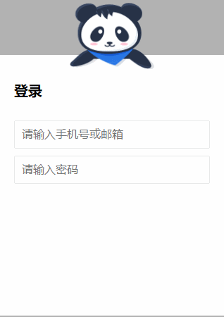

源码如下:
<!DOCTYPE html>
<html lang="en">
<head>
<meta charset="UTF-8">
<title>Title</title>
<style>
.g-wrap {
position: fixed;
top: 0;
left: 0;
bottom: 0;
right: 0;
background: rgba(0, 0, 0, 0.3);
}
.g-container {
position: relative;
width: 318px;
margin: 100px auto;
height: 370px;
padding: 20px;
box-sizing: border-box;
background: #fff;
z-index: 10;
}
.g-container h2 {
font-size: 20px;
font-weight: bold;
margin-bottom: 30px;
}
.g-container input {
outline: none;
padding: 10px;
width: 100%;
border: 1px solid #e9e9e9;
border-radius: 2px;
outline: none;
box-sizing: border-box;
font-size: 16px;
}
img {
position: absolute;
top: -20%;
left: 50%;
width: 120px;
height: 95px;
-webkit-transform: translate(-50%, 0);
transform: translate(-50%, 0);
}
.g-username {
margin-bottom: 10px;
}
.g-username img {
display: none;
width: 120px;
height: 113px;
}
.g-username:focus-within ~ img {
display: none;
}
.g-username:focus-within input {
border-color: #007fff;
}
.g-username:focus-within img {
display: block;
}
.g-password {
margin-bottom: 10px;
}
.g-password img {
display: none;
width: 103px;
height: 84px;
top: -15%;
}
.g-password:focus-within ~ img {
display: none;
}
.g-password:focus-within input {
border-color: #007fff;
}
.g-password:focus-within img {
display: block;
}
</style>
</head>
<body>
<div class="g-wrap"></div>
<div class="g-container">
<h2>登录</h2>
<div class="g-username">
<input name="loginPhoneOrEmail" maxlength="64" placeholder="请输入手机号或邮箱" class="input">
<img src="https://b-gold-cdn.xitu.io/v3/static/img/greeting.1415c1c.png" class="g-username">
</div>
<div class="g-password">
<input name="loginPassword" type="password" maxlength="64" placeholder="请输入密码" class="input">
<img src="https://b-gold-cdn.xitu.io/v3/static/img/blindfold.58ce423.png" class="g-password">
</div>
<img src="https://b-gold-cdn.xitu.io/v3/static/img/normal.0447fe9.png" class="g-normal">
</div>
</body>
</html>