可兼容移动端视图
效果图如下:太极图是可以旋转的
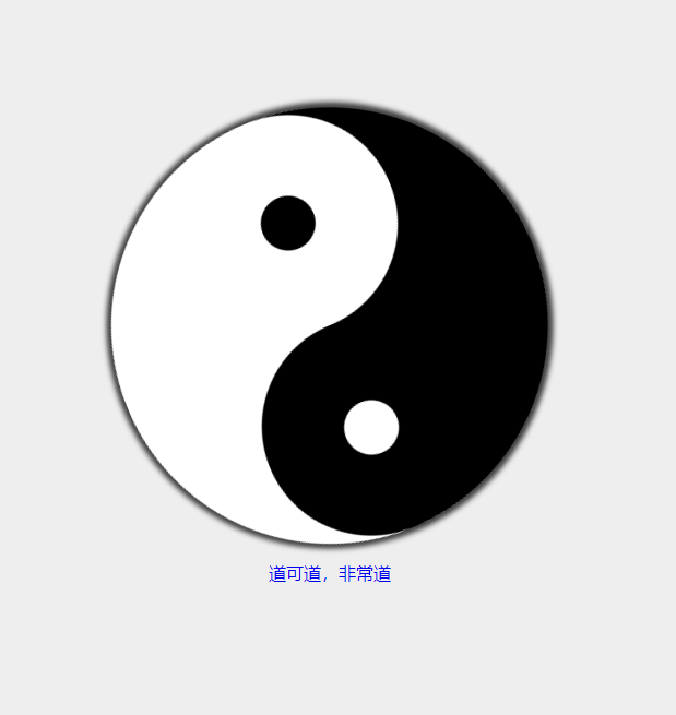
具体实现如下:


<!DOCTYPE html>
<html lang="zh">

<head>
    <meta charset="UTF-8">
    <meta name="viewport" content="width=device-width, initial-scale=1.0">
    <meta http-equiv="X-UA-Compatible" content="ie=edge">
    <title>八卦</title>
    <style>
        body{
            background: #eee;
        }
        * {
            box-sizing: border-box;
            padding: 0%;
            margin:0%;
        }
        @keyframes x{
            from{
                transform: rotate(0deg);
            }
            to{
                transform: rotate(360deg);
            }
        }

        #bagua {
            width: 400px;
            height: 400px;
            /* border: 1px solid red; */
            border-radius: 300px;
            position: relative;
            overflow: hidden;
            animation: x 5s infinite linear;
            box-shadow: 0px 0px 5px 5px rgba(0,0,0,0.75);
        }
        @media (max- 500px){
            #bagua {
            width: 200px;
            height: 200px;
            /* border: 1px solid red; */
            border-radius: 300px;
            position: relative;
            overflow: hidden;
            animation: x 5s infinite linear;
            box-shadow: 0px 0px 5px 5px rgba(0,0,0,0.75);
        }
        }

        #bagua>div:first-child {
            /* border: 10px solid green; */
            width: 50%;
            height: 100%;
            position: absolute;
            left: 0;
            background: black;
        }

        #bagua>div:nth-child(2) {
            /* border: 10px solid blue; */
            width: 50%;
            height: 100%;
            position: absolute;
            right: 0;
            background: white;
        }
        #bagua>div:nth-child(3){
            /* border: 10px solid yellow; */
            position: absolute;
            width: 50%;
            height: 50%;
            left:50%;
            margin-left: -25%;
            background: black;
            border-radius: 50%;
        }
        #bagua>div:nth-child(4){
            /* border: 10px solid red; */
            position: absolute;
            width: 50%;
            height: 50%;
            left:50%;
            bottom: 0;
            margin-left: -25%;
            background: white;
            border-radius: 50%;
        }
        #bagua>div:nth-child(5){
            /* border: 10px solid red; */
            position: absolute;
            width: 12.5%;
            height: 12.5%;
            left:50%;
            top:18.5%;
            margin-left: -6.25%;
            background: white;
            border-radius: 50%;
        }
        #bagua>div:nth-child(6){
            /* border: 10px solid red; */
            position: absolute;
            width: 12.5%;
            height: 12.5%;
            left:50%;
            bottom: 18.5%;
            margin-left: -6.25%;
            background: black;
            border-radius: 50%;
        }
        #bagua_wrapper{
            /* border: 1px solid red; */
            height: 100vh;
            display: flex;
            justify-content: center;
            align-items: center;
            flex-direction: column;
        }
        #bagua_description{
            margin-top: 1em;

        }
        a{
            text-decoration: none;
        }
    </style>
</head>

<body>
    <div id="bagua_wrapper">
    <div id="bagua">
        <div></div>
        <div></div>
        <div></div>
        <div></div>
        <div></div>
        <div></div>
    </div>
    <div id="bagua_description">
            <a href="face.html">道可道,非常道</a>
    </div>

</div>
</body>

</html>