转自:http://docwiki.embarcadero.com/RADStudio/XE5/en/Mobile_Tutorial:_Using_ListBox_Components_to_Display_a_Table_View_(iOS_and_Android)
Mobile Tutorial: Using ListBox Components to Display a Table View (iOS and Android)
Go Up to Mobile Tutorials: Delphi Mobile Application Development (iOS and Android)
Using ListBox Components to Display a Table View in Mobile Applications
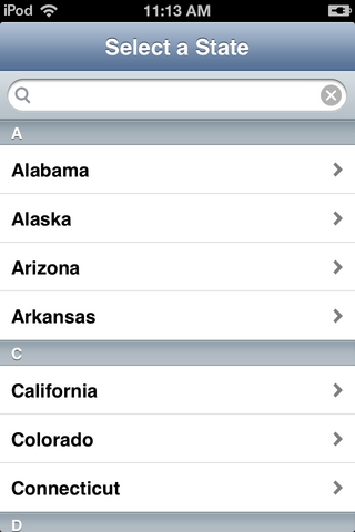
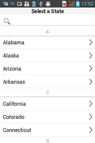
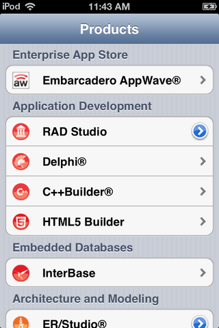
On the mobile platform, FireMonkey uses the FMX.ListBox.TListBox component to present a Table View in a mobile style, like the following ListBoxes.
Plain List
| iOS | Android (LG E-612) |
|---|---|
Grouped List
Note: Only iOS devices support the grouped lists.
This tutorial describes the basic steps to build items for a Table View in your FireMonkey mobile applications.
Create Items on the ListBox Component
- Select File > New > FireMonkey Mobile Application - Delphi > Blank Application.
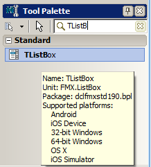
- Select the TListBox component in the Tool Palette, and drop it on the FireMonkey Mobile Form Designer. To find TListBox, enter a few characters (such as "TListB") in the Searchbox of the Tool Palette:
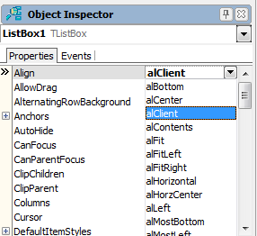
- Select the TListBox component on the Mobile Form Designer, go to the Object Inspector and select alClient for the Align property:
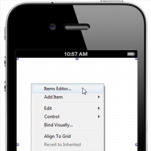
- On the FireMonkey Mobile Form Designer, right-click the TListBox component, and select Items Editor:
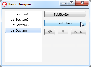
- On the Items Designer, click the Add Item button several times to add several items to the ListBox:
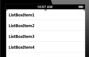
- Close the Items Designer. Now you can find your ListBox Items on the TListBox component. For example:
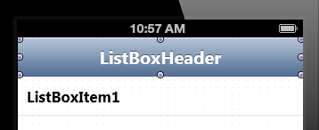
Add a Header
You can define a Header on the TListBox component by using the following steps:
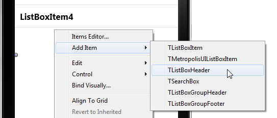
- On the FireMonkey Mobile Form Designer, right-click the TListBox component, and select Add Item > TListBoxHeader:
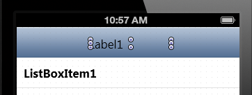
- On the Tool Palette, select the TLabel component and drop it on top of the TListBoxHeader component you just added:
- In the Object Inspector, change the properties of the TLabel component as follows:
Property Value Align alClient StyleLookup toollabel TextAlign taCenter Text (Text value as you want)
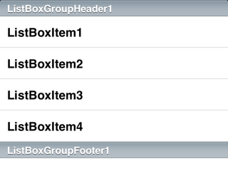
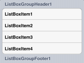
You can define a Group Header and a Group Footer for items on TListBox as follows:
- On the FireMonkey Mobile Form Designer, right-click the TListBox component, and select Items Editor.
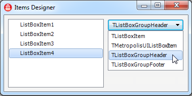
- On the Item Designer, select TListBoxGroupHeader from the drop-down list, and then select Add Item:
- Select TListBoxGroupFooter from the drop-down list, and then select Add Item.
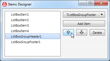
- Select ListBoxGroupHeader1 in the list of items, and click the Up button several times until this item becomes the top item on the list:
- Close the dialog box. Now you have a Group Header and a Group Footer on the TListBox component.
Show List Items as Separate Grouped Items
Items on a ListBox can be shown as either a Plain list or a Grouped list (only for iOS target platform). This choice is controlled by the GroupingKind property and the StyleLookupproperty, as shown in the following graphic:
Show Items as Plain List Show Items as Grouped List gsPlain = GroupingKind Property Value gsGrouped = GroupingKind Property Value listboxstyle = StyleLookup Property Value transparentlistboxstyle = StyleLookup Property Value
Important: For iOS devices, you can specify either style for your TListBox component in the Object Inspector. For Android devices, you can specify only the plain list.
Add a Check Box or Other Accessory to a ListBox Item
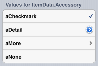
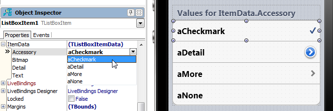
Each item in a TListBox can use an Accessory such as Check Mark through the ItemData.Accessory property. The following picture shows the value you can assign to ItemData.Accessory and the Accessory assigned:
You can select the Accessory property in the Object Inspector when ListBox Item is selected in the Form Designer.
Add an Icon to a ListBox Item
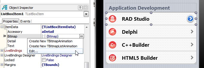
Each Item on a ListBox component can contain Bitmap data, as an Icon, through the ItemData.Bitmap property:
You can select the Bitmap property in the Object Inspector when the ListBoxItem is selected in the Form Designer.
Add Detail Information to an Item
You can add additional text information to each item on the ListBox component.
Specify additional text in the ItemData.Detail property, and select the location of the Detail Text through the StyleLookup property, as shown in the following table:
StyleLookup property Look & Feel listboxitemnodetail listboxitembottomdetail listboxitemrightdetail listboxitemleftdetail
Add Items to a ListBox from Your Code
To add regular items to a ListBox, you can simply call the Items.Add method as following code:
ListBox1.Items.Add('Text to add');
If you want to create items other than a simple item, or control other properties, you can create an instance of the item first, and then add it to the list box.
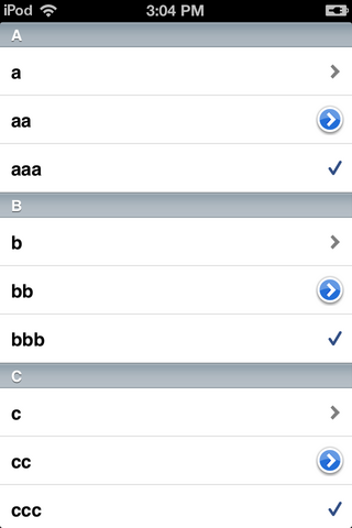
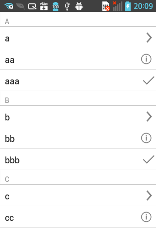
The following code adds items to a ListBox, as shown in the picture:
| iOS | Android (LG E-612) |
|---|---|
procedure TForm40.FormCreate(Sender: TObject);
var
  c: Char;
  i: Integer;
  Buffer: String;
  ListBoxItem : TListBoxItem;
  ListBoxGroupHeader : TListBoxGroupHeader;
begin
  ListBox1.BeginUpdate;
  for c := 'a' to 'z' do
  begin
    // Add header ('A' to 'Z') to the List
    ListBoxGroupHeader := TListBoxGroupHeader.Create(ListBox1);
    ListBoxGroupHeader.Text := UpperCase(c);
    ListBox1.AddObject(ListBoxGroupHeader);

    // Add items ('a', 'aa', 'aaa', 'b', 'bb', 'bbb', 'c', ...) to the list
    for i := 1 to 3 do
    begin
      // StringOfChar returns a string with a specified number of repeating characters.
      Buffer := StringOfChar(c, i);
      // Simply add item
      // ListBox1.Items.Add(Buffer);

      // or, you can add items by creating an instance of TListBoxItem by yourself
      ListBoxItem := TListBoxItem.Create(ListBox1);
      ListBoxItem.Text := Buffer;
      // (aNone=0, aMore=1, aDetail=2, aCheckmark=3)
      ListBoxItem.ItemData.Accessory := TListBoxItemData.TAccessory(i);
      ListBox1.AddObject(ListBoxItem);
    end;
  end;
  ListBox1.EndUpdate;
end;
Add a Search Box
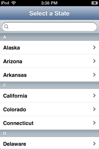
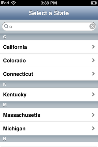
You can add a search box to a ListBox. With a search box, users can easily narrow down a selection from a long list as in the following pictures:
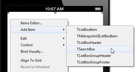
- To add a Search Box to the ListBox component, right-click the TListBox component and simply select Add Item > TSearchBox from the context menu:
See Also
- FMX.ListBox.TListBox
- Mobile Tutorial: Using LiveBindings to Populate a ListView (iOS and Android)
- Mobile Tutorial: Using LiveBindings to Populate a ListBox in Mobile Applications (iOS and Android)
- Mobile Tutorial: Using a Button Component with Different Styles (iOS and Android)
- Mobile Tutorial: Using the Web Browser Component (iOS and Android)
- Mobile Tutorial: Using Tab Components to Display Pages (iOS and Android)
