使用 http://datav.jiaminghi.com/ DataV
问题1 在浏览器没有全屏时 会有部分被遮盖住 无法查看
问题二 同时,使用手机端浏览器 平板浏览器查看时样式

问题1解决方法
添加隐藏滚动条
1动态监听当前页面可视高度
2.使用element隐藏组件 滚动条 el-scrollbar https://www.cnblogs.com/aknife/p/14898243.html
<template>
  <div id="data-view">
    <dv-full-screen-container> //dataV容器 第二个问题中将会删除
      <el-scrollbar
         :style="{ height: clientHeight + 'px' }"
         :native="false"
         wrapStyle=""
         wrapClass=""
         viewClass=""
         viewStyle=""
          :noresize="false"
          tag="section"
        >
         <div class="el-scrollbar__wrap_scrollBodyHidden">

           界面内容此处自己写

         </div>
       </el-scrollbar>
     </dv-full-screen-container>
  </div>
</template>
export default {
  name: 'DataView',
  components: {
  },
  data () {
    return {
      clientHeight: 1080,//屏幕高度
    }
  },
  unmounted () { //vue3中为unmounted  vue2中销毁为destroyed
clearInterval(this.clientHeightTime)
  },
  created () {
    this.clientHeightTime = setInterval(() => {
      if (this.clientHeight = (document.documentElement.clientHeight < 600 ? 1000 : (document.documentElement.clientHeight < 927 ? 1080 : document.documentElement.clientHeight))) {
        this.clientHeight = (document.documentElement.clientHeight < 600 ? 1000 : (document.documentElement.clientHeight < 927 ? 1080 : document.documentElement.clientHeight))
      }
    }, 500)
  }
}
样式
.el-scrollbar__wrap {
overflow-x: hidden !important;
}
.el-scrollbar__wrap_scrollBodyHidden {
width: 100%;
overflow: hidden;
}
问题2 解决 在手机端 ipad 保持缩放
1.引入jq 不会自己百度
2.添加 一个js文件 screenAdapt.js 名字自取
import $ from 'jquery'
export default {
  /**
   * 适应屏幕
   */
  screenAdapt () {
    window.global = window;
    (function () {
      if ($(window).width() >= 1920) {
        $(window).width() && $('body').css('width', $(window).width());
        $(window).height() && $('body').css('height', $(window).height());
      } else {
        $(window).width() && $('body').css('width', "1920px");

        var ratio = $(window).width() / (1920 || $('body').width());
        $('body').css({
          transform: "scale(" + ratio + ")",
          transformOrigin: "left top",
          backgroundSize: "100%",
          height: "1080px"
        });
      }
      $('head').append('<meta name="viewport" content="width=' + $(window).width() + '"/>');


      //监听页面是否发生改变
      $(window, document).resize(function () {
        resize();
      })


      function resize () {
        if (window.screen.display == 2) { // 等比缩放高度铺满
          resizeCenter();
        } else if (window.screen.display == 3) { //全屏铺满
          resizeFull();
        } else if (window.screen.display == 4) { //等比缩放高度铺满并且可以左右移动
          resizeHeight();
        } else { // 等比缩放宽度铺满
          resizeWidth();
        }


      }
      function resizeWidth () {
        window.location.reload()
        if ($(window).width() >= 1920) {
          var ratio = $(window).width() / ($(window).width() || $('body').width());
          $(window).height() && $('body').css('height', $(window).height());
        } else {
          $('body').css('height', "1080px");
        }
        var ratio = $(window).width() / (1920 || $('body').width());
        $('body').css({
          transform: "scale(" + ratio + ")",
          transformOrigin: "left top",
          backgroundSize: "100%"
        });
      }
      function resizeCenter () {
        if (!window.screen.height || !window.screen.width) return resizeCenterBak();
        var ratio = $(window).height() / window.screen.height;


        $('body').css({
          transform: "scale(" + ratio + ")",
          transformOrigin: "left top",
          backgroundSize: 100 * (window.screen.width / $(window).width() * ratio) + "%" + ' 100%',
          backgroundPosition: ($(window).width() - $('body').width() * ratio) / 2 + "px top",
          marginLeft: ($(window).width() - $('body').width() * ratio) / 2
        });
      }


      function resizeHeight () { //
        if (!window.screen.height || !window.screen.width) return resizeCenterBak();
        var ratio = $(window).height() / window.screen.height;


        $('body').css({
          transform: "scale(" + ratio + ")",
          transformOrigin: "left top",
          backgroundSize: 100 * (window.screen.width / $(window).width() * ratio) + "%" + ' 100%',
          backgroundPosition: ($(window).width() - $('body').width() * ratio) / 2 + "px top",
          // marginLeft: ($(window).width() - $('body').width() * ratio) / 2
        });
        $('html').css({
          overflowX: 'scroll',
        })
      }


      function resizeFull () {
        if (!window.screen.height || !window.screen.width) return resizeFullBak();
        var ratioX = $(window).width() / window.screen.width;
        var ratioY = $(window).height() / window.screen.height;


        $('body').css({
          transform: "scale(" + ratioX + ", " + ratioY + ")",
          transformOrigin: "left top",
          backgroundSize: "100% 100%",
        });
      }


      function resizeCenterBak () {
        var ratioX = $(window).width() / $('body').width();
        var ratioY = $(window).height() / $('body').height();
        var ratio = Math.min(ratioX, ratioY);


        $('body').css({
          transform: "scale(" + ratio + ")",
          transformOrigin: "left top",
          backgroundSize: (1 / ratioX) * 100 * ratio + "%",
          backgroundPosition: ($(window).width() - $('body').width() * ratio) / 2 + "px top",
          marginLeft: ($(window).width() - $('body').width() * ratio) / 2
        });
      }
      function resizeFullBak () {
        var ratioX = $(window).width() / $('body').width();
        var ratioY = $(window).height() / $('body').height();


        $('body').css({
          transform: "scale(" + ratioX + ", " + ratioY + ")",
          transformOrigin: "left top",
          backgroundSize: "100% " + ratioY * 100 + "%",
        });
      }
    })();
  }
}
在刚刚前面的页面中 引入
import screenAdapt from "@/utils/system/screenAdapt"
在created 中添加
created () {
    screenAdapt.screenAdapt()
    this.clientHeightTime = setInterval(() => {
      if (this.clientHeight = (document.documentElement.clientHeight < 600 ? 1000 : (document.documentElement.clientHeight < 927 ? 1080 : document.documentElement.clientHeight))) {
        this.clientHeight = (document.documentElement.clientHeight < 600 ? 1000 : (document.documentElement.clientHeight < 927 ? 1080 : document.documentElement.clientHeight))
      }
    }, 500)
  },
删除template中DataV容器
<dv-full-screen-container> </dv-full-screen-container>
至此问题解决!!!
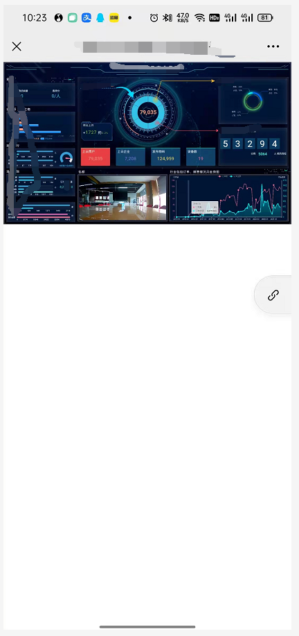
展示下效果 这是竖屏效果 横屏效果更佳
由于添加了滚动 横屏时部分浏览器展示不下的情况下 也可以用手指滚动