I’m in the process of writing a Charting WebPart for SharePoint 2010, specifically aimed at the standard version, which does not come with such a feature. Of course, it’s still usable within an enterprise environment if you were to find it useful.
To download the solution and installation script, follow this link.
The zip contains a solution (wsp) file and a PowerShell script for installation. Before running the script, edit it and change the SolutionFolder variable (line 6) to the location of the extracted wsp file.
Once installed, enable the Site Collection Feature SharePoint Stu Chart WebPart.
Then add the SharePoint Stu Chart WebPart WebPart (within the Custom category) to your page.
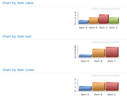
The WebPart works by processing values within the list it’s configured against and displaying either the sum, total or actual item values in a graph. The graphical component of the WebPart utilises the Visifire Silverlight control.
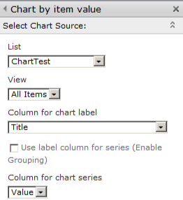
To configure the WebPart, start by bringing up the WebPart editor pane. At the top of the pane you’ll notice a section titled Select Chart Source, this is where you configure the source for the chart, as hinted at by the section title ![]()
The first drop down is for selecting the source list.
Next, we have a list of views to use for reading the data.
The third drop down list contains a list of available and valid fields for the chart axis; i.e the primary x axis, the content of which will be displayed as the label in the chart.
The last section within this configuration group is where you can specify how the columns are calculated. Leaving the checkbox unchecked allows you to select a value field from the last drop down list to use to when displaying the chart columns. For example, if the source list has three items with a field called total, the value of this field would be used for the rendered columns.
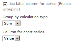
Ticking the checkbox, changes the configuration options slightly.
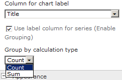
Now, instead of selecting a column to read the value of, you are required to select one of two options – count or sum. If you select count, the number of distinct fields for the primary x axis are used for the value. If, on the other hand, you select sum, you will need to select a value field to use when calculating the sum total for each column in the chart.
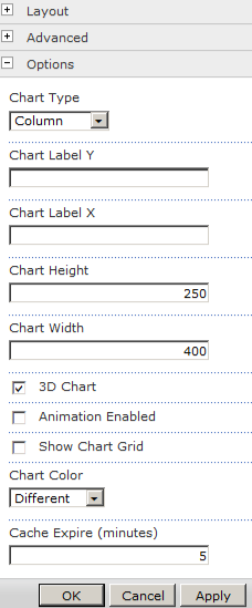
That pretty much covers the source configuration. The final part of the configuration is for how the chart is displayed. This configuration is contained with the section titledOptions.
Within this section you can configure the following:
- Type of chart – area, column, line, pie or stacked bar
- Label for the y axis
- Label for the x axis
- Height of the chart, in pixels. Minimum is 100, anything below will be ignored
- Width of the chart, also in pixels. Minimum is 200
- If the chart should be rendered in 3D
- If the chart should be animated
- If a grid should be shown behind the chart columns
- The colour of the columns – aqua, blue, gray, green, orange, red or violet
- The cache timeout in minutes for the chart, specifying 0 disables caching
