- SVG简介
- SVG画线与矩形
- SVG画圆、椭圆、折线
- SVG画多边形和文本
- SVG透明度与线条样式
- SVG的Path标签
- SVG线性渐变、放射性渐变
- SVG高斯模糊
- SVG虚线以及简单的动画
- SVG的viewbox(比例尺)
一、SVG简介
SVG全称Scalable Vector Graphics,意为可缩放的矢量图,SVG使用XML格式定义图像。IE9及以上,Chrome,Opera,Safari,Firefor都兼容。
IE8和早期版本需要插件支持,如Adobe SVG浏览器。
SVG与Canvas的区别:
SVG:矢量图,不会失真,适合大面积的贴图,通常动画较少的或者简单的图标;SVG使用标签和CSS实现绘制。
Canvas:适合用于小面积的绘图,适合动画;Canvas使用标签和javascript实现绘制。
参考手册:https://www.runoob.com/svg/svg-reference.html
二、SVG画线与矩形
- <line x1="" y1="" x2="" y2="">:用来创建直线
- 属性:
- (x1,y1):表示直线的起始点
- (x2,y2):表示直线的结束点
- 样式(css):
- stroke:设置直线的颜色
- stroke-设置直线的粗细;如果设置为0px,画布上不会渲染直线,但html结构中依然会存在该元素
1 <style>
2     line{
3       stroke: black;
4       stroke- 5px;
5     }
6 </style>
7 <svg width="500" height="500" style="border:1px solid;">
8     <line x1="100" y1="100" x2="200" y2="100"></line>
9 </svg>
- <rect height="" width="" x="" y="" rx="" yx="">:用来创建矩形
- 属性:
- height:矩形的高度
- 矩形的宽度
- (x,y):设置矩形的起始点(左上角)
- (rx,ry):设置横坐标方向和纵坐标方向的圆角
- 样式:
- fill:设置背景颜色,如果不需要填充背景颜色的话设置为透明(transparent)
- stroke-width:设置边框宽度
- stroke:设置矩形边框的颜色(如果设置了背景透明,不设置边框颜色会看不到矩形)
<style>
    rect{
      fill: transparent;//设置背景透明
      stroke: red;//设置边框为红色
    }
</style>
<svg width="500" height="500" style="border:1px solid;">
    <rect height="50" width="100" x="100" y="100" rx="5" ry="5"></rect>
</svg>
三、SVG画圆、椭圆、折线
- <circle r="" cx="" cy="">:用来创建圆形
- 属性:
- r:设置圆的半径
- (cx,cy):设置圆心坐标;如果不设置的话,圆心坐标默认为(0,0)
- 样式:
- fill:设置圆的背景填充
- stroke:设置边框的颜色
- stroke-设置边框的宽度
 1 <style>
 2     circle{
 3       fill: transparent;
 4       stroke: #f0f;
 5       stroke- 5px;
 6     }
 7 </style>
 8 <svg width="500" height="500" style="border:1px solid;">
 9     <circle r="50" cx="50" cy="220"></circle>
10 </svg>
- <ellipse rx="" ry="" cx="" cy="">:用来创建椭圆
- 属性:
- (cx,cy):设置椭圆的中心坐标点
- (rx,ry):设置椭圆的水平半径和垂直半径
- 样式:
- fill:设置圆的背景填充
- stroke:设置边框的颜色
- stroke-设置边框的宽度
 1 <style>
 2     ellipse{
 3       fill: transparent;
 4       stroke: blueviolet;
 5       stroke- 3px;
 6     }
 7 </style>
 8 <svg width="500" height="500" style="border:1px solid;">
 9 <ellipse rx="100" ry="30" cx="300" cy="200"></ellipse>
10 </svg>
- <polyline points="x1 y1,x2 y2,x3 y3,x4 y4...,xn yn">:用来创建折线
- 属性:
- (x y):设置折线每个折点的坐标
- 样式:
- fill:设置值为none或者transparent取消填充
- stroke:设置折线的颜色(如果不设置颜色,不能渲染出折线)
- stroke-width:设置折线的宽度(如果宽度为0px,同样会渲染不出折线)
 1 <style>
 2     polyline{
 3     fill:  none /* transparent */;
 4     stroke: blueviolet;
 5     stroke- 1px;
 6     }
 7 </style>
 8 <svg width="500" height="500" style="border:1px solid;">
 9     <polyline points="0 0,50 50,50 100,100 50"></polyline>
10 </svg>
四、SVG画多边形和文本
- <polygon points="x1 y1,x2 y2,x3 y3,x4 y4...,xn yn">:用来创建多边形
- 属性:
- (x y):设置折线每个折点的坐标
- 样式:
- fill:设置值为none或者transparent取消填充
- stroke:设置折线的颜色(如果不设置颜色,不能渲染出折线)
- stroke-width:设置折线的宽度(如果宽度为0px,同样会渲染不出折线)
注意polygon与polyline的绘制原理是一样的,唯一的区别就在于polygon绘制到最后一个点后会将结束点和起始点连接起来,形成多边形的图形。
 1 <style>
 2     polygon{
 3       fill:  none /* transparent */;
 4       stroke: blueviolet;
 5          stroke- 1px;
 6     }
 7 </style>
 8 <svg width="500" height="500" style="border:1px solid;">
 9 <polygon points="0 0,50 50,50 100,100 50"></polyline>
10 </svg>
- <text x="" y="">:用来创建文本
- 属性:
- (x y):用来设置文本的起始位置
- 样式:
- font相关的样式能作用text元素内容
- stroke:用来设置文本颜色
- stroke-width:用来设置文本粗细
 1 <style>
 2     text{
 3     font-size: 15px;/* 字体样式能作用text标签 */
 4     stroke: #faf; /* 设置文本颜色 */
 5     stroke- 3px; /* 设置字体粗细 */
 6     }
 7 </style>
 8 <svg width="500" height="500" style="border:1px solid;">
 9     <text x="300" y="50">台风韦帕再次登陆</text>
10 </svg>
五、SVG透明度与线条样式
用来设置SVG的图形的透明度和线条样式都是使用css样式来完成的,下面就来看看这些样式属性:
- stroke-opacity:设置边框的透明度
- fill-opacity:设置填充背景的透明度
- stroke-linecap:设置svg的线端样式(round:线端半圆、square:线端添加与线宽一致的方体)
- stroke-linejoin:设置svg的折角样式(round:圆角 bevel:切掉尖角 miter:默认)
 1 //使用折线来测试这些样式
 2 polyline{
 3     /* fill:  none transparent; */
 4     stroke: blueviolet;
 5     stroke- 10px; /* 如果设置了线条透明,在线的中心上会出现一条可视的中心线 */
 6
 7     stroke-opacity: 0.5;/* 边框透明度 */
 8     fill-opacity: 0.3; /* 背景填充透明度 */
 9     stroke-linecap: square; /*round: 线的末端添加一个半圆;  square:线的末端添加一个线宽一致的方块 */
10     stroke-linejoin: round; /*设置折线的折角样式:round:圆角  bevel:切掉尖角  miter:默认*/
11 }
12 <svg width="500" height="500" style="border:1px solid;">
13     <polyline points="0 0,50 50,50 100,100 50"></polyline>
14 </svg>
六、SVG的path标签
path标签用来绘制路径,默认情况下图形会有填充,元素使用d属性来描述路径绘制规则,d属性的参数内部包含指令和参数,详细了解d属性的内部指令:
- M :路径起始点
- L :路径节点(区分大小写,大写表示在画布上的绝对路径,小写表示相对前面一个路径节点移动方向和距离)
- H :水平线,表示水平方向画线(区分大小写,大写表示横向画到那个点,小写表示横向画多少距离)
- V :垂直线,表示垂直方向画线(区分大小写,与H的规则一致)
- Z :闭合路径,不区分大小写
- (还有其他指令后面继续介绍)
 1 <style>
 2     path{
 3     fill: none;
 4     stroke: red;
 5     }
 6 </style>
 7 <svg width="500" height="500" style="border:1px solid;">
 8     <path d="M 100 100 L 200 100 L 200 200"></path><!--L绝对路径绘制-->
 9     <path d="M 100 100 l 100 0 l 200 200"></path><!--L相对路径绘制-->
10     <path d="M 100 100 H 200 V 200 200"></path><!--HV绝对路径绘制-->
11     <path d="M 100 100 h 200 v 200"></path><!--hv相对路径绘制-->
12 </svg>
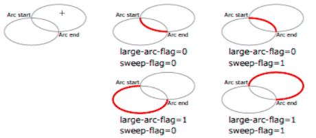
- A :椭圆弧
- 参数:
- M mx my A rx ry 旋转角度 大弧线/小弧线 顺时针/逆时针 x y
- M起始点指令,(mx,my)其实先坐标
- A取椭圆弧线的指令,(rx ry)椭圆的x轴方向半径和y轴方向的半径
- 旋转角度:图像的旋转角度
- 大弧线/小弧线:在一个平面内两点可以确定两个圆,两个圆一两点相交,会切割出两个椭圆弧形,这个参数指定取大弧线还是小弧线
- 逆时针/顺时针:以起始点为准向结束点,按照顺时针还是逆时针取椭圆弧线
- (x,y):设置椭圆弧的结束点
1 path{
2     fill: none;
3     stroke: red;
4 }
5 <svg width="500" height="500" style="border:1px solid;">
6     <path d="M 100 100 A 100 50 30 1 0 100 180"></path>
7 </svg>
椭圆弧的原理图:
- C:curveto
- S:平滑曲线
- Q:二次贝塞尔曲线
- T:平滑二次贝塞尔曲线
七、线性渐变放射性渐变
7.1线性渐变
- <defs>:引用元素容器
- <linearGradient id="" x1="" y1="" x2="" y="">:创建线性渐变
-
- id:渐变ID
- x1 y1:渐变起始点
- x2 y2:渐变结束点
- <stop>:定义关键帧
-
- offset:关键帧的位置
- style:"stop-color:rgb(255,255,0)" :设置关键帧颜色
1 <svg width="500" height="500" style="border:1px solid;">
2     <defs>
3         <linearGradient id="bg1" x1="0" y1="0" x2="100%" x2="100%">
4             <stop offset="0%" style="stop-color: rgb(255,255,0)"></stop>
5             <stop offset="100%" style="stop-color: rgb(255,0,0)"></stop>
6         </linearGradient>
7     </defs>
8     <rect x="100" y="100" height="100" width="200" style="fill:url(#bg1)"></rect>
9 </svg>
八、SVG高斯模糊(滤镜)
SVG滤镜参考手册:https://www.runoob.com/svg/svg-filters-intro.html
- <defs>:引用元素容器
- <filter id="">:创建滤镜
- <feGaussianBlur in="" stdDeviation="">:定义滤镜类型
基于之前的线性渐变的基础,叠加一个高斯模糊效果:
 1 <svg width="500" height="500" style="border:1px solid;">
 2     <defs>
 3         <linearGradient id="bg1" x1="0" y1="0" x2="100%" x2="100%">
 4             <stop offset="0%" style="stop-color: rgb(255,255,0)"></stop>
 5             <stop offset="100%" style="stop-color: rgb(255,0,0)"></stop>
 6         </linearGradient>
 7         <filter id="gaussian">
 8             <feGaussianBlur in="SourceGraphic" stdDeviation="10"></feGaussianBlur>
 9         </filter>
10     </defs>
11     <rect x="100" y="100" height="100" width="200" style="fill:url(#bg1);filter:url(#gaussian)"></rect>
12 </svg>
九、SVG虚线及简单的动画
- stroke-dasharray:设置直线为虚线,参数(npx npx ...),参数以组为单位重复以(实线、虚线...)的方式风格直线,知道完全将直线分割完。
- stroke-dashoffset:设定虚线描边偏移量(在路径开始的前面,看不到),意思就是将虚线重原位置偏移出去,超出虚线范围的不渲染,原位置偏移的部分被空置占用。
这里有一篇不错的相关博客:https://www.cnblogs.com/zmxmumu/p/6069846.html
有了上面两个样式,加上CSS动画控制stroke-dashoffset的偏移量,就可以实现直线伸缩动画:
 1 <style>
 2     .line1{
 3         stroke: black;
 4         stroke-width: 10px;
 5
 6         stroke-dasharray: 200px;/*创建虚线*/
 7         stroke-dashoffset: 200px; /*定义虚线描边的偏移量(在路径开始的前面,看不到)*/
 8         animation: move 2s linear infinite alternate-reverse;
 9     }
10     @keyframes move{
11         0%{
12             stroke-dashoffset: 200px;
13         }
14         100%{
15             stroke-dashoffset: 0px;
16         }
17     }
18 </style>
19 <svg width="500" height="500" style="border:1px solid;">
20     <line x1="100" y1="100" x2="300" y2="100" class="line1"></line>
21 </svg>
十、SVG的可视窗口viewbox(比例尺)
- <svg viewBox="x,y,width,height">
- viewBox的参数:
- (x,y)设置可视区域的开始位置(可视的起始点)
- (width,height)设置可视区域的大小;基于起始点切割横向为width,纵向为height的画布内容显示出来。而显示的实际窗口时svg的元素实际窗口。
viewBox最常见的应用场景就是web端的地图,在标题中使用了比例尺的描述也就是通常以同比例的方式修改width,height就可以实现地图的放大与缩小;修改x,y的坐标就可以实现地图的窗口移动。
<svg width="500" height="500" style="border:1px solid;" viewBox="0,0,250,250">