今天逛京东金融的时候发现他家网站首页的滚动效果看着很有意思,于是就做了一个,demo链接http://1.liwenyang.applinzi.com/index.html
大多数的视差滚动效果都是使用js来实现的,实际上,如果你对兼容性要求不是很高,比方说忽略IE浏览器,则我们使用简单的几行CSS代码就可以实现视差滚动效果了。
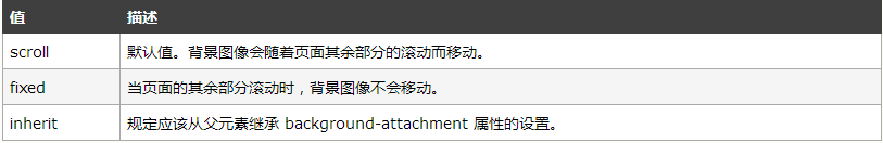
css有一个background-attachment属性
作用是设置背景图像是否固定或者随着页面的其余部分滚动。
这里要注意任何版本的 Internet Explorer (包括 IE8)都不支持属性值 "inherit"。
上代码
结构超级简单,用到的文字是00后小诗人姜二嫚的,哈哈,真的很不错
html
<!DOCTYPE html>
<html lang="en">
<head>
    <meta charset="UTF-8">
    <title>css视差滚动</title>
    <link rel="stylesheet" type="text/css" href="index.css">
</head>
<body>

        <div class="box">
            <div class="flowImage fixed-bg bg1">
                <p>
                    这个西红柿死了吗<br>
                    可是它的颜色<br>
                    还像鲜花一样奔放
                </p>
            </div>
            <div class="flowImage fixed-bg bg2">
                <p>为了跳到天上<br>
                   月亮先爬到树上。
                </p>
            </div>
            <div class="flowImage fixed-bg bg3">
                <p>
                    晚上<br>
                    我打着手电筒散步<br>
                    累了就拿它当拐杖<br>
                    我拄着一束光
                </p>
            </div>
            <div class="flowImage fixed-bg bg4">
                <p>
                我是在摸一颗星星<br>
                因为地球<br>
                也是一颗星星
            </p>
            </div>
            <div class="flowImage fixed-bg bg5">
                <p>
                    我在家等爸爸妈妈<br>
                       我饿了<br>
                    这时飞来一只金龟子<br>
                    可能金龟子也饿了
                </p>
            </div>
            <div class="flowImage fixed-bg bg6">
                <p>
                    每当见到加油站<br>
                    我就在心里大声地喊<br>
                    加油加油加油<br>
                    也不知为了谁
                </p>
            </div>
        </div>

</body>
</html>
css
body, html {
    height: 100%;
    margin: 0;
    padding: 0
}

.box {
    height: 100%;
    position: relative;
    z-index: 1;
}

.flowImage {
    position: relative;
    height: 500px;
    background-size: cover;
    background-repeat: no-repeat;
    background-position: center center;
    z-index: 1;
   background-attachment: fixed; //划重点!!!
}

.flowImage>p {
    margin: 0;
    position: absolute;
    top: 50%;
    left: 10%;
    color: #fff;
    font-size: 30px;
    transform: translate(-10%, -50%);
}

.bg1 {
    background-image: url(images/1.jpg);
}

.bg2:nth-child(2) {
    background-image: url(images/2.jpg);
}

.bg3:nth-child(3) {
    background-image: url(images/3.jpg);
}

.bg4:nth-child(4) {
    background-image: url(images/4.jpg);
}

.bg5:nth-child(5) {
    background-image: url(images/5.jpg);
}

.bg6:nth-child(6) {
    background-image: url(images/6.jpg);
}
搞定收工