1、边框的圆角
border-radius: 25px; 圆角弧度的大小
可以设置边框、背景色、背景图片的圆角效果及其圆角大小
background: #ccc; 设置背景色的圆角
border: 5px solid #ccc; 设置边框的圆角效果
background-image: url(../images/1.jpg); 设置背景图片的圆角效果
代码内容:


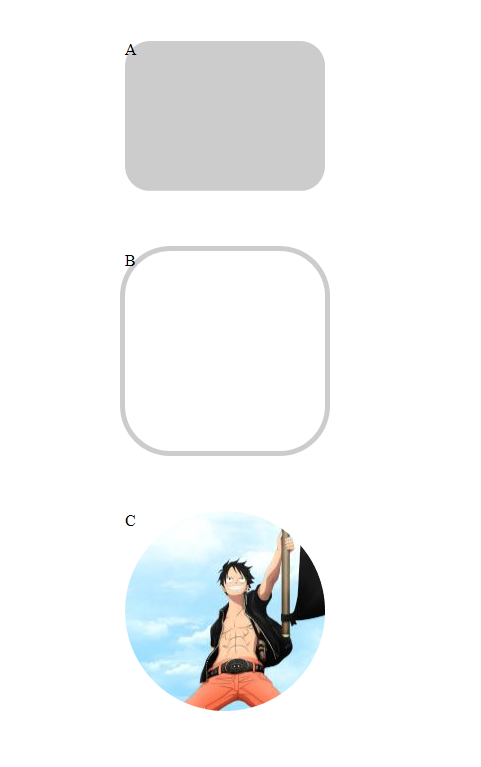
<body>

    <br>
    <br>

    <div class="a">
        A
    </div>

    <br>
    <br>
    <br>

    <div class="b">
        B
    </div>

    <br>
    <br>
    <br>

    <div class="c">
        C
    </div>

</body>
div{
    margin: auto;                                        /*所有div都居中*/
}
.a{
    border-radius: 25px;
    background: #ccc;
    width: 200px;
    height: 150px;

}

.b{
    border-radius: 50px;
    border: 5px solid #ccc;
    width: 200px;
    height: 200px;

}


.c{
    border-radius: 100px;
    background-image: url(../images/1.jpg);
    background-position: left bottom;                    /*图片向左,向下对齐*/
    width: 200px;
    height:200px;
}
显示效果:
2、盒子阴影
box-shadow: 100px 10px 5px #888888;
(左右的偏移量) (上下的偏移量) (虚化程度) (阴影颜色)
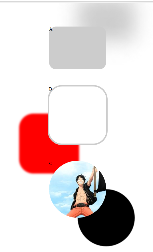
代码示例:
div{
    margin: auto;                                        /*所有div都居中*/
}
.a{
    border-radius: 25px;
    background: #ccc;
    width: 200px;
    height: 150px;


    /*盒子阴影*/
    box-shadow: 100px -100px 100px #ccc;

}

.b{
    border-radius: 50px;
    border: 5px solid #ccc;
    width: 200px;
    height: 200px;

    /*盒子阴影*/
    box-shadow: -100px 100px 10px red;


}


.c{
    border-radius: 100px;
    background-image: url(../images/1.jpg);
    background-position: left bottom;                    /*图片向左,向下对齐*/
    width: 200px;
    height:200px;


    /*盒子阴影*/
    box-shadow: 100px 100px 1px black;

}
效果图:
3、背景图片
background-size :背景图片的尺寸
background-image:可以设置多张图片,以逗号隔开。最左侧的为最上层图片
一张图片还可以同时设置多个属性值: background-image:url(../../) right bottom no-repeat;
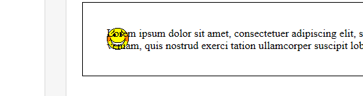
background-origin :指定图片显示在内容中(centent-box)、内容和边框之间(padding-box)、边框位置(border-box)
效果示意图: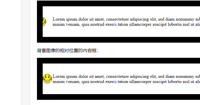
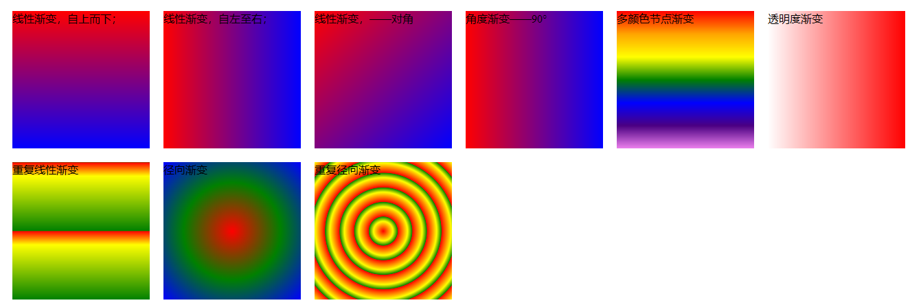
4、渐变
background:linear-gradient(red,blue); 默认从上到下渐变
代码演示:
<div>
    .s_x{
    background:linear-gradient(red,blue);
}

/*从左往右*/

.z_y{
    background: linear-gradient(to right, red , blue);

}
/*对角:左上角到右下角*/
.d_j{
    background: linear-gradient(to bottom right, red , blue);
}

/*角度渐变*/

.jd{
    background: linear-gradient(90deg, red, blue);
}

/*多颜色节点渐变*/

.caihong{
    background: linear-gradient(to bottom, red, orange, yellow, green, blue, indigo, violet);
}

/*透明度渐变*/

.tmd{
    background: linear-gradient(to right, rgba(255,0,0,0), rgba(255,0,0,1));
}

/*重复线性渐变*/

.cf_jb{
    background: repeating-linear-gradient(red, yellow 10%, green 50%);
}

/*径向渐变*/

.jx_jb{
    background: radial-gradient(red, green, blue);
}

/*重复径向渐变*/

.cf_jx{
    background: repeating-radial-gradient(red, yellow 10%, green 15%);
}

<div>
效果图:
 2D转换
2D转换
代码演示:
<body>
    <div class="zhuan2d">
            向下、向右偏移(原来的位置还在)
        </div>

        <div class="xuanzhuan">
            旋转
        </div>
    <div class="suof">
        缩放
        <img src="images/adl.png" alt="">
    </div>
</body>
.zhuan2d{
    background-color: bisque;
    transform: translate(50px,50px);
}

.xuanzhuan{
    transform: rotate(30deg);
    background-color: coral;
}

.suof{
    transform: scale(0.5);            /*图片显示为原来尺寸的一半大小*/
}

.suof img:hover{                    /*鼠标放上,图片变为之前的2倍大*/
    transform: scale(2)
}
效果图:
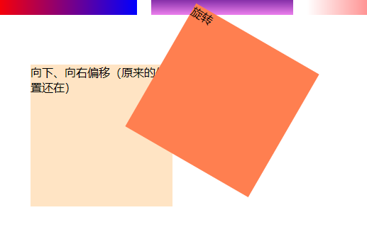


放上鼠标后就是上面的这张放大效果
5、过渡
transition : transform 1s; 此例是给动画加一个 1s 的过渡时间;(可以设置多个 过渡属性 和 时间 )
(过渡) : (要进行过渡的属性) (过渡所需要的时间)
animation:dh 5s;
}
@keyframes div{
0% {left:0px; transform: scale(0.5);}
25%{left:200px; transform: scale(1);}
50%{right:100px;transform: rotate(180deg);}
100%{right: 100px;transform: scale(0.5);}
}