某公司面试题:下图绿色区域的宽度为100%,其中有三个矩形,第一个矩形的宽度是200px,第二个和第三个矩形的宽度相等。使用CSS3中的功能实现它们的布局。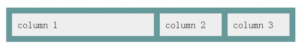
这里要用到的CSS3特性box-flex
box-flex :属性规定框的子元素是否可伸缩其尺寸。可伸缩元素能够随着框的缩小或扩大而缩写或放大。只要框中有多余的空间,可伸缩元素就会扩展来填充这些空间。
此外,元素的可伸缩行柔性是相对的,例如 box-flex 为 2 的子元素两倍于 box-flex 为 1 的子元素。
思路:
1.定义如下html:
<body>
<div class="box">
<div class="item">column1</div>
<div class="item">column2</div>
<div class="item">column3</div>
</div>
</body>
2.对column1设置固定宽度,box-flex:0(表示固定宽度,不参与自适应宽度)200px;
3.对column2 column3设置box-flex:1(按照比例1自适应宽度);
css代码如下:
<head>
    <style type="text/css">
    .box {
        background-color:green;
        display:-moz-box;
        display:-webkit-box;
        display:box;
        height:50px;
        line-height:30px;
        text-indent:10px;
    }
    .item {
        box-flex:1;
        -moz-box-flex:1;
        -webkit-box-flex:1;
        margin:10px;
        background:#fff;
        text-align:center
    }
    .item:first-child {
        box-flex:0;
        -moz-box-flex:0;
        -webkit-box-flex:0;
        width:200px;
        background:#fff;
        margin:10px;
        text-align: left;
    }
    .item:nth-child(2) {
        margin:10px 0
    }
    </style>
</head>
看看它的显示效果:
