• highcharts.js两种数据绑定方式和异步加载数据的使用


    一,我们先来看看异步加载数据的写法(这是使用MVC的例子)

    1》js写法

    <script src="~/Scripts/jquery-2.1.4.min.js"></script>
    <script src="~/Scripts/highcharts.js"></script>
    
    <div id="chart"></div>
    <script type="text/javascript">
    
    
        //定义一个Highcharts的变量,初始值为null
        var highCharts = null;
    
        //定义highCharts的布局环境
        //布局环境组成:X轴、Y轴、数据显示、图标标题
        var oOptions = {
            chart: {
                renderTo: 'chart',  //设置显示的页面块
                type: 'column'   //设置显示的方式
            },
            title: {
                text: ''      //设置null则不显示标题
            },
            plotOptions: {
                column: {
                    pointPadding: 0,
                    borderWidth: 1,
                    groupPadding: 0,
                    shadow: false
                }
            },
            xAxis: {
                tickWidth: 0,
                //labels: {
                //    enabled: false   //禁止X轴的标题显示
                //},
                type: 'category',
                categories: ['Jan', 'Feb', 'Mar', 'Apr', 'May', 'Jun', 'Jul', 'Aug', 'Sep', 'Oct', 'Nov', 'Dec']
            },
            yAxis: {
                title: {
                    text: ''
                },
                //labels: {
                //    enabled: false  //禁止Y轴的标题显示
                //},
            },
            legend: {
                enabled: false
            },
            credits: {
                enabled: false
            },
            tooltip: {
                formatter: function () {
                    return '<span>' + this.series.name + '</span>: <b>' + this.y + '</b>'+ '<span>分数范围</span>: <b>' + (this.x + 10) * 10 + "-" + (this.x + 11) * 10 + '</b>'
                },
            }
        };
    
    
        $(function () {
            highCharts = new Highcharts.Chart(oOptions);
            highCharts.showLoading();
            $.ajax({
                url: '/home/getJosn2',
                type: 'POST',
                success: function (Data) {
                    Data = eval("(" + Data + ")");
                    var Series = {
                        name: "人数",
                        data: Data.rows,
                        color: '#ddd'
                    };
                    highCharts.addSeries(Series);
                }
            });
            highCharts.hideLoading();
        });
    </script>

    2》C#后台代码(MVC)

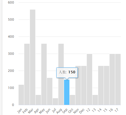
        [HttpPost]
            public JsonResult getJosn2()
            {
                return Json("{"rows":[120, 360, 560, 60, 360, 160, 40, 360, { y: 150, color: '#45a9f4' }, 60, 230, 230, 300, 60, 230, 230, 300, 300]}");
            }

    看我返回的json这个{ y: 150, color: '#45a9f4' }, 是什么效果呢?如下图,高亮的那条

     二,有两种数据绑定的方法,这里使用固定数据来展示例子

    第一种:

    <script src="~/Scripts/jquery-2.1.4.min.js"></script>
    <script src="~/Scripts/highcharts.js"></script>
    
    <div id="chart"></div>
    <script type="text/javascript">
        $(function () {
            $('#chart').highcharts({
                chart: {
                    type: 'column'
                },
                title: {
                    text: ''
                },
                plotOptions: {
                    column: {
                        pointPadding: 0,
                        borderWidth: 1,
                        groupPadding: 0,
                        shadow: false
                    }
                },
                xAxis: {
                    tickWidth: 0,
                    //labels: {
                    //    enabled: false
                    //},
                    type: 'category'
                },
                yAxis: {
                    title: {
                        text: ''
                    },
                    //labels: {
                    //    enabled: false
                    //}
                },
                legend: {
                    enabled: false
                },
                credits: {
                    enabled: false
                },
                tooltip: {
                    formatter: function () {
                        return '<span>' + this.series.name + '</span>: <b>' + this.y + '</b>'
                    },
                },
                series: [{
                    name: '人数',
                    data: [
                        ['Jan', 50],
                        ['Feb', 60],
                        ['Mar', 70],
                        {
                            name: "Apr",
                            y: 150,
                            color: "#45a9f4"
                        },
                        ['May', 140],
                       
                    ],
                    color: '#ddd'
                }]
            });
        });
    </script>

    我们可以同时在series给X赋名字和值的一个json集合

    第二种:

    <script src="~/Scripts/jquery-2.1.4.min.js"></script>
    <script src="~/Scripts/highcharts.js"></script>
    
    <div id="chart"></div>
    <script type="text/javascript">
        $(function () {
            $('#chart').highcharts({
                chart: {
                    type: 'column'
                },
                title: {
                    text: ''
                },
                plotOptions: {
                    column: {
                        pointPadding: 0,
                        borderWidth: 1,
                        groupPadding: 0,
                        shadow: false
                    }
                },
                xAxis: {
                    tickWidth: 0,
                    //labels: {
                    //    enabled: false
                    //},
                    type: 'category',
                    categories: ['Jan', 'Feb', 'Mar', 'Apr', 'May']
                },
                yAxis: {
                    title: {
                        text: ''
                    },
                    //labels: {
                    //    enabled: false
                    //}
                },
                legend: {
                    enabled: false
                },
                credits: {
                    enabled: false
                },
                tooltip: {
                    formatter: function () {
                        return '<span>' + this.series.name + '</span>: <b>' + this.y + '</b>'
                    },
                },
                series: [{
                    name: '人数',
                    data: [120, 360, { y: 150, color: "#45a9f4" }, 560, 60],
                    color: '#ddd'
                }]
            });
        });
    </script>

    我们X轴的标题和值也可以分开赋值,如上:

    .

  • 相关阅读:
    什么,你还不会Mysql主从复制???快来看
    MySQL二进制安装(版本:5.7.26)
    MySQL--备份恢复【Mysqdump+xtrabackup(XBK)】
    Mysql日志分析(错误日志,Binlog日志,慢日志),有惊喜哦
    Mysql多实例启动
    Zabbix服务自定义监控和模板
    Centos7安装Zabbix服务端、Zabbix客户端和Win客户端配置(源码编译安装)
    运维工作经验汇总---------高级运维工程师
    手误【删库】 == 跑路,不存在的 ——删瓦辛格
    python——map()函数
  • 原文地址:https://www.cnblogs.com/May-day/p/8521945.html
Copyright © 2020-2023  润新知