Transition过渡
transition-property 过渡属性 all|[attr]
transition-duration 过渡时间
transition-delay 延迟时间
transition-timing-function 运动类型
- ease:(逐渐变慢)默认值
- linear:(匀速)
- ease-in:(加速)
- ease-out:(减速)
- ease-in-out:(先加速后减速)
- cubic-bezier 贝塞尔曲线( x1, y1, x2, y2 )贝塞尔曲线
webkit内核下:
ele.addEventListener('webkitTransitionEnd',function(){},false);
标准浏览器下:
ele.addEventListener(‘transitionend',function(){},false)
transition 执行次数问题
2D变换
transform
rotate() 旋转函数
- deg 度数
- Transform-origin 旋转的基点
skew() 倾斜函数
- skewX()
- skewY()
scale() 缩放函数 默认值是1
- scaleX()
- scaleY()
translate() 位移函数
- translateX()
- translateY()
animation声明关键帧动画
关键帧---@keyframes
- 类似于flash
- 定义动画在每个阶段的样式,即帧动画
- 关键帧的时间单位
- 数字:0%、25%、100%等(设置某个时间段内的任意时间点的样式)
- 字符:from(0%)、to(100%)
- 格式
@keyframes 动画名称
	{
		 动画状态
	}
animation调用动画
必要属性
- animation-name 动画名称(关键帧名称)
- animation-duration 动画执行时间
可选属性
animation-timing-function - linear 匀速
- ease 缓存
- ease-in 加速
- ease-out 减速
- ease-in-out 先加速后减速
- cubic-bezier(number, number, number, number):特定的贝塞尔曲线类型,4个数值需在[0, 1]区间内
可选属性
- animation-delay 动画延迟
- animation-iteration-count 重复次数
- animation-direction 动画运行的方向 normal | reverse | alternate | alternate-reverse
- animation-play-state 动画状态 running | paused
- animation-fill-mode 动画结束后的状态 none | forwards| backwards | both
3D变换
transform-style : flat | preserve-3d (3D空间展示)
perspective 透视效果
transform:perspective(800px) 直接作用在子元素上
perspective-origin 透视点位置
transform 新增函数
- translate3d( tx , ty, tz )
translateX() translateY() translateZ() - rotate3d( rx , ry , rz,a)
rotateX() rotateY() rotateZ() - scale3d( sx , sy , sz)
scaleX() scaleY() scaleZ()
动画进阶
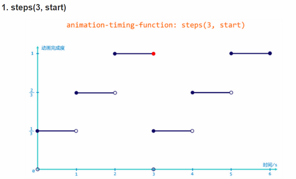
【timing-function steps (<number_of_steps>,`<direction>`)】
steps()是一个timing function,允许我们将动画或者过渡分割成段,而不是从一种状态持续到另一种状态的过渡。这个函数有两个参数;
第一个参数是一个正值,指定我们希望动画分割的段数;
第二个参数定义了这个要点 在我们的@keyframes中申明的动作将会发生的关键,这个值是可选的,在没有传递参数时,默认为”end”;
【”start”】表示一个左--持续函数,在动画开始时,动画的第一段将会马上完成。以左侧端点为起点,立即跳到第一个step的结尾处。它会立即跳到第一段的结束并且保持这样的状态直到第一步的持续时间结束。后面的每一帧都将按照此模式来完成动画;
【”end”】表示一个右--持续函数。动画执行时,在每一帧里,动画保持当前状态直到这一段的持续时间完成,才会跳到下一步的起点,后面的每一帧都按照这个模式来进行,在最后一帧的起点,等到这一帧的持续时间结束,整个动画的执行也已经结束,执行动画的元素来不及跳到这一帧的终点,直接回到了整个动画起点,开始了第二次动画。每个选择本质上从一个不同的面移动这个元素并且将产生一个不同的位置在这个相同的动画里;
【Sprites 精灵动画】
原理:使用一张含有多帧静态画面的图片,通过切换 background-position 使其变为连续的动画
<!DOCTYPE html>
<html>
<head lang="en">
    <meta charset="UTF-8">
    <title></title>
</head>
<style>
    .box1 {
         100px;
        height: 100px;
        line-height:100px;
        text-align: center;
        margin:20px 0;
        font-size:20px;
        color:#fff;
        -webkit-animation: animation1 6s steps(3, start) infinite;
    }
    .box2 {
         100px;
        height: 100px;
        line-height:100px;
        text-align: center;
        margin:20px 0;
        font-size:20px;
        color:#fff;
        -webkit-animation: animation2 6s steps(3, end) infinite;
    }
    @-webkit-keyframes animation1{
        from {
            background-color: red;
        }
        to {
            background-color: blue;
        }
    }
    @keyframes animation1{
        from {
            background-color: red;
        }
        to {
            background-color: blue;
        }
    }
    @-webkit-keyframes animation2{
        from {
            background-color: red;
        }
        to {
            background-color: blue;
        }
    }
    @keyframes animation2{
        from {
            background-color: red;
        }
        to {
            background-color: blue;
        }
    }
</style>
<body>
<div class="box1">start</div>
<div class="box2">end</div>
</body>
</html>